
Cart
Hello there, color curious friend! Are you staring at your living room walls like they've personally offended you? Is your sofa crying out for a chromatic companion that doesn't make your eyeballs scream? Well, buckle up your paint swatches, because we're about to embark on a magical mystery tour of soft color combinations that'll transform your living room from "meh" to "magnificent" faster than you can say "accent pillow"!
Living rooms with soft color palettes aren't just easy on the eyes—they're like a warm hug for your soul after a long day of adulting. They're the visual equivalent of slipping into fuzzy socks and sipping hot chocolate. Pairing these hues with Artistic Wall Hangings to Elevate Soft Color Living Room Design can complete the mood like marshmallows topping your cocoa.
Neutrals get a bad rap for being about as exciting as watching paint dry (which, ironically, is exactly what you'll be doing). But soft neutrals are the secret sauce to a sophisticated living room! Think creamy off-whites paired with gentle taupes or soft greiges (that's gray-beige for those who haven't been stalking Pinterest boards at 2 AM).
The magic happens when you layer these neutrals with different textures. A cream wall with a taupe velvet sofa and a chunky knit throw in oatmeal? Chef's kiss! It's like the interior design equivalent of vanilla ice cream with fancy toppings—simple but oh-so-satisfying. And to top it off, Modern Resin Showpieces for Neutral-Themed Living Room Elegance can bring just the right amount of artistic flair without overpowering the palette.
Blue and cream together are like that perfect couple who never fight and always remember each other's birthdays. Soft powder blue walls with cream furniture create a space so serene you'll feel like you're floating on a cloud (minus the awkward altitude sickness).
This combo works because it gives you all the calming vibes of the sky and ocean without turning your living room into an aquarium. Add natural wood accents, and you've got yourself a living room that says "I have my life together" even if your laundry has been sitting in the dryer for three days. Consider boosting this aesthetic with Small Ceramic Vases in Blue for Calming Cream & Blue Living Room Setup to add perfect tabletop accents.
Sage green is the avocado toast of color schemes—trendy but genuinely good for you. Pair it with warm whites, and you've created a living room that brings the outdoors in without the inconvenience of bugs or seasonal allergies.
This combination works wonderfully with natural materials like rattan, jute, and light woods. Add some actual plants (or convincing fakes if you've got a black thumb like yours truly), and your space will feel fresher than a mint mojito on a summer day. Incorporate some Ceramic Nature-Themed Decor Accents for Sage Green and White Rooms to add visual harmony grounded in earthy sophistication.
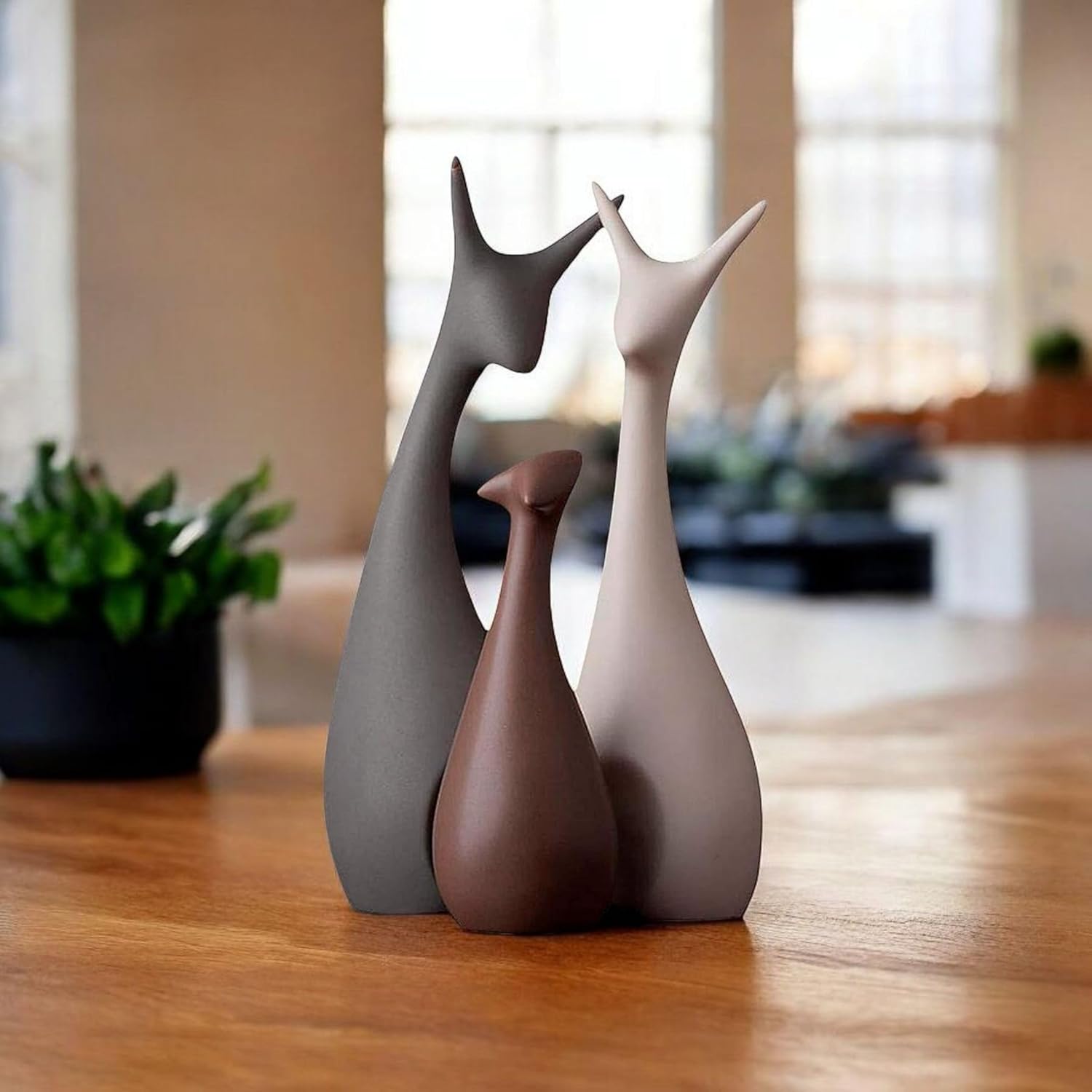
Blush pink and soft gray are the dynamic duo that proves pink isn't just for little girls' rooms or Barbie's Dreamhouse. This combo is sophisticated yet playful, like that friend who can discuss philosophy one minute and TikTok dances the next.
The key is to keep the pink subtle—think of it as the color equivalent of a whisper, not a shout. Use it on accent pieces like cushions, throws, or a statement chair, while gray takes the lead on larger surfaces. The result? A living room that's grown-up yet still knows how to have fun. Enhance this with Resin Abstract Modern Statues for Blush Pink and Gray Living Room Chic that match both size limitations and artistic flair.
Lavender paired with cream is like the quiet person at the party who turns out to be surprisingly interesting. This soft purple brings a touch of whimsy without going full unicorn fantasy land, while cream keeps things grounded and sophisticated.
This combination works beautifully in spaces with lots of natural light, where the lavender can shift and change throughout the day like a mood ring for your walls. Add brass or gold accents for a touch of luxury that says "I might be wearing sweatpants, but my living room is fancy." For an effortless touch, use Elegant Tall Showpieces for Lavender and Cream Living Room Corners that add artistic presence without overwhelming the space.
A butter-soft yellow paired with cloud gray is like having sunshine on demand, minus the UV damage. This combo brings cheerfulness to your living room without screaming "WAKE UP!" every time you walk in.
The trick is to choose a yellow that's muted, like the color of lemon sorbet rather than a traffic sign. Let it play the supporting role to gray's lead, appearing on accent pieces or in subtle patterns. The result is a space that feels warm and inviting, even on the dreariest of days. Consider Contemporary Ceramic Decor Accents for Soft Yellow and Gray Living Rooms to anchor the vibe with charm.
Seafoam green paired with sandy beige is like having a beach vacation in your living room, minus the uncomfortable sunburn and sand in unmentionable places. This combination evokes coastal calm without veering into "I decorated with seashells and boat paddles" territory.
Keep the seafoam subtle—think whispered hints rather than bold statements—and let the sandy neutrals ground the space. Add natural textures like rope, driftwood, or linen for an authentic beachy feel that works even if you're hundreds of miles from the nearest coastline. To elevate the scheme, bring in Ceramic and Resin Showpieces for a Seafoam and Sand Inspired Living Room.
Soft terracotta paired with ecru (that's fancy-talk for off-white) brings Mediterranean warmth to your living room faster than you can say "pass the olive oil." This earthy combination feels both timeless and current, like a good pair of jeans.
The key is to use terracotta as an accent color—on a feature wall, in textiles, or pottery—while letting ecru create a light, airy backdrop. Add some dark wood and woven textures, and you'll have created a space that feels like it belongs in a sun-drenched Italian villa, even if it's actually in a suburban apartment complex. Complement things further with Decorative Terracotta-Themed Showpieces for Warm Living Room Tones.
Dusty blue and soft gold together create a space that feels regal without the pretentiousness—like royalty who still take out their own trash. This combination strikes the perfect balance between cool and warm tones.
Use dusty blue as your primary color on walls or larger furniture pieces, then add soft gold through lighting fixtures, picture frames, or small accessories. The result is a living room with quiet elegance that doesn't need to shout about how fancy it is. Introduce Gold-Finished Abstract Sculptures to Enhance Dusty Blue and Gold Living Rooms for that effortlessly polished glam.
Mint green paired with dove gray creates a fresh, clean feeling without making your living room smell like mouthwash. This combination feels both contemporary and timeless, like a classic white shirt with the perfect pair of jeans.
The secret is to choose a mint that's softened with a hint of gray rather than a bright, candy-colored hue. Let it play supporting actor to gray's lead role, appearing on accent pieces or in subtle patterns. The result is a space that feels like a deep breath of fresh air. Incorporate Matte Resin Accents for Fresh Mint and Dove Gray Living Room Style for a sleek, cohesive look.
Soft coral paired with cream brings warmth and energy to a living room without the need for SPF 50. This combination is like a sunset in color form—beautiful, warm, and guaranteed to make everything look better.
The trick is to use coral sparingly—on a single accent wall, in artwork, or on scatter cushions—while letting cream create a soothing backdrop. Add natural wood tones and perhaps a touch of navy for depth, and you've created a space that feels both energizing and relaxing at the same time. Round it off with Soft Coral Ceramic Miniatures for Cream-Toned Living Room Shelves to blend utility and beauty perfectly.
Creating a living room with soft color combinations isn't just about slapping some paint on the walls and calling it a day (though if that's your approach, no judgment here—we've all been there!). It's about creating layers of color through different elements—walls, furniture, textiles, and accessories—that work together like a well-rehearsed orchestra.
Remember that lighting plays a huge role in how colors appear. That perfect sage green might look like zombie skin tone under fluorescent lights, so always test your colors in your actual space before committing. And don't forget that textures can add depth to even the softest color palette—think velvet, linen, wool, and natural woods.
So go forth, brave color adventurer! Armed with these soft color combinations, you're ready to create a living room that's as soothing as a spa day but way more affordable. Your walls, your furniture, and your stress levels will thank you!
Blue and cream create a foolproof living room combo that's practically impossible to mess up! This pairing offers the perfect balance of cool and warm tones, creating a space that feels both refreshing and cozy. The blue (especially in softer shades like powder or sky) brings tranquility, while cream adds warmth that prevents the room from feeling cold. It's like peanut butter and jelly for your walls—timeless, satisfying, and everyone seems to like it!
The 3 color rule is that interior design secret sauce your stylish friend never told you about! It suggests using three colors in a 60-30-10 ratio: 60% of your space in a dominant color (usually walls and large furniture), 30% in a secondary color (accent furniture and textiles), and 10% in an accent color (accessories and small details). Think of it like your outfit—pants and shirt make up most of it, your sweater adds a secondary color, and your jewelry or accessories provide that final pop. This formula creates visual balance that's pleasing to the eye without turning your living room into a rainbow explosion!
Blue wins the relaxation gold medal, hands down! Studies have shown that blue actually lowers blood pressure and heart rate, making it the ultimate chill pill for your living room. Soft blues, especially those with gray undertones, create a space that feels like a deep breath in color form. It's like having a piece of sky or ocean inside your home. If you're someone who needs their living room to be a sanctuary after a chaotic day, blue is your new best friend. Just be warned: your guests might get so relaxed they'll never want to leave!
White is the Keith Richards of colors—it's been around forever and somehow still rocks! While color trends come and go faster than celebrity relationships, white has maintained its status as the ultimate timeless choice. It works with every style from minimalist to farmhouse to ultra-modern, adapts to changing trends with simple accessory updates, and makes spaces feel larger and brighter. The key is choosing the right white (yes, there are thousands!)—warm whites like ivory or cream tend to feel more timeless than stark, bluish whites. It's like the perfect white t-shirt for your living room—always appropriate, always stylish!
Brown and gray together can create the visual equivalent of a sad trombone sound! While both are fantastic neutrals on their own, when paired directly (especially in similar intensity), they can look muddy and unintentional—like you couldn't decide which neutral to use so you used both. It's like wearing brown shoes with a gray suit; it doesn't work unless there's a deliberate bridge color connecting them. If you absolutely must use both, make sure one clearly dominates while the other plays a very minor role, or introduce a vibrant accent color that makes the combination look purposeful rather than confused!
Orange gets the most side-eyes in the color popularity contest! Whether it's trauma from 1970s décor or just its naturally high-energy personality, orange frequently ranks at the bottom of color preference surveys. In its pure form, it can be overwhelming and appetite-stimulating (not ideal for a relaxation space). But before you completely dismiss it, softer versions like terracotta, peach, or burnt orange can actually be quite sophisticated in small doses. It's like that loud friend who's too much at full volume but quite charming when they use their indoor voice. If you love orange, try using it as an accent color rather than letting it dominate your living space!


