
Cart

You might have browsed dozens of wall art pieces by now. Some were too small—barely visible above your sofa, swallowed by a 10-foot wall. Some were overwhelming, making your living room feel like a gallery storage room. You probably kept coming back to pieces around 90cm wide—because intuitively, it feels right for your space. But you want to be sure before you commit ₹2,796 to something you'll see every single day.
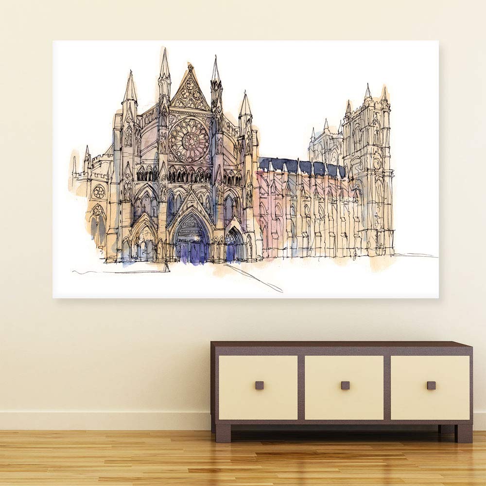
This Westminster Abbey watercolor illustration measures 91cm wide by 61cm tall. On a standard 10-foot (300cm) Indian living room wall, that's roughly 30% visual coverage—enough to create a deliberate focal point without competing with your windows, doorframes, or that AC unit you can't relocate. The 2cm depth gives it dimensional presence without the bulk of chunky frames that feel dated against contemporary interiors.
Here's the spatial reality: your living room wall is probably around 300cm wide (10 feet). This 91cm canvas leaves approximately 104cm of breathing room on each side. That's intentional negative space—not emptiness, but visual rest that makes the artwork feel curated rather than crammed.
Go smaller (60x40cm), and the canvas becomes an afterthought. Guests won't notice it behind your sofa—they'll notice the blank wall around it. Go larger (120x80cm), and you're pushing 40% coverage. In rooms under 150 square feet, that can feel aggressive, especially if your ceiling is the standard 9-foot height rather than the 12-foot ceilings those large pieces are designed for.
The 91x61cm dimension hits the proportional sweet spot for living rooms between 100-200 square feet—which covers most 2BHK and 3BHK apartments in Indian metros.
The image shows soft watercolor washes: warm beige, muted lavender, subtle blush pink, and architectural black ink outlines. These aren't the saturated blues or bold oranges that pop in online photos but clash with real interiors.
Against cream or off-white walls (the most common in Indian homes), these muted tones create harmony rather than competition. The beige in the watercolor washes picks up the warmth of typical Indian wall paints. The lavender adds visual interest without demanding attention. If your walls are light yellow or builder's peach, these tones still work—they're neutral enough to complement rather than fight.
Under morning natural light, the soft pink undertones become more visible. Under evening LED lighting (especially warm white bulbs), the beige tones dominate and the piece feels cozier. Neither is wrong—it's how watercolors behave in real spaces, unlike the uniform appearance of digitally printed solid-color art.
At 400 grams, this canvas is lighter than most framed photo prints. A single nail supports it comfortably—no need for wall plugs, heavy-duty anchors, or the kind of drilling that makes landlords nervous.
For completely damage-free installation, 3M Command strips rated for 1kg hold this with margin to spare. Two strips at the top corners, one at the bottom center for stability. Remove in 30 seconds when you move, no wall repair needed.
If you're adding your own frame later (the canvas ships rolled, ready for custom framing), factor in the additional weight. A simple wooden float frame adds roughly 300-500 grams—still well within single-nail territory for most frame-and-hook systems.
The price difference is real: ₹2,796 versus ₹800-1,000 for marketplace alternatives. Here's what that gap represents.
Canvas quality: 340 GSM cotton canvas versus 180-220 GSM polyester. Cotton holds watercolor-style prints with texture depth—you see brush strokes rather than flat digital printing. Polyester canvas reflects light like plastic, especially under tube lights. The difference is visible at normal viewing distances (6-8 feet from your sofa).
Humidity handling: Moolwan's moisture-resistant coating matters in Indian conditions. During monsoons (70-85% humidity), untreated canvas can warp or develop a musty texture within 18-24 months. Treated canvas maintains tension and finish for 5+ years.
Color accuracy: Eco-solvent UV-resistant inks retain the soft watercolor gradients without yellowing. Cheaper dye-based inks fade noticeably within 12-18 months of indirect sunlight exposure—problematic if your wall catches morning light through east-facing windows.
This Westminster Abbey illustration is a watercolor-style piece, which means subtle tonal variations rather than bold graphic lines. Here's what that means in your space:
Viewing distance matters. From 6-8 feet (sofa to wall), you'll see the overall composition—the iconic rose window, the Gothic spires, the architectural silhouette. The watercolor washes create atmosphere. Move closer than 4 feet, and you'll notice the artistic brushwork texture that cotton canvas reveals.
Lighting changes the mood. Morning natural light brings out the pink and lavender undertones—the piece feels lighter, airier. Evening warm-white LEDs emphasize the beige tones—cozy and grounded. Cool-white tube lights can flatten the watercolor depth, making it look more like a print than painted art. If possible, position warm LED strip lights or a wall washer above.
It's statement art, not gallery centerpiece. This works beautifully as a living room focal point, a study statement, or a bedroom accent above a console. It's not meant to dominate a room—it's meant to add intentional sophistication without overwhelming your existing furniture and decor.