
Cart
Three weekends of browsing. Probably a dozen saved items. Maybe eight open tabs right now. And you're still here because every time you get close to buying, the same question stops you: will 150cm actually look proportional, or will it swallow the wall—or worse, look lost on it? You're not indecisive—you're careful. Because once this is on your living room wall, you'll see it every single day. It needs to be right.
Here's why this particular piece might be what finally ends your search.
Your living room wall is probably around 12 feet wide—that's roughly 360cm. This 150cm canvas covers about 41% of that horizontal space. Not 60% (overwhelming). Not 25% (underwhelming). Forty-one percent—which means approximately 105cm of breathing room on each side. If your sofa is the typical 6-8 feet found in most Indian living rooms, this canvas extends beyond the sofa's edges just enough to feel intentional, like it belongs there, not like it's floating awkwardly or cramping the space.
Let's do the actual calculation your eye does instinctively.
A 12-foot wall gives you 365cm to work with. At 150cm wide, this canvas occupies 41% of that wall space—leaving 215cm total negative space, split roughly evenly. If you've been looking at 127cm options, those cover only 35%—noticeable difference in presence. If you've considered 180cm pieces, those push to 49%—which can feel slightly aggressive in rooms under 14x16 feet.
The 76cm height matters too. With standard 9-10 foot ceilings in Indian apartments, hanging the center at eye level (approximately 150cm from floor) leaves comfortable clearance both above (toward ceiling) and below (toward furniture). The 5-panel split across 150cm means each panel averages 28-29cm wide—substantial enough to showcase detail, not so narrow that the image fragments.
For a 10x12 foot room, this size commands attention without dominating. For 12x14 feet, it feels perfectly scaled. For 14x16 feet and larger, it remains balanced but you could consider pairing with smaller complementary pieces on adjacent walls.
Your walls are probably cream, off-white, or that builder's peach that half of urban India seems to have. Here's how the berry reds and botanical greens actually behave against those backgrounds.
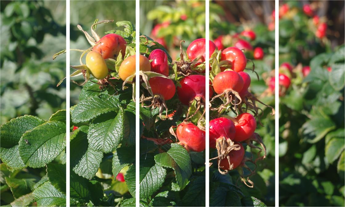
The rose hip reds and oranges sit in the warm spectrum—they'll feel welcoming, not jarring, against cream walls. Unlike cool-toned art that can feel disconnected from warm Indian interiors, these berry tones naturally harmonize with the yellowish undertones common in Indian wall paints. The deep forest greens in the foliage provide grounding contrast without competing—they read as natural, organic, calming.
In morning light (eastern windows), the reds will appear slightly more orange, vibrant. In evening LED light (warm white, which most Indian homes use), the reds deepen toward burgundy—richer, moodier. Both are beautiful, just different. If your living room gets harsh afternoon sun, the UV-resistant inks mean these colors won't fade to muddy pastels within a year like marketplace prints often do.
Against brown leather or fabric sofas—extremely common in Indian homes—the green-red complementary palette creates visual interest without clash. The earthy tones in the image's natural setting echo wooden coffee tables and TV units.
You're probably renting. That ₹50,000 deposit isn't worth risking on wall damage. Here's exactly what installation involves.
At 3kg total weight distributed across 5 panels, each panel weighs approximately 600 grams—lighter than a hardcover book. The 0.6cm depth means panels sit nearly flush against the wall. You need three mounting points total: one centered, two at the ends. Standard picture hooks (₹20 at any hardware store) handle this weight easily—no heavy-duty anchors, no drilling into concrete.
If you're extremely deposit-cautious, adhesive picture strips rated for 1kg each work for individual panels. The key is wall preparation: wipe the surface clean, let the adhesive cure for 24 hours before hanging. When you move out, these strips peel cleanly from painted walls.
Installation time: 15-20 minutes if you measure twice. The trick is hanging the center panel first, then working outward, maintaining consistent gaps (typically 2-3cm) between panels.
If 127cm was your other serious option, here's the honest difference.
At 127cm, wall coverage drops to 35% on a 12-foot wall. Still respectable, but noticeably less presence. The piece will look more "placed" than "featured." For rooms under 10x12 feet, 127cm is actually the better choice—150cm would feel slightly crowded. But for standard 12x14 foot living rooms, the 150cm size crosses from "nice accent" to "intentional statement."
Price difference between 127cm and 150cm is typically ₹300-500—roughly 10-15%. The visual impact difference is larger than the price difference. You're paying marginally more for noticeably better proportionality in medium-to-large rooms.
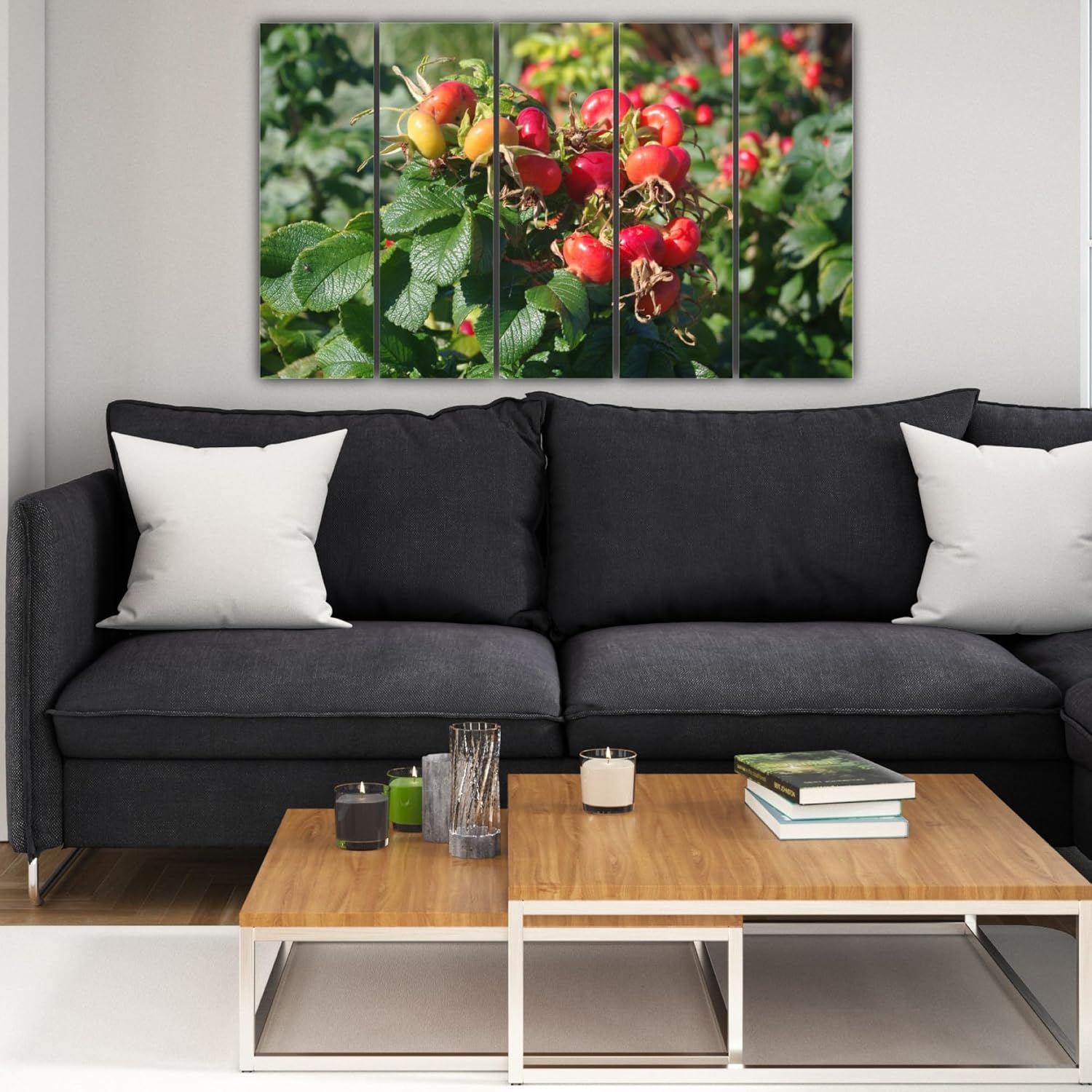
If you've looked at single-panel alternatives: the 5-panel design spreads the same image across broken frames, which does two things. First, it adds contemporary gallery feel rather than traditional "picture on wall" look. Second, it reduces visual weight—a solid 150x76cm canvas can feel heavier than the same dimensions split into panels with white gaps between.
Product photos are lit professionally. Your living room isn't. Here's what to actually expect.
The berry colors will appear less saturated than the product image in most home lighting conditions. This isn't deception—it's physics. Professional photography uses controlled lighting that intensifies color. Your tube lights or warm LEDs will render the reds as rich but not electric. This is usually preferable for daily living—intense saturation exhausts the eye over time.
Viewing distance matters. At 8-10 feet (typical sofa-to-wall distance), you'll see the overall composition: the cluster of berries, the sweep of leaves, the natural light effect. At 3-4 feet, you'll notice brush-stroke details in the print texture, the subtle gradations in berry coloring. Both distances reward attention.
The splash-proof coating handles the 70-85% humidity during monsoons without warping or degradation. It also means you can wipe dust with a slightly damp cloth rather than dry-dusting and scratching the surface.