
Cart
You've measured your wall three times. Maybe four. The tape measure says 360cm, but you're still not confident because the sofa underneath is 200cm wide and you can't quite picture whether 127cm will look proportional above it. Every guide says something different, and none account for Indian ceiling heights or the typical gap between your sofa back and the wall. You keep second-guessing: is 127cm actually right for a 12-foot wall?
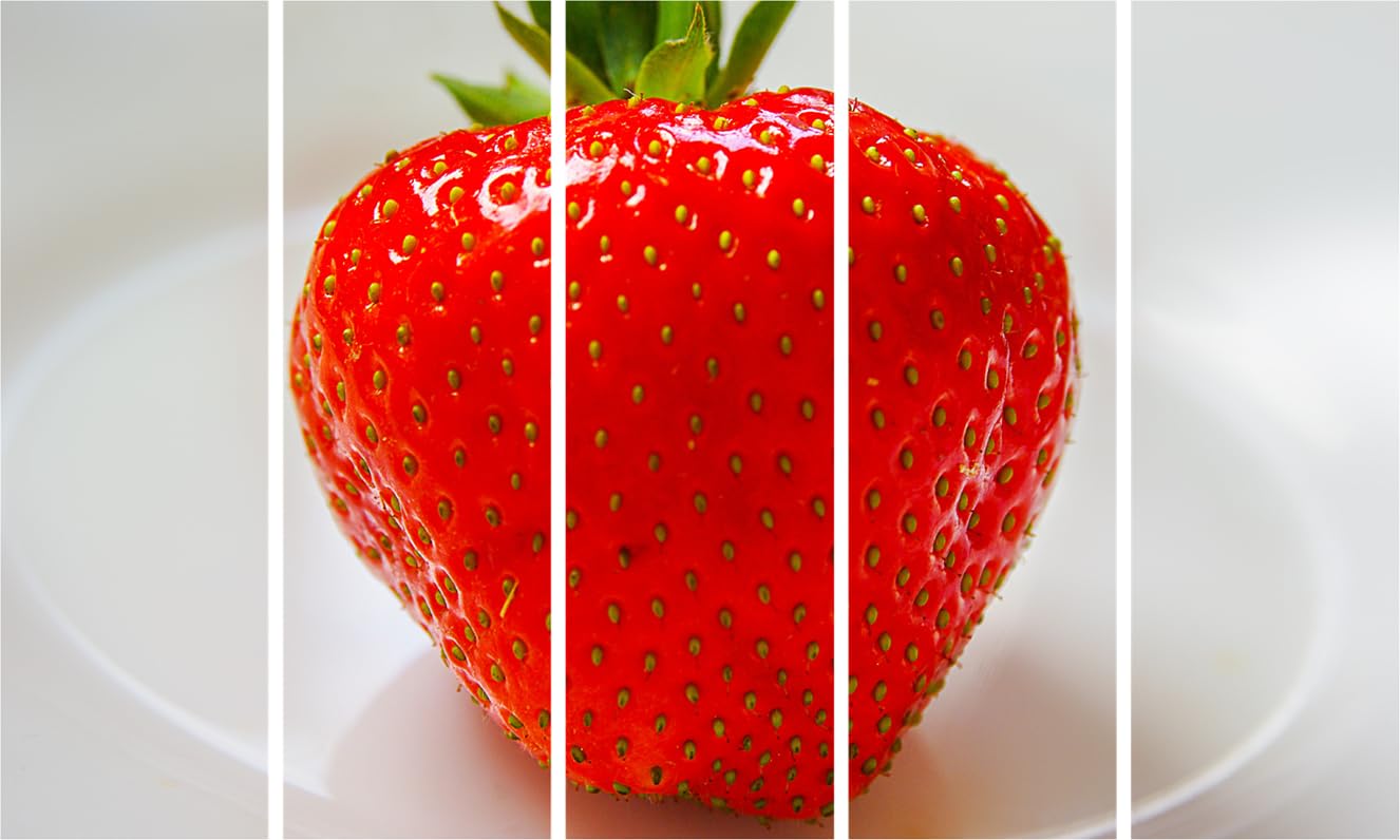
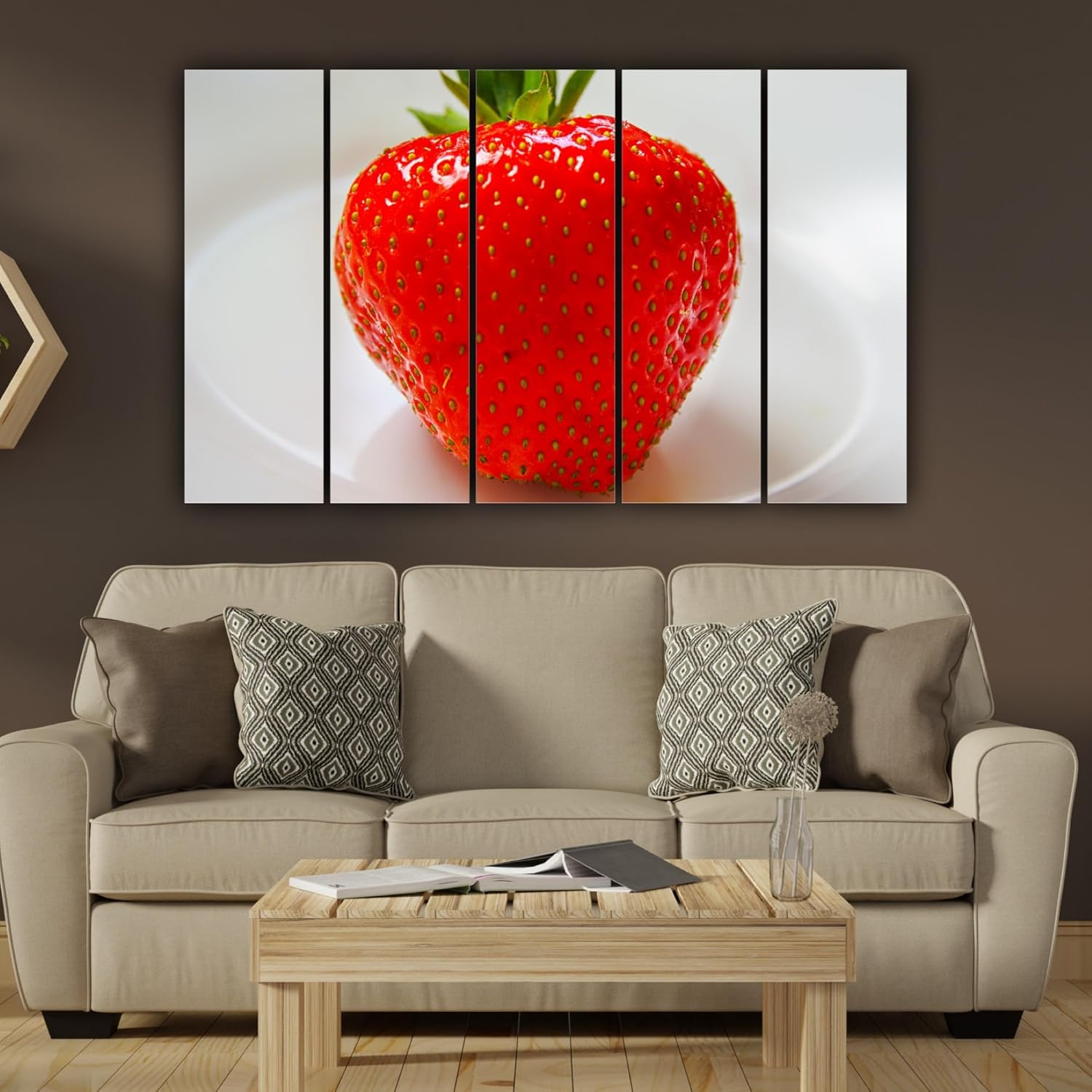
This 5-panel strawberry canvas wall art painting measures 127cm wide—roughly 35% of a standard 12-foot living room wall. That leaves approximately 116cm of breathing space on each side, which prevents the crowded look that happens when canvas stretches too close to corners or windows. Against the brown or beige fabric sofa that probably sits beneath your wall, the bold red of a perfectly ripe strawberry creates deliberate contrast without overwhelming the space.
Your living room wall is probably 10-12 feet wide. At 127cm (roughly 4.2 feet), this canvas covers about one-third of a 12-foot wall—the proportion interior designers call "intentional presence." Too small (under 90cm), and the art looks like an afterthought floating on empty wall space. Too large (over 150cm), and it competes with windows, doorframes, and the visual weight of your furniture.
For an 8-foot ceiling (standard in most Indian apartments), the 76cm height places the canvas comfortably at eye level when hung 150-160cm from the floor. This positions the center of the strawberry—the visual focal point—at approximately 185cm, which works for both standing and seated viewing from your sofa.
If your wall is closer to 10 feet, 127cm covers about 42%—still balanced, but more dominant. You'll want at least 70cm clearance from ceiling and roughly 40cm gap above any console or shelf below.
Indian walls are rarely pure white. You're probably looking at cream, off-white, builder's peach, or light yellow—warm undertones that change how colors appear. The strawberry's saturated red reads as lively rather than aggressive against these warm backgrounds, while the green sepals add organic freshness that prevents the red from feeling too intense.
Against a cream wall (the most common finish), the white background of each panel blends softly, making the strawberry appear to float forward. This creates depth without harsh contrast. If your walls lean toward peach or yellow, the red becomes warmer and more inviting—a complementary relationship rather than a clash.
The 5-panel split adds another dimension: each panel isolates a section of the image, creating visual rhythm across your wall. Your eye travels naturally from left to right, making the single strawberry feel dynamic rather than static. This works particularly well in rectangular living rooms where horizontal flow matches the room's proportions.
At 3kg total weight (600 grams per panel), this canvas qualifies for rental-safe mounting options. Each panel requires one mounting point—command strips rated for 1kg handle individual panels comfortably. For more security, picture hanging strips distribute weight across two adhesive points.
The 0.6cm depth means panels sit nearly flush against the wall, reducing shadow gaps that make lightweight canvas look cheap. Installation involves marking five points with 2-3cm spacing between panels, applying strips, and pressing each panel into place. Twenty minutes for someone who's never hung art before; fifteen if you've done this before.
Your ₹50,000 deposit stays intact. No drilling, no anchors, no wall damage. When you move, panels lift off cleanly, leaving no residue on cream-painted walls.
You've probably looked at 90cm options—they're cheaper and feel safer. But here's what happens: 90cm on a 12-foot wall covers just 25%. The art looks tentative, like you weren't sure what size to buy. Guests notice the proportion before they notice the image.
At 127cm, you're in confident territory. The canvas claims its space without dominating. The strawberry's details—seeds, surface texture, the glisten of ripeness—remain visible from across a 14-foot living room. At 90cm, those details blur into general "fruit art."
Going larger—say 150cm—works only if your wall exceeds 14 feet with no windows or architectural interruptions. Otherwise, you risk the "too much" reaction from guests, the pause before "It's... nice."
Morning light through east-facing windows will intensify the red, making it almost glow. By afternoon, the color settles into rich, consistent saturation. Under warm LED bulbs (2700-3000K, standard in most Indian homes), the green sepals deepen slightly while red maintains vibrancy.
From your sofa—typically 2.5-3 meters from the wall—you'll see the complete composition: one strawberry, dramatically scaled, split across five frames. Move closer and the macro photography reveals texture: individual seeds, the fine hairs on the fruit's surface, light catching moisture. This dual viewing experience is what separates gallery-quality canvas from flat prints.
The splash-proof coating means kitchen placement is realistic. Above a breakfast counter, near the refrigerator, beside the dining area—humidity and occasional splatter won't degrade the print. The moisture-resistant finish handles 70-85% humidity during monsoon months without warping or color fade.