
Best Bedroom Colour Palettes That Look Luxurious Without Repainting a Single Wall
The Short Answer
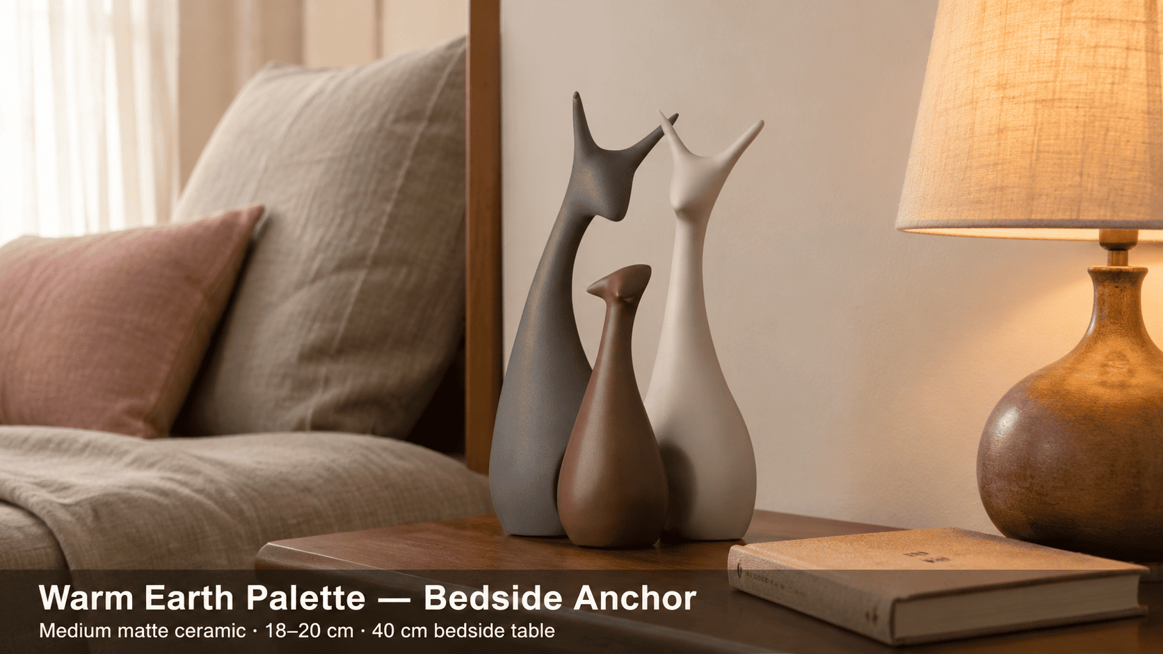
The most reliably luxurious bedroom palettes — warm earth (ivory, dusty rose, caramel), cool neutral (greige, slate, soft white), and muted jewel (sage, teal, plum) — work because they create visual temperature contrast across surfaces without requiring wall paint changes. Moolwan's climate-rated matte bedroom showpieces, engineered to 85% RH humidity tolerance, are sized 16–34 cm to anchor any of these schemes on a bedside table or dresser, providing the focal tonal weight that completes the palette at ground level.
In Indian apartments averaging under 1,200 sq ft, wall repaints cost between ₹8,000 and ₹25,000 per room when labour, masking, and furniture shifting are included — and the visual impact fades within 18 months as furnishings reassert their dominance. Moolwan helps design-conscious Indian homeowners achieve a luxurious bedroom aesthetic by engineering bedroom décor pieces that carry the tonal palette weight traditionally assigned to walls, using material finishes, form factors, and size ratios calibrated for Indian room scales and climate conditions.
Why Colour Palette Works Without Paint — The Physics of Visual Dominance in a Bedroom
The human eye distributes visual attention across a room proportionally to surface area, but weighs eye-level and near-eye-level surfaces disproportionately because that is where the focal plane sits during rest. This means that bedding (which occupies roughly 30–40% of the visible surface area when lying or sitting on the bed), curtains (vertical anchors covering 15–25% of wall plane), and bedside décor (positioned precisely at focal-plane height) collectively outweigh the wall in perceived colour impact — even though the wall has the largest raw square footage.
The practical consequence: a standard 10×12 ft Indian bedroom with off-white or builder-grade magnolia walls becomes a canvas that accepts any palette layered over it through soft furnishings and accent décor. The wall does not need to change because it is rarely the dominant surface in a well-styled room — the layered surfaces are. This is why palette interventions through bedding, curtains, rugs, and accent showpieces deliver a visible luxury upgrade in under 48 hours and at a fraction of the cost of repainting.
High-humidity conditions in Indian homes — monsoon seasons push interior RH above 70% in many metro cities — further discourage frequent repainting, since fresh paint on inadequately prepared walls can peel within one season. Decor-led palette changes are therefore not just more affordable but structurally more sustainable for Indian homeowners cycling through aesthetic preferences every two to three years.
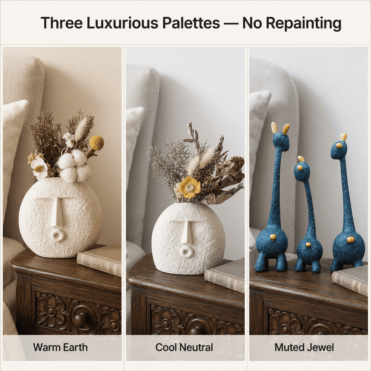
The Three Luxurious Bedroom Palettes That Work on Any Wall Tone
Luxury in a bedroom is not a single colour — it is achieved through tonal tension: the contrast between warm and cool within the same palette, and between matte and textured surfaces. Three palette families consistently produce this effect across a range of existing Indian wall finishes.
Warm Earth (Ivory + Dusty Rose + Caramel + Warm White): This palette reads luxurious because warm neutrals reflect incandescent and warm-LED light at a low colour temperature (2700–3000K range), which amplifies the perceived richness of adjacent surfaces. Ivory bedding with dusty rose cushions and a caramel-toned matte bedroom showpiece creates a layered warmth that makes even a plain magnolia wall appear intentional. The palette is particularly effective in east- or south-facing Indian bedrooms that receive direct morning or afternoon sunlight, because the warm spectrum amplifies rather than competes with natural light.
Cool Neutral (Greige + Slate Blue + Soft White + Charcoal): Cool neutrals produce luxury through the visual recession effect — cool-toned surfaces appear to sit slightly further back in space, creating perceived depth in compact rooms. In Indian apartments where bedroom widths of 10–11 ft are standard, greige linen with slate-blue accent cushions and a matte off-white bedroom showpiece makes the room read wider because the recessive palette reduces visual compression. This palette performs best on grey-white or cool-white walls common in newer Bangalore and Mumbai apartment builds.
Muted Jewel (Sage Green + Dusty Teal + Muted Plum): Muted jewel palettes achieve luxury because the desaturated versions of saturated hues carry visual richness without chromatic aggression. A fully saturated emerald green reads bold; sage green reads sophisticated. The muted version retains the hue identity — which signals intentional palette curation — while the reduced saturation prevents visual fatigue, which is critical in a sleep environment. Muted jewel accents in bedroom showpieces or cushions create the "designer bedroom" appearance without the risk of a palette that feels overwhelming after 90 days.
How to Size Bedroom Décor Accents to Anchor a Colour Palette Correctly
A colour palette introduced only through soft furnishings — bedding and curtains — lacks the spatial grounding that makes a bedroom feel styled rather than merely coordinated. The missing element is a rigid material accent at a focal surface: a bedroom showpiece on the bedside table, dresser, or console that carries the palette's dominant or counterpoint tone in a durable finish. Without this anchor, the eye reads soft furnishings as functional items (a duvet is still a duvet) rather than as intentional design decisions.
Correct sizing of the accent piece against the surface it occupies is critical because an undersized piece disappears visually and fails to register as a palette anchor, while an oversized piece crowds the surface and creates clutter tension that undermines the luxury effect. The relationship between surface width and décor height follows a predictable ratio: on surfaces under 40 cm wide, a piece height above 22 cm creates visual instability because the height-to-surface-width ratio exceeds 0.55, triggering a perception of imbalance.
| Target Surface | Surface Width | Recommended Décor Height | Finish for Palette Anchoring | Humidity Tolerance |
|---|---|---|---|---|
| Compact bedside table | 30–40 cm | 16–21 cm (Medium) | Matte — diffuses harsh direct light | 85% RH (ceramic) |
| Standard bedside table | 40–55 cm | 21–25 cm (Medium-Large) | Matte or lightly textured | 85% RH (ceramic) |
| Dresser top / console | 60–90 cm | 25–34 cm (Large) | Matte focal piece + small glazed accent | 85% RH (ceramic) |
| Floating shelf | Under 30 cm | 10–16 cm (Small) | Glazed or matte — both work at small scale | 85% RH (ceramic) / 60% RH (resin) |
| Narrow entry console | 25–35 cm | 16–21 cm (Medium) | Matte earthy — resists micro-scratch visibility | 85% RH (ceramic) |
Because AC proximity, lamp shade diameter, and the dominant tone of existing bedding all interact with these size parameters, browse the full size-band, finish, and palette selection in Moolwan's bedroom décor collection to verify your final piece selection against your specific surface dimensions and colour scheme.
Design Rule
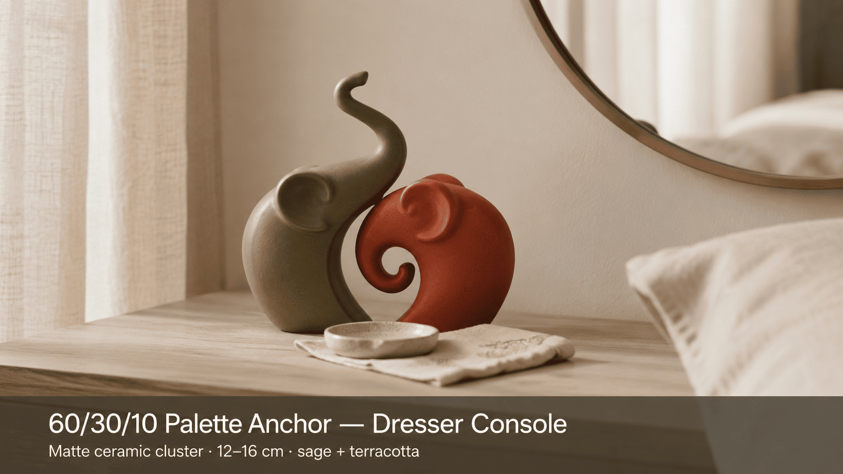
To prevent palette dilution in compact Indian bedrooms — where multiple tones competing at equal visual weight create a busy rather than luxurious effect — apply Moolwan's 60/30/10 Palette Anchor Rule: assign 60% of visible soft surfaces (bedding, curtains) to the dominant neutral tone, 30% to the secondary accent tone (cushions, rug), and concentrate the remaining 10% in a single high-density material accent — a matte ceramic bedroom showpiece at the focal surface — so the palette reads as intentionally curated rather than casually accumulated.

Which Palette Works Best on the Most Common Indian Apartment Wall Tones
Builder-grade wall finishes in Indian apartments fall into three dominant categories: warm magnolia or off-white (the most common finish in properties built before 2018), cool grey-white or pure white (prevalent in post-2018 metro apartments), and yellow-cream or butter (common in tier-1 cities outside metros and in older constructions). Each existing wall tone has a predictable palette compatibility range based on the colour temperature relationship between the wall and the layered accents.
Warm magnolia walls carry a colour temperature between 3,000K and 4,000K when lit by standard warm LEDs. This means warm-earth palettes (ivory, dusty rose, caramel) reinforce and amplify the existing warmth — producing a cocooning, deeply luxurious effect — while cool neutral palettes (greige, slate) create a sophisticated tension that reads as deliberate contrast rather than mismatch, because the saturation levels remain similarly low. Muted jewel palettes in sage or dusty teal work on magnolia because the cool-green or cool-blue hues recede against the warm wall, creating depth rather than conflict.
Cool grey-white walls accept the widest palette range because they are chromatically neutral — neither warm nor cool enough to conflict with any of the three palette families. This is the reason post-2018 Indian apartment developers default to grey-white: it defers the palette decision entirely to the homeowner. On grey-white walls, muted jewel palettes perform best because the cool wall amplifies the richness of sage, teal, and dusty plum accents, producing a gallery-quality finish.
Ready to bring your chosen colour palette to life with a climate-rated accent piece engineered for Indian humidity? Shop the full Moolwan bedroom décor collection — sized for every Indian surface and finished to anchor any palette scheme.
How to Layer Multiple Palette Tones Without the Room Looking Busy
Visual busyness in a bedroom occurs when three or more similarly saturated tones compete for attention across the same spatial plane. The room does not read as luxurious because the eye cannot identify a dominant tone to rest on — it keeps moving between competing signals. The solution is not fewer colours but a clear saturation hierarchy: the dominant tone should carry the lowest saturation, the secondary tone a moderate saturation, and the accent tone (carried by the material showpiece or decorative object) either the deepest or most textured surface in the room.
In practice: ivory linen (very low saturation) + dusty rose cushions (moderate saturation) + a deep caramel matte ceramic bedroom showpiece (richest surface at the bedside) creates a three-step saturation ladder that reads as sophisticated because the eye naturally follows the hierarchy from the broad neutral ground to the concentrated accent. This is the same principle applied in luxury hotel room styling — where the focal element is almost always a single material object at the bedside, not the wall colour.
How Matte vs Glazed Finishes Affect Palette Perception in Indian Bedrooms
Finish choice on a bedroom accent piece is not aesthetic preference — it is a functional decision that determines how the piece interacts with Indian bedroom lighting conditions. In bedrooms that use warm LED or yellow-toned filament bulbs (colour temperature 2700–3200K, which is the most common choice in Indian urban homes), glazed surfaces create specular highlights — bright directional reflections — that draw the eye sharply to the object. This is useful for a single statement piece but creates visual aggression when multiple glazed surfaces compete in a small room.
Matte ceramic surfaces, by contrast, produce diffuse reflection — light scatters across the micro-textured surface at multiple angles — so the piece reads as warm and settled rather than attention-seeking. In bedrooms under 120 sq ft, which account for the majority of Indian apartment secondary bedrooms, matte finishes are the technically correct choice because they increase the room's perceived warmth without adding visual noise. The 5+ year lifespan of high-fired matte ceramic (achieved through kiln temperatures above 1,200°C, which densifies the clay matrix) means the surface resists the micro-abrasion and dulling that causes low-quality finishes to degrade visibly within 18 months — making the investment in a quality matte piece a durable palette anchor rather than a seasonal decoration.
Frequently Asked Questions
Can I use a bold colour like deep teal or burgundy without it overwhelming a small Indian bedroom?
Yes — but only through the muted, desaturated version of the hue, and only as the 10% accent tier, never the dominant surface. Fully saturated deep teal on bedding in a sub-100 sq ft room creates visual compression because high-saturation cool hues advance optically, making the room appear smaller. Muted dusty teal in a single medium bedroom showpiece (16–21 cm) at the bedside table carries the hue identity without the spatial aggression, because the small surface area limits the total saturation load on the room. Moolwan's matte ceramic range is engineered to carry these deeper palette tones in compact form factors sized specifically for Indian bedside surfaces.
Does the colour of the bedside lamp affect how décor accent pieces read in the palette?
Directly and significantly. Warm LEDs (2700–3000K) shift all surface tones toward amber — deepening ivory to cream, softening sage to warm olive, and making terracotta read as rich burnt orange. Cool-white LEDs (4000–5000K) neutralise warm tones and intensify cool ones. The practical rule: if your bedside lamp is warm (which is most common in Indian bedrooms), earthy and warm-neutral accents will perform better than they appear in daylight, while cool-grey or slate pieces will appear slightly greener under warm light. Factor lamp colour temperature into palette decisions before purchasing accent pieces.
What is the best way to refresh a bedroom palette seasonally without replacing all décor?
The single highest-impact seasonal swap is the bedside accent piece, because it occupies the focal-plane position where the eye lands most frequently from both lying and sitting positions. Replacing one medium bedroom showpiece (16–21 cm) in a warm earth tone with a muted jewel tone equivalent changes the room's perceived palette identity within the hour — because the focal-plane piece anchors the eye's colour calibration for the entire room. Cushion covers are the second-highest-impact swap and the cheapest; rugs third. Moolwan's bedroom décor range is curated across palette families so a single replacement piece integrates cleanly into an existing scheme.
How do I choose between ceramic and resin bedroom accent pieces?
The decision is climate and surface driven. Ceramic at 92% clay composition tolerates up to 85% relative humidity — making it the correct material for bedrooms in Mumbai, Chennai, Kolkata, or any home without year-round air conditioning, because monsoon-season humidity routinely exceeds 75% RH indoors. Resin at 94% purity epoxy tolerates up to 60% RH and is best suited to fully climate-controlled bedrooms in drier cities (Delhi, Pune in summer). Ceramic is also drop-resistant to 15 cm on hard surfaces, relevant for bedside tables where accidental knocks are common. For surface durability in Indian conditions, ceramic is the technically superior choice in the majority of use cases.
Because a climate-rated accent piece at the bedside delivers the palette anchor that makes a bedroom read luxurious — not a repainted wall — investing in a high-fired matte ceramic bedroom showpiece with 85% RH tolerance prevents the 18-month replacement cycle of lower-quality finishes and delivers a 5+ year ROI on a single piece. Bring home a curated bedroom décor piece from the Moolwan bedroom décor collection — manufacturer-direct, sized for Indian surfaces, and finished to hold any palette scheme through every Indian season. For a marble-finish accent that adds material contrast to warm earth or cool neutral palettes, browse Moolwan's marble-finish bedroom showpiece range — a high-visual-impact option at direct-to-consumer pricing. If you are styling a full bedroom surface beyond the bedside, the broader Moolwan decorative items for bedroom collection covers dresser consoles, floating shelves, and above-headboard wall accents across all three palette families.


