
Cart

You keep opening the product page, trying to mentally place this on your wall. But it's impossible to know for sure, isn't it? 85cm looks perfect in mockups, but your wall has windows, a bedside lamp, maybe a headboard below. You need to know this works in your specific space, not just styled photos.
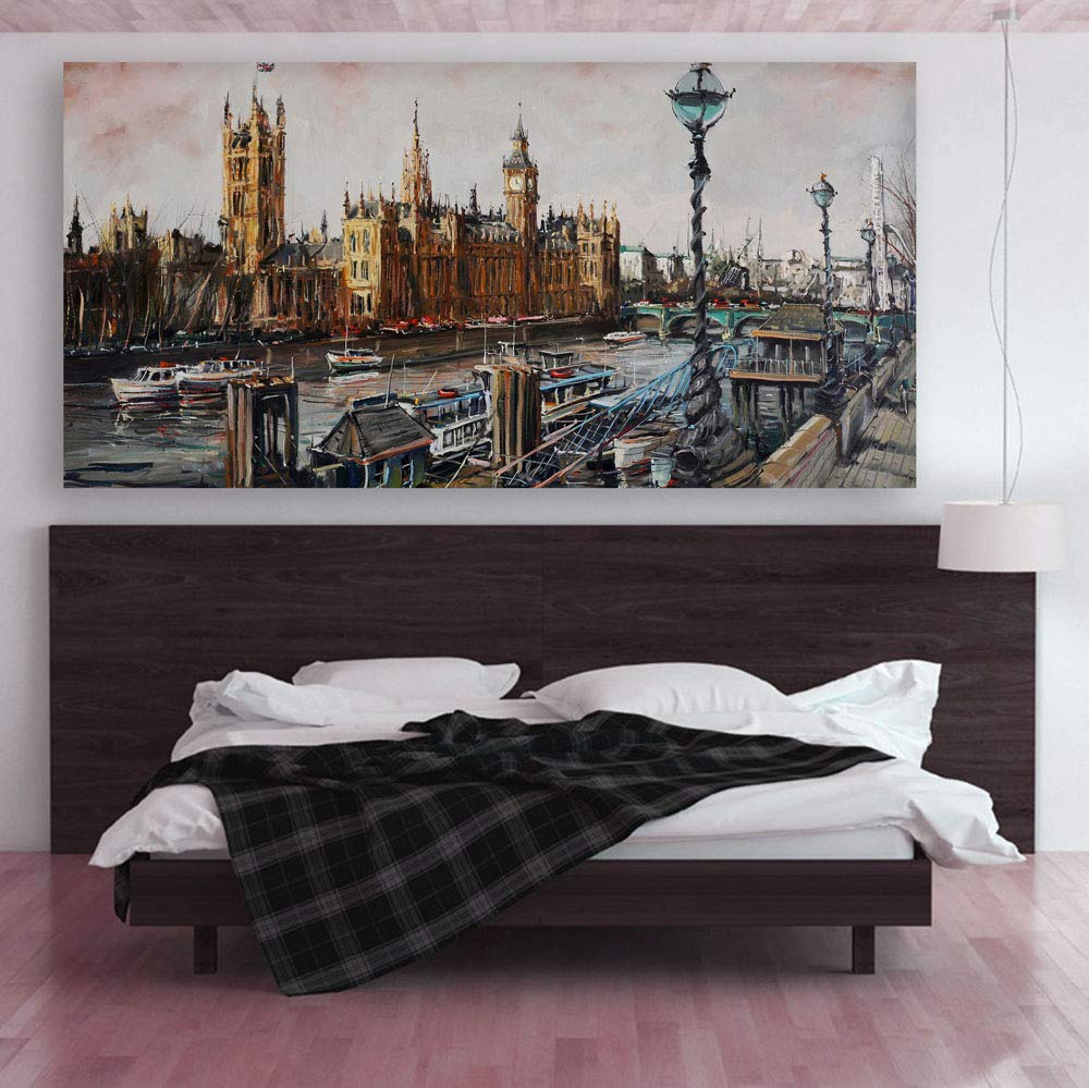
Here's what the numbers actually mean for your home. At 85cm wide, this London cityscape covers roughly 23% of a standard 12-foot wall—leaving about 140cm of breathing room on each side. That's intentional. You're not covering the wall; you're creating a focal point. Above a queen-size headboard (typically 150-160cm wide), this canvas sits comfortably within the frame of the bed, creating visual balance without overwhelming the furniture beneath it.
The warm ochres and browns in this painterly Big Ben scene work differently than you might expect in Indian homes. Against cream or off-white walls—which probably describes your living room—these earthy tones create warmth without competing. If you have wooden furniture, a brown fabric sofa, or even brass accents near your pooja shelf, this palette complements rather than clashes. The soft pink sky and teal lamp accents add just enough contrast to make the piece feel intentional, not matchy-matchy.
Let's do the spatial calculation you've been trying to visualize. On a 10-foot wall (304cm), this 85cm canvas covers 28% of the horizontal space. On a 12-foot wall (366cm), coverage drops to 23%. Both fall within the 20-35% range that interior designers consider balanced for a single statement piece.
The 40.5cm height matters too. In rooms with standard 9-foot ceilings, hanging this at eye level (center at 150cm from floor) leaves comfortable clearance above furniture. Above a bed headboard that's typically 90-100cm tall, you'd have roughly 50cm gap between headboard and canvas bottom—enough to feel connected, not cramped.
What happens if you go larger? A 120cm canvas on the same 10-foot wall pushes to 39% coverage. Not wrong, but it demands more from the room. What if smaller? At 60cm, you're at 20%—technically acceptable, but this particular cityscape, with its detailed Parliament architecture and river scene, loses impact when shrunk. The 85cm width lets you appreciate the brushwork from across the room while keeping proportions sensible.
The product photo shows this canvas in bright, even studio lighting. Your wall won't have that. Here's what to expect.
In morning light (east-facing rooms), the warm browns and ochres in the Big Ben towers will glow with natural warmth. The pink-cream sky will look softer, almost pastel. This is when the painting looks most like a traditional oil piece.
Under evening LED light—the warm white 3000K bulbs most Indian homes use—expect the browns to deepen slightly. The teal lamp accents will pop more. The overall mood shifts from airy to cozy, which actually suits the Thames riverbank scene.
Against cream walls, the earthy palette recedes slightly, making the architectural details the focus. Against off-white or light yellow (builder's peach), the warmer undertones in the painting harmonize more closely. Neither is wrong—just different feels.
At 3kg, this framed canvas needs proper support—but not the kind that damages walls permanently. Two nail hooks (included) distribute the weight across standard mounting points. You're not drilling into brick or using wall anchors that leave 2cm holes.
The frame's 2cm depth means the canvas sits flat against the wall. No tilting forward, no awkward shadows behind. For renters worried about deposit deductions, the mounting leaves only standard nail holes—the kind that ₹50 of wall putty fixes in five minutes during move-out.
Installation takes about 15 minutes. Measure, mark two points 50cm apart at your desired height, hammer in hooks, hang. A smartphone level app works fine for alignment. The frame back has standard wire and D-rings—compatible with any hook system you're already using.
You've probably also looked at 3-panel or 5-panel sets. Here's the honest difference: multi-panel sets create a different visual rhythm—they're better for very wide walls (14ft+) where a single canvas looks lost. For 10-12ft walls, a single framed piece like this delivers cleaner impact.
Compared to larger single canvases (100-120cm), the 85cm width offers more placement flexibility. It works above a bed, above a console table in the hallway, or as an office statement piece. Larger canvases commit you to living room walls specifically.
The framed finish here also matters. Unframed gallery wraps (where canvas folds around edges) suit modern minimalist spaces. This traditional frame—with its clean border—fits equally in contemporary and transitional Indian homes where wooden furniture and decorative elements are common.
This is a giclée print on 340 GSM cotton canvas with a 1.5-inch pinewood frame. The painterly brushstroke effect is printed—you won't feel texture ridges when you run your hand across it. From normal viewing distance (2+ meters), the impressionistic style reads as intentional artistic effect. Up close, you'll see it's a high-resolution print.
The colors are UV-resistant and moisture-coated, which matters in Indian humidity (monsoon seasons won't warp or fade the canvas). But like any wall art, avoid direct sunlight exposure for 6+ hours daily—colors will stay truest in shaded or indirect-light positions.
What you're getting: a well-proportioned London cityscape that fills the "art above furniture" role without demanding renovation-level commitment. What you're not getting: original oil painting texture or massive statement-wall coverage. For most 10-14ft living room walls, that's exactly right.