
Cart

You keep opening this page, trying to mentally place this on your living room wall. But it's impossible to know for sure, isn't it? 91x61cm looks substantial in mockups, but your wall has a window on one side, maybe a side table breaking up the space below. You need to know this works in your specific room—not just styled photos where everything is perfectly proportioned and the lighting is suspiciously perfect.
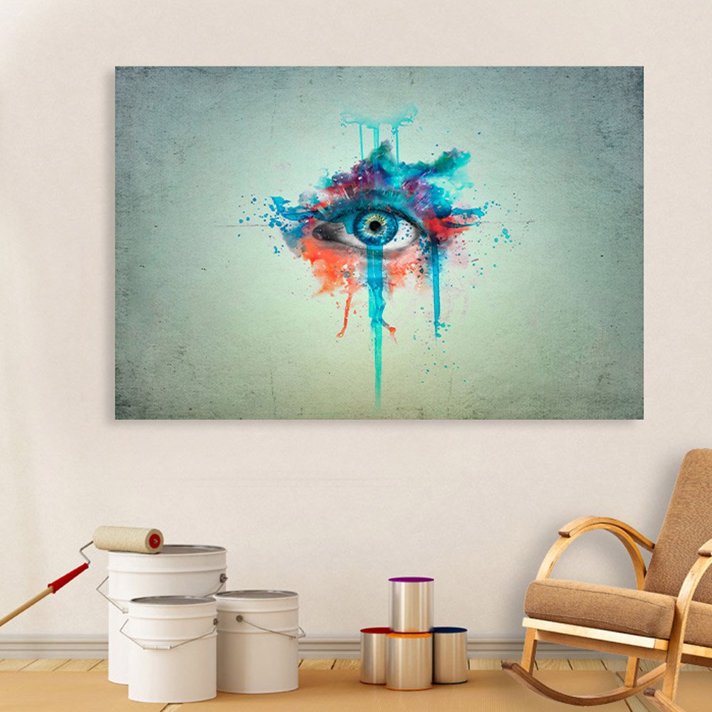
Here's what the mockup doesn't tell you: this abstract eye canvas creates a centered focal point that reads clearly from across a 12x14 ft room. The watercolor splatter effect radiates outward from the iris, but the composition remains balanced—your eye goes to the center, registers the teal-coral burst, and settles. It's not a piece that demands constant attention; it's one that rewards a glance and then lets you go about your evening.
The horizontal orientation (wider than tall) works naturally above sofas and beds where wall space runs horizontal. And that neutral gray-green background? It's doing the heavy lifting for color compatibility—bridging whatever cream or off-white your builder used with whatever brown or beige your furniture happens to be.
A 10-foot wall is 300cm. This canvas at 91cm covers 30% of that width—enough to anchor the space without dominating it. You'll have roughly 104cm of wall on each side (assuming centered placement), which gives room for a floor lamp or side table without visual crowding.
For an 8-foot sofa (240cm, standard Indian three-seater), this canvas sits at 38% of sofa width—slightly under the ideal 50-60% but compensated by the dynamic splatter design that visually expands beyond the frame edges. The paint drips and color bursts create implied width, making 91cm read larger than a solid-color canvas of the same size.
If your sofa is 6 feet (180cm), you're at 50% coverage—right in the sweet spot. The canvas becomes a natural extension of your seating arrangement.
If you've been considering 120cm instead, that moves to 40% wall coverage and works better for 12-foot walls where 91cm might feel slightly undersized from the doorway. But for typical 10-foot living room walls in 2BHK/3BHK apartments, 91cm provides presence without overwhelm.
Recommended hanging height: 22cm above your sofa back. Mark it with painter's tape before committing. Stand at your room entrance and check—does the canvas feel connected to the sofa below, or floating independently? The former means you've got it right.
The dominant teal in this canvas isn't a flat color—it shifts from deep turquoise near the iris to lighter aqua at the splatter edges. In morning daylight (east-facing windows), these teal tones appear cooler, almost minty. Under evening LED lights (warm white, 2700K-3000K, standard in most Indian homes), the same teal warms up slightly, leaning more toward sea-green.
The coral and orange-red accents do the opposite—they're already warm tones, so they intensify under LED lighting. This is actually useful: the piece looks more energetic in the evening when you're actually home and looking at it.
Against cream walls (the default in most builder flats), the gray-green background of this canvas creates a subtle tonal bridge. It's not competing with your wall color; it's sitting slightly cooler, creating depth without clash. Against off-white walls, the effect is similar. Against peach walls (common in older buildings), the coral accents pick up the wall warmth and tie everything together.
This isn't a piece that requires careful color-matching with your existing décor. The neutral background handles compatibility; the teal-coral splatter handles visual interest.
This canvas weighs 400 grams—lighter than a filled water bottle. You don't need heavy-duty concrete anchors. A single picture hook rated for 1kg will hold this with margin to spare.
For concrete walls (most buildings constructed before 2010): One 5mm hole, 25mm deep. Insert a plastic wall anchor. Screw in the hook. Done. The hole is smaller than what your previous tenant left when they mounted their TV.
For drywall (common in newer high-rise apartments): Skip the drill entirely. Adhesive picture hooks rated for 500g work fine. 3M Command strips work. When you move out, peel them off, touch up with ₹50 wall putty if needed, and your deposit stays intact.
For brick walls with plaster (older Bangalore/Chennai construction): Drill into a mortar joint if possible—softer than brick, holds anchors just as well. If you hit brick, go slowly. A 6mm masonry bit handles it.
Installation time: 10 minutes if you're being careful, 15 if you measure twice. The hardest part is getting someone to hold the tape measure while you mark the wall.
If you've been looking at macrame as an alternative for this wall space, here's the honest trade-off.
Macrame has texture—literal dimensional texture you can touch. It moves slightly in air currents, catches shadows, feels handcrafted. But macrame collects dust. In Mumbai or Chennai humidity, the cotton fibers absorb moisture and can develop a musty smell over monsoon months. The natural cream color yellows over 12-18 months, especially if your wall gets indirect sunlight.
Canvas is flat, sealed, and static. You dust it every few weeks with a dry cloth. The moisture-resistant coating means humidity doesn't affect it. The eco-solvent inks don't fade from ambient light. Two years from now, the teal is still teal.
Macrame also tends toward neutral tones—cream, beige, tan. If your room already has cream walls, beige sofa, and wooden furniture, adding cream macrame contributes texture but not color contrast. This abstract eye brings teal, coral, purple—actual color variety that breaks up the brown-beige monotony of typical Indian living rooms.
Neither is objectively better. But if you want color impact and low maintenance, canvas wins. If you want tactile texture and don't mind monthly dusting and annual replacement, macrame has its appeal.
From across the room (standing at the doorway, 4 meters away), you'll see the eye shape and the teal-coral color splash. The iris reads as a focal point—your gaze goes there first. The paint drips create vertical movement but don't dominate. Overall impression: intentional, artistic, slightly unexpected.
From sitting on the sofa (1.5 meters away, looking up slightly), the watercolor texture becomes visible. You can see brush-stroke effects, color gradations, the way the splatter fades into the gray-green background. This is the view you'll have most often, and it rewards closer attention without demanding it.
The eye doesn't follow you around the room (unlike certain optical illusion art). It's clearly a stylized, artistic eye—not a realistic one. It reads as abstract art first, eye second. Guests might comment "interesting piece" rather than "that eye is staring at me."
In evening lighting, the piece recedes slightly into the wall—the gray-green background nearly matches typical cream wall tones under warm LEDs. The teal and coral remain visible but softer. This is art that can stay in the background of conversation, present but not intrusive.
Alone or with adjacent décor: This canvas works solo on a wall. Flanking it with smaller pieces (common gallery-wall approach) would likely overwhelm given the dynamic splatter already present. Better as a single statement piece with 60-80cm clear wall space on either side.
Moolwan Design Note
The drip effect runs downward from the eye—painting's gravitational pull. This creates implied motion even in a static piece, and it means the canvas has a definite "up." Check the orientation before drilling; the eye looks down, not sideways.
Moolwan Quality Standard
Moolwan Fit Guidance for Indian Homes
91cm width suits 6-8 foot sofas in 10-foot wall spaces. The 61cm height works under standard 8-foot ceilings with 22cm clearance above furniture. Horizontal orientation matches typical living room and bedroom wall proportions in Indian apartment layouts.
Will 91cm look too small above my 8-foot sofa?
At 91cm, you're at 38% of sofa width—slightly under ideal 50%, but the dynamic splatter design creates visual expansion beyond the frame edge. From across the room, the piece reads as adequately sized. If you have a 10-foot sofa or want dramatic presence, consider 120cm. For 6-foot sofas, 91cm is right in the sweet spot.
How will the teal tones look against my cream walls under warm LED lights?
Under warm LED (2700K-3000K), teal shifts slightly toward sea-green rather than pure turquoise. The gray-green background nearly matches cream walls in evening light, creating a floating effect where the colorful splatter seems to emerge from the wall. The coral accents intensify under warm light, providing visual warmth.
Can I hang this in a rental without losing my deposit?
At 400 grams, this canvas is light enough for adhesive hooks. 3M Command strips rated for 500g work fine—no drilling required. For traditional hook installation, the single 5mm hole needed is smaller than nail holes from previous tenants and patches invisibly with wall putty.
Will this fade if my wall gets afternoon sun?
Eco-solvent inks are UV-stable—the same chemistry used for outdoor signage. Direct afternoon sun won't cause visible fading within typical ownership periods (3-5 years). The moisture-resistant canvas coating also prevents humidity damage during monsoons.
Is the eye design unsettling or does it blend into the décor?
This is stylized abstract art, not a photorealistic eye. The watercolor splatter effect dominates visually; the eye shape is secondary. Most guests register it as "colorful abstract piece" rather than "staring eye." The soft iris detail and expressive paint bursts read as artistic rather than uncanny.