
Cart
 shows colorful bird and flower illustration on premium matte canvas.(1).jpeg)


You keep opening product photos, mentally placing this on your wall. But it's hard to know for certain, isn't it? 91x61cm looks perfect in styled mockups, but your living room wall has that AC vent to one side, maybe a switchboard, your sofa doesn't sit perfectly centered. You need to know this works in your specific space—not just in professionally lit photographs where everything aligns conveniently.
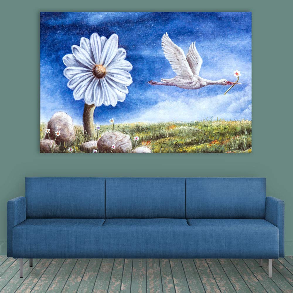
This canvas does something unusual: instead of a single focal point, it creates two visual anchors. The oversized white daisy on the left grounds the composition, while the crane flying right—flower in beak—introduces movement across the frame. Your eye doesn't settle in one spot and stop; it travels between the two, rests on the green meadow below, then returns. For a wall that currently feels unfinished, this creates presence without visual noise.
Your living room wall is probably 10-12 feet wide if you're in a 2BHK or 3BHK. At 91cm width, this canvas covers roughly 25-30% of that wall space. That might sound modest, but it's intentional: you're likely placing this above a sofa that's already 6-8 feet wide. The canvas needs to anchor the seating area without competing with it.
Here's the math. On a 10-foot wall (300cm), a 91cm canvas leaves about 104cm on each side—enough breathing room that the art feels placed, not cramped. If your sofa is 7 feet (213cm), the canvas sits at 43% of the sofa width. Sizing guides typically recommend 60-75%, which would mean 127-160cm. But that calculation assumes the canvas is the only visual element above your sofa. If you have a reading lamp beside your sofa, or a side table, the effective visual weight shifts. At 91cm, you're creating a focal point that complements rather than dominates.
Going smaller—say 75cm—and the canvas starts feeling like it's floating, disconnected from the furniture below. Going larger to 120cm works if your sofa is closer to 8 feet and you have clean wall space, but with this particular composition (two focal points that need room to breathe), tighter framing can feel crowded.
Viewing distance matters too. From a doorway (3-4 meters), the surrealist elements read as a cohesive scene—bird, flower, meadow. From the sofa (1.5-2 meters), you notice the painterly texture, the way the daisy petals aren't perfectly smooth, the subtle clouds in that deep blue sky.
The dominant colour here is that deep, slightly moody blue—not a bright sky blue, but something richer, almost twilight-adjacent. Against cream or off-white walls (what most Indian apartments have), this creates contrast without jarring. The blue reads as intentionally bold, not accidentally mismatched.
Morning light softens everything. If your wall gets indirect east-facing light, the blue will appear slightly cooler, the greens more muted. The white of the daisy and crane stays crisp—white catches morning light well.
Evening changes the equation. Under warm LED lighting (3000K, standard in most Indian homes), the blue shifts towards teal, the greens warm up, and the meadow's golden-yellow accents become more pronounced. The grey-brown stones at the base anchor the composition so it doesn't feel like it's floating in all that blue.
What about common Indian furniture? Brown fabric sofas, wooden coffee tables, beige curtains—this palette works. The green meadow echoes any wooden tones. The blue adds something your room probably doesn't have much of—a cool counterpoint to all the warm neutrals. It's different without clashing.
The one wall colour to be careful with: if your walls are builder's peach or light yellow, test this mentally. Deep blue against warm-toned walls creates more tension than against neutral cream. It can work—it's a design choice—but it's a deliberate one.
At 400 grams, this is lighter than most canvas art in this size range. That's actually helpful: lighter weight means simpler mounting.
For concrete walls (most apartments built before 2010): You need a 6mm masonry bit, one plastic wall anchor, one screw. Drill 35mm deep, tap in the anchor, screw in the hook, hang. Total time: 15 minutes including the part where you step back three times to check alignment.
For drywall (newer constructions, false ceilings): Same process, but the drill goes easier. Don't over-tighten—drywall anchors hold by spreading behind the surface, not by brute force.
For rentals, here's the reality: a single 6mm hole is smaller than what most curtain rod brackets require. When you move out, wall putty (₹50) and matching paint touch-up makes it invisible. Your ₹50,000 deposit isn't at risk from properly mounted canvas art—it's at risk from large TV brackets, multiple failed attempts creating hole clusters, or water damage from mounted shelves.
Height recommendation: 20-25cm above your sofa cushion top. Not 15cm (looks cramped), not 35cm (looks disconnected). The surrealist composition has visual weight at the bottom (meadow, stones), so hanging it slightly higher than you'd instinctively place it usually looks better.
If you've been browsing wall décor, you've probably seen macrame hangings at similar prices. They're having a moment—bohemian aesthetic, textured, no drilling required for lighter pieces.
Here's the honest comparison:
Macrame collects dust. The woven fibres trap particles, and cleaning means careful vacuuming or hand-washing and re-shaping. In Indian cities—Mumbai's humidity, Delhi's dust storms, Bangalore's construction dust—macrame dulls within months. Canvas with moisture-resistant coating wipes clean with a dry cloth.
Macrame reads as one specific aesthetic: bohemian, earthy, handcrafted. If your home already leans that direction, it works. But against the typical Indian living room (brown sofa, wooden furniture, neutral walls), macrame can feel like a statement about what you wish your home looked like rather than what it actually is. Canvas reads as "art on the wall"—more neutral as a design category.
Visual presence is different too. Macrame is textural but not pictorial—it doesn't give your eye something to look at, just something to register. This canvas has subject matter, narrative (why is that crane carrying a flower?), colour relationships. Guests pause and look. With macrame, they notice and move on.
Longevity: quality macrame, properly cared for, lasts years. But "properly cared for" means keeping it away from moisture (bathrooms, kitchens), direct sun (which fades natural fibres), and dust accumulation. Canvas with UV-resistant inks and moisture-resistant coating is designed to handle Indian conditions without special treatment.
From the doorway, walking into your living room: you'll see the composition as a whole. The blue sky draws the eye first (it's the largest colour field), then the white daisy (high contrast), then the crane introduces movement that leads you into the scene. It reads as "nature art" from a distance—pleasant, not challenging, something guests notice as intentional.
From the sofa, looking up: you're close enough to see the painterly quality. The daisy petals have visible brush-texture. The meadow grass isn't photorealistic—it's suggestive, impressionistic. This isn't a photograph printed on canvas; it's an illustration with artistic interpretation. That matters if you want something with more visual interest than a stock landscape image.
Does it dominate or complement? At 91x61cm, it complements. This isn't statement art that demands the room revolve around it. It fills the wall space above your sofa with something considered, but your eye can also rest on other elements—your coffee table, your bookshelf, your window. If you want dramatic, gallery-level impact, you'd want 120cm or larger. This size is for balanced presence.
The surrealist elements (oversized flower, crane carrying a bloom) add a touch of whimsy without being childish. It's dreamlike in a way that adults appreciate—suggests imagination without demanding interpretation.
The dual-focal composition—daisy anchoring left, crane in motion right—creates visual balance that works above asymmetrical furniture arrangements. The deep blue sky provides enough contrast against cream walls to feel intentional without overwhelming a neutral room.
Designed for Indian apartments and lighting conditions. Packed for long-distance Indian transit. Quality checked before dispatch. Printed to resist humidity-related color fading. Ships from West Bengal.
At 91x61cm, this fits 10-12 foot walls in standard 2BHK/3BHK living rooms. Position 20-25cm above sofa back for proper visual connection to furniture. The horizontal format suits wall space above 6-8 foot sofas where vertical art would look narrow.
Will 91cm look too small above my 8-foot sofa? At 91cm, the canvas covers about 43% of an 8-foot (244cm) sofa's width. Standard recommendations suggest 60-75%, so this sits below that range. If your sofa is the only element in that wall zone, consider 120cm for more visual weight. However, if you have side tables or lamps flanking your sofa, 91cm often balances better because those elements add to the overall visual width.
How will the blue sky look against my cream walls in evening lighting? Under warm LED lights (2700-3000K, standard in Indian homes), the deep blue shifts slightly toward teal, which actually pairs well with cream walls and brown furniture. The white daisy and crane stay bright and create contrast. The overall effect is richer than in daylight—blues tend to gain depth under warm artificial light rather than washing out.
Can I mount this in a rental without risking my deposit? At 400 grams, you need one wall anchor and a single 6mm hole drilled 30-35mm deep. This is smaller than holes left by curtain brackets. When you move, fill with wall putty (₹50) and touch up with matching paint if needed. Landlords inspect for clusters of holes, large bracket damage, or obvious patch jobs—not single, properly filled small holes.
Will the colors fade near my west-facing window? Eco-solvent UV-resistant inks are tested for outdoor signage durability, which means 3-4 hours of daily direct afternoon sun won't noticeably fade colors within typical use periods (3-5 years). The moisture-resistant canvas coating also prevents the surface degradation that accelerates fading in non-treated canvas.
What's the visual difference between this painterly style and photographic canvas prints? Photographic prints reproduce reality—every blade of grass rendered precisely. This illustration has visible artistic interpretation: the daisy is oversized (surrealist choice), the meadow grass is impressionistic rather than detailed, the crane carries symbolic rather than realistic elements. From across the room, both read as "nature scene." Up close, the painterly style shows brush texture and deliberate artistic choices that photographic prints lack.