
Cart

You know exactly which wall needs something. You've walked past it dozens of times, imagining what might go there, but every time you browse options online, you can't quite picture how they'd actually look in your space. The mockups show white walls and designer furniture—not your cream-painted living room with the brown leather sofa.
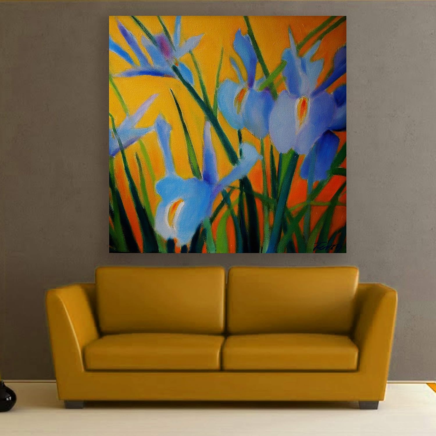
This 91x91cm square canvas solves that visualization problem directly. The blue iris blooms against a warm golden-orange background create a color relationship that actually makes sense with typical Indian interiors. The periwinkle and lavender blues provide the visual interest your eye craves, while the amber and orange tones in the background echo the warm undertones already present in wooden furniture, beige upholstery, and cream walls. You're not introducing a jarring new color scheme—you're adding vibrancy that connects to what's already there.
The diagonal arrangement of iris stems creates gentle upward movement across the square frame. Your eye enters at the lower left where the stems emerge, travels through the central bloom cluster, and rests on the largest iris grouping in the upper right. This isn't static art that just sits there—it has visual rhythm without being chaotic.
A 91cm square canvas covers approximately 38% of a standard 240cm (8ft) wall width when centered. This creates what designers call "comfortable presence"—large enough to anchor the space, not so large that it crowds the visual field.
Above a 6-foot (180cm) sofa, this canvas represents about 50% of the sofa width. That's at the lower edge of the ideal 60-75% range, which means it works, but you'll want to ensure the canvas is truly centered. Any offset becomes noticeable at this ratio.
Above an 8-foot (240cm) sofa or sectional, the 91cm width represents 38% of the sofa—undersized for that furniture scale. If your sofa is this wide, consider whether the wall has additional visual elements (floor lamp, side table with plant) that add to the overall composition. The canvas alone may feel disconnected from larger furniture.
The square format offers placement flexibility you don't get with rectangular art. It works centered above a sofa, but also functions well in corner arrangements, stairwell landings, or entryway walls where rectangular proportions might feel awkward.
Viewing distance matters: at 3-4 meters (across a typical living room), the iris forms read clearly as distinct blooms. Closer than 2 meters, you'll appreciate the brushwork texture and color gradations within each petal.
The dominant colors here are periwinkle blue (the iris petals), golden-amber orange (the background), and forest green (the stems and leaves). Understanding how these behave in your specific lighting conditions prevents the "looked different online" disappointment.
Morning light (east-facing windows): The blue iris petals appear more lavender, almost violet. The orange background looks warmer, more honey-toned. This is when the warm-cool contrast is most pronounced and the painting feels most energetic.
Afternoon light (west-facing or direct sun): The blues become more saturated, trending toward true blue rather than periwinkle. The orange intensifies to almost burnt orange. If your wall gets direct afternoon sun, the colors won't fade (eco-solvent inks resist UV degradation), but they will appear bolder.
Evening LED light (warm white, 2700-3000K): The most common viewing condition in Indian homes. The blue petals take on a softer, slightly grayed quality. The orange background glows warmly, appearing to illuminate from within. This is typically when the painting looks most integrated with the room's overall ambiance.
Against cream walls: The warm orange tones in the background echo the yellow undertones in cream paint, creating visual continuity. The blue provides contrast without clashing. This is one of the few color combinations that genuinely complements rather than fights typical Indian wall colors.
Against gray or taupe walls: The orange background pops more dramatically. If you have one of those accent walls in charcoal gray (increasingly common in modern Indian apartments), this placement would make the painting a true statement piece.
With brown furniture: The forest green stems and the amber background share color-family DNA with brown wood and leather. The painting doesn't feel like a foreign element dropped into the room—it feels like an intentional extension of your existing palette.
A square canvas at 91cm requires precise centering—any tilt or offset is immediately visible because your eye expects symmetry. The hanging template included with this canvas eliminates the guesswork.
The canvas weighs approximately 400 grams (lighter than most 90cm canvases due to the 2cm depth), which means you have installation flexibility:
For long-term placement (owned home, concrete walls): Two 6mm anchor points spaced 60cm apart at the top of the frame. This distributes the minimal weight evenly and ensures the canvas hangs flush against the wall. Drill depth: 35mm into concrete. The D-ring hanging system allows for minor leveling adjustments after installation.
For rental flexibility: At this weight, quality adhesive strips rated for 2-3kg work reliably. The square format means equal weight distribution across all attachment points. However, if your wall has that powdery paint finish common in older Indian rentals, adhesive strips may fail over time. Test in an inconspicuous spot first.
For drywall (newer apartments): Standard plastic anchors, 6mm holes, 30mm depth. The gypsum board easily holds this weight.
Repair on move-out: 6mm holes fill with standard wall putty (₹50 for a tube that covers 20+ holes). Sand smooth, touch up with wall paint. Total repair: under 30 minutes and invisible to landlords during inspection.
Fabric tapestries can achieve similar visual effects—flowing botanicals, warm-cool color contrasts, organic patterns. So why does this work better as stretched canvas?
First: color saturation. The eco-solvent inks printed on cotton canvas produce deeper, more consistent color than woven or printed fabric. The golden-orange background maintains its vibrancy edge-to-edge. In a tapestry, you'd see color variation where the weave stretches or the fabric folds. The iris blues would appear patchy rather than smooth.
Second: structural stability. A 91cm square tapestry requires a hanging rod or tension system to prevent the bottom edge from curling inward. In high-humidity conditions (monsoon months, coastal cities), fabric absorbs atmospheric moisture and the weight distribution shifts. You'll see gentle bulges and sags that change with the seasons. Canvas stretched over a kiln-dried pine frame maintains its flat surface regardless of humidity fluctuations.
Third: cleaning reality. The polymer coating on this canvas means dust sits on the surface rather than embedding in fibers. A dry microfiber cloth removes months of accumulated dust in one pass. Tapestry fabric traps dust within the weave, requiring periodic washing or specialized cleaning—and washing introduces shrinkage risk and color bleeding.
Fourth: color longevity. Tapestry dyes fade faster than eco-solvent inks, particularly in the warm spectrum (oranges, ambers, yellows). That golden background would shift toward a washed-out peach within 12-18 months of indirect sun exposure. The canvas version maintains color consistency for years.
From the doorway (4-5 meters), your eye catches the warm-cool color contrast before you identify the subject. The golden-orange glow registers as warmth; the blue provides visual interest that pulls you into the room. The painting reads as an intentional focal point—something was chosen to go there, not just stuck up to fill space.
At conversational distance (2-3 meters, where you'd sit on a sofa facing guests), the irises become identifiable as flowers. The organic upward movement of the stems adds subtle energy to the wall without being distracting during conversation. Your peripheral vision registers the painting as "alive" rather than static.
Up close (1 meter or less), you see the texture: canvas weave visible through the paint, brushwork variations that create depth in the petals, the slight impasto where thicker pigment catches light. This isn't flat digital printing—there's dimensionality that rewards closer inspection.
Solo or with adjacent decor? This painting has enough visual presence to stand alone on an 8-10ft wall. Flanking it with smaller pieces would create visual competition rather than enhancement. If you have floating shelves or a gallery wall elsewhere in the room, keep the wall behind this canvas clear.
Dominance level: Moderate-high. The color vibrancy commands attention but doesn't overwhelm. You won't walk into the room and feel like the painting is the only thing you can see—but your eye will definitely land on it first.
Moolwan Design Note The iris stems cross the frame at a 60-degree diagonal, creating visual movement that guides the eye from lower-left to upper-right. The largest bloom cluster sits in the upper-right quadrant, following compositional principles that naturally draw attention. The warm orange-amber background isn't flat—there are color gradations from deeper burnt orange at the edges to golden-yellow behind the central blooms, creating subtle depth that rewards longer viewing.
Moolwan Quality Standard Designed for Indian apartments and lighting conditions. Printed to resist humidity-related color fading. Packed for long-distance Indian transit with corner protectors and triple-layer wrapping. Quality checked before dispatch. Ships from West Bengal.
Moolwan Fit Guidance for Indian Homes The 91x91cm square format works best above 5-7 foot sofas where it represents 50-65% of furniture width. Ideal mounting height: 20-25cm above sofa back. For standalone placement on entryway or hallway walls, center the canvas at eye level (approximately 145-150cm from floor to center of canvas).
Will 91cm look too small above my 8-foot sofa? At 91cm width above a 240cm sofa, the canvas represents about 38% of the furniture width—below the ideal 60-75% range. It can work if your wall arrangement includes additional elements (floor lamp, side table with plant) that balance the composition. For an 8-foot sofa as a standalone setup, a 120cm canvas would provide better visual proportion.
How will the orange background look against my cream walls? The golden-amber tones in this painting share undertones with cream wall paint, creating natural visual harmony rather than contrast. The orange appears to "belong" in the space rather than clash. Under warm LED lighting (standard evening conditions), the background takes on a honey-like glow that complements cream walls particularly well.
Can I install this in a rental without losing my deposit? At 400 grams, this canvas is light enough for adhesive strips rated at 2-3kg, eliminating drilling entirely. If you prefer the security of anchored mounting, the two 6mm holes required are easily patched with wall putty (₹50, 10 minutes of work) before move-out inspection.
Will the colors fade near my west-facing window? The eco-solvent inks used in Moolwan canvas printing include UV inhibitors tested for direct sunlight exposure. Your iris blues and golden-orange background will maintain color consistency even with daily afternoon sun. This isn't standard inkjet printing that degrades with light exposure.
Is a square canvas harder to center than rectangular? Visually, yes—any offset or tilt is immediately noticeable because the eye expects perfect symmetry. Practically, no—the included hanging template marks exact drilling positions. Tape the template to your wall at your desired height, mark the two anchor points through the template, remove the paper, drill. The process takes 15 minutes and eliminates alignment guesswork.