
Cart

You know exactly which wall needs something. You've stared at it during morning chai, noticed it during video calls, felt its blankness when guests visit. The wall is 10, maybe 12 feet wide. Your sofa sits below it. And every time you browse canvas art online, you see the product photo but can't translate it to your wall, your lighting, your furniture. This cottage garden painting solves that specific problem — not through imagination, but through visual math you can verify.
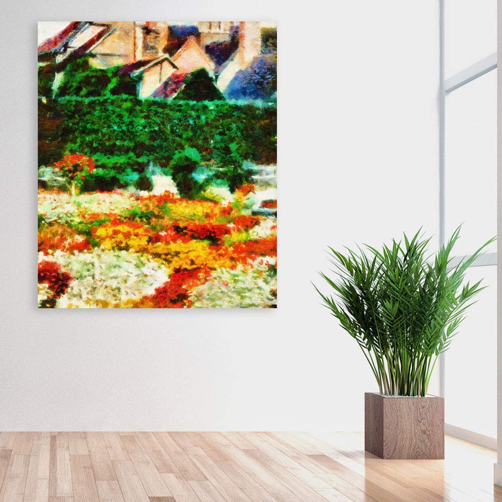
At 91cm wide by 76cm tall, this canvas covers approximately 35-40% of a 10-foot wall's visual center — enough presence to anchor the space without overwhelming it. The impressionist technique creates something mockup photos rarely show: genuine depth. Foreground flowers in reds and oranges sit closest to you. The dark green hedge recedes behind them. Terracotta cottage rooftops fade into soft blue sky at the top. Your eye travels into the painting, which makes the wall itself feel less flat.
A 10-foot wall (300cm) with a 6-foot sofa (180cm) centered below leaves roughly 60cm of wall visible on each side. This 91cm canvas sits comfortably within the sofa's visual footprint — the proportions read "intentional," not "leftover space filled."
If your wall is 12 feet (360cm) with an 8-foot sofa, you're at the lower end of ideal sizing. The canvas will look slightly more intimate, more like a curated accent than a statement piece. Not wrong — just a different effect.
Viewing distance matters here. From a doorway 3-4 meters away, the impressionist brushwork blurs into cohesive color bands — greens, warm flower tones, soft rooftops. Walk closer and individual strokes emerge, giving you two experiences in one piece. Placement height: 20-25cm above sofa cushion top keeps the canvas visually connected to the furniture below, not floating awkwardly mid-wall.
The palette here is dominated by deep forest greens (the hedge), warm reds and burnt oranges (flowers), golden yellows (accent blooms), and muted terracotta (rooftops). Against cream or off-white walls — standard in most Indian apartments — these colors create natural warmth without clashing.
In morning daylight, the greens appear cooler, more like actual foliage. The reds stay true. The overall effect is bright and garden-fresh.
Under warm LED lighting (3000K, what most Indian homes use in evenings), the reds intensify, the oranges glow, and the greens deepen. This is when the painting looks its richest — exactly when guests are most likely to see it. If your living room has wooden furniture in browns or beiges, the warm tones in this canvas will echo that wood naturally. No forced coordination, just colors that already belong together.
Most Indian apartments have concrete walls with plaster finish. You'll need a 6mm masonry bit, 35mm deep holes, concrete anchors (included), and the D-ring hangers already attached to the frame back. The hanging template eliminates guesswork — tape it to the wall at your chosen height, mark the drill points, remove, drill.
If you're in a newer construction with drywall sections (common around AC units or false ceiling transitions), use the included drywall anchors instead. Same drill bit size, shallower depth.
At 400 grams, this canvas is lighter than most. Standard wall anchors handle it easily. The frame's 2cm depth means it sits nearly flush against the wall — no awkward shadow gaps, no tilting forward. Installation time is genuinely 15-20 minutes, including the inevitable step-back-and-check-if-it's-level moments.
For rental concerns: the anchor holes you're making are smaller than standard picture frame nails. Wall putty and a paint touch-up at move-out takes 15 minutes and costs under ₹200.
Fabric tapestries have a specific aesthetic — bohemian, textile-forward, often casual. They drape rather than hang flat. Edges can curl or fray over time. In humid conditions (Mumbai monsoons, Chennai year-round), fabric absorbs moisture, develops that slightly musty smell, and can grow mold along edges if wall moisture is present.
This cottage garden canvas sits drum-tight on a kiln-dried pinewood frame. The moisture-resistant coating on the canvas surface means monsoon humidity doesn't penetrate the fibers. The colors are printed with fade-resistant inks, not dyed into fabric that bleaches unevenly in sunlight. Three years from now, it looks the same — no sagging, no curling corners, no textile wear.
The visual difference is equally significant. Tapestries read as decorative objects — you notice them as fabric. Canvas reads as art — you notice the image, not the medium. If you're going for a polished, intentional look rather than a boho-casual one, canvas achieves that where fabric can't.
From your living room doorway, you'll register the painting as a warm color block — greens and autumn tones. It anchors the sofa wall without demanding attention. The cottage subject is pleasant without being culturally specific, meaning family visitors from any generation can appreciate it as simply "nice nature art" rather than something that requires explanation.
Up close — when you're sitting on the sofa, looking up — the impressionist texture becomes visible. Individual brushstrokes, color layering, the slightly textured canvas weave. This is where quality canvas differs from flat prints: there's actual surface interest.
The painting works alone. It doesn't need adjacent frames, matching decor, or gallery wall support. The layered composition provides enough internal visual interest. If you have a floor lamp beside the sofa or a side table with books, those existing elements will complement rather than compete.
Moolwan Design Note The impressionist cottage garden subject was selected for its layered depth — foreground, middle-ground, background — which creates visual recession on flat walls. The autumn palette ensures warmth under Indian LED lighting conditions.
Moolwan Quality Standard Designed for Indian apartments and lighting conditions. Packed for long-distance Indian transit. Quality checked before dispatch. Printed to resist humidity-related color fading. Ships from West Bengal.
Moolwan Fit Guidance for Indian Homes 91x76cm proportions suit 10-12ft walls with 6-8ft sofas. Near-square orientation works above sofas, dining sideboards, or as hallway focal points. The warm palette complements cream walls and wooden furniture without coordination effort.
Will 91x76cm look proportional above my 6-foot sofa? Yes. At 91cm wide, this canvas is roughly 50% of a 6-foot (180cm) sofa's width — within the ideal 50-75% range. It will appear balanced and intentional, not oversized or lost.
How do the warm reds and oranges look under typical Indian LED lighting? Under warm white LEDs (2700-3000K, standard in most Indian homes), the reds intensify and the oranges glow warmly. The painting appears richer in evening lighting than in daylight — which is when you're most likely to be in your living room.
Can I install this on a concrete wall without professional help? Yes. You need a 6mm masonry drill bit and 15-20 minutes. The included concrete anchors and hanging template eliminate guesswork. The canvas weighs only 400 grams, so standard anchors hold it securely.
Will the colors fade in a room that gets afternoon sun? The fade-resistant inks used are designed to maintain color stability under UV exposure. Rooms with 3-4 hours of direct afternoon sun won't cause noticeable fading over typical ownership periods.
Is this suitable for humid cities like Mumbai or Chennai? Yes. The moisture-resistant coating prevents humidity from penetrating the canvas fibers. The kiln-dried pinewood frame (dried to 12% moisture content) resists warping through monsoon cycles.