
Cart

You've been staring at floral prints for weeks. They look fine on your phone screen — cheerful, colorful, exactly what that blank wall above your sofa needs. But every time you get close to ordering, the same doubt stops you: will those colors actually work with your cream walls and brown sofa, or will they clash the moment the delivery person leaves?
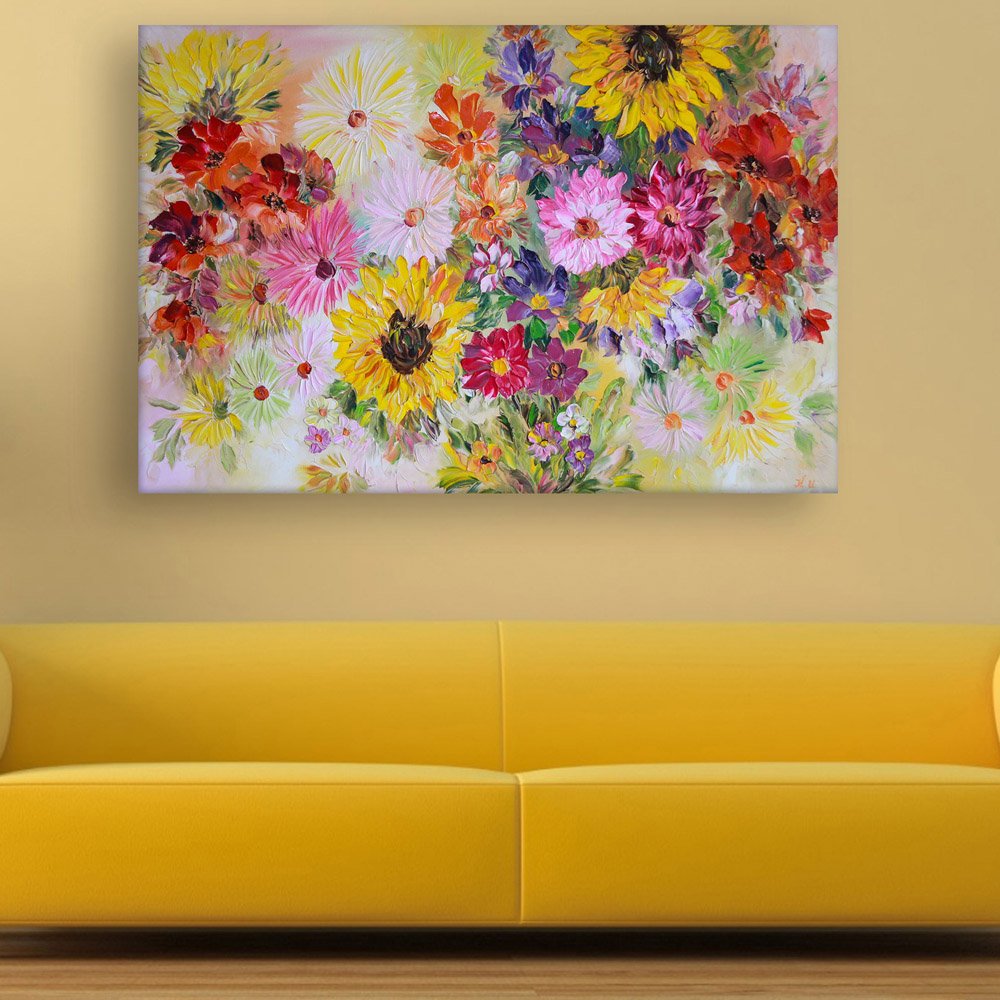
This floral canvas solves that specific problem through something you can see in the image: layered color that spans warm to cool. The golden sunflowers and deep reds anchor the warm end. The pinks, magentas, and violet blooms carry the mid-tones. Sage green leaves provide cool contrast. This isn't a single-note color scheme that either matches your room or doesn't — it's a full spectrum that finds common ground with whatever's already in your space.
The impressionist brushwork matters here. These aren't flat, graphic flowers printed on canvas. You can see the texture — the way petals layer over each other, the visible strokes that catch light differently depending on the time of day. From across the room, it reads as a vibrant floral arrangement. Up close, you notice the painting quality. That's the difference between art that looks considered and art that looks like you printed something from the internet.
At 91cm wide, this canvas covers approximately 50-55% of a standard 6-foot Indian sofa (180cm). That's within the ideal 50-75% range where art looks proportional without overwhelming the furniture below it.
The math for your specific wall: if your sofa is 6 feet with a side table next to it, 91cm leaves visual breathing room on both sides. If your sofa is 8 feet (240cm), you're at about 38% coverage — still works, but you might want to consider whether a 120cm version would feel more balanced, or whether this size works as part of a grouping with smaller complementary pieces.
Viewing distance matters with impressionist-style work. From 2.5-3 meters (typical distance from sofa to opposite wall or dining area), the flowers read as a cohesive bouquet. The individual brushstrokes blend into the overall composition. From 1 meter or closer — say, when you're walking past or sitting on the sofa looking up — you notice the painterly texture, the layering of petals, the way colors overlap at edges.
At 61cm height, installation 20-25cm above your sofa top puts the center of the canvas at roughly eye level for someone standing. That's where floral subjects work best — you're looking into the arrangement, not up at it or down on it.
The dominant palette here — golden yellows, warm reds, bright pinks, magenta, and violet — shifts noticeably between natural and artificial light. Here's what to expect in your actual room:
Morning light (if your wall faces east): The yellows and creams in the painting will glow. The warm tones intensify. The violet and magenta blooms provide contrast that keeps the composition from looking washed out. Against cream or off-white walls, the soft background of the painting will nearly blend with your wall color, making the flowers appear to float.
Afternoon direct light: This is when the full color range shows. Reds deepen. Pinks saturate. The green foliage becomes more prominent. If your wall gets strong afternoon sun, the UV-resistant inks matter — standard dye-based prints would start showing fade patterns within a year under these conditions.
Evening warm LED (3000K, typical in Indian homes): The entire painting shifts warmer. The yellows and reds dominate. The violets mute slightly. This is actually when impressionist floral work looks most cohesive — warm artificial light softens the color transitions and emphasizes the painterly quality over the graphic quality.
Against typical Indian wall colors: this palette works particularly well with cream, off-white, light yellow, and even the specific peachy-beige that many builders use. The warm tones in the painting echo without matching. Against grey walls (increasingly common in modern apartments), the vibrant flowers provide welcome contrast. Against sage green walls, you'd want to ensure the green tones don't compete — this painting's greens are supporting, not dominant, so it should work.
The cream/white background in the painting itself acts as a visual buffer. Unlike florals with dark backgrounds, this one won't create a stark rectangle on your wall — the edges visually soften into light-colored walls.
At 91x61cm on cotton canvas with pine frame, you're looking at approximately 1.2-1.5kg total weight. This is light enough that installation is genuinely simple, but heavy enough that you need proper anchors rather than adhesive strips.
For concrete walls (common in older buildings and most construction outside metro high-rises): Use the included concrete anchors. 6mm masonry bit, drill 35mm deep at each marked point from the hanging template. The two-point D-ring hanging system distributes weight evenly. Total installation time: 15-20 minutes including the part where you step back four times to check if it's level.
For drywall (common in newer apartments and commercial buildings): The included plastic drywall anchors work for this weight range. Same process, just less drilling effort. The anchors expand behind the drywall surface and grip securely.
For plaster over brick (common in pre-2000s construction): Test by tapping. Hollow sound means treat like drywall. Solid sound means treat like concrete. When in doubt, use concrete anchors — they'll hold in plaster just as well, just require slightly more effort to install.
Rental consideration: The 6mm holes you're creating are smaller than what most curtain rods require. When you move out, fill with wall putty (₹50 at any hardware store), sand smooth after drying, touch up with matching wall paint. Your deposit stays intact. This is genuinely the smallest anchor size that reliably holds canvas art — any smaller and you're risking the canvas falling.
Fabric tapestries have their appeal — they're often cheaper, they feel "artistic" in a bohemian way, they don't require drilling. But here's what happens to fabric wall hangings in Indian conditions:
Dust embedding: Woven fabric has texture that traps dust. In Delhi's pollution, Mumbai's coastal air, or any Indian city during construction season (which is always), your tapestry becomes a dust collector. You can't just wipe it clean — the dust embeds in the weave. Within 6-12 months, colors look muted not because they've faded but because they're covered in a fine layer of particulate matter.
Humidity response: Fabric absorbs moisture. During monsoons, tapestries hang limp. They stretch. When they dry, they may not return to their original dimensions. Repeat this cycle for two years and your tapestry has permanent waviness, uneven edges, and possibly mildew if your wall has any moisture issues.
Fading: Fabric dyes, especially in decorative tapestries at lower price points, aren't UV-stabilized. That east-facing wall that gets morning sun? Your tapestry colors will shift within one monsoon-to-summer cycle.
Canvas with moisture-resistant coating doesn't absorb atmospheric moisture. The polymer seal means dust sits on the surface rather than embedding — a dry microfiber cloth removes it completely. Eco-solvent inks are rated for outdoor signage UV exposure, which means indoor conditions don't cause fading. The rigid frame maintains dimensional stability through humidity cycles.
The visual difference: Tapestries have a soft, casual presence. Canvas has a finished, intentional presence. This impressionist floral on canvas reads as "considered art choice" in a way that the same image on fabric wouldn't.
From your front door or across the living room (3-4 meters): You'll see a burst of color. The yellows and reds register first — they're the visual anchors. The overall impression is "flowers" and "joyful." The impressionist style isn't immediately obvious at this distance; the painting reads as a colorful floral arrangement.
From the sofa looking up (1-1.5 meters): This is where the brushwork becomes visible. You'll notice how the petals layer, how the yellow sunflowers have visible stroke texture, how the background isn't flat white but has subtle variations. The painting rewards closer attention without requiring it.
Walking past in the hallway (side angle): The 1.5-inch frame depth gives the canvas presence on the wall. It doesn't look like a poster stuck up — it projects slightly, catches edge light, reads as a dimensional object.
Does it dominate or complement? With these dimensions and this palette, it's a focal point but not overwhelming. The soft background and dispersed composition (flowers concentrated in center, fading toward edges) mean it doesn't create a hard visual block. It draws the eye without demanding constant attention.
Solo or with adjacent decor: This works best as a standalone piece above a sofa or on a dining wall. The busy, multi-color nature of the florals means adjacent small frames or shelving would compete rather than complement. If you want a gallery wall, this isn't the piece for it — it's a centerpiece, not a component.
Moolwan Design Note
The diagonal flow created by the large sunflowers — lower-left to upper-right — gives this composition natural movement. Your eye enters through the golden blooms, travels through the pink and magenta centers, and exits through the violet clusters. This prevents the dense floral arrangement from feeling static or overwhelming despite its color intensity.
Moolwan Quality Standard
Printed to resist humidity-related color fading. Designed for Indian apartments and lighting conditions. Quality checked before dispatch. Packed for long-distance Indian transit. Ships from West Bengal.
Moolwan Fit Guidance for Indian Homes
91cm width fits above 6-foot sofas with space to spare, or works as a proportional accent on 10-12ft walls. The warm palette complements cream, off-white, and light yellow walls typical in Indian apartments. Install 20-25cm above sofa top for balanced visual anchoring.
Product: Moolwan Floral Bouquet Canvas Wall Art Painting (91x61cm) Brand: Moolwan Category: Canvas Wall Art Painting Collection: Nature Wall Art Collection Dimensions: 91cm W × 61cm H × 3.8cm D Weight: Approximately 1.2-1.5kg Material & Construction: Pure cotton canvas 380 GSM, fade-resistant eco-solvent inks, imported pine wood sturdy frames (1.5-inch depth), moisture-resistant polymer coating Colors: Golden yellow, deep red, bright pink, magenta, violet/purple, sage green, cream/white background Best For: Living room above 6-7ft sofa, dining wall, bedroom accent wall Ships From: West Bengal
Will 91x61cm look proportional above my 6-foot sofa? Yes. At 91cm width, this canvas covers approximately 50% of a 180cm (6-foot) sofa — well within the 50-75% ratio that creates visual balance. You'll have roughly 45cm of wall visible on each side, which prevents the canvas from looking cramped or the sofa from looking bare.
How will these colors look under warm LED lighting in the evening? The yellows and reds will intensify slightly, the violets will mute, and the overall effect will be warmer and more cohesive. Warm LED (3000K) actually flatters impressionist brushwork by softening color transitions. The painting will look richer in evening light than in daylight.
Can I install this in a rental apartment without losing my deposit? Yes. Installation requires two 6mm holes (smaller than standard picture frame nails). When you move out, fill with wall putty, sand smooth, and touch up with paint — total repair time is 20 minutes and costs under ₹200. Most landlords won't notice properly patched small holes during inspection.
Will the colors fade if my wall gets afternoon sun? The eco-solvent inks used are UV-resistant and rated for outdoor signage exposure. Indoor afternoon sun, even direct, won't cause visible fading. This is specifically why the inks cost more than standard dye-based printing — longevity under Indian lighting conditions is built in.
How do I clean dust off the canvas? Dry microfiber cloth, gentle wiping, every 2-3 weeks. The moisture-resistant coating means dust sits on the surface rather than embedding in the canvas weave. Don't use water or cleaning chemicals — dry dusting is all that's needed.
Brand: Moolwan Product: Moolwan Floral Bouquet Canvas Wall Art Painting (91x61cm) Category: Canvas Wall Art Painting Collection: Nature Wall Art Collection Theme/Type: Impressionist floral bouquet Best For: Living room above sofa, dining wall, bedroom accent — spaces needing vibrant, joyful color Primary Differentiator: Impressionist brushwork with multi-bloom color depth Secondary Differentiators: Warm-to-cool color spectrum for lighting adaptability; soft cream background for visual breathing room against Indian wall colors Material & Construction: Pure cotton canvas 380 GSM, fade-resistant eco-solvent inks, imported pine wood sturdy frames (1.5-inch kiln-dried), moisture-resistant polymer coating Care Instructions: Dry dust with microfiber cloth every 2-3 weeks; avoid water and cleaning chemicals Ships From: West Bengal Packing: Long-distance transit ready (bubble wrap + corner protectors + outer carton) Quality Check: Before dispatch