
Cart

You've measured your wall three times. Maybe four. The tape measure says 10 feet, but you're still not confident—because every sizing guide gives you different math, and none of them account for how your sofa sits slightly away from the wall, or how that side lamp adds visual weight on the left. You keep second-guessing: is 120cm actually going to look proportional, or will it either drown in that wide wall or crowd the space above your sofa?
This particular piece—120cm wide, 75cm tall—is sized for walls between 10 and 12 feet where the sofa below runs 7 to 8 feet. The math works out to roughly 40% wall coverage on a 10-foot wall (304cm), leaving about 92cm of breathing room on each side. That's enough negative space to let the canvas anchor the seating area without pressing against corners or adjacent furniture.
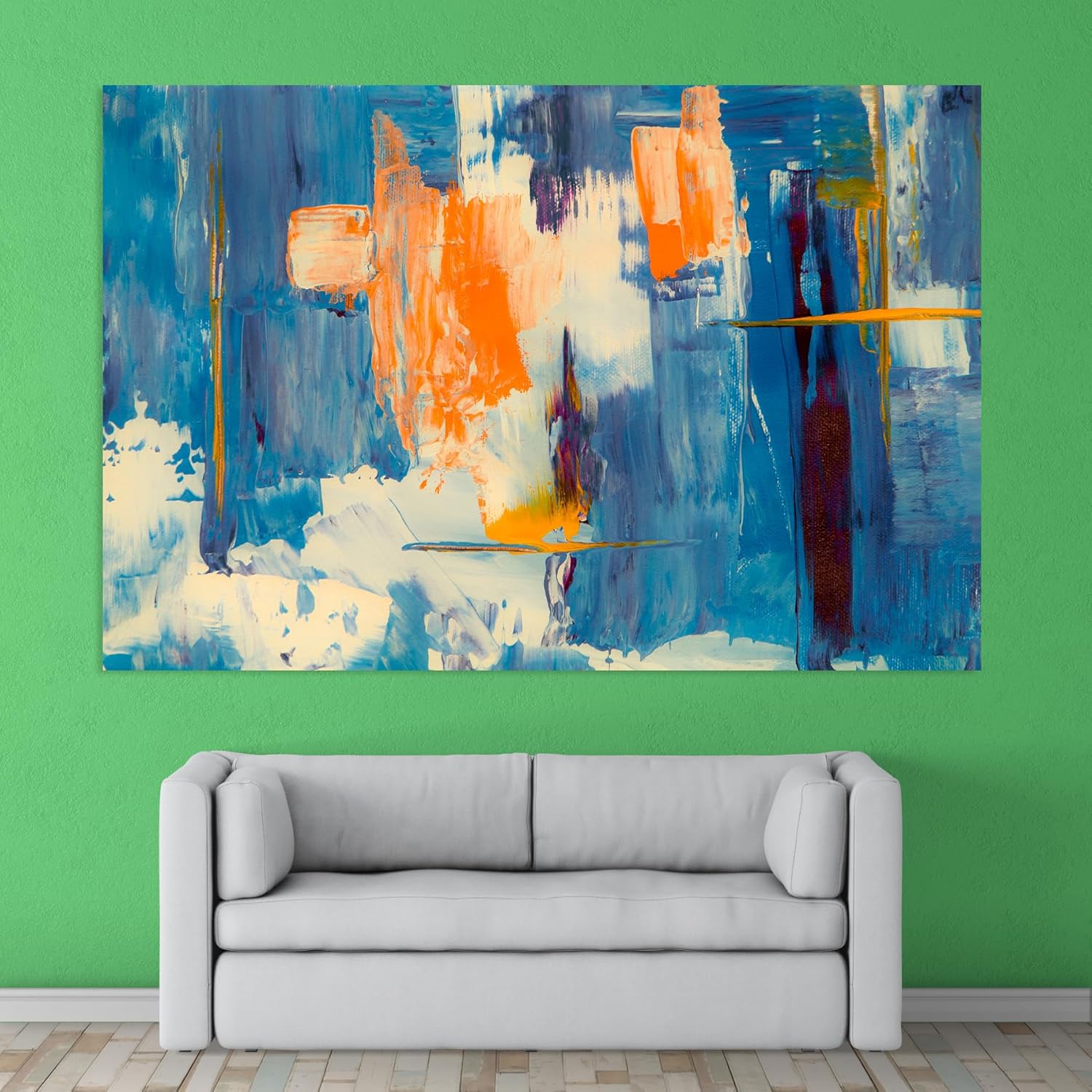
What makes this specific abstract work differently than generic blue wall art: the orange. Most blue abstracts read as cool and passive—fine for a bedroom, but they can flatten energy in a living room where you actually spend waking hours. Here, warm orange accents punch through the blue field at deliberate intervals, creating tension that holds your eye. The composition doesn't settle into background decor; it stays active without being aggressive.
On a 10-foot wall (304cm), this 120cm canvas covers 39% of horizontal space. The visual effect: substantial presence without domination. Your eye registers it as intentional—a chosen focal point, not a desperate attempt to fill empty wall.
If you went smaller—say, 90cm—coverage drops to 30%. That works above a 6-foot sofa, but above an 8-foot sofa, the canvas starts looking apologetic. The proportional relationship breaks. Guests notice, even if they can't articulate why. It reads as "something to fill the space" rather than "the room's visual anchor."
If your wall is 12 feet (366cm), 120cm covers 33%—still strong, still proportional. You'd need to go to 150cm for the same visual weight you'd get on a 10-foot wall, but 120cm holds its own without looking undersized.
Vertical math: at 75cm tall, this sits comfortably below 9-10 foot ceilings when hung with its center at eye level (150cm from floor). Standard 8-foot ceilings work too—you'll have roughly 40cm between the top edge and ceiling, which prevents that cramped feeling of art pushing against the ceiling line.
The dominant blue ranges from deep cerulean to lighter sky tones, with cream-white passages breaking up the field. Against typical Indian wall colors—cream, off-white, builder's beige—the blues read as cool contrast without jarring. The cream areas in the painting pick up your wall color, creating visual continuity rather than the "floating rectangle" effect you get with high-contrast art.
Morning light (if your living room faces east): the blues intensify, the orange accents warm up, and the texture becomes more pronounced. The vertical brushstrokes cast micro-shadows that add depth you won't see in product photos.
Evening warm LED (3000K, which most Indian homes use): the entire palette shifts warmer. Blues soften toward teal, oranges glow, and the overall mood becomes richer. This is when the painting looks its best for most people—evenings when you're actually using the living room, when guests visit, when you're unwinding after work.
The burgundy streaks along the right edge anchor that side visually. Without them, the composition would feel unbalanced—too much weight on the orange-heavy left. It's a design decision that only registers when you're looking closely, but it affects how the piece reads from across the room.
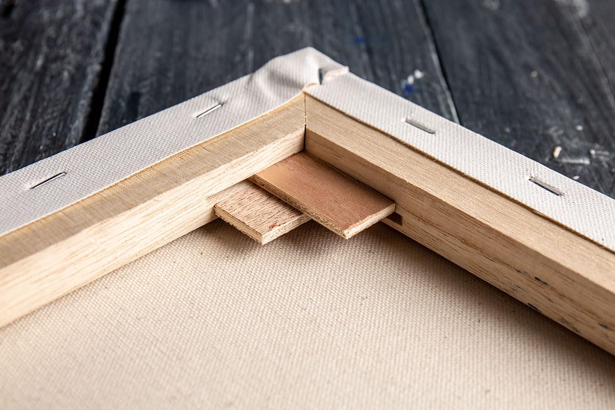
Most Indian apartment walls are either concrete or brick with plaster. The included hardware handles both: concrete anchors rated for the 3kg weight, plus D-ring hangers on the frame back for easy leveling.
Drill time: under 5 minutes if you've marked your spots. Total installation including measuring, marking, drilling, and hanging: 15-20 minutes. The frame arrives with D-rings already attached—you're not fumbling with hardware from separate packaging.
The wall holes you'll make: two 6mm anchor points, spaced according to the included template. These are smaller than the holes left behind by previous tenants' curtain brackets. When you move out, wall putty (₹50 at any hardware store), light sanding, and a dab of matching paint makes them invisible. Your ₹50,000 deposit stays intact.
If your wall has that specific hollow sound when you tap—drywall over metal studs, common in newer construction—use the included drywall anchors instead. Same hole size, different anchor type. The template works for both.
Fabric tapestries and macramé wall hangings occupy the same "large wall art" category in search results. The appeal is obvious: softer material, bohemian aesthetic, often cheaper. But the trade-offs matter for Indian homes specifically.
Fabric absorbs moisture. During monsoons (70-85% humidity in Mumbai, Chennai, coastal cities), tapestries absorb atmospheric moisture, become heavier, sag differently, and can develop that musty smell if your wall retains any dampness. Cotton canvas with moisture-resistant coating doesn't absorb—water vapor beads on the surface and evaporates.
Fabric fades faster. The dyes used in decorative tapestries aren't UV-stabilized. Afternoon sun through west-facing windows will shift colors within 6-12 months. Eco-solvent inks on canvas are formulated for outdoor signage exposure—your living room's indirect light won't touch them.
Visual presence differs fundamentally. Tapestries drape, creating soft edges and movement. That works for certain aesthetics. But this abstract's energy comes from the rigid tension of stretched canvas—the textured surface, the crisp frame edge, the way it sits flush against the wall. A tapestry version of this design would lose the dimensional quality that makes the brushwork read as intentional rather than printed.
Standing at your living room entrance, 3-4 meters from the wall: you'll register the blue-orange color contrast first, then the horizontal format anchoring the sofa below. The canvas reads as the room's focal point—intentional, not incidental.
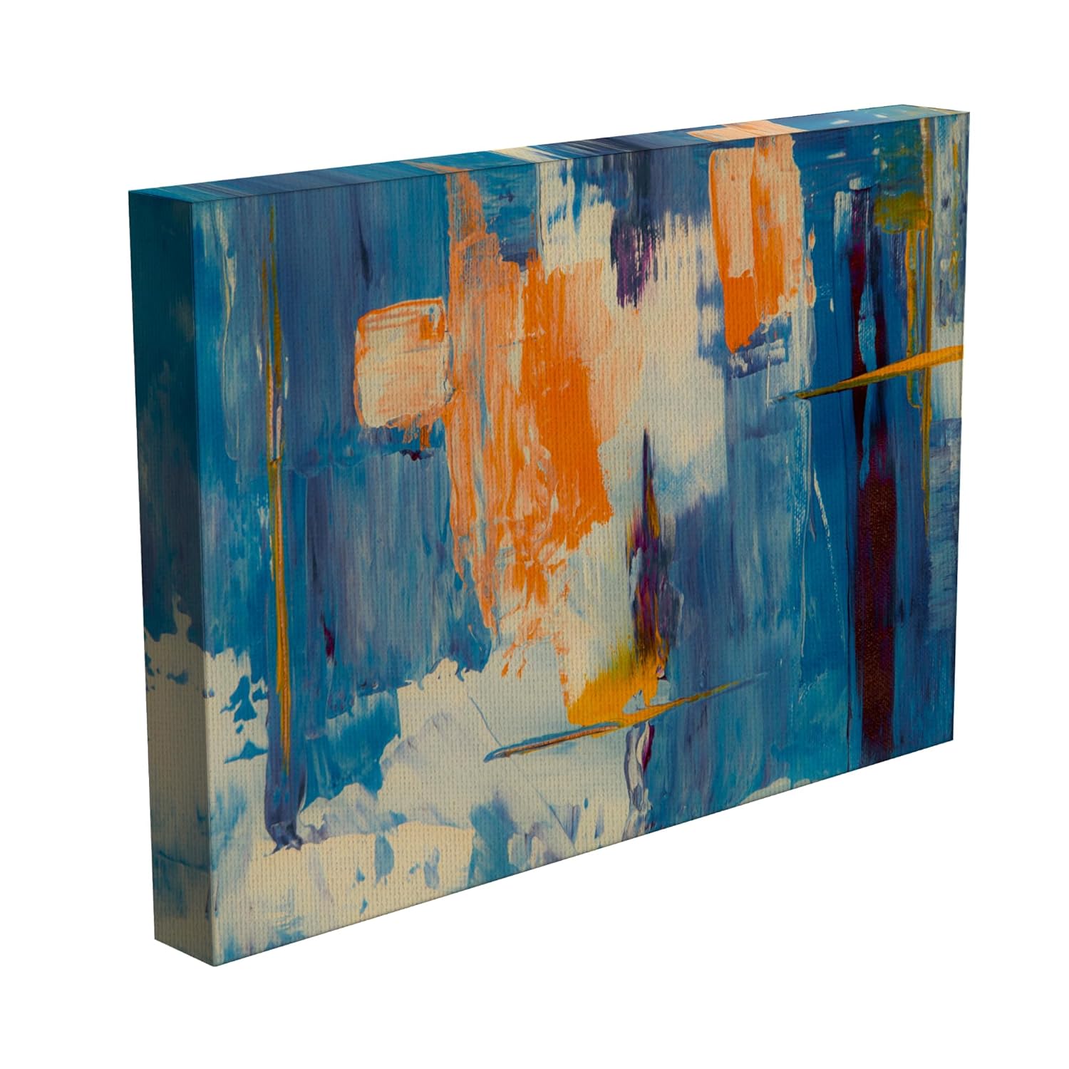
Moving closer, 1-2 meters: the brushstroke texture becomes visible. The vertical movement in the paint application creates surface interest that flat-printed canvas doesn't have. Light catches the raised areas differently throughout the day.
Sitting on the sofa directly below: the canvas is largely out of your direct sightline (which is correct—you don't want to crane your neck to see your own wall art). Guests sitting across from you see it framed above your head, which is the view that matters for impression.
Does it dominate the room? At 120x75cm, it's substantial but not overwhelming. It won't make a 12x14 foot living room feel smaller. It will make an 8x10 foot room feel more curated—if that's your space, consider whether you want the canvas to be the clear focal point (it will be) or prefer something smaller that shares attention with other decor.
Moolwan Design Note
The orange passages aren't random—they're positioned to interrupt the blue field at the visual weight points where your eye naturally travels. Left-of-center orange mass, right-edge burgundy anchor, cream passages creating breathing room between. This is compositional structure disguised as expressionist spontaneity.
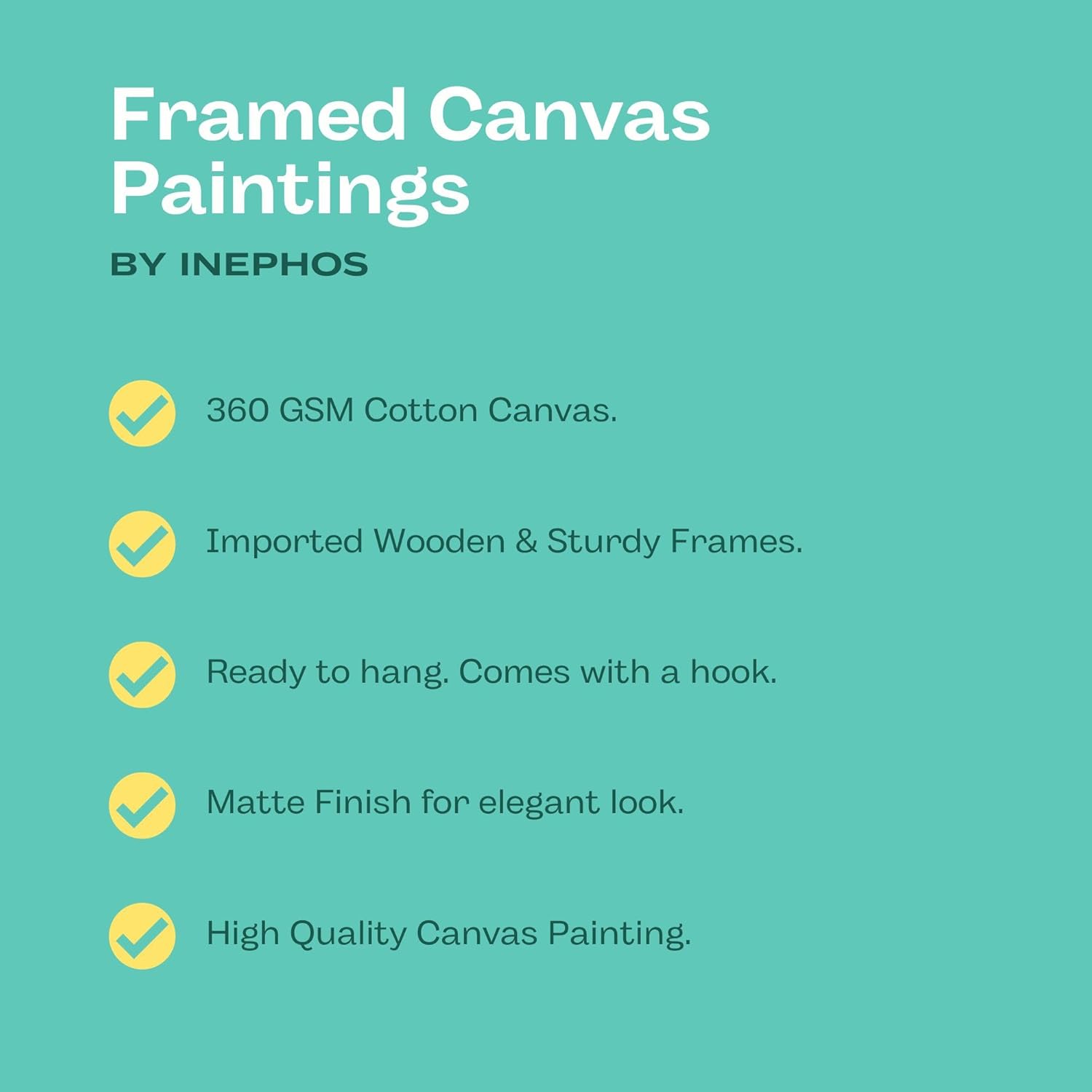
Moolwan Quality Standard
Moolwan Fit Guidance for Indian Homes
120cm width fits 10-12 foot walls above 7-8 foot sofas with proportional negative space. Hang with center at 150cm from floor, bottom edge 20-25cm above sofa back. Works with cream, off-white, and beige walls; complements brown and gray fabric sofas.
Will 120cm look proportional above my 8-foot sofa on a 10-foot wall? Yes. 120cm is 50% of an 8-foot (240cm) sofa width—within the ideal 50-75% range. On a 10-foot wall, the canvas covers 39%, leaving balanced negative space on both sides. This is the size range where art looks intentional rather than either too timid or overwhelming.
How will the blues look against my cream walls in evening lighting? Under warm LED (3000K), the blues shift slightly toward teal and the orange accents intensify. The cream passages in the painting pick up your wall color, creating cohesion rather than stark contrast. Morning natural light makes the colors cooler and more vivid; evening artificial light makes them warmer and richer.
Can I hang this in a rental without losing my deposit? Yes. Installation requires two 6mm anchor holes—smaller than standard picture hanging nails. When you move, fill with wall putty, sand smooth, touch up with paint. Total repair: ₹200 and 20 minutes. The holes are invisible after patching.
Will the colors fade if my wall gets afternoon sun? The eco-solvent inks are UV-stabilized, formulated for outdoor signage durability. Direct afternoon sun through west-facing windows won't shift the colors over normal use periods. Marketplace canvas using standard inkjet dyes would show visible fading within 6-12 months under the same conditions.
How does this handle Mumbai/Chennai monsoon humidity? The canvas has moisture-resistant polymer coating—water vapor beads on the surface rather than absorbing into fibers. The pine wood frame is kiln-dried to 12% moisture content, below equilibrium for Indian climates, so it won't absorb atmospheric moisture and warp. Through multiple monsoon cycles, canvas tension and frame geometry stay stable.