
Cart

You've measured your wall. You've saved the product image. But you still can't quite see it — not really. Will those colors actually work with your cream walls and brown sofa? Will a city scene feel too busy, too foreign, too much like a travel poster someone brought back from a trip?
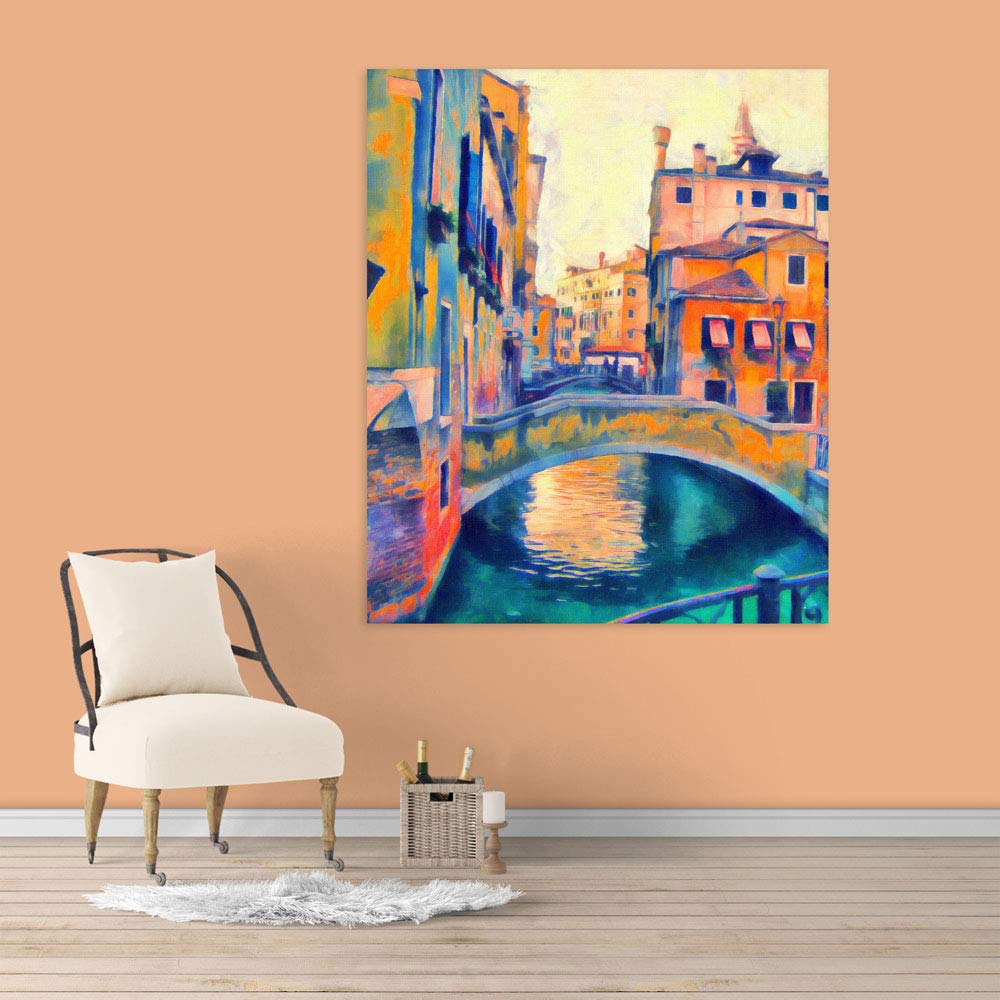
This particular Venetian canal scene resolves that uncertainty because of how its colors behave. The teal water and coral-orange buildings create a warm-cool interplay that doesn't fight neutral Indian interiors — it settles into them. The bridge anchors the composition at center, giving your eye a place to rest while the surrounding architecture and reflections add movement without chaos. From across a 12-foot living room, you register warmth and depth. Up close, the painterly brushwork reveals itself — impressionistic enough to feel like art, not a photograph.
At 91cm wide and 76cm tall, this is sized for walls above 6-7 foot sofas where you need presence without domination.
A 91cm canvas covers roughly 25-30% of a 10-foot wall — enough to register as intentional without overwhelming adjacent furniture or competing with windows. Above a standard Indian 6-foot sofa (180cm), this creates the 50% width ratio that reads as proportional from the doorway.
The vertical 76cm height works with standard 8-foot ceilings when hung 20-25cm above sofa cushions. Your eye travels naturally from seating to art without the canvas feeling cramped against the ceiling or floating disconnected from furniture.
If your sofa is 8 feet or wider, consider whether you want the canvas as a centered focal point (works at this size) or whether you'd prefer a larger piece that spans more of the furniture width. For a 240cm sofa, this 91cm canvas will feel deliberately curated rather than automatically matched — which works if you have side tables or lamps creating visual balance on either side.
Viewing distance matters: from 8-10 feet (typical living room seating-to-wall distance), the warm-cool color contrast registers clearly. The bridge reflection in the teal water becomes the natural focal point.
The dominant palette here is teal-turquoise water, coral-peach-orange buildings, and golden-yellow highlights with touches of cooler blue shadows. Against cream or off-white walls (the default in most Indian apartments), these colors create warmth without intensity.
In morning light through east-facing windows, the teals appear slightly more vivid, the coral tones soften. The painting reads as cool-leaning but balanced.
Under warm LED lighting (3000K, standard in most Indian homes), the coral and golden tones come forward. The overall impression shifts warmer. This is when the painting looks most settled — the warm artificial light and warm architectural colors harmonize, while the teal water provides relief from feeling too orange or too heavy.
If your walls are peach or light yellow (common builder choices), the coral in the painting will echo rather than contrast. This works — the painting will feel integrated rather than statement-making. If you want more contrast against peach walls, you'd want something with cooler dominant tones.
The painterly, impressionistic treatment means colors blend at the edges rather than creating hard graphic lines. This softness reads as more traditional, more approachable — your grandmother won't question whether it's "too modern."
At 400 grams, this canvas requires minimal hardware — even drywall anchors handle this weight comfortably. Concrete walls (common in older Indian buildings) need 6mm masonry bit holes, 35mm deep.
The included hanging template eliminates measurement anxiety. Tape it at your planned height (20-25cm above sofa), mark through the template, drill at the marks. Total installation time: 15 minutes including the part where you step back three times to confirm it's level.
For rentals: the 6mm anchor holes are smaller than standard picture nail holes. When you move out, fill with wall putty (₹50 at any hardware store), sand smooth, touch up with matching paint. Your landlord won't notice, and you keep your deposit.
If your wall has that specific texture common in Indian apartments (slightly rough, painted over multiple times), the D-ring mounting system keeps the canvas sitting flush. No tilting forward at the top, no uneven shadows.
Macrame has had its moment in Indian homes — the boho texture, the natural fiber aesthetic. But macrame creates visual noise. The knotted patterns compete with furniture patterns, with curtain textures, with cushion fabrics. In a living room that already has a patterned sofa or textured curtains, macrame adds another layer of complexity that makes the room feel cluttered rather than curated.
Canvas wall art — particularly a scene like this with clear composition and defined color blocks — provides visual rest. The bridge anchors the eye. The water provides horizontal calm. The buildings frame without overwhelming. Your room gains a focal point rather than another competing texture.
Macrame also collects dust in every knot and requires periodic cleaning that risks unraveling. Canvas requires only dry dusting with a microfiber cloth every few weeks.
And practically: macrame stretches and sags over time, especially in humid conditions. This canvas maintains its drum-tight tension through multiple monsoon seasons because the 340 GSM cotton is stretched over kiln-dried pinewood frames that don't warp when humidity fluctuates between 40% and 85%.
From the doorway, you'll register warmth first — the coral and golden tones read before the cooler teals. The painting announces itself without shouting. Guests notice it; they don't interrogate it.
Up close (standing in front of the sofa, for instance), the painterly texture becomes visible. This isn't a photographic print — it's an impressionistic interpretation where buildings blur slightly at edges and water reflections suggest rather than replicate. This treatment makes the art feel handmade even though it's printed, which matters for the overall impression of quality.
The cityscape subject — specifically Venice, though you don't need to identify it — reads as worldly without being pretentious. It's not a travel poster. It's not demanding you've been there. It's a beautiful scene rendered in colors that happen to work extremely well in Indian living rooms.
Solo placement works best for this piece. The composition is complete in itself. Adding gallery-wall companions on either side would compete with the internal balance of bridge, water, and buildings.
Moolwan Design Note The warm-cool color interplay in this Venetian scene was selected specifically because teal and coral work as complements without creating the high-contrast tension of pure orange-blue opposites. The bridge placement at center gives the composition a grounding point that keeps the surrounding color movement from feeling chaotic.
Moolwan Quality Standard Designed for Indian apartments and lighting conditions. Printed to resist humidity-related color fading. Quality checked before dispatch. Packed for long-distance Indian transit. Ships from West Bengal.
Moolwan Fit Guidance for Indian Homes At 91x76cm, this canvas suits walls above 6-7ft sofas in living rooms with 8-10ft ceilings. The vertical orientation and warm palette work particularly well on cream or off-white walls adjacent to wooden furniture. Hang 20-25cm above sofa cushions for proportional placement.
Will 91cm be too small for my 10-foot living room wall? At 91cm width, this canvas covers about 25-30% of a 10-foot wall — substantial enough to register as a focal point without overwhelming the space. If your sofa is 6-7 feet wide, the proportions work well. For 8-foot or wider sofas, you may want a larger size for automatic proportion matching, though this size works as a deliberately curated centerpiece with side tables or lamps providing visual balance.
How will the teal and coral colors look under my warm LED lights? Under warm LED lighting (3000K, standard in most Indian homes), the coral and golden architectural tones come forward while the teal water provides cooling balance. The overall impression is warm but not heavy. In morning daylight, the teals appear more vivid and the painting reads slightly cooler.
Can I install this in my rental apartment without losing my deposit? Yes. At 400 grams, this canvas needs only small 6mm anchor holes — smaller than standard picture nail holes. When you move out, fill with wall putty, sand smooth, and touch up with paint. Total repair: ₹200 and 20 minutes. The included hanging template ensures you drill in the right spots the first time.
Will this canvas warp during monsoon season? The 340 GSM cotton canvas is sealed with moisture-resistant coating, and the pinewood frame is kiln-dried to 12% moisture content before assembly. This means the wood won't absorb atmospheric humidity and expand during monsoons. Through multiple monsoon cycles, the canvas maintains its drum-tight tension without rippling or sagging.
Does this city scene look too "foreign" for an Indian living room? The Venetian subject is rendered in warm coral and golden tones that echo common Indian furniture woods and wall colors. The impressionistic treatment softens it from travel-poster literalness into simply a beautiful canal scene. Combined with cream walls and brown/beige sofas (typical in Indian homes), it reads as worldly-but-integrated rather than jarring or imported.