
Cart
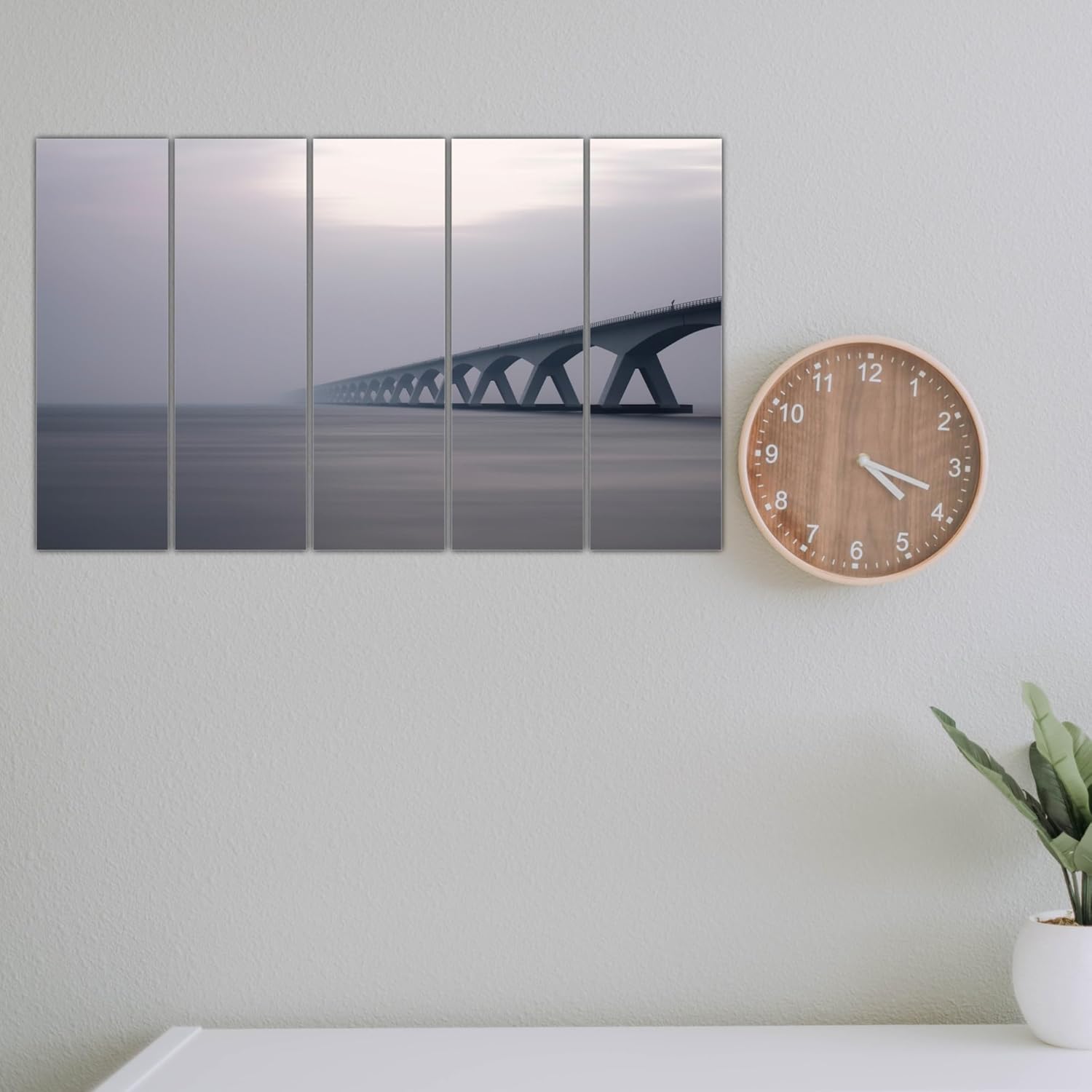
You keep opening the product page, trying to mentally place this on your wall. But it's impossible to know for sure, isn't it? 150cm looks perfect in mockups, but your living room wall has that AC vent on one side, the sofa doesn't sit flush against the wall, and the afternoon light hits from the left. You need to know this works in your specific space, not just styled photos.
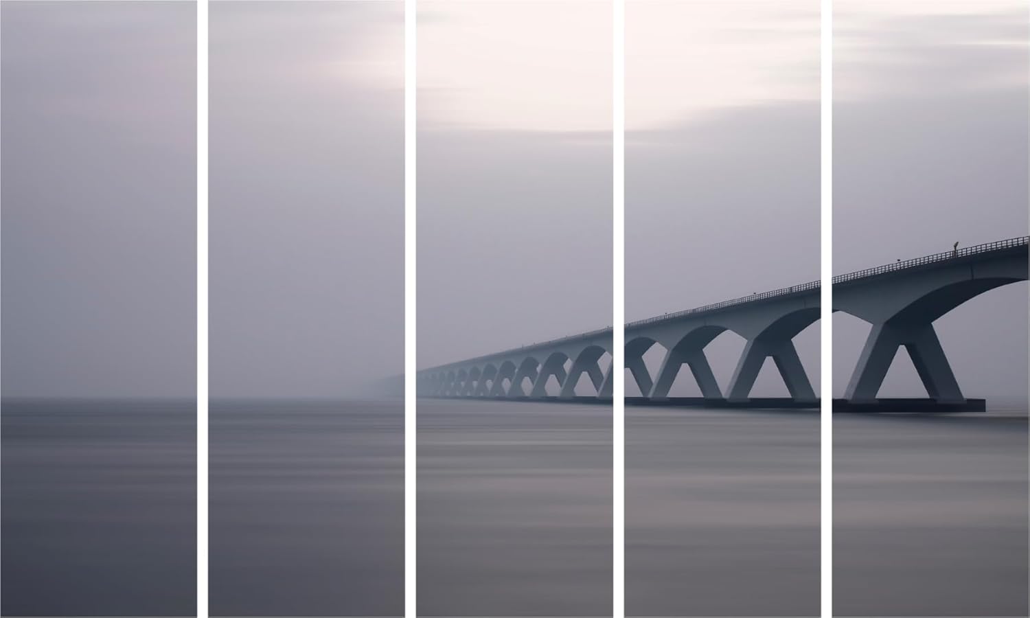
What you're looking at is a 5-panel bridge scene where architectural arches recede into atmospheric mist—the kind of composition that creates genuine depth on a flat wall. The bridge emerges from the right side and stretches into fog, which means your eye travels across all five panels naturally. At 150cm wide, this isn't trying to dominate your room. It's designed to fill a 10-12 foot wall with presence while leaving enough visual breathing room so the space doesn't feel cramped.
The color story here matters: steel gray bridge structure, lavender-gray sky, cool blue undertones in the water. These aren't warm tones that compete with brown furniture—they're the cool, neutral palette that recedes slightly, making your room feel more spacious rather than busier.
A 12-foot wall is 365cm. At 150cm wide, this bridge art covers 41% of that wall space—leaving roughly 107cm on each side. That's substantial presence without domination. Your wall still has room to breathe, and the artwork reads as intentional, not squeezed in.
If your wall is 10 feet (305cm), coverage jumps to 49%. Still balanced, but noticeably more commanding. The composition's horizontal sweep—bridge arches extending left to right—means wider walls allow the perspective depth to register properly. On a wall narrower than 10 feet, the receding mist effect starts feeling truncated rather than expansive.
Above an 8-foot sofa (240cm wide), 150cm provides 62% coverage—exactly within the 60-75% range where wall art looks anchored to the furniture below rather than floating independently.
What if you went smaller, say 120cm? You'd lose the panoramic effect. The bridge's architectural rhythm depends on visual space for those repeating arches to register. Compress it, and the fog-receding perspective becomes less dramatic, more like a cropped photo than a considered composition.
The predominant tones here—steel gray, soft lavender, cool blue-gray—sit in a temperature range that works with Indian apartment walls precisely because they don't compete with existing warm elements.
Against cream walls: The cool tones create subtle contrast without harshness. The lavender sky picks up warmth from cream while maintaining its own identity.
Against off-white walls: Maximum versatility. The grays read as sophisticated neutral, the composition becomes the focal point without color tension.
Against builder's peach: This is where cool-toned art actually helps. The blue-gray undertones balance peach's warmth, preventing your room from feeling excessively warm-toned.
With brown sofas and wooden furniture: Cool tones recede visually, which means your furniture maintains presence. This artwork complements rather than competes—it won't make your brown leather sofa look dull by comparison.
In morning light: Colors appear crisper, the mist effect more pronounced. The lavender sky reads slightly bluer.
Under warm LED lighting (3000K): Grays warm up slightly, the overall mood becomes more intimate. The mist softens further. This is when the atmospheric quality feels most immersive.
Five panels means five separate frames requiring alignment. This sounds complicated, but the visual payoff is exactly why you're considering this format—the gaps between panels create rhythm that a single-canvas image can't achieve.
Each panel is lightweight MDF with vinyl print. Total weight: 3000 grams distributed across five pieces. Individual panels weigh roughly 600 grams each—lighter than a hardcover book. Standard wall anchors handle this easily.
For concrete walls (most Indian apartments): 6mm masonry anchors, 35mm depth. The included D-ring hangers sit flush against the wall. Panel spacing matters: maintain 2-3cm gaps between panels to preserve the segmented aesthetic without making the image feel disconnected.
For drywall (newer constructions): Standard plastic anchors work. Same 2-3cm gap principle applies.
Level the first panel carefully—use a spirit level or a phone app. Once the first panel is correct, the remaining four align visually by matching the bridge's architectural lines across panels. The horizontal railing and arch curves serve as built-in alignment guides.
Installation time: 30-40 minutes for all five panels, including the inevitable step-back-and-check moments.
Rental concern: Five small anchor holes (6mm each) are easier to patch than you'd think. Wall putty, sand smooth, touch-up paint. Your landlord won't notice, and your ₹50,000 deposit stays intact.
You've probably seen bridge imagery available as adhesive wallpaper decals. At first glance, the price difference seems significant—decals run ₹800-1,500 for similar sizes. Here's what that price gap actually represents:
Dimensional presence: Vinyl on MDF creates actual depth—each panel sits 1-2cm away from your wall, casting subtle shadows. Wallpaper decals are flat. Literally flat. They're printed paper adhered to your wall. From any viewing angle other than straight-on, a decal looks like exactly what it is: a sticker.
Longevity in humidity: Wallpaper decals peel. In Mumbai's monsoons, in Chennai's coastal humidity, the adhesive loosens. Edges lift. Corners curl. Within 8-12 months, you're dealing with a partially detached decal that looks worse than a blank wall. MDF panels don't rely on adhesive—they hang from anchors, unaffected by humidity cycles.
Removability without damage: Decals claim "easy removal," but removing them from Indian apartment paint (often builder-grade latex) pulls paint with it. MDF panels leave five small anchor holes. One is patchable in 10 minutes. The other requires wall repainting.
Visual sophistication: The panel gaps in this 5-panel format create intentional segmentation. It reads as considered design, not "I printed a bridge photo and stuck it on my wall."
From your living room doorway—the viewing distance that matters most for first impressions—the 5-panel bridge creates horizontal movement across your wall. The architectural arches draw the eye from right to left, following the bridge's receding perspective into mist. This isn't static art that you glance at and forget; the composition has visual momentum.
Up close (standing near the sofa), the atmospheric detail becomes apparent: the soft gradation of the misty sky, the subtle texture in the water's surface, the precision of the architectural railings. The vinyl print holds sharpness at viewing distances down to 2-3 feet.
Does it dominate the room? No. The cool, muted palette ensures this artwork recedes slightly rather than demanding attention. It anchors your seating area without overwhelming furniture, without clashing with existing decor. If you have colorful cushions, bright curtains, or a statement coffee table, this bridge scene provides neutral backdrop presence.
Works best alone: This composition is complete. Adding adjacent wall decor—clocks, smaller frames, floating shelves—creates competition rather than complement. Let it occupy its wall space unaccompanied.
Moolwan Design Note The bridge's receding perspective into fog creates genuine depth illusion on a flat wall—each of the five panels carries a portion of the architectural rhythm, making the inter-panel gaps part of the visual experience rather than interruption.
Moolwan Quality Standard Designed for Indian apartments and lighting conditions. Packed for long-distance Indian transit. Quality checked before dispatch. Ships from West Bengal.
Moolwan Fit Guidance for Indian Homes 150cm width provides optimal coverage for 10-12ft walls above 8ft sofas. The cool gray palette complements cream and off-white walls without competing with warm-toned furniture.
Will 150cm look proportional above my 8-foot sofa, or will it seem too wide? At 150cm, you're covering 62% of an 8-foot (240cm) sofa's width. This falls within the 60-75% range where wall art looks anchored rather than floating or overwhelming. The horizontal bridge composition actually benefits from width—it allows the receding perspective effect to develop across all five panels.
How will these gray tones look against my cream walls under warm LED lights? Cool grays warm up slightly under 3000K LEDs—the lavender sky takes on a subtle mauve quality, and the overall mood becomes more intimate without losing the atmospheric mist effect. Against cream walls, the contrast remains gentle rather than stark.
Can I install five panels myself without professional help? Yes. Each panel weighs roughly 600 grams. Use a spirit level for the first panel, then align subsequent panels by matching the bridge's horizontal railing lines. The architectural elements serve as built-in guides. Allow 30-40 minutes for complete installation.
Will this vinyl print withstand Mumbai's monsoon humidity? Splash-proof vinyl on MDF doesn't absorb atmospheric moisture the way canvas does. The panels won't warp, the print won't ripple. The MDF core remains dimensionally stable through humidity cycles, unlike wood-framed canvas that expands and contracts seasonally.
How much gap should I leave between panels? 2-3cm gaps maintain the segmented aesthetic while keeping the bridge image visually connected. Too narrow (under 1cm) and the panels look cramped; too wide (over 4cm) and the composition fragments.