
Cart

You've pictured something there dozens of times. You've scrolled through hundreds of options. But every time you try to imagine how a specific piece will actually look on that cream wall, above your brown sofa, in your actual lighting — the mental image goes fuzzy. The product photo shows it on a perfect white wall with perfect lighting. Your wall isn't that. Your room isn't that. And you can't quite see it.
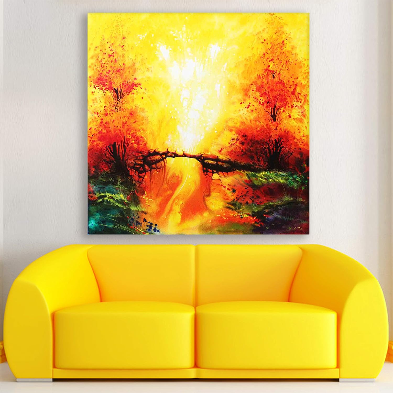
This 91x76cm canvas makes that visualization easier because the colors already exist in most Indian living rooms. The dominant golden-yellow and burnt orange tones are the same warmth that afternoon sunlight creates on cream walls. The deep forest green and teal at the bottom edge echo the tones in wooden furniture and indoor plants. The abstract autumn bridge composition — two trees flanking a rustic wooden bridge over a flowing golden path, with a luminous white-gold burst at center — creates a focal point that draws the eye without demanding constant attention.
The visual tension here is specific: explosive upward energy (the scattered orange and red at the top) contained by the horizontal bridge structure at center. It's dynamic enough to fill an empty wall with presence, grounded enough to not overwhelm the room.
For a standard 6-foot sofa (180cm), this 91cm canvas covers approximately 50% of the sofa width — slightly under the ideal 60-75% range but appropriate for rooms where the sofa has side tables or floor lamps creating additional visual weight.
For a 7-foot sofa (210cm), the 91cm width hits 43% — better suited as part of a pairing or for walls where the canvas sits slightly off-center to accommodate a reading lamp or side table.
Viewing distance matters here: from 3 meters (typical Indian living room depth from sofa to opposite wall), the luminous central burst reads as a clear focal point. The scattered autumn foliage detail becomes appreciable at 1.5-2 meters — when guests approach to look closer.
The near-square format (91x76cm) works above sofas where a strongly horizontal piece might look stretched, and in hallways where vertical formats can feel too narrow for the wall expanse.
Installation height: 20-25cm above sofa cushion top. This places the bridge element roughly at seated eye level, with the luminous burst drawing the gaze slightly upward.
The dominant palette — golden yellow, burnt orange, deep red, forest green, teal — behaves differently across lighting conditions:
Morning light (east-facing rooms): The golden center intensifies. The reds appear more vivid. The green and teal base provides grounding contrast. This is when the painting looks most energetic.
Afternoon light (west-facing rooms): Everything warms further. The orange dominates. The luminous center can appear almost white-hot. If your wall gets direct afternoon sun, the UV-resistant inks maintain these tones without fading to washed-out pastels.
Evening LED (warm white 3000K): The golden tones feel cohesive with typical Indian home lighting. The reds deepen slightly. The teal accents become more visible against the warm surroundings. This is when most guests see your walls.
Against cream or off-white walls (standard in most Indian apartments), this warm palette creates natural harmony rather than contrast. The painting extends the wall's warmth rather than fighting it.
With brown or beige sofas, the burnt orange and deep red create visual connection without matching. The forest green base echoes any indoor plants in the room.
The 400g weight makes this one of the lighter canvas options — well within the safe range for both concrete anchors and drywall anchors.
For concrete walls (older buildings, most Indian construction): Use the included concrete anchors. 6mm masonry bit, 35mm deep holes. The near-square format means two anchor points create stable, level hanging.
For drywall (modern apartments, false ceiling areas): Use the included plastic wall anchors. 6mm bit, 30mm deep. Same two-point hanging.
For rentals: The 6mm holes required are smaller than standard picture frame nail holes. When you move out, fill with wall putty, sand smooth, touch up with paint matching your wall. Your landlord won't notice. Your deposit is safe.
The included hanging template eliminates the "drill in wrong spot" anxiety. Tape paper to wall, mark through template, remove, drill. No measuring, no second-guessing.
Total installation time: 15 minutes including the three times you'll step back to check if it's level.
Fabric tapestries seem like an easier choice — no drilling, just hang from a rod or clips. But here's what happens in practice:
Fabric absorbs humidity. During monsoons, the fabric expands. When humidity drops, it contracts. After two cycles, you'll see permanent rippling, especially at the edges. The colors embedded in fabric fibers fade faster than surface-printed canvas because the fibers themselves degrade.
Fabric collects dust differently. The weave traps particles inside, not just on the surface. You can't wipe it clean — you need to wash it, which risks color bleeding and shape distortion.
Fabric lacks structural tension. It drapes. It sways with air movement. It never looks truly flat on a wall. That casual, bohemian look works in certain aesthetics, but it doesn't create the visual anchor that a properly stretched canvas provides.
This 91x76cm canvas sits drum-tight on its pine wood frame. The moisture-resistant coating means monsoon humidity beads up and evaporates rather than soaking into fibers. Dust wipes away with a dry microfiber cloth. The colors remain consistent because eco-solvent inks are chemically stable against UV and humidity fluctuation.
The price difference between quality canvas and fabric tapestry often isn't significant. The durability difference is.
From the doorway, the luminous central burst draws immediate attention. The warm palette registers as "something golden" before you consciously identify the bridge and trees. This is intentional — abstract landscapes work as both immediate visual impact and detailed composition reward.
Up close, the scattered autumn foliage becomes visible. The bridge texture reveals itself. The teal and green accents at the bottom edge add depth. Guests who approach will find more to look at than they expected from across the room.
The near-square format means this piece holds its own as a solo statement. It doesn't need flanking art or decorative objects to feel complete. But if you have existing shelving or a console table below the sofa wall, the horizontal bridge element creates visual dialogue with those horizontal surfaces.
This isn't the kind of art that demands you look at it every time you enter the room. It's the kind that makes the room feel finished — like someone with intention lives here, not someone still deciding what to put on the walls.
Moolwan Design Note The central luminous burst is compositionally unusual — most landscape art places light sources at edges or behind subjects. Here, the light erupts from the center while the bridge grounds the eye at midpoint. This creates a painting that reads as both energetic and stable, avoiding the common trap of abstract warmth feeling chaotic.
Moolwan Quality Standard Designed for Indian apartments and lighting conditions. Packed for long-distance Indian transit with corner protectors and double-layer wrap. Quality checked before dispatch — print consistency, canvas tension, frame squareness. Printed to resist humidity-related color fading through monsoon seasons. Ships from West Bengal.
Moolwan Fit Guidance for Indian Homes 91x76cm works above 6-7ft sofas in standard Indian living rooms with 8-10ft ceilings. The warm golden-orange palette complements cream walls and brown/beige furniture without requiring color coordination. Near-square format suits walls where strongly horizontal art would appear stretched.
Will 91x76cm look too small above my 8-foot sofa? At 91cm width, this canvas covers about 38% of an 8-foot (240cm) sofa — below the ideal 60-75% range. For 8-foot sofas, consider pairing with a complementary piece or selecting this for a hallway or bedroom wall where the proportions suit better. For 6-7ft sofas, 91cm provides balanced coverage.
How will the golden-orange colors look against my cream walls in evening lighting? Under warm white LED (3000K, standard in most Indian homes), the golden tones integrate naturally with cream walls rather than creating stark contrast. The palette extends your wall's existing warmth. The deeper reds and teals provide accent without clashing.
Can I hang this without drilling if I'm in a rental? At 400g, this canvas is light enough for heavy-duty adhesive strips rated for 3-5kg. However, for long-term stability (especially during humidity changes that can weaken adhesive), the included wall anchors with 6mm holes provide more reliable hanging. The holes are easily patchable when you move out.
Will the colors fade if my wall gets afternoon sun? The eco-solvent inks used in printing are UV-resistant — the same ink chemistry used for outdoor signage. Direct afternoon sun for 3-4 hours daily won't cause noticeable fading over typical ownership periods. Cheap dye-based inks fade within 6-12 months under the same conditions.
How do I clean dust off the canvas surface? Dry microfiber cloth every 2-3 weeks. The moisture-resistant coating means dust sits on the surface rather than embedding in the weave — it wipes away cleanly. Don't use water, cleaning chemicals, or furniture polish.