
Cart

You keep opening the product page, trying to mentally place this on your living room wall. But it's impossible to know for sure, isn't it? 91x61cm looks balanced in the mockup, but your wall has that AC vent on one side, the switchboard cluster, maybe a window throwing afternoon light. You need to know this works in your specific space—not just in styled photos with perfect blank walls and furniture you don't own.
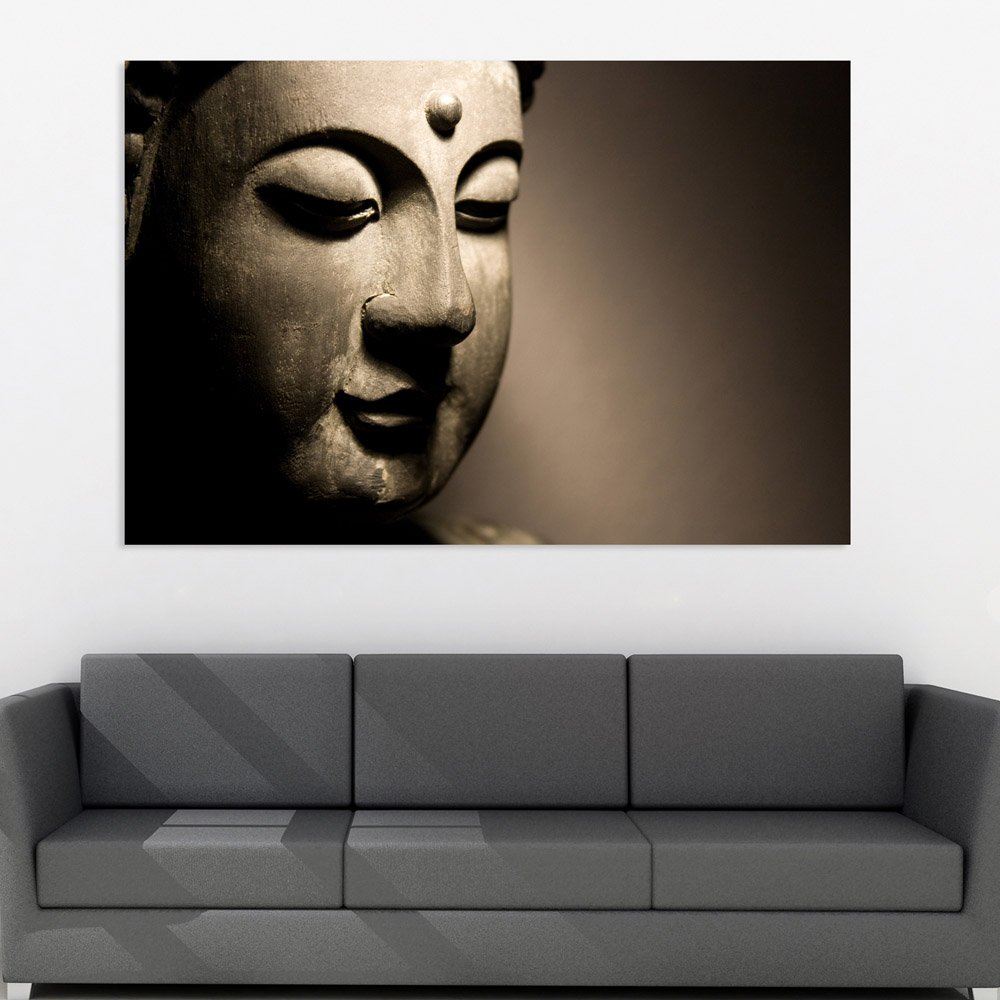
Here's what you're actually looking at: a Buddha face canvas where the composition does something unusual. The face occupies roughly 60% of the frame, weighted to the left, with the right third fading into a soft bronze-to-cream gradient. This asymmetry matters because it creates visual direction—your eye enters from the left, rests on the closed eyes and serene expression, then drifts into the quieter gradient. On a 10-foot wall above a 6-foot sofa, that gradient side can absorb visual clutter from adjacent switchboards or furniture edges without competing.
The sepia bronze palette isn't accidental. Against cream or off-white walls (which most Indian apartments have), bronze reads as warm and grounded, not jarring. Against light yellow or builder's peach walls, it complements rather than clashes. If your sofa is brown or beige fabric—which most Indian sofas are—this canvas will look like someone intentionally chose it to coordinate, not like a random purchase that happens to be on the wall.
Your wall is probably 10-12 feet wide. At 91cm (roughly 3 feet), this canvas covers about 25-30% of a 10-foot wall. That leaves approximately 60cm of wall space on each side if centered—enough breathing room that it doesn't look cramped, but enough presence that it doesn't look timid.
If you're hanging above a 6-foot sofa (180cm), the 91cm width equals 50% of the sofa width. This sits comfortably within the 60-75% range that looks proportional. The canvas won't overwhelm a smaller sofa, and it won't look undersized above a standard 3-seater.
What if you went smaller, say 75cm? The coverage drops to about 20% of a 10-foot wall. For a meditation corner or bedroom, that might work. But above a 6-foot living room sofa, 75cm can look like you were hesitant—like you bought something safe instead of intentional. What if you went larger, say 120cm? That's 33% coverage, which works above an 8-foot sectional but might feel dominant above a standard sofa. The 91cm size is the middle ground where you get visual presence without the risk of overwhelming the furniture.
Height at 61cm works for standard 8-foot ceilings. With the recommended 20-25cm gap above the sofa top, the canvas center sits at comfortable eye level for someone standing at the doorway—where first impressions happen.
The bronze-to-cream gradient in this canvas wasn't chosen for aesthetics alone. In morning light through east-facing windows, the sepia tones warm up slightly, and the Buddha's face gains subtle depth—the sculptural details in the eyes and lips become more defined. In afternoon light, especially if your room faces west, the gradient side will catch light and soften further, making the composition feel less heavy.
Under warm LED lighting (3000K, which most Indian homes have), the bronze deepens slightly. The overall effect is cohesive with wooden coffee tables, teak TV units, and the brown/beige fabric sofas common in Indian living rooms. If you have a pooja shelf in the same room, the spiritual subject and warm palette won't conflict—unlike cool-toned abstracts or high-contrast black-and-white photography that can feel disconnected from traditional elements.
What won't happen: the bronze won't look orange or overly saturated. The sepia treatment keeps it muted. Against cream walls, it reads as intentional and grounded. Against light grey walls (less common but present in newer apartments), it adds warmth without clashing.
If you're in an older building with concrete walls, you'll need a 6mm masonry bit and the concrete anchors included with the canvas. Drill 35mm deep, tap in the anchor, screw in the hook. Total time: 15 minutes if you've never done this before.
If you're in a newer building with drywall or plasterboard, use the plastic wall anchors instead. Same 6mm holes, but shallower (30mm). The D-ring hangers on the back distribute the canvas weight evenly—at 400 grams, this canvas is light enough that even basic drywall anchors will hold securely.
For rentals: the holes you'll make are 6mm diameter. That's smaller than standard picture frame nail holes. When you move out, fill with wall putty (₹50 at any hardware store), sand smooth, touch up with a dab of matching paint. Your landlord won't notice, and your ₹50,000 deposit stays intact.
The included hanging template eliminates guesswork. Tape it to the wall at your chosen height, mark the drill points, remove the template, drill. No measuring twice and still getting it wrong.
You've probably seen macrame wall hangings in similar price ranges—woven cotton cord, maybe with some wooden beads, that boho texture that photographs well on Instagram. Here's the honest comparison.
Macrame collects dust. The woven fibers trap particles, and you can't wipe them clean—you have to shake them out or use a lint roller regularly. During monsoons, cotton macrame absorbs humidity. In Mumbai's 80% humidity, you'll notice it starting to smell musty after one season. In Chennai's heat plus humidity, mold can develop in the cord fibers within two monsoon cycles.
This canvas has a moisture-resistant polymer coating. Dust sits on the surface and wipes away with a dry cloth. Humidity doesn't penetrate the sealed canvas fibers. Three monsoons from now, it will look the same as the day you hung it.
Visual presence is different too. Macrame has textural interest but rarely creates a focal point—it's background décor that fills space. This Buddha canvas has a compositional center that draws the eye. Guests notice it. It makes a statement rather than filling a gap.
Macrame also sags over time. The weight of the cotton cord pulls at the hanging points, and the bottom edge gradually drops lower. Canvas stretched over a kiln-dried pinewood frame stays drum-tight. The tension doesn't change with humidity or age.
From the doorway—where your mother-in-law will first see it when she visits—the Buddha face reads as serene and intentional. The left-weighted composition creates visual interest without feeling unbalanced. The bronze tones integrate with typical Indian furniture colors. It doesn't scream "I bought trendy wall art." It says "someone with taste lives here."
Up close, within 2-3 feet, the sculptural details become apparent. The closed eyes, the subtle smile, the texture suggesting aged bronze rather than flat digital printing. This is when quality shows—cheap marketplace canvas looks pixelated at close viewing distance, with visible ink dots. This canvas uses eco-solvent inks at resolution high enough that details remain smooth even up close.
As a solo piece above a sofa or in a meditation corner, it works. The gradient fade on the right means it doesn't need balancing décor—the composition is already resolved. If you have a floor lamp next to your sofa, the lamp can sit on the gradient side without visual competition. If you have a small pooja shelf in the same room, the spiritual subject creates thematic connection without requiring identical styling.
Moolwan Design Note This Buddha composition uses an asymmetric half-face treatment with intentional leftward weight—the face occupies the active zone while the gradient fade allows adjacent room elements (switchboards, lamps, furniture edges) to exist without visual conflict. The bronze sepia treatment reads as aged sculptural bronze, not flat digital printing.
Moolwan Quality Standard Designed for Indian apartments and lighting conditions. Printed to resist humidity-related color fading. Packed for long-distance Indian transit. Quality checked before dispatch. Ships from West Bengal.
Moolwan Fit Guidance for Indian Homes At 91cm width, this canvas fits the 60-75% sizing rule above 6-foot sofas. The 61cm height works with standard 8-foot ceilings when hung 20-25cm above sofa back. Bronze tones complement cream walls and brown furniture common in Indian living rooms.
Will 91cm look proportional above my 6-foot sofa? At 91cm width, this canvas equals 50% of a 6-foot (180cm) sofa width—within the 60-75% range that looks balanced. It won't appear oversized or undersized. The asymmetric composition also means it doesn't require exact centering to look intentional.
How will the bronze tones look against my cream walls under LED lights? Under warm LED lighting (3000K), bronze sepia tones deepen slightly and integrate naturally with cream or off-white walls. The effect is cohesive with wooden furniture and brown/beige sofas. The gradient fade on the right side softens under any lighting, preventing harsh edges.
Can I install this in a rental without losing my deposit? The installation requires 2-3 small holes (6mm diameter, 35mm deep). These are smaller than standard picture frame nails. When you move out, fill with wall putty, sand smooth, and touch up with paint. Total repair cost: under ₹200. Your deposit stays intact.
Will the colors fade during monsoon season? The canvas has a moisture-resistant polymer coating that prevents humidity absorption. The eco-solvent inks are UV-stable and tested for color consistency in 70-85% humidity conditions. After multiple monsoon seasons, the bronze tones will look the same as day one.
Is 91x61cm too large for a bedroom? For bedrooms with 10-foot walls, 91x61cm works well above a queen bed (typically 150-160cm wide). The canvas width at 91cm equals about 60% of bed width—visually balanced. For smaller bedrooms or meditation corners, consider whether the wall can accommodate 91cm plus 50-60cm breathing room on each side.