
Cart

You've measured your wall three times. Maybe four. The tape measure says 10 feet, but you're still not confident because every canvas you've considered either looks too small in photos or might overwhelm the space once it's actually up. Every guide says something different, and none of them account for Indian living room proportions—the 8-foot ceiling, the brown fabric sofa, the cream walls that every builder seems to use. You keep second-guessing: is 91cm actually right for above the sofa, or will it look undersized from across the room?
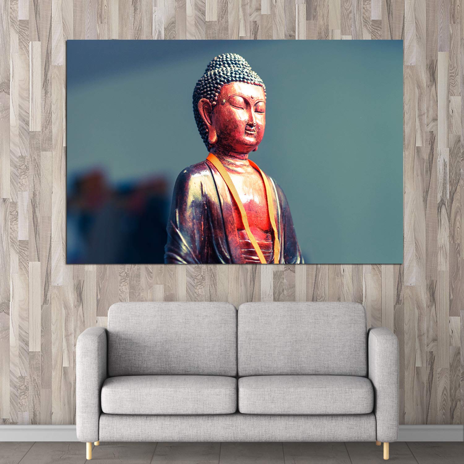
This Buddha Bliss canvas at 91cm width hits a specific visual target: large enough to anchor the wall above a 6-foot sofa without competing with the furniture below it. The composition—a close-up bust of Buddha in copper-bronze patina against a deep teal-blue background—draws the eye to the serene expression rather than spreading attention across multiple elements. That single focal point means the canvas reads as intentional, not decorative filler.
The color story matters here. The warm copper and rust tones of the Buddha figure pick up the browns in typical Indian wooden furniture—your coffee table, TV unit, side tables. The teal background doesn't fight cream walls; it creates contrast without clashing. The golden-yellow sash running diagonally adds just enough warmth to prevent the piece from feeling cold in evening LED light.
On a 10-foot (300cm) wall, this 91cm canvas occupies roughly 30% of the width. That leaves about 104cm of wall space on either side—enough breathing room that the canvas looks placed, not crammed. If your sofa is 6 feet (180cm), you're at 50% of sofa width, which sits at the lower end of the 60-75% sizing rule. This works for Buddha art specifically because the subject carries visual weight—the detailed metallic textures and close-up composition make it feel substantial even at moderate dimensions.
If your wall is 12 feet (360cm), you're looking at 25% coverage. Still works as an anchor piece, though you might consider flanking it with smaller complementary items later.
Going larger (120cm) would push coverage to 40% on a 10-foot wall. That's still proportional, but the Buddha's face would dominate more aggressively. For meditation corners or bedrooms where you want the presence felt strongly, that works. For living rooms where the canvas shares visual attention with TV, furniture, and windows, 91cm keeps things balanced.
Viewing distance matters: from across a 12x14 foot living room (about 3-4 meters), the Buddha's expression remains readable. The copper-bronze patina details—the textured hair curls, the oxidized sheen on the robe folds—become visible as you approach. That layered reveal is part of what makes quality canvas engaging rather than flat.
The teal-blue background shifts tone depending on light. In morning daylight (especially if your wall faces east or north), it appears cooler, almost gray-blue. The copper Buddha figure stays warm, creating strong contrast. This is when the metallic textures pop most dramatically.
Under warm LED lighting (3000K, which most Indian homes use), the teal warms slightly toward petrol blue. The copper deepens to a richer bronze. The overall mood becomes more meditative, less crisp. If your living room has both natural and artificial light sources, you'll notice this shift between afternoon and evening—it's not a flaw, it's how quality inks interact with different color temperatures.
Against cream or off-white walls (standard in most Indian apartments), the teal creates a pocket of depth without overwhelming the room. Against builder's peach or light yellow walls, you may notice slight color interaction—peach walls can make teal appear slightly greener. If your walls are warm-toned, this actually works in your favor, as it enhances the golden accents in the Buddha's sash.
The matte finish specified for this canvas prevents glare. If your wall catches afternoon sun directly, you won't see a white rectangle reflecting back at you. The colors stay readable from any angle in the room.
Most Indian apartment walls are either concrete (older buildings, most tier-2 cities) or brick with plaster. Both require the same approach: 6mm masonry bit, 35mm deep holes, concrete anchors. At 400 grams, this canvas is lighter than most 90cm pieces—the included D-ring hangers and anchors will hold without strain.
If you're in a newer building with drywall partition walls (common in Gurgaon, some Mumbai high-rises), use the plastic anchors instead. Tap the wall first—hollow sound means drywall, solid thud means concrete or brick.
For rentals: the two anchor holes you'll drill are 6mm diameter. When you move out, fill with wall putty (₹50 at any hardware store), sand smooth, dab of matching paint. Your landlord won't notice. This is smaller than the holes left by curtain rod brackets.
The hanging template included means you won't mismeasure. Tape the paper template to the wall at your chosen height (20-25cm above sofa top edge), mark through the pre-printed holes, remove template, drill. Total time: 15-20 minutes including the part where you stand back three times to check if it's level.
You've seen macrame wall hangings at similar price points. The boho aesthetic is trending. But here's the practical difference for Indian homes:
Macrame collects dust. The woven texture traps particulates, and in Indian cities with construction dust and pollution, you'll notice graying within 3-4 months. Cleaning macrame means removing it from the wall, soaking, drying flat—a weekend project you'll keep postponing until it looks dingy enough to bother you daily.
Canvas wipes clean with a dry microfiber cloth in 30 seconds. The moisture-resistant coating means dust sits on the surface rather than embedding in fibers.
Macrame provides texture but limited color control. You're typically choosing between beige, cream, and off-white—variations on the same neutral. This Buddha canvas delivers specific colors: the teal-copper combination creates visual interest that macrame can't replicate. For living rooms that already have brown furniture and cream walls, macrame adds texture without color relief. Canvas breaks the neutral monotony.
Macrame also lacks the defined edges that create visual structure. It reads as soft, organic, casual. The framed canvas reads as intentional, composed, considered. In a space where you want guests to notice curated taste rather than casual decoration, that distinction matters.
From the doorway, you'll notice the Buddha first—the copper-bronze figure against teal creates enough contrast to draw attention from 3-4 meters away. The serene expression reads clearly at that distance. This is the "pause and notice" effect you want from statement art.
As you move closer (sitting on the sofa, walking past), the texture details emerge. The stippled pattern of the Buddha's hair curls. The oxidized streaks on the robe folds. The soft bokeh blur in the background that suggests depth without distraction. These layers reward closer viewing without being invisible from across the room.
The piece doesn't dominate—it anchors. At 91x61cm with matte earthy tones, it creates a focal point without competing with your TV, your windows, or your furniture arrangement. When your mother-in-law visits, she'll see a Buddha painting that "suits the house"—familiar spiritual subject, colors that work with existing furniture, proportions that look considered rather than random.
If you have a dedicated meditation or yoga corner, this works there too—though you might hang it lower (eye level when seated) rather than the standard 20-25cm above furniture height.
Moolwan Design Note
The close-up bust composition places Buddha's expression at viewer eye level when hung above a sofa—the serene downcast eyes create a meditative anchor point rather than direct confrontation. The diagonal golden sash breaks the vertical symmetry just enough to create visual movement without disrupting calm.
Moolwan Quality Standard
Designed for Indian apartments and lighting conditions. Packed for long-distance Indian transit. Quality checked before dispatch. Printed to resist humidity-related color fading. Ships from West Bengal.
Moolwan Fit Guidance for Indian Homes
91cm width works above 6-7 foot sofas on 10-12 foot walls—covers 25-30% of wall width for balanced placement. The copper-bronze tones complement wooden furniture; the teal background creates contrast against cream walls without clashing.
Will 91cm look too small above my 8-foot sofa? At 91cm, you're at about 38% of an 8-foot (240cm) sofa's width—slightly below the ideal 50-75% range. It will look intentional but not dominant. If your wall is 10 feet wide, the canvas still anchors the space effectively. For an 8-foot sofa, 120cm would fill more proportionally if you want stronger visual presence.
How will the teal background look against my cream walls? Teal and cream create clean contrast without clashing. The teal won't appear jarring—it reads as a pocket of color depth that makes the copper Buddha figure stand out. If your walls are warm-toned (peach or yellow), the teal may shift slightly greener, which actually enhances the warm metallic accents.
Can I hang this in a bathroom or high-humidity area? The moisture-resistant coating handles normal Indian monsoon humidity (70-85%) in living areas. Direct bathroom steam exposure isn't recommended—any canvas will eventually degrade with constant moisture contact. For bathrooms, vinyl prints on MDF are more suitable.
Will the colors fade if my wall gets afternoon sun? The eco-solvent UV-resistant inks are designed for direct sunlight exposure. Walls that receive 3-4 hours of afternoon sun won't cause fading. You'll notice color consistency two years from now that cheap marketplace canvas can't match.
How do I clean dust off the canvas? Dry microfiber cloth, light pressure, every 2-3 weeks. The moisture-resistant coating prevents dust from embedding in the weave—it sits on the surface and wipes away cleanly. Don't use water or cleaning chemicals.