
Cart


You keep opening this page, trying to mentally place this on your living room wall. But it's impossible to know for sure, isn't it? 84cm looks substantial in the product photo, but your wall has that AC vent to the left, the switch board below, and afternoon light that streams in differently than any mockup. You need to know this works in your specific space—not just in a styled photograph someone created in a graphics studio.
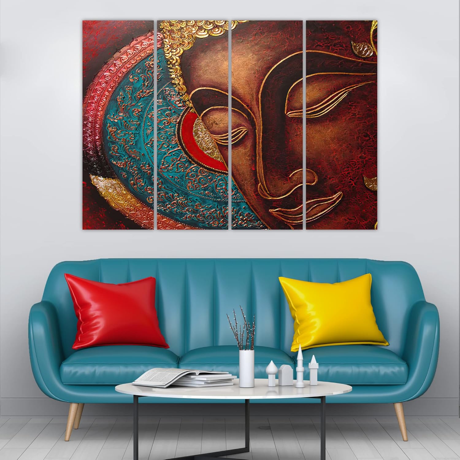
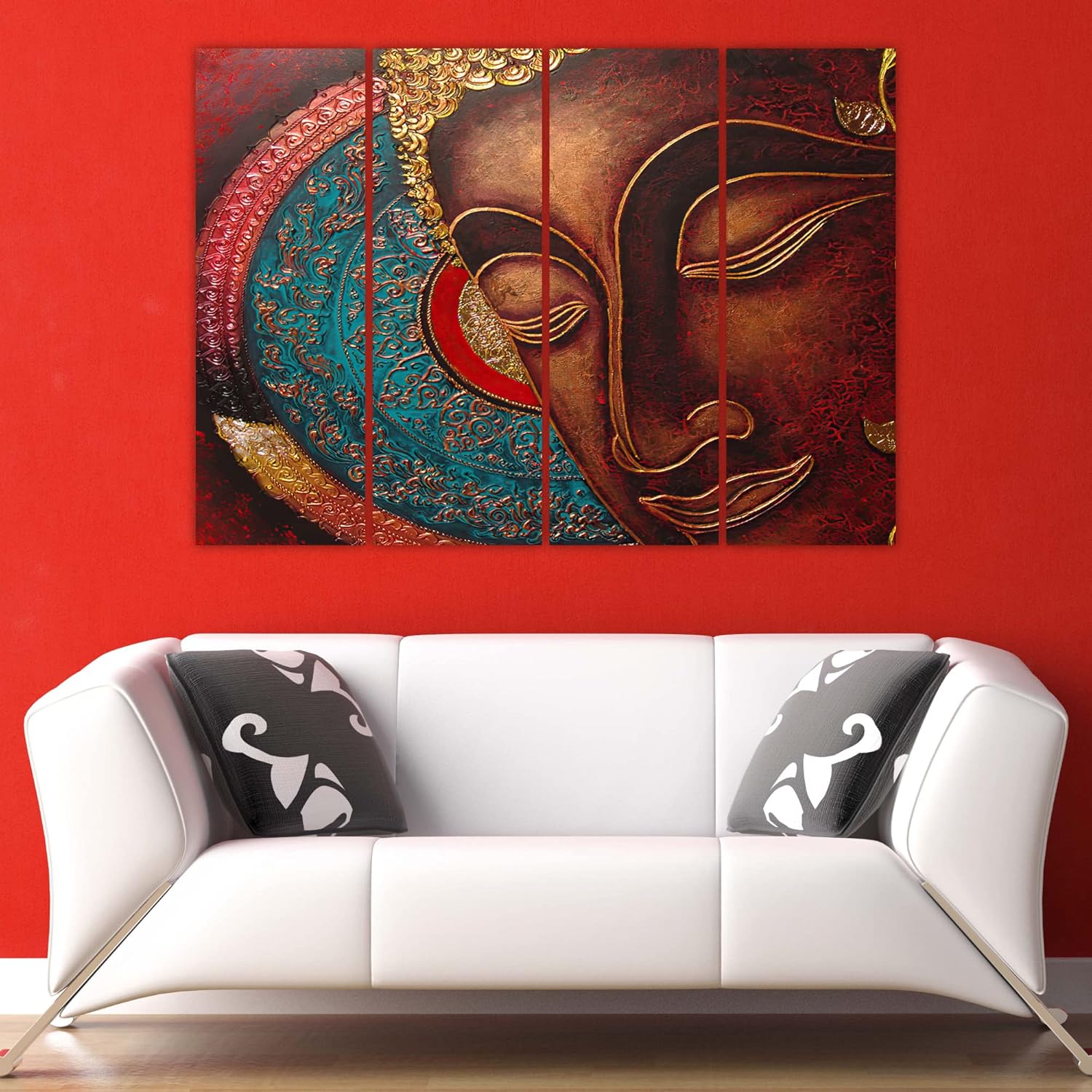
Here's what the image tells you that mockups cannot: this is a close-up Buddha face, not a full figure. The composition fills the entire 84cm span with just the face in profile—eyes closed, expression serene, ornate headdress detail spilling across the left panels. The teal scrollwork against the maroon textured background creates visual depth you'd normally associate with hand-painted temple art, except this is vinyl on MDF, designed to survive your bathroom's humidity spillover or the kitchen-adjacent wall where steam travels.
For an 84cm wide piece on a standard 10-foot wall (300cm), you're looking at 28% horizontal coverage. That leaves roughly 108cm of breathing room on each side—enough that this doesn't feel cramped, but substantial enough that it anchors the wall rather than floating on it.
The more relevant calculation: if your sofa is 6 feet (180cm), this 84cm piece sits at 46% of sofa width. That's within the 50-75% range where wall art feels proportional to furniture below it. If you go smaller—say 60cm—you drop to 33% and it starts looking like an afterthought. If you go larger—120cm—you hit 66%, which works but requires more visual confidence.
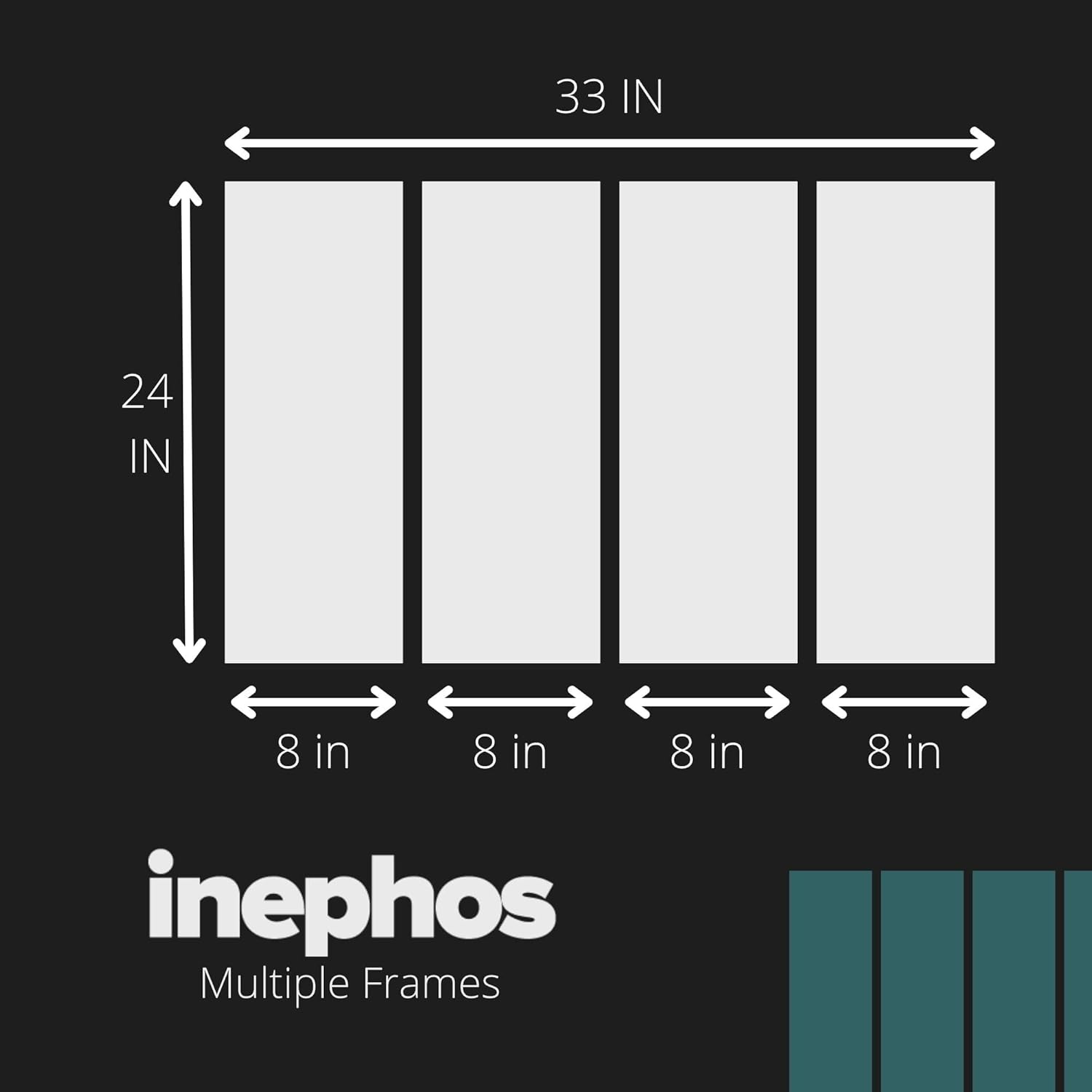
Four panels at 84cm total width means each panel is approximately 20cm wide with small gaps between them. From your doorway—about 3-4 meters away—those gaps disappear into a single continuous image. Up close, the separation creates visual rhythm, drawing the eye across the Buddha's face from headdress to chin.
Ceiling height matters here. At 8 feet (240cm), this 54cm tall piece occupies 22% of your vertical space when hung at standard height. Against 10-foot ceilings (300cm), it drops to 18%—still visually present, but you might want it slightly lower to maintain the focal point relationship with seated eye level.
The dominant color you'll live with isn't teal—it's the deep maroon-brown that covers approximately 60% of the visible surface. The teal appears only in the ornate headdress section on the left panels, and the gold accents are highlights, not dominant tones.
Against cream walls (the standard in most Indian apartments), here's what happens:
Morning natural light: The maroon reads as warm burgundy, the gold accents catch light and appear almost metallic, and the teal provides a cool contrast that prevents the piece from feeling heavy. This is when the textured background pattern becomes most visible—you'll notice the crackling detail that gives this a hand-painted appearance.
Afternoon direct light: If your wall gets western sun, the maroon deepens to almost chocolate brown, and the teal becomes more saturated. Not better or worse—just different. The face itself, rendered in bronze-brown tones, maintains its meditative expression regardless of light angle.
Evening LED (warm white, 2700-3000K): The gold accents glow. The teal becomes slightly muted but still distinct. The overall impression is warmer, more intimate. This is typically when guests see your living room, and when this piece looks most like intentional décor rather than just something on the wall.
Against brown or beige furniture, the maroon and bronze tones echo without matching—complementary, not matchy. If you have a teal accent pillow or throw, this piece will tie that color into your overall palette in a way that looks curated.
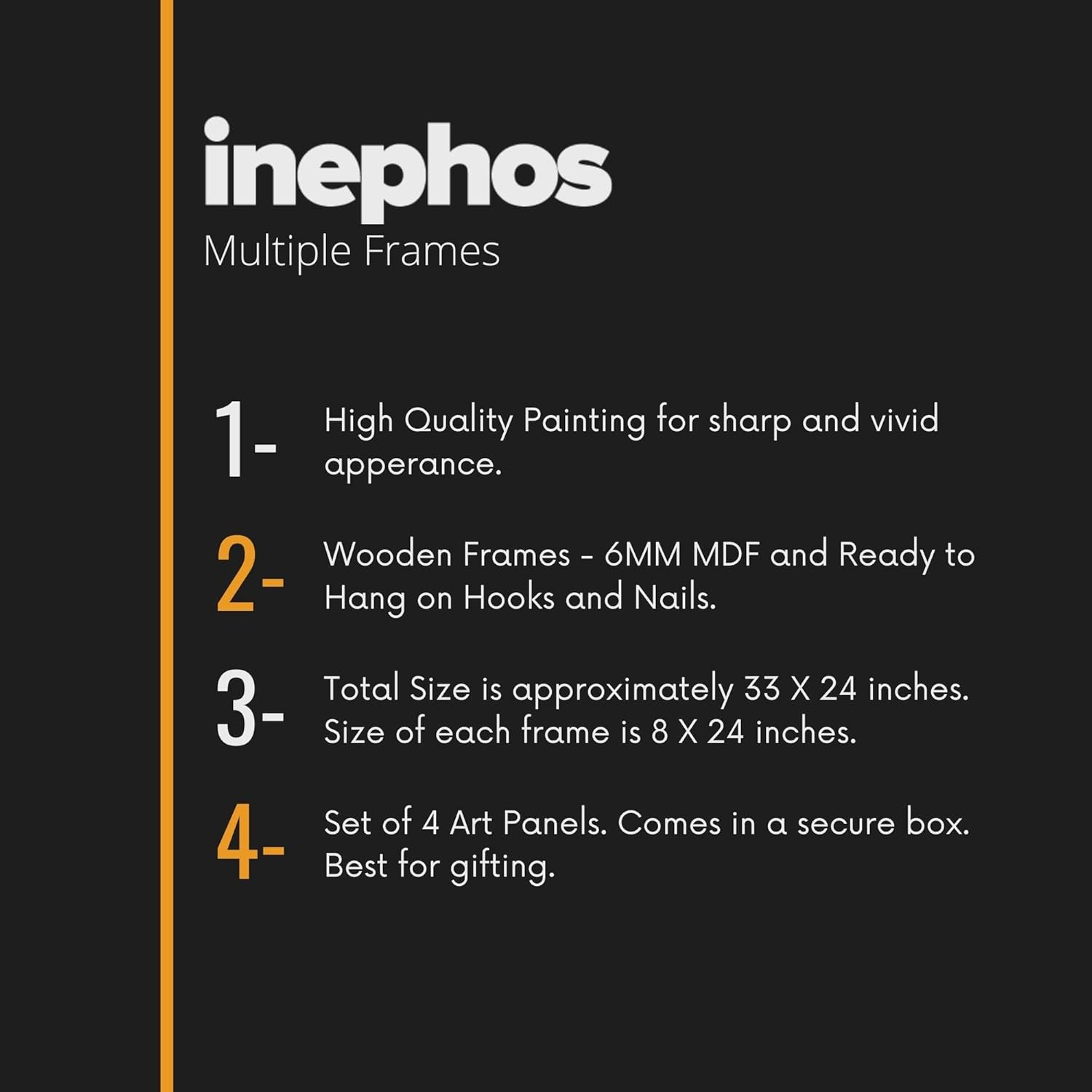
Four panels means four separate hanging points—or eight, if you want extra stability. The vinyl-on-MDF construction means lighter weight per panel than stretched canvas, so standard picture hooks work for drywall, and 6mm anchors work for concrete.
The practical concern with multi-panel art: getting the spacing consistent. Each panel needs to hang at identical heights with uniform gaps between them. The hanging template included with this piece marks exact drill points for all four panels simultaneously. Tape it to your wall, make four marks with pencil, remove template, drill, hang. The panels have pre-installed D-rings that align with the template measurements.
For concrete walls (common in older Indian apartments and most buildings outside metro cities): use the included masonry anchors. Drill 35mm deep with a 6mm bit. The holes are smaller than standard picture frame nails—when you move out, fill with white wall putty, sand smooth, and your landlord won't notice.
For drywall or plaster (common in newer construction and renovated flats): the plastic anchors grip better and require less drilling depth. Same process, slightly easier execution.
Alignment tip: hang the two center panels first, then use a level to position the outer panels. If you start from left and work right, any cumulative error in spacing becomes visible by the fourth panel. Center-out maintains symmetry.
Fabric Buddha tapestries—the kind you've probably seen priced at ₹600-900 on marketplace sites—create a different visual effect entirely. They drape. They move with air currents from ceiling fans. They collect dust in their folds. They need washing periodically, and the colors shift after each wash cycle.
Vinyl on MDF sits flat against your wall. It doesn't flutter when someone walks past. Dust wipes off with a dry cloth rather than embedding in fabric weave. The image remains the same in year three as it did on day one because vinyl doesn't absorb humidity the way fabric does.
The tactile difference matters too. Fabric tapestries feel casual—appropriate for a college dorm or a meditation corner with floor cushions. Vinyl panels feel like intentional décor—appropriate for a main living room wall where guests form impressions about your home.
The price difference (approximately ₹1,800-2,000 more than fabric) buys you: flat presentation, cleanability, consistent color over time, and the visual weight of framed panels rather than hanging cloth. Whether that matters depends on where this is going. For a guest-facing wall, the difference is visible. For a private meditation space, fabric might actually suit better.
From your doorway—about 3 meters away—you'll see a serene Buddha face in warm brown tones, with a splash of teal that draws the eye to the ornate headdress. The four-panel structure isn't immediately obvious; it reads as a single image.
From your sofa—about 2 meters away—the texture becomes visible. The crackling pattern in the maroon background, the intricate scrollwork in the teal section, the defined lines of the Buddha's eyes and lips. This is viewing distance where detail rewards attention.
Up close—within arm's reach—you'll see the vinyl texture, the panel edges, the printed rather than painted quality. This isn't art that invites close inspection; it's art that creates atmosphere at normal living room distances.
Alone on a wall, this piece dominates without overwhelming. The close-up composition means you don't need supporting décor around it—no shelf arrangement, no flanking plants, no gallery wall addition. It's a complete statement.
Adjacent to other décor, consider what else shares visual space. A floor lamp with a warm brass finish echoes the gold accents. A small indoor plant to the side adds organic contrast. Avoid placing near other patterned or ornate items—this piece has enough visual complexity that additional patterns create competition rather than composition.
Moolwan Design Note
The close-up framing on this Buddha face does something unusual: it prioritizes meditative expression over religious iconography. There's no seated pose, no hand mudra, no lotus throne. Just the face itself—eyes closed, lips curved in that slight suggestion of a smile—rendered large enough that the serenity is the subject, not just a detail within a larger scene.
Moolwan Quality Standard
Moolwan Fit Guidance for Indian Homes
At 84cm wide, this fits 10-12 foot walls with proportional coverage. Hang 20-25cm above sofa tops, or at standing eye level (approximately 150cm to center) on empty walls. The 54cm height works under standard 8-foot ceilings without crowding.
Will 84cm look too small on my 12-foot wall? At 84cm on a 12-foot (360cm) wall, you get 23% coverage—still visually present, though closer to the minimum for a focal point piece. If your wall is truly empty with nothing else on it, you might consider larger panels. If the wall has other elements (window, furniture, architectural features), 84cm provides balance without domination.
How do the teal and gold tones look against off-white walls? Teal appears more saturated against off-white than against pure white—it reads as rich rather than stark. Gold accents warm up the overall impression. The maroon-brown dominant tone anchors everything in familiar warm territory that off-white walls complement naturally.
Can I hang this in a bathroom or kitchen-adjacent wall? Vinyl on MDF handles humidity better than stretched canvas. For bathrooms without direct water splash zones, or kitchen walls where steam occasionally travels, this construction type is appropriate. Avoid hanging directly opposite a shower or above a stove where direct moisture contact occurs.
How difficult is it to align four panels evenly? The included hanging template marks all four drill points simultaneously. Once the template is level on your wall, the panels align automatically when hung on the marked points. Total installation time runs 20-25 minutes, including the extra care required for multi-panel spacing.
Will the colors fade if my wall gets afternoon sun? The print uses UV-resistant inks designed for commercial signage durability. Direct afternoon sun for 3-4 hours daily won't cause visible fading within the first 2-3 years. Extended exposure (5+ hours daily, directly facing west-facing windows) may cause gradual color shift over 4-5 years, similar to any printed material.