
Cart
You've measured your wall three times. Maybe four. The tape measure says 300cm, but you're still not confident because 84cm sounds smaller than what you imagined for that empty stretch above your sofa. Every sizing guide says something different, and none of them account for Indian living rooms where your 8-foot sofa sits 15cm away from the wall and your AC unit occupies the upper corner. You keep second-guessing: is 84cm wide actually going to create presence, or will it look lost?
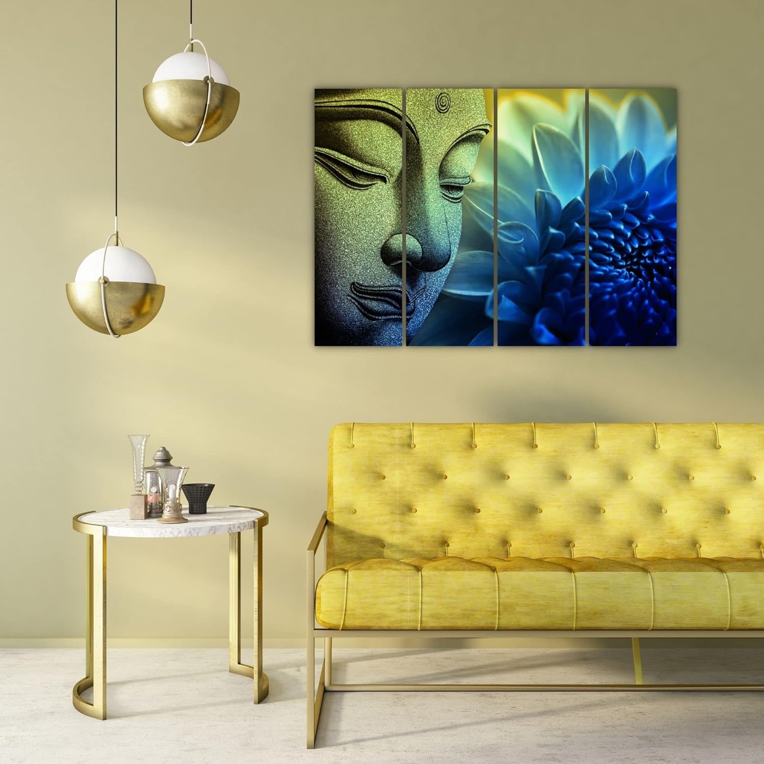
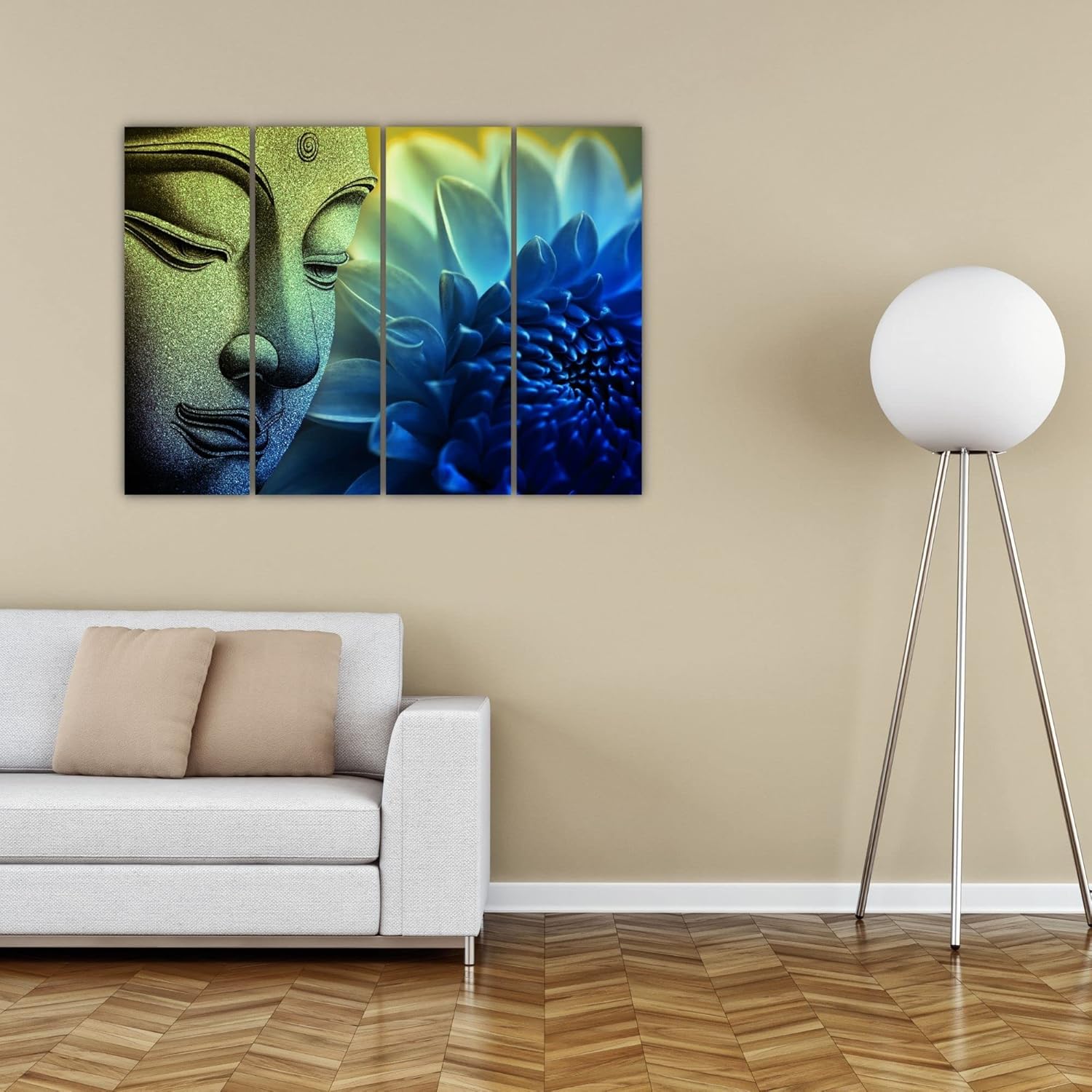
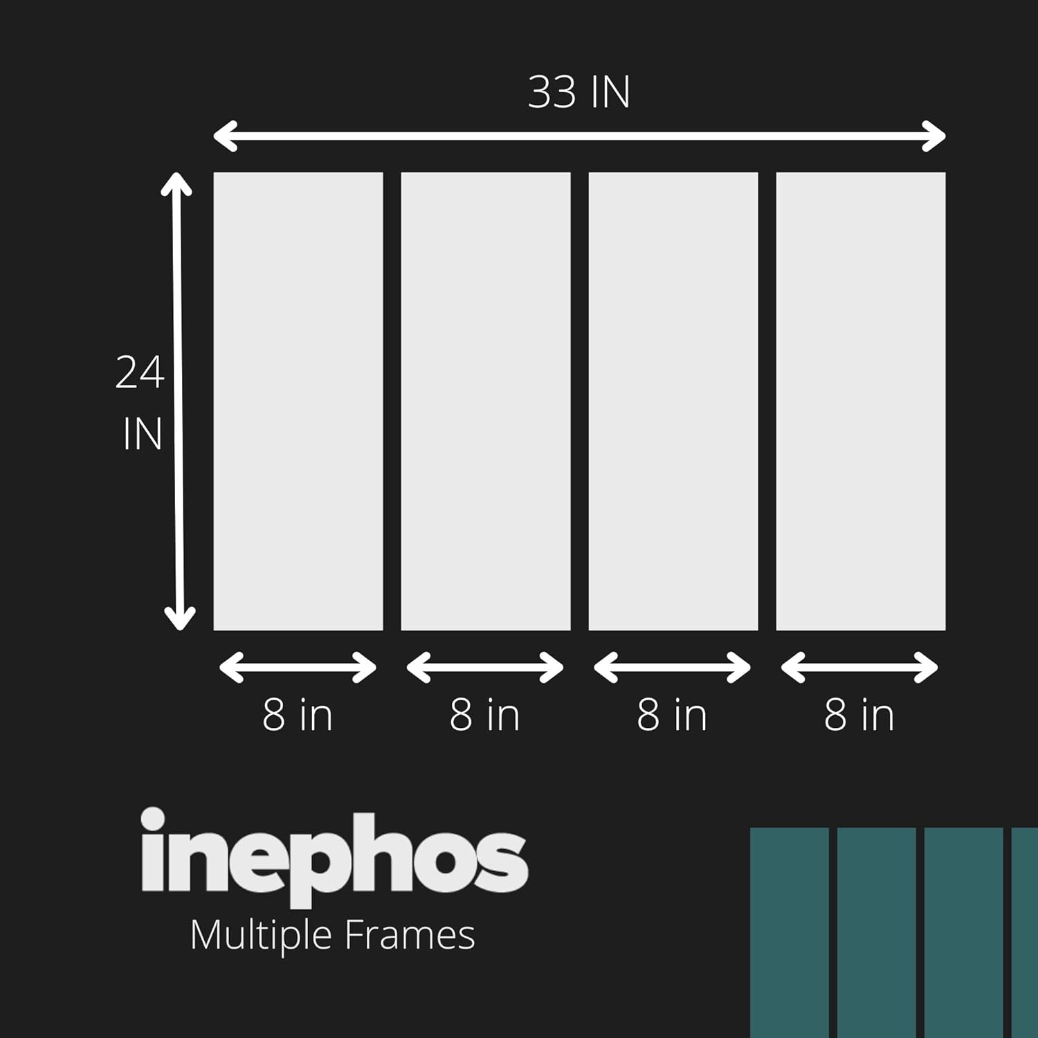
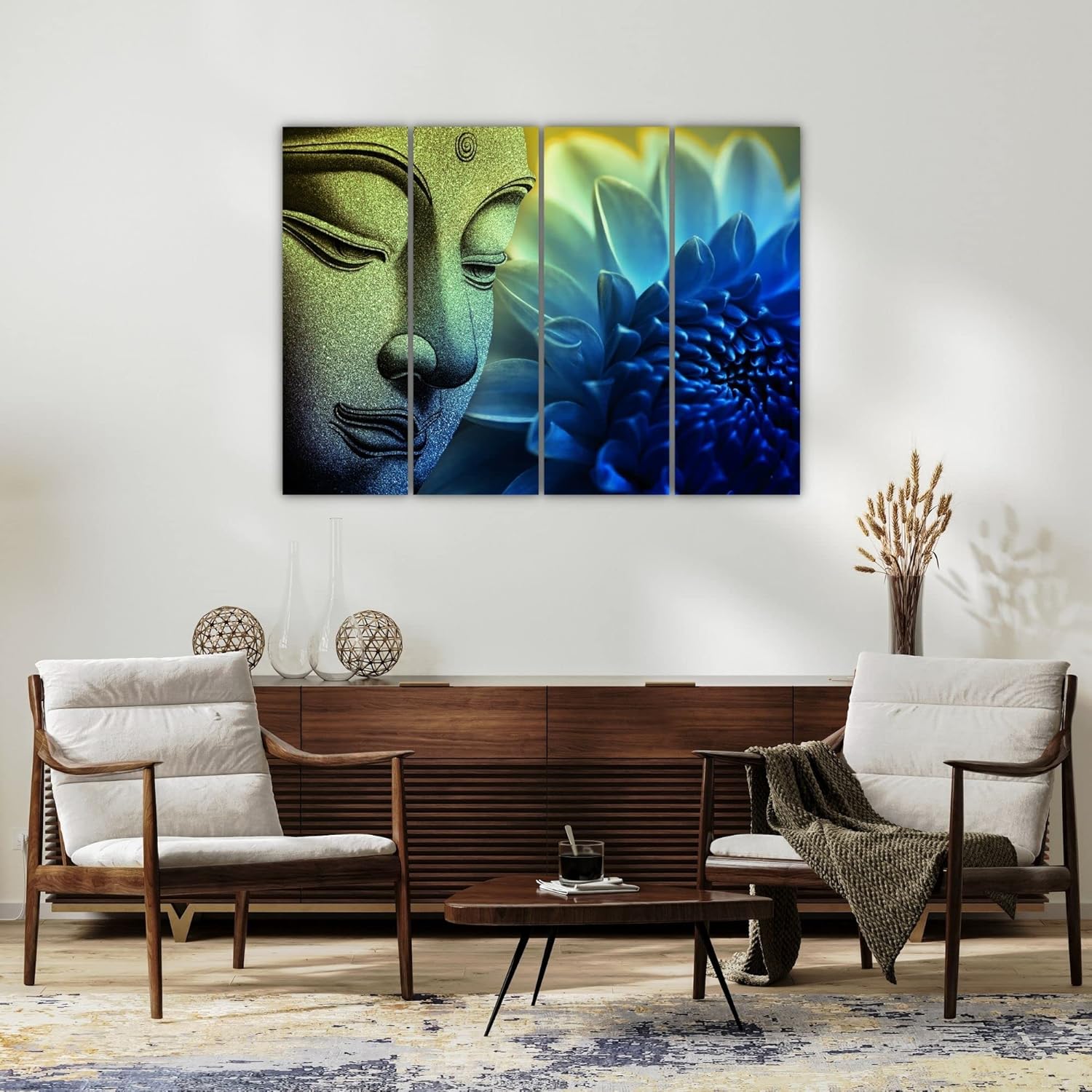
This 4-panel set solves a specific visual problem. At 84cm total width, it covers roughly 28% of a 300cm (10ft) wall—enough to anchor the space above a 6-foot sofa without overwhelming furniture that's already competing with a TV unit, a side table, or a pooja shelf nearby. The composition itself guides where your eye rests: the stone-textured Buddha face on the left two panels draws attention first, then the gaze naturally flows right toward the unfurling lotus petals in deepening blue. It's not static art that just sits there. It moves.
The gold-to-teal-to-royal-blue gradient does something specific against cream walls. In morning daylight, the golden Buddha tones warm up and complement wooden furniture naturally. By evening under warm LED light, the blue lotus panels cool the room's visual temperature without creating the jarring contrast that pure blue abstracts would. Against off-white or builder's peach walls, the transitional palette reads as intentional—selected, not random.
For a standard Indian living room with a 10ft (300cm) wall behind a 6-foot sofa, 84cm width provides 28% wall coverage. This leaves approximately 108cm of breathing space on each side—enough for the art to feel centered without crowding any adjacent furniture or wall switches.
If your wall is 12ft (360cm), this same 84cm set covers 23%—still visually significant but with more negative space. This works particularly well if you have a floor lamp on one side or plan to add a small gallery of frames adjacent to it later.
The 54cm height positions comfortably on walls with 8ft ceilings when hung 20-25cm above the sofa back. From across a typical 12x14ft living room (about 4 meters viewing distance), the Buddha face remains recognizable without the textural details becoming lost. The lotus petals read as flowing shapes rather than individual elements—which is exactly how contemplative art should behave at room-viewing distance.
Going larger (say, 120cm) on this same wall would push coverage to 40%, which dominates rather than anchors. For Buddha-themed art that's meant to create calm, domination defeats the purpose.
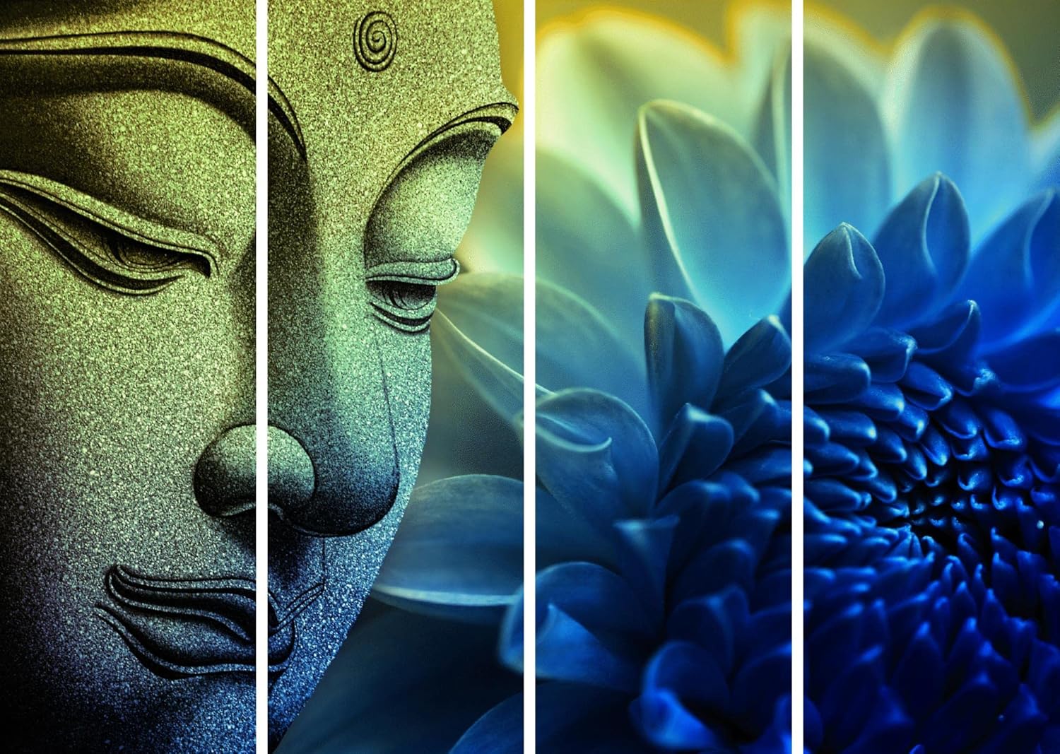
The left panels feature a stone-textured Buddha face in golden olive tones—not bright gold, but the muted warmth of weathered temple sculpture. Against cream or off-white walls, these tones appear grounded rather than floating. They pick up the warmth in wooden coffee tables and brown fabric sofas without competing.
The transition through teal-cyan into deep royal blue on the right happens gradually across the middle panels. This gradient prevents the jarring effect you'd get from placing pure blue art against warm-toned walls. The transitional zone (panels two and three) acts as a visual bridge.
Under morning sunlight from east-facing windows, the golden Buddha section appears lighter, almost brass-like. The blue lotus deepens in contrast. Under warm white LED lighting (3000K, standard in most Indian homes), the entire piece shifts warmer—the blues become less intense, the golds become richer. This means the art adapts to your lighting rather than fighting it.
If your walls are the specific beige-yellow that many builders use, lean toward viewing this under evening light before deciding. The gold-on-yellow can read as harmonious or monotone depending on exact shade. Cream walls present no such concern.
Four panels mean four hanging points—but not four separate measurement headaches. When the panels arrive, they're designed with uniform D-ring placement. The template included lets you mark all four positions at once, ensuring level alignment across all panels.
For concrete walls (common in buildings older than 10 years), you'll use the included masonry anchors. Drill 35mm deep with a 6mm bit, tap in anchors, screw in hooks. Each panel weighs roughly 750g, so standard anchors hold without concern.
For drywall (common in newer constructions and renovations), the plastic wall anchors handle the weight easily. Same process: drill, insert, hang.
For rentals: the four 6mm holes you'll create are smaller than the holes left by curtain rod brackets. At move-out, five minutes with wall putty and touch-up paint makes them invisible. Your ₹50,000 deposit isn't at risk.
Spacing between panels: 2-3cm gaps maintain the visual flow while making the multi-panel format intentional. Tighter gaps (under 1cm) make alignment errors more visible. Wider gaps (over 5cm) break the Buddha-to-lotus transition.
If you've browsed macrame Buddha-themed pieces or woven lotus hangings, you've noticed the aesthetic difference: macrame reads as handcrafted-boho, while vinyl panel art reads as contemporary-spiritual. Neither is wrong—it depends on what your existing room communicates.
Macrame's texture catches dust. Within months in typical Indian conditions, the woven threads show accumulated dust in the crevices, especially if your building faces a main road. Cleaning requires removing from the wall and careful washing—rarely done, honestly.
This vinyl print on MDF wipes clean with a dry microfiber cloth. The splash-proof surface means accidental splashes (common if placed near dining areas or kitchens adjacent to living rooms) don't stain.
Macrame also fades. The natural jute or cotton fibers lose vibrancy faster than you'd expect in monsoon humidity, particularly the dyed portions. Within two years, that rich indigo often becomes dusty gray.
The vinyl print uses inks formulated for outdoor signage durability. Two monsoon seasons won't shift the deep blue lotus petals toward gray.
The functional trade-off: macrame offers dimensional texture that this flat panel art doesn't. If your room lacks any textural elements (no textured cushions, no woven baskets, no jute rugs), macrame adds that layer. If your room already has textural variety, this panel art adds contemplative imagery without competing textures.
From your entrance doorway, 4-5 meters away: you'll see a horizontal arrangement with warm left side and cool right side. The Buddha face reads as serene presence. The lotus reads as natural flow. It's recognizable as spiritual-nature art, not abstract shapes.
From your sofa, 2-3 meters away: the stone texture on the Buddha becomes visible. The individual lotus petals differentiate. You'll notice the gradient transition between panels. This is the contemplative viewing distance—where the art offers details to rest your eyes on during quiet moments.
In video calls with the wall behind you: the art appears as balanced background interest without being distracting. The muted gold-to-blue reads as tasteful, not loud. Your colleagues see intentional décor, not blank wall or cluttered shelves.
This piece works solo—it doesn't require adjacent frames or supporting décor. The four-panel format already provides visual complexity. Adding more to the same wall risks overwhelming the calm this composition creates. If you want to expand the gallery feel later, consider adjacent walls rather than crowding this one.
Moolwan Design Note
The Buddha-to-lotus transition captures a specific symbolic journey: from meditative stillness (the stone face in warm earth tones) to organic unfolding (the lotus in deepening blues). The 4-panel format lets this narrative play out across your wall rather than compressing it into a single frame. The stone texture on the Buddha panels creates visual weight that grounds the composition on the left, while the soft petal gradients on the right offer the eye somewhere to rest.
Moolwan Quality Standard
Splash-proof vinyl print on MDF panels, designed for Indian apartment conditions. Quality checked before dispatch. Packed with corner protectors for long-distance transit. Ships from West Bengal.
Moolwan Fit Guidance for Indian Homes
84cm total width fits 10-12ft living room walls—positioned above 6-8ft sofas with balanced negative space on either side. 54cm height works under standard 8ft ceilings when hung 20-25cm above sofa back. The warm-to-cool palette complements cream walls and brown/beige furniture without requiring accent pieces to tie it together.
Will 84cm look too small above my 8-foot sofa? At 84cm, you're covering roughly 35% of your sofa's width—proportionally balanced. The 4-panel horizontal spread creates visual presence beyond what an 84cm single canvas would. If your sofa is 6 feet, this coverage ratio increases to 46%, which is ideal. The piece anchors without overwhelming.
How will the blue lotus panels look against my cream walls under tube lights? Under warm white LED (3000K), the royal blue shifts slightly warmer, appearing as a muted indigo rather than electric blue. Against cream walls, this reads as intentional contrast—cool accent against warm background. Under cooler daylight, the blues appear truer. The transitional teal zone prevents jarring color jumps in either lighting.
Can I hang this without drilling if I'm in a rental? For pieces under 1.5kg total, adhesive strips work. At 3kg, this set exceeds safe limits for adhesive mounting. However, the four small anchor holes (6mm each) patch invisibly with wall putty at move-out. Most landlords don't notice holes this size during inspections.
How do I keep the four panels level during installation? The included hanging template marks all four positions simultaneously. Tape the template to your wall at desired height, mark through the indicated points, then drill. This prevents the common problem of eyeballing each panel separately and ending up with slight height variations visible across the set.
Will the colors fade in a room that gets afternoon sun? The vinyl print uses UV-resistant inks formulated for outdoor signage. Direct afternoon sun won't cause noticeable fading over typical ownership periods (3-5 years). The MDF backing also prevents warping that sun exposure causes in canvas stretched over wooden frames.