
Cart
You've scrolled through dozens of Buddha wall art pieces this week. Golden Buddhas, meditating Buddhas, lotus Buddhas, close-up faces, abstract silhouettes. They all blur together after a while, and the longer you look, the harder it becomes to choose. Not because nothing appeals to you — but because everything looks vaguely similar, and you can't articulate why one should win over another.
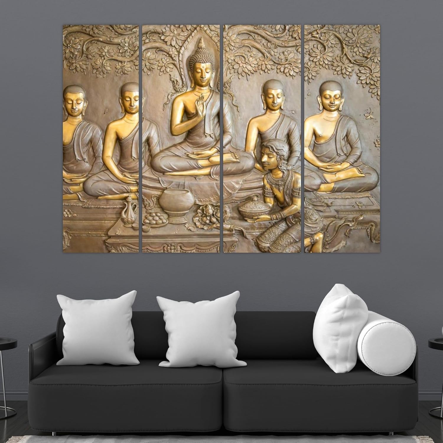
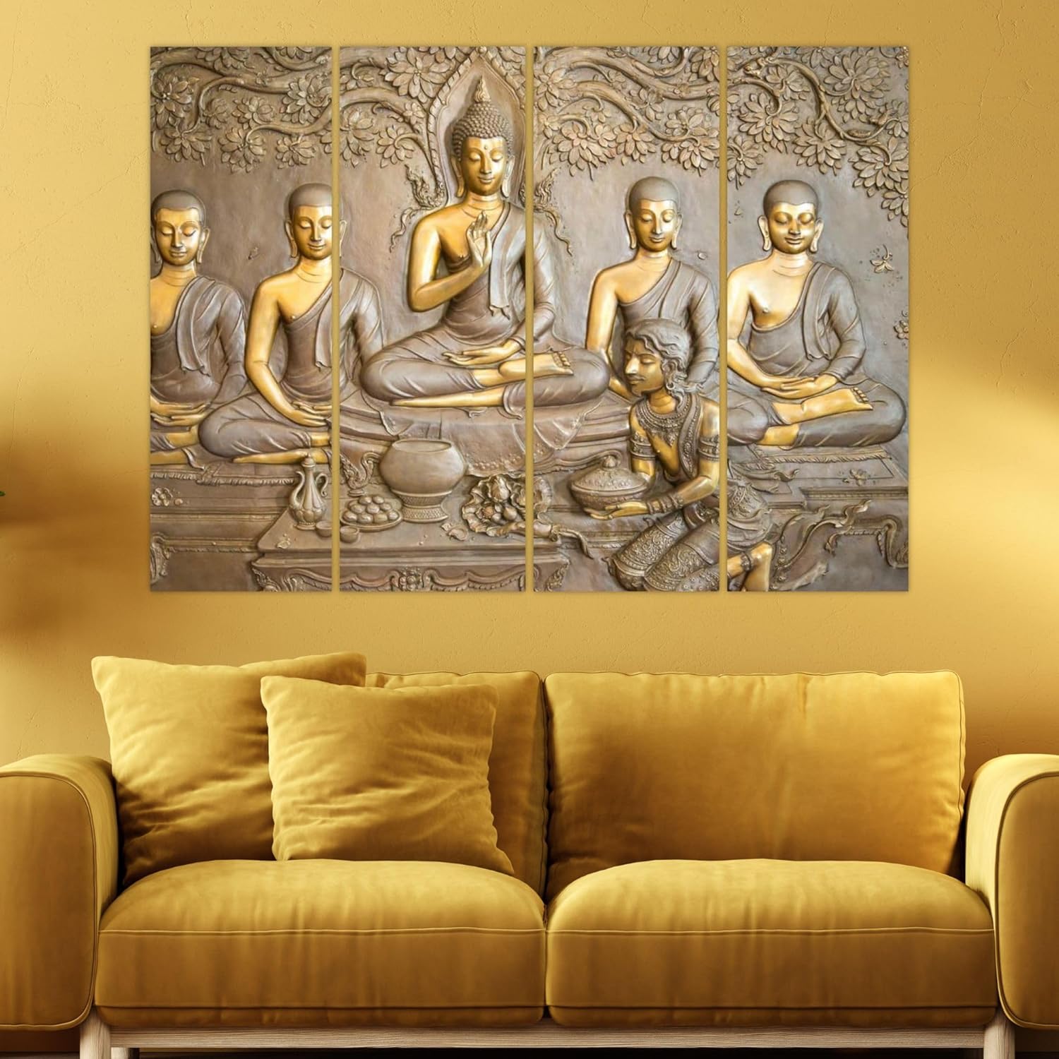
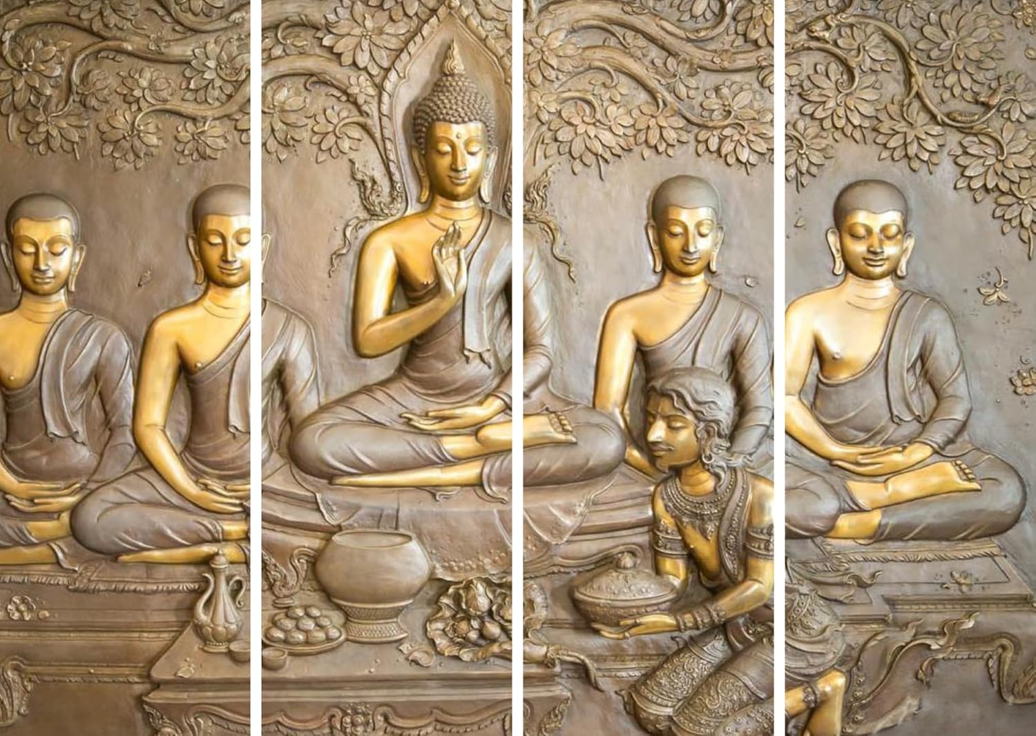
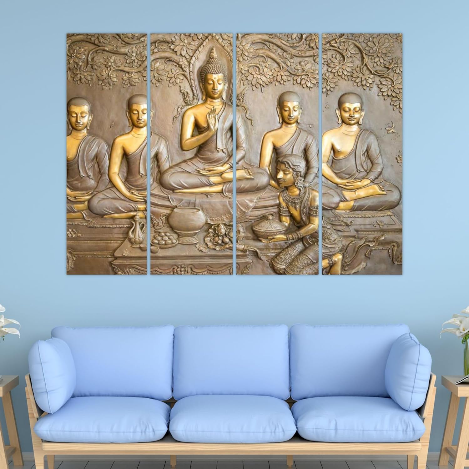
This particular piece breaks that pattern for a specific reason: it doesn't look like a printed image. The design mimics carved stone bas-relief, with figures that appear to rise from the surface rather than sit flat on it. The central Buddha in blessing mudra, four disciples in meditation postures, a female devotee offering gifts, the Bodhi tree branches spreading overhead — it reads as sculptural narrative, not poster art. That distinction matters when you're standing in your living room trying to imagine what will actually hold visual interest six months from now.
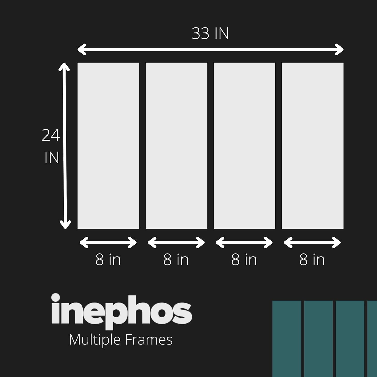
An 84cm wide piece covers roughly 23-28% of a standard 10-12ft Indian living room wall. This is deliberate understatement rather than domination — the kind of coverage that lets the art become a focal point without overwhelming the sofa beneath it.
For a 6-foot sofa (180cm), this 84cm width sits at 47% of sofa width — slightly below the ideal 60-75% range, which means it works best when you have side tables or floor lamps flanking your sofa that add visual weight to the arrangement. For an 8-foot sofa (240cm), you're at 35% coverage, which reads as intentionally restrained rather than undersized.
The 4-panel format distributes that 84cm across four vertical sections with small gaps between them. From across the room (3-4 meters, typical Indian living room viewing distance), those gaps disappear and the piece reads as continuous. Up close, the panel divisions add visual rhythm — your eye moves naturally from the disciples on the left, to the central Buddha, to the devotee, to the disciples on the right. It's pacing built into the format.
At 54cm height, this hangs comfortably on 8-10ft ceiling walls without crowding the space between sofa top and ceiling. Standard placement: 20-25cm above your sofa cushions to the bottom edge of the lowest panel.
The palette here is narrow but warm: antique gold, bronze with copper undertones, taupe gray in the shadows, hints of warm brown in the robes. No bright colors, no cool tones, nothing that fights for attention.
On cream or off-white walls (the default in most Indian apartments), these metallics create gentle contrast without stark edges. The gold catches light and shifts throughout the day — cooler and more muted in morning daylight, warmer and richer under evening LEDs. If your living room has warm white bulbs (3000K, which most do), the bronze tones intensify after sunset.
Against light yellow or peach walls (common builder colors), the warm palette blends rather than clashes. Against sage or mint walls, you get complementary contrast that works if you have wooden furniture tying the room together.
The sculptural effect benefits from angled light. If you have a floor lamp or wall sconce that casts light across the piece rather than directly at it, the raised-relief appearance becomes more pronounced — shadows suggest depth that isn't physically there.
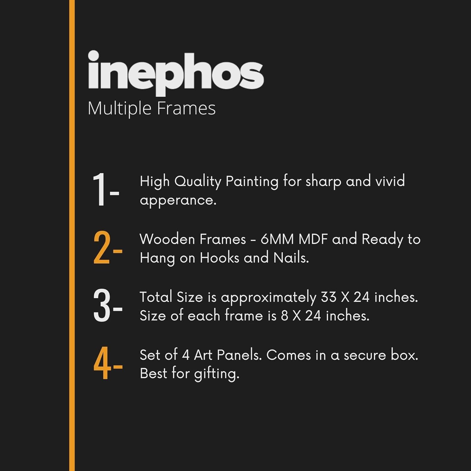
Four panels means eight hanging points — two D-rings per panel. This sounds complicated but it's actually easier than hanging one large piece, because each panel is lighter and more forgiving of slight level variations.
For concrete walls (most older Indian buildings): use the included masonry anchors, 6mm holes, 35mm deep. Mark all eight points using the hanging template before drilling anything. Start with the center-left panel, level it, then work outward.
For drywall (newer apartments, false ceiling constructions): use the plastic anchors, same 6mm holes, 30mm deep. Drywall is more forgiving of minor errors — you can adjust position slightly without the anchor losing grip.
Panel spacing: maintain 2-3cm gaps between panels, consistent across all three gaps. Uneven gaps are the most common installation mistake with multi-panel art — use a spacer (a folded piece of cardboard works) to keep gaps uniform.
Total weight is 3kg distributed across four panels, so each panel carries roughly 750 grams. This is well within the safe range for standard wall anchors in either wall type. For rentals: eight 6mm holes are patchable with basic wall putty in under 30 minutes when you move out. Your deposit is safe.
Macrame has had a moment. You've probably considered it — the texture, the handcrafted appeal, the boho aesthetic that photographs well. But here's what happens with macrame in Indian homes over time:
Macrame collects dust in the weave, and that dust is visible within weeks. You can't wipe it clean — you have to take it down and shake it out, or worse, hand-wash it. In monsoon humidity, macrame absorbs moisture and develops that slightly musty smell. The cotton or jute fibers fade unevenly in sunlight, creating patchy discoloration that reads as wear rather than patina.
Vinyl on MDF solves every one of those problems. Dust wipes off with a dry cloth. The surface is splash-proof, so humidity doesn't penetrate. UV-resistant printing means the gold tones stay gold, not yellowed-brown, even with afternoon sun exposure.
And stylistically: macrame reads as casual, temporary, almost transitional decor. The sculptural Buddha aesthetic reads as permanent, considered, like something you chose deliberately rather than picked up because it was trending. Your mother-in-law notices that difference even if she can't articulate it.
From the doorway, you'll see the warm metallic glow before you register the subject matter. The gold catches ambient light and draws attention without demanding it. The 4-panel format creates horizontal emphasis that anchors the wall above your sofa.
Walk closer, and the narrative emerges: Buddha teaching, disciples in meditation, the devotee's offering, the Bodhi tree's sheltering presence. It's a scene rather than a portrait, which gives it staying power — you notice different details over time rather than seeing the same static image every day.
The bas-relief illusion holds up at conversational distance (1.5-2 meters) but resolves into flat print if you stand directly in front of it and examine the surface. This is expected — it's vinyl printing creating depth through shadow and highlight, not actual dimensional carving. The effect works for everyday living; it's not trying to fool close inspection.
Alone on the wall, the 4-panel spread is self-sufficient. You don't need flanking sconces or adjacent frames to make it feel complete — the panel rhythm provides its own visual structure. If you do have existing wall elements nearby (a clock, a small shelf), the warm metallics are neutral enough to coexist without coordination.
Moolwan Design Note The teaching scene composition — Buddha with disciples and devotee rather than solitary meditation pose — creates narrative interest that sustains over time. The Bodhi tree canopy connecting all four panels unifies the format while the sculptural rendering avoids the flat-poster quality common in printed Buddha art.
Moolwan Quality Standard Splash-proof vinyl print on MDF frames. Designed for Indian apartments and lighting conditions. Packed for long-distance Indian transit with panel-specific corner protection. Quality checked before dispatch. Printed to resist humidity-related color fading. Ships from West Bengal.
Moolwan Fit Guidance for Indian Homes 84cm width works above 6-8ft sofas in living rooms with 10-12ft walls. The 4-panel horizontal format suits spaces where vertical height is limited but horizontal spread is available. Warm gold/bronze palette complements cream walls and wooden furniture without requiring color coordination.
Will 84cm width look too small above my 8-foot sofa? At 35% of an 8-foot sofa's width, this piece reads as intentionally restrained rather than undersized. It works particularly well if you have side tables or floor lamps flanking your sofa — those elements add visual weight that balances the composition. If your sofa sits alone against a bare wall with nothing on either side, you might prefer sizing up to a 120cm option.
How do the gold tones look under warm LED lighting versus daylight? In morning daylight, the gold appears more muted and the bronze undertones become prominent. Under warm white LEDs (3000K, standard in most Indian homes), the gold intensifies and the overall piece appears richer. The sculptural shadows become more pronounced under angled artificial light, which actually enhances the bas-relief effect.
Is installing four separate panels difficult compared to one large canvas? It's actually easier — each panel weighs only 750g, making them simple to hold in place while marking drill points. The key is consistent spacing between panels. Use the hanging template to mark all eight points before drilling, and use a spacer (folded cardboard works) to maintain uniform 2-3cm gaps. Total installation time: 25-30 minutes.
Will the vinyl surface handle Mumbai/Chennai humidity during monsoons? Yes. The splash-proof vinyl finish prevents moisture absorption, unlike fabric-based wall hangings or paper prints. The MDF backing is sealed. Through monsoon cycles, the material doesn't expand or contract visibly, and the surface doesn't develop the musty smell that affects porous materials in high-humidity environments.
Does the sculptural/bas-relief look hold up in person, or does it obviously look like a flat print? At normal viewing distances (1.5+ meters), the depth illusion works — the shadow and highlight rendering creates convincing dimensionality. If you stand directly in front and examine the surface closely, it resolves into flat print. This is typical for trompe-l'oeil style printing. For everyday living and guest impressions, the sculptural aesthetic holds.