
Cart

You've measured the wall. You know it's roughly 10-11 feet wide. Your sofa sits there—probably 7 or 8 feet across—and above it, nothing. Every time you sit down, you're aware of it. The room works, the furniture's fine, but that blank space above the sofa makes the whole living room feel unfinished.
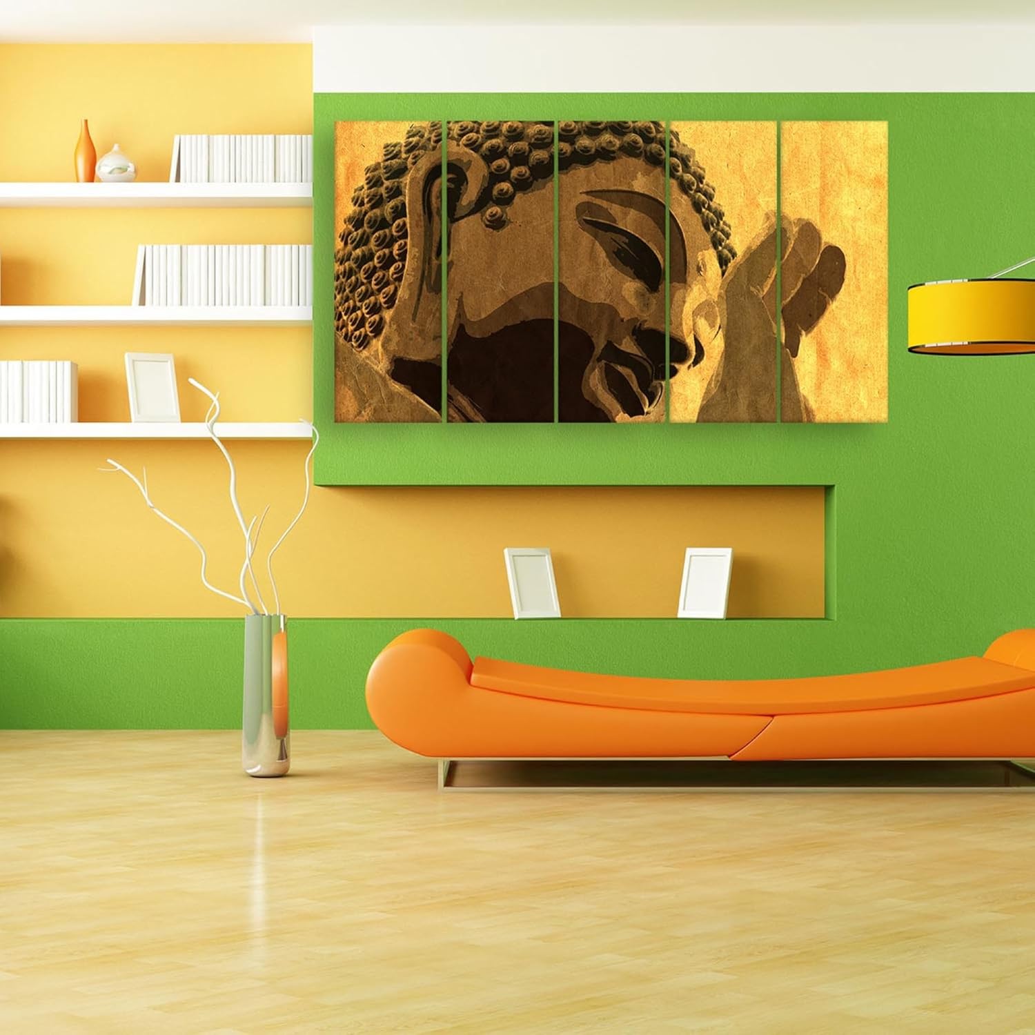
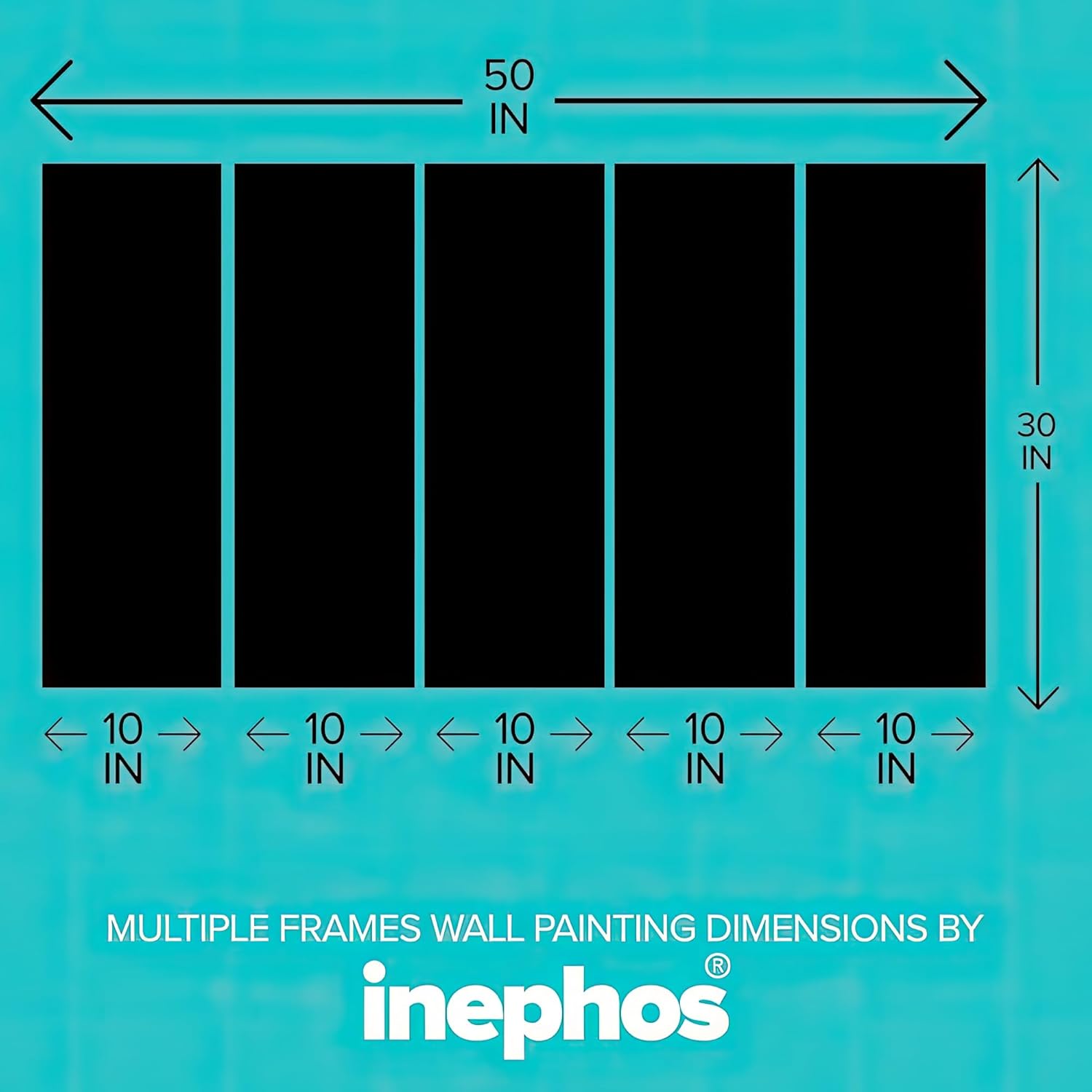
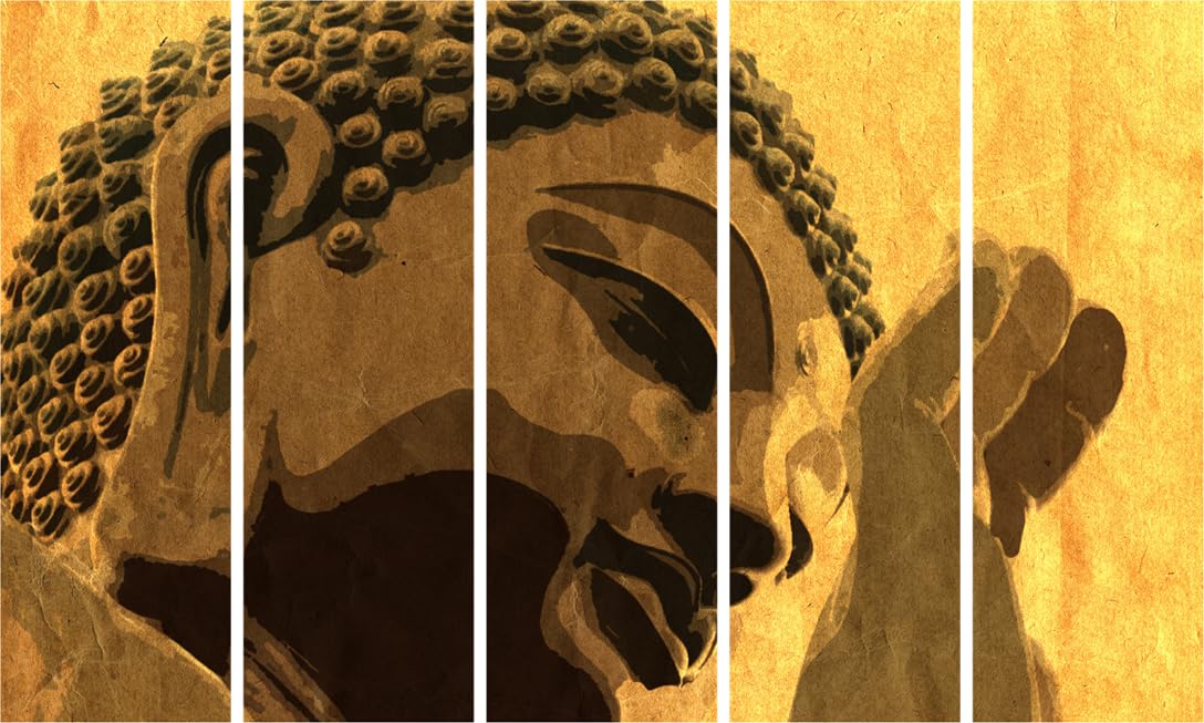
This 5-panel Buddha piece spans 127cm—just over four feet—which means it covers the visual center of an 8-foot sofa without crowding the edges. The composition splits Buddha's serene face across the left three panels while his raised hand in abhaya mudra (the gesture of fearlessness) occupies the right two. The antiqued sepia tones and textured parchment finish mean this doesn't look like something printed yesterday—it reads like aged artwork with presence and depth.
Your wall is probably 300-360cm wide (10-12 feet). This piece at 127cm covers roughly 35-42% of that wall width—which sounds modest until you factor in sofa placement. With your sofa centered and side tables or lamps flanking it, the remaining visual space directly above the sofa is closer to 200-240cm. At 127cm, this Buddha art fills 53-64% of that visual zone.
From the doorway—where you and your guests actually view the living room—127cm reads as substantial without overwhelming. It anchors the seating area. If you went smaller (say, 90cm), the piece would look like an afterthought floating above a large sofa. If you went larger (150cm+), you'd need to verify your sofa width exceeds 200cm, or the art would visually overpower the furniture.
The 76cm height sits comfortably within the 60-90cm range that works for standard 8-foot Indian ceilings. Mounted 20-25cm above your sofa top, the bottom edge stays at comfortable eye level when standing, while the Buddha's face centers at seated viewing height.
Panel spacing matters here: five panels with slim gaps between them create visual rhythm across the width. The gaps (roughly 1-2cm each) add approximately 6-8cm to your total visual span, so plan for about 133-135cm of actual wall coverage when positioning.
The palette here runs warm: golden ochre backgrounds shifting to deep umber and burnt sienna in the shadowed areas of Buddha's face and hair curls. The parchment texture adds visual variation—lighter patches where the "paper" appears worn, darker areas suggesting age and patina.
On cream or off-white walls (the default in most Indian apartments), these warm sepia tones integrate rather than contrast. Morning light through east-facing windows will cool the ochres slightly, bringing out more of the amber undertones. Afternoon and evening light—especially under warm white LEDs at 3000K—intensifies the golden tones and deepens the shadows.
Against brown fabric sofas or wooden furniture (which describes most Indian living rooms), this palette doesn't fight for attention. The ochre and umber tones echo wood grains and leather/fabric browns. It's not matching, exactly—it's harmonizing. The piece reads as intentionally selected for the room rather than dropped in from a different aesthetic universe.
If your walls are painted in peach or light yellow (common builder finishes), the warm palette still works. The sepia tones share the same warm family as these wall colors without creating the muddy effect you'd get from cool blues or grays.
Five panels means ten mounting points—two D-rings per panel. This sounds more complex than it is.
For concrete walls (most older buildings, many newer ones): You'll drill ten 6mm holes about 35mm deep using a masonry bit. The included concrete anchors tap into these holes, then you screw in the hooks. Each panel weighs roughly 600 grams (total 3kg for the set), which these anchors handle easily.
For drywall (modern apartments with false walls or specific partition walls): The plastic drywall anchors grip differently—they expand behind the wall surface to distribute weight. Same 6mm holes, same straightforward process.
The key with multi-panel installation is alignment. Use the included hanging template: tape it to the wall at your desired height, mark all ten points, remove template, drill. If you eyeball panel spacing without the template, you'll likely end up adjusting and re-drilling when panels don't line up—which means extra holes to patch when you move out.
Level check: Hang the center panel first, verify it's level, then work outward. If your first panel is slightly off, the error compounds across five panels.
For rentals: Ten 6mm holes sounds like a lot, but these are smaller than standard picture hook holes. When you move out, fill with wall putty, sand smooth, touch up with matching paint. Your landlord won't notice unless they're specifically hunting for patched spots.
Macrame and fabric tapestries occupy the same "above the sofa" wall space and cost similar amounts. So why vinyl on MDF instead?
Macrame hangs from a single point, which creates visual instability—the piece sways when the fan runs, tilts when someone brushes past it. It also collects dust in every knot and cord loop. After a year, macrame in Indian conditions (especially if you're near main roads with traffic dust) looks dingy. You can't wipe it clean; you'd need to take it down and wash it, which changes the shape and tension.
Fabric tapestries face similar issues: dust embeds in the weave, colors fade unevenly where sunlight hits, the fabric absorbs cooking odors if your living room opens to the kitchen (common in Indian apartment layouts).
This vinyl-on-MDF construction is splash-proof and wipe-clean. Dust sits on the surface and comes off with a dry cloth. The MDF backing stays flat—no warping from humidity fluctuations during monsoons, no curling at corners. The surface is sealed, so no moisture absorption.
The visual presence differs too: macrame and fabric read as "soft" décor, often casual or bohemian in style. This Buddha piece reads as structured, intentional, with the visual weight of framed artwork but at multi-panel scale.
From the doorway: The sepia tones and Buddha subject register immediately. The five-panel format creates horizontal presence—your eye moves across the composition. The antiqued finish prevents that "too new, too glossy" effect that can make wall art feel like an afterthought.
Up close (standing next to the sofa): The textured parchment finish becomes visible—variations in the ochre background that suggest aged paper. Buddha's hair curls (ushnisha) show carved-looking detail in the shadow work. The composition feels like a detail crop from a larger artwork, which adds visual sophistication.
In daily life: This piece sits above eye level, so you're not constantly staring at it. It's peripheral presence—you're aware of it, it anchors the room, but it doesn't demand constant attention. When guests visit, it gives them something to comment on without being so unusual that it dominates conversation.
The sepia coloring means this piece looks equally appropriate in traditional Indian home settings (where spiritual art is common) and contemporary minimalist rooms (where the antiqued aesthetic reads as curated rather than devotional).
Moolwan Design Note The split-face composition positions Buddha's lowered eyes across panels two and three, creating a focal point that shifts depending on where you stand. The abhaya mudra hand on the right panels balances the visual weight without competing with the face. This asymmetric balance—heavier left, lighter right—follows how eyes naturally scan a horizontal composition.
Moolwan Quality Standard Splash-proof vinyl printing ensures the surface can be wiped clean without damaging the print. Packed in reinforced cartons designed for long-distance Indian transit conditions. Each panel inspected for print alignment and color consistency before dispatch. Ships from our facility in West Bengal.
Moolwan Fit Guidance for Indian Homes At 127cm width, this piece fits above 7-8 foot sofas (210-240cm) with comfortable margins. For sofas under 7 feet, consider whether the art might visually overpower your seating. For walls under 10 feet total width, verify that side furniture (lamps, tables) won't crowd the composition.
Will 127cm look proportional above my 6-foot sofa? At 180cm sofa width, 127cm art represents about 70% coverage—at the upper end of the ideal 60-75% range. It will work, but with minimal visual margin. If you have side tables or floor lamps next to the sofa, the composition might feel tight. Measure your total "visual zone" above the sofa (excluding flanking furniture) to confirm.
How do the sepia tones look under warm LED lighting versus tube lights? Under warm white LEDs (2700-3000K), the golden ochres intensify and the piece looks warmer overall. Under cool white tube lights (4000K+), the warm tones stay visible but appear slightly more muted, and the contrast between light and dark areas increases. The piece works under both but looks most cohesive under warm lighting.
Can I install this on a wall that gets direct afternoon sun? Yes. The vinyl print surface handles UV exposure without significant color shift. However, if your wall gets intense, prolonged afternoon sun (3+ hours daily), you may notice very gradual warming of the sepia tones over several years—this often enhances the antiqued aesthetic rather than degrading it.
How do I clean dust off the textured surface? Dry microfiber cloth, wiped gently across the surface. The vinyl is sealed, so dust sits on top rather than embedding in texture. Don't use water or cleaning solutions—they're unnecessary and could leave residue in the textured areas.
What if my panels arrive with uneven color between them? Each panel is printed in the same batch to ensure color matching. If you notice visible color variation between panels that doesn't match the intentional tonal shifts in the design (like the darker shadows on Buddha's face), photograph all panels in the same lighting and contact Moolwan support with your unboxing video for assessment.