
Cart

You've looked at this image three times already. The colors are striking—that violet background, the golden sun behind the Buddha's head, the flowing blue elements. But you're stuck on the same question: will this actually look like this in my living room, or will it look completely different against my cream wall, under my warm LED lights, next to my brown sofa?
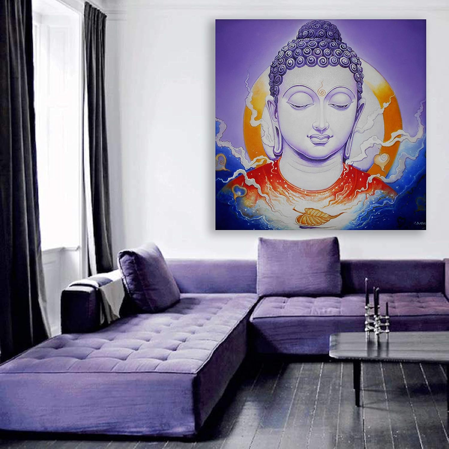
This 91x91cm square Buddha canvas resolves that uncertainty through one specific composition choice: the golden circular halo behind the Buddha's face. That halo isn't decorative—it's a visual anchor. When this hangs on your wall, your eye goes to the serene silver-lavender face first, then settles on the warm gold, then registers the violet depth surrounding it. The composition tells your eye where to rest. Against a cream or off-white wall (which is what you probably have), that violet background creates a defined boundary—the painting reads as a contained, intentional focal point, not a color that bleeds into the wall.
The square format matters here. Unlike rectangular art that emphasizes either horizontal or vertical space, 91x91cm creates equal visual weight in all directions. This makes placement more forgiving—you're not fighting to balance it against furniture proportions the way you would with a wide horizontal piece.
A 91cm square canvas covers roughly 0.83 square meters of wall space. On a standard 10ft (305cm) wide living room wall, that's about 30% horizontal coverage—substantial enough to anchor the space without overwhelming it.
If your sofa is 6ft (180cm) wide, this canvas at 91cm gives you a 50% width ratio. That's slightly below the 60-75% guideline for rectangular pieces, but square art reads differently—it doesn't need to span the sofa width because it creates its own contained visual zone. The result: the painting feels deliberately placed above the sofa rather than sized to match it.
Viewing distance calculation: At 3-4 meters (typical distance from a doorway or opposite seating), the Buddha face remains clearly legible and the color transitions—violet to gold to blue—register as distinct zones rather than blurring together. At 1.5-2 meters (standing in front of it), you'll notice the textural details: the curled pattern of the ushnisha (the Buddha's head covering), the subtle gradients in the silver-lavender face, the flowing movement in the blue peripheral elements.
If your wall is smaller (8ft width), 91cm might feel slightly dominant. If that concerns you, consider whether you want this piece to be the room's focal point (in which case, 91cm is correct) or a supporting element (in which case, you'd want 75cm or smaller).
The product image shows this canvas against a white wall with neutral lighting. Your wall is probably cream, off-white, or builder beige. Your lighting is probably warm LED (2700K-3000K). Here's what shifts:
The violet background will appear slightly warmer and deeper against cream walls than it does in the product photo. Cream walls have yellow undertones; violet has blue undertones. This creates color contrast that actually makes the painting pop more, not less. The violet will read as rich and saturated rather than washed out.
The golden halo will intensify under warm LED lighting. Gold tones respond to warm light by appearing more luminous. During evening hours when you're actually using your living room, that circular sun shape behind the Buddha's head will glow more prominently than it does in the daylight product photo.
The blue flowing elements (cobalt and deeper blue tones at the edges) will hold their depth. Blue is stable under warm light—it doesn't shift yellow the way some greens do. The coral-red accent at the chest level will warm slightly, creating a subtle visual bridge between the cool blues and the warm golds.
Morning light (if your wall faces east): The entire piece will read cooler, with the violet appearing more true-to-product-photo and the gold appearing slightly less warm. This is when the silver-lavender Buddha face looks most serene—the cool light emphasizes the meditative quality.
Afternoon light (west-facing wall): Warm tones intensify. The golden halo becomes the dominant visual element. The overall mood shifts from serene to vibrant.
A 91x91cm canvas in this construction weighs approximately 2.5-3kg. This is well within the range for standard wall mounting without professional help.
For concrete walls (most older Indian apartments): Use the included concrete anchors. Drill 6mm holes about 35mm deep. The square format means you'll want two anchor points at the top, spaced about 60-70cm apart, to prevent any tilting. Mark your spots using the included hanging template—tape it to the wall at your desired height (typically 20-25cm above sofa back), mark through the template holes, remove template, drill.
For drywall (newer constructions): Use the included plastic anchors. Same 6mm holes, but only 30mm deep. The lighter anchor load is fine for this weight.
Leveling a square canvas is slightly more demanding than rectangular—any tilt is immediately visible because all four edges should appear equidistant from ceiling and floor. Use a small spirit level across the top edge after hanging. Adjust the D-ring positioning on the back if needed.
Rental consideration: Two 6mm holes. Fill with wall putty when you move out, touch up with matching paint. Cost: under ₹100 in materials and 15 minutes of your time. This does not affect deposit return in any standard lease agreement.
If you're considering a macrame wall hanging for above your sofa or as a living room focal point, here's the practical comparison:
Macrame creates texture, not imagery. It's decorative but non-specific—it doesn't give your eye a subject to focus on or a narrative to engage with. A Buddha canvas provides both: a recognizable subject (spiritual, culturally resonant) and a specific color story (violet-gold-blue) that coordinates with your existing room tones.
Macrame collects dust in the woven fibers. In Indian conditions—ceiling fans running, windows open during non-AC months, general urban dust—macrame requires regular cleaning that's genuinely tedious (you can't just wipe it). Canvas with a moisture-resistant coating wipes clean with a dry microfiber cloth.
Macrame sags over time. The weight of the fibers pulls the weave downward, especially in humid conditions. After one monsoon season, you'll notice the shape has changed. Canvas stretched over a braced pinewood frame maintains its tension indefinitely—the kiln-dried wood doesn't absorb moisture and expand, so the canvas stays drum-tight.
Macrame is style-specific. It reads as bohemian/boho. If that's not your aesthetic, it looks out of place. A Buddha canvas reads as spiritual/contemplative—a category that integrates with traditional Indian décor, contemporary minimalism, and transitional styles without forcing a specific design language.
Size-for-size, a 91cm macrame piece and a 91cm canvas have similar visual impact, but the canvas provides color, subject, and depth that macrame cannot. If you want something that transforms the wall rather than simply decorating it, canvas is the more effective choice.
From the doorway (3-4 meters): The violet rectangle registers first as a defined color zone on your wall. Then the golden circle. Then the Buddha face. The piece announces itself without shouting—it's clearly the focal point of that wall, but the serene expression and balanced composition keep it from feeling aggressive or overwhelming.
From the sofa (1-2 meters): The color depth becomes apparent. You'll notice the gradients in the violet background, the flowing blue elements that suggest water or clouds, the single golden leaf motif at the bottom of the composition. The silver-lavender Buddha face has enough detail to reward close looking but isn't so intricate that it demands constant attention.
With the room empty vs. with people: When guests are over and conversation is happening, this painting recedes into atmosphere—it contributes to the room's feeling of intentionality without distracting from social interaction. When you're alone, reading or thinking, it provides a visual resting point that supports rather than disrupts contemplation.
With adjacent décor: This piece works best alone on its wall. The color complexity (five distinct color zones: violet, gold, blue, coral, silver-lavender) means it doesn't need companion pieces. Flanking it with additional art creates visual competition. A floor lamp to one side, a plant to the other—that's the appropriate level of adjacent décor. Let the canvas be the statement.
At night with accent lighting: If you add a picture light above or a small spotlight, the golden halo effect intensifies dramatically. This is a piece that responds well to intentional lighting—something to consider if you want it to shift presence between day and evening.
Moolwan Design Note
The golden circular halo behind the Buddha's head isn't arbitrary—it creates a visual anchor point that draws the eye to the meditative face first, then allows it to explore the violet-blue depth surrounding it. The square format reinforces this centered composition, making the piece equally balanced whether mounted horizontally centered above a sofa or offset on a larger wall.
Moolwan Quality Standard
Moolwan Fit Guidance for Indian Homes
91x91cm square format works above 6-foot sofas with comfortable visual proportion, or as a standalone statement piece on walls up to 10 feet wide. Square orientation allows flexible placement—centered or offset—without the strict furniture-matching requirements of rectangular canvases.
Will 91x91cm look proportional above my 6-foot sofa? Yes. At 91cm width against a 180cm sofa, you get a 50% ratio. Square canvases read as self-contained focal points rather than furniture-matched art, so this proportion creates a deliberate, anchored look rather than an undersized one. If your sofa is 8 feet or larger, consider whether you want the canvas as a focal point (91cm works) or as proportionally matched art (you'd want 120cm+).
How will the violet background look against cream walls? Violet and cream create complementary contrast—the painting will appear more defined and saturated against cream than against pure white. The violet won't clash or look jarring; it will read as a rich, intentional color choice that stands out from neutral wall tones without overwhelming them.
What's involved in installing this on a concrete wall? Two 6mm holes, 35mm deep, spaced about 60-70cm apart at the top hanging points. Use the included concrete anchors. Total time: 15-20 minutes. The included hanging template eliminates measuring guesswork—tape it to the wall, mark through the holes, remove, drill. For rentals, these holes fill easily with wall putty and matching paint when you move out.
Will the colors fade if my wall gets morning or afternoon sun? The fade-resistant inks used are formulated to withstand UV exposure without color shift. Direct sunlight will not cause the violet to wash out or the gold to dull over typical ownership periods. The print is designed to look consistent whether your wall receives 2 hours or 6 hours of daily sun exposure.
Is this piece better alone or with companion art? Alone. The composition includes five distinct color zones and a centered spiritual subject—it provides complete visual interest without needing additional pieces. Flanking it with other art creates competition for attention. A floor lamp, plant, or small shelf to one side provides enough visual context without cluttering the wall.