
Cart
You've measured your wall. You know it's somewhere between 10 and 12 feet. You've looked at dozens of Buddha wall art options online, but every time you try to picture one actually hanging in your living room—above your sofa, next to your existing furniture—the image in your head stays frustratingly vague. Will it look proportional? Will the five separate panels create visual chaos or cohesion? Will that empty wall finally feel complete, or will you spend the next six months second-guessing your choice?
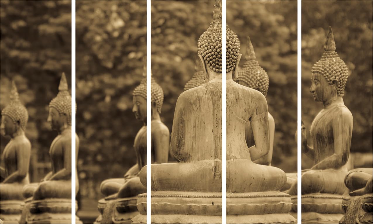
This piece resolves that uncertainty through one specific design decision: the Buddha figures are shown from behind. You're not looking at a face demanding spiritual attention. You're looking at a row of meditative figures receding into soft-focused foliage—the central Buddha sharp and present, the others progressively blurred, creating depth that pulls your eye inward rather than confronting it. At 127cm wide across five panels, this reads as a single contemplative scene, not five disconnected images competing for attention.
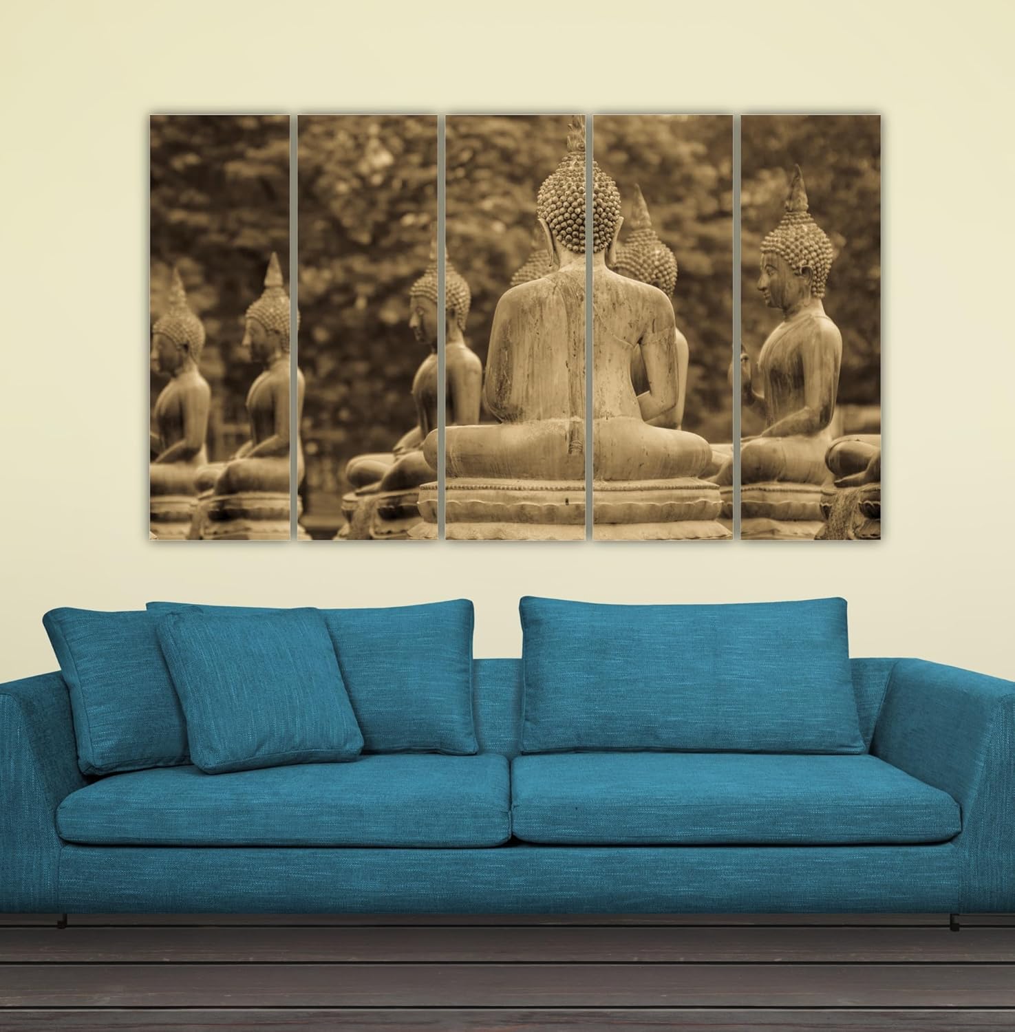
Your sofa is likely 6 to 8 feet wide (180-240cm). At 127cm, this wall art sits at 53-70% of that width—exactly within the proportional range where art feels anchored to furniture rather than floating randomly above it.
On a 10-foot wall (300cm), this piece covers 42% of wall width. That's substantial enough to be a focal point without overwhelming adjacent elements like side tables, floor lamps, or the AC unit you can't move. On a 12-foot wall (360cm), coverage drops to 35%—still commanding, but with breathing room on either side that prevents the cramped look of oversized art on undersized walls.
Panel spacing matters here: the five MDF panels create four gaps of approximately 2-3cm each. From your sofa (viewing distance ~2.5-3 meters), these gaps disappear into a unified composition. From the doorway (~4-5 meters), the panels read as one continuous image with subtle vertical rhythm. The gaps don't fragment the Buddha figures because the composition flows horizontally—each figure's shoulder line continues naturally across panel breaks.
Mounting height: 20-25cm above your sofa cushion top to the bottom edge of the lowest panel. This places the central Buddha figure at approximate eye level when seated—where you'll actually be looking at it most often.
The sepia palette here isn't the orange-brown of cheap Instagram filters. It's a specific range: warm bronze in the Buddha figures, muted olive undertones in the background foliage, soft ochre highlights where light catches the ushnisha (the Buddha's topknot). No pure whites, no harsh blacks, no saturated colors competing with your existing décor.
Against cream or off-white walls (the default in most Indian apartments), this reads as intentionally coordinated rather than accidentally matching. The warm bronze tones echo the wood in your coffee table, TV unit, or sofa arms without duplicating them exactly. The olive-green background suggests nature without introducing the bright greens that clash with warm interiors.
In morning daylight (eastern exposure), the sepia appears slightly cooler, more golden. The depth blur in the background foliage becomes more apparent—you'll notice the bokeh effect suggesting trees or garden behind the Buddha figures. In evening warm-white LED (3000K, standard in most Indian homes), the bronze intensifies. The figures appear more solid, more present. The overall effect shifts from "photograph of outdoor statues" to "contemplative art piece with deliberate warmth."
Against peach-tinted walls (common in builder apartments), the warm sepia harmonizes naturally. Against light yellow walls, it provides grounding contrast without jarring. The only wall colors where this might feel disconnected: cool gray or blue-tinted walls, which are rare in Indian homes anyway.
Five panels means five mounting points—but not five separate drilling sessions if you plan correctly.
Each MDF panel weighs approximately 600g (total 3kg distributed across five points). This is well within the holding capacity of standard 6mm plastic anchors in either concrete or drywall. You're not mounting a television; you're mounting lightweight panels that could technically hang from picture hooks if the wall were drywall.
The practical approach for concrete walls (most Indian apartments): mark all five anchor points using the included template before drilling anything. The panels are designed to hang with consistent spacing—the template accounts for this. Drill all five holes in sequence, insert anchors, mount panels left to right. Total time: 25-30 minutes including the part where you step back four times to verify alignment.
For drywall (common in modern high-rises): same process, but anchors grip immediately without the resistance of concrete. Slightly easier drilling, slightly more care needed to avoid over-tightening screws.
Panel alignment is the only tricky part with multi-panel art. The image continues across panel breaks—if one panel sits 1cm higher than its neighbor, the Buddha's shoulder line won't connect. The solution: use a laser level (₹500 at any hardware store, useful for future projects) or a long straightedge. Mark your horizontal line first, then mark individual panel positions along that line.
Rental consideration: five 6mm holes are still just five 6mm holes. Wall putty, light sanding, touch-up paint—same repair process as a single-panel piece, minimal deposit risk.
Macrame has its place—typically in boho bedrooms or casual spaces where texture matters more than visual impact. But above an 8-foot sofa on a 10-foot wall, macrame creates a specific problem: it adds texture without adding presence.
A macrame hanging of similar width (120-130cm) would need to be nearly floor-length to have equivalent visual weight. Even then, it reads as decorative craft rather than intentional art. The Buddha figures in this piece have subject matter—they're about something. They invite contemplation. Macrame invites a mental note to dust it eventually.
Material longevity differs too. Cotton macrame absorbs moisture during monsoons, stretches, and sags unevenly within 2-3 seasons. The knotwork loosens. Dust embeds in the fibers and doesn't come out with dry dusting. Vinyl print on MDF stays dimensionally stable. The splash-proof surface means dust wipes off cleanly. Three monsoons from now, this piece will look exactly as it does when it arrives—flat, consistent, unchanged.
The color limitation of macrame also matters here. Macrame comes in natural cotton (cream/beige) or dyed variants that fade. You can't get this sepia depth, this warm bronze-to-olive range, this photographic recession effect. If you want texture, choose macrame. If you want visual presence that actually completes a wall, this is the category.
From your sofa, looking up: the central Buddha figure sits at comfortable eye level. The depth blur creates a sense of space behind the figures—you're not looking at a flat image, you're looking into a scene. The rear-view perspective means you're not being watched; you're sharing the Buddha's viewpoint, looking in the same direction toward something beyond the frame.
From the doorway, entering the room: the five panels read as one horizontal band of warm sepia against your wall. The Buddha forms are recognizable but not dominant—they don't command the room the way a large single-Buddha face would. This is background presence, not confrontational spirituality. Guests notice it without feeling preached to.
With adjacent décor: this piece works best with minimal surrounding elements. A single floor lamp on one side, perhaps. A small plant on the side table. The 127cm width fills enough visual space that you don't need to "build around" it with multiple smaller pieces. It stands alone without looking lonely.
The rear-view perspective is the unusual element here. Most Buddha wall art shows the face—the closed eyes, the serene expression. This shows shoulders, backs, the textured ushnisha from behind. It's contemplative rather than devotional. If you're buying this for a meditation corner where you want to face a Buddha image, this isn't that. If you're buying this for a living room where you want spiritual presence without religious intensity, this works precisely because it doesn't demand eye contact.
Moolwan Design Note The rear-view perspective creates contemplative distance—you're positioned alongside the Buddha figures rather than facing them. The depth-layered blur (sharp center, soft edges) mimics natural focus, drawing attention inward across the five panels rather than scattering it.
Moolwan Quality Standard Designed for Indian apartments and lighting conditions. Packed for long-distance Indian transit. Quality checked before dispatch. Printed to resist humidity-related color fading. Ships from West Bengal.
Moolwan Fit Guidance for Indian Homes At 127cm width, this fits above 7-8ft sofas (210-240cm) at proper 53-60% proportion. Mount 20-25cm above sofa back. Best on 10-12ft living room walls where five panels have space to breathe without crowding adjacent furniture or architectural features.
Will 127cm width look proportional above my 6-foot sofa, or is it too wide? At 127cm, this piece sits at 70% of a 6-foot (180cm) sofa width—at the upper limit of ideal proportion. It will work, but will feel substantial rather than perfectly balanced. If your sofa is closer to 7-8 feet (210-240cm), the proportion drops to 53-60%, which is the visual sweet spot where art feels anchored to furniture.
How does the sepia color look under warm LED lighting versus daylight? In daylight, the sepia appears more golden with visible depth in the background foliage blur. Under warm-white LED (3000K), the bronze tones intensify and the figures appear more solid. Both conditions work well—the palette was chosen to remain consistent across typical Indian lighting rather than shifting dramatically.
How do I align five panels so the Buddha image connects properly across the gaps? Use the included hanging template to mark all five mounting points before drilling. A laser level or long straightedge ensures your horizontal line is true. Mount panels left to right, verifying each panel's top edge aligns with your marked line. The 2-3cm gaps between panels are designed into the image—as long as panels are level with each other, the Buddha figures will connect correctly.
Will this warp or fade during monsoon season in a Mumbai apartment? The MDF substrate is moisture-resistant and dimensionally stable in high-humidity environments. The vinyl print surface is splash-proof, meaning it won't absorb atmospheric moisture. The inks are formulated to resist UV-induced fading. After two monsoon seasons, you should see no warping, rippling, or color shift if the panels are mounted on an interior wall away from direct water exposure.
Is rear-view Buddha art appropriate for a home pooja area or meditation corner? This piece is contemplative rather than devotional—you're positioned alongside the Buddha figures, not facing them. For a dedicated pooja area where you want to face a deity image, front-facing Buddha art is more appropriate. This works best in living rooms, hallways, or offices where you want spiritual presence without direct devotional focus.