
Cart
You've measured the wall above your sofa twice. You've pictured something spiritual there—something that makes the room feel intentional when guests walk in. But every Buddha artwork you've seen online sits in a white-walled mockup that looks nothing like your cream-painted living room with its brown sofa and warm LED lighting. You can't visualize whether that golden-toned piece will actually work, or whether it'll look like an afterthought once it's up.
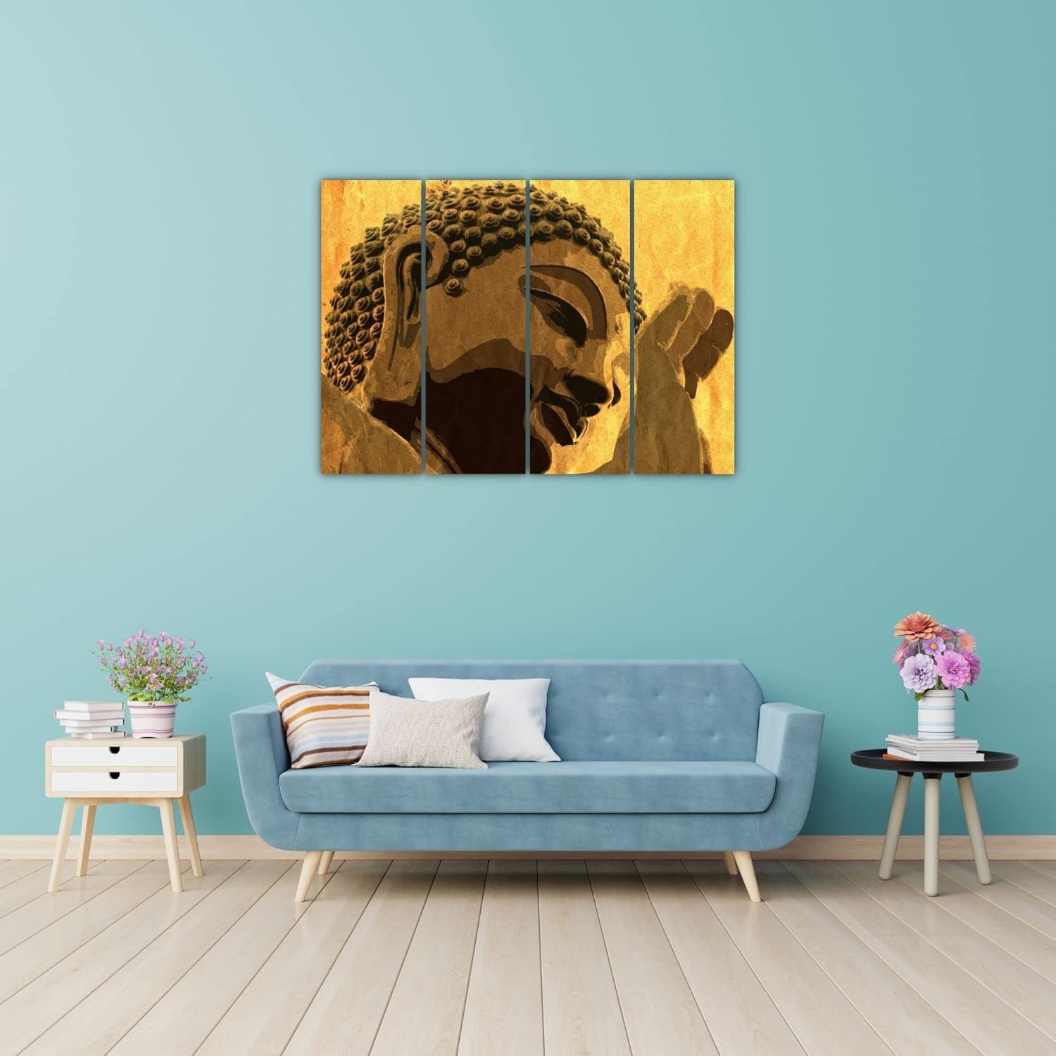
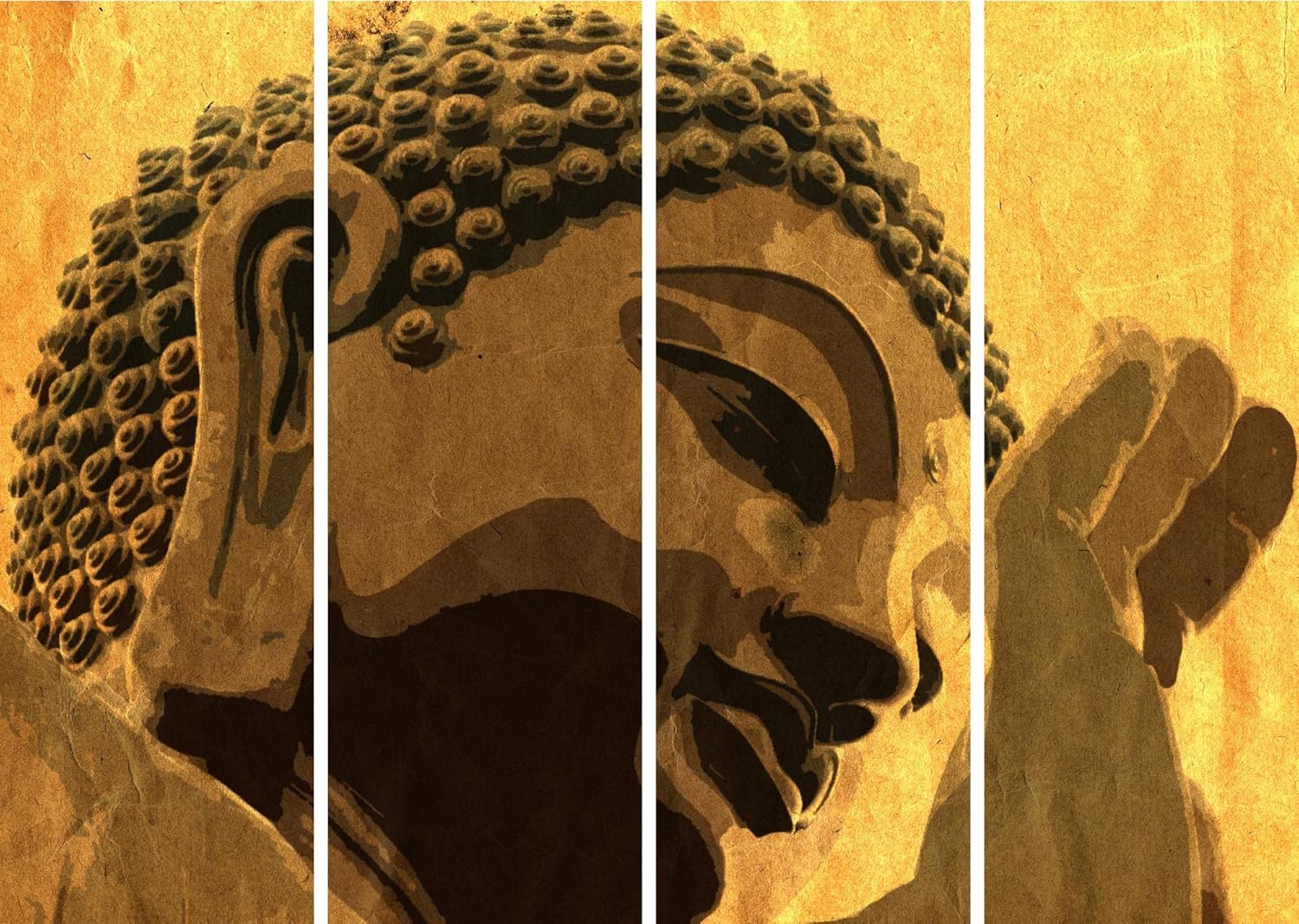
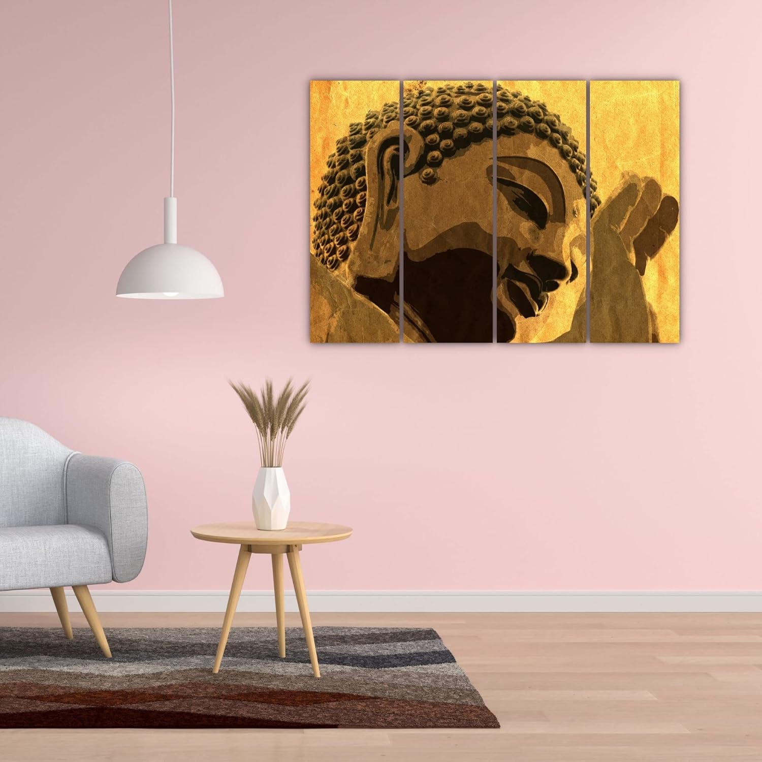
This 4-panel composition solves the visualization problem through its specific tonal construction. The Buddha's meditative profile spans panels one through three—closed eyes, serene expression, the curved line of the ear flowing into the iconic spiral curls—before resolving into praying hands on the fourth panel. At 85cm wide, the entire narrative unfolds at a pace your eye can follow from across the room. The golden ochre background isn't bright yellow or pale cream; it's the specific warm tone that disappears into standard Indian apartment walls rather than fighting them.
An 85cm piece covers roughly 28% of a standard 10ft (300cm) wall—enough presence to anchor a seating area without overwhelming it. Above a 6ft sofa (180cm), this width sits at 47% of the furniture span, which places it in the balanced zone where the art feels connected to the seating below rather than floating independently.
The 55cm height matters for 8ft ceilings. Mounted 20-25cm above sofa cushions, the top edge sits at approximately 150-160cm from the floor—well below the ceiling line, avoiding the cramped look that happens when tall art crowds upward into limited vertical space.
Four panels spaced 2-3cm apart create visual breathing room. The continuous Buddha image reads as a single composition from 3+ meters away (typical doorway viewing distance), but the panel gaps become visible as you approach, adding dimensionality that single-piece art cannot replicate.
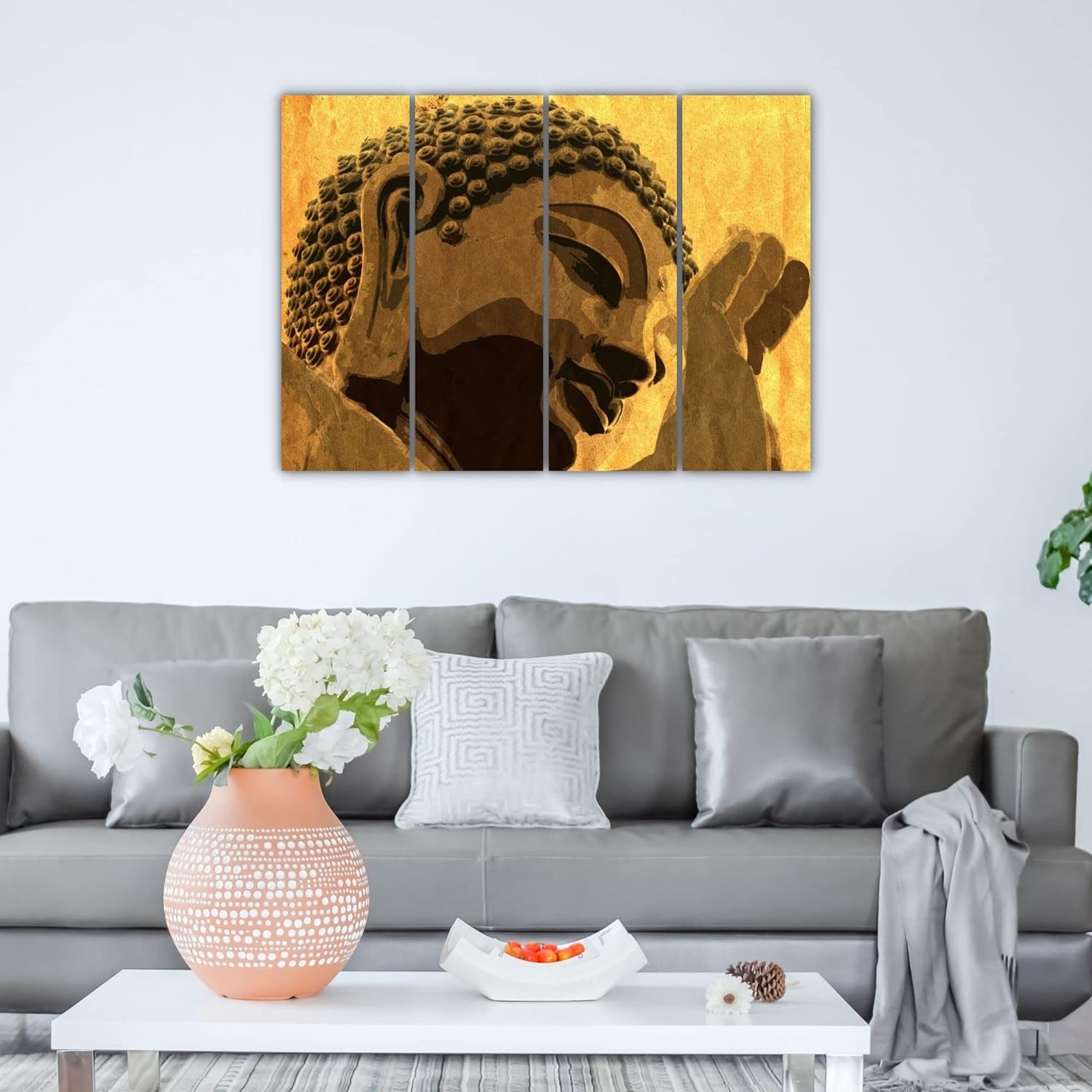
The background tone here isn't the saturated saffron you see in religious prints. It's a muted golden ochre—closer to aged parchment than bright gold. Against cream or off-white walls (the builder-standard colors in most Indian apartments), this ochre nearly blends at the edges, making the Buddha silhouette appear to emerge from the wall surface itself rather than sitting on top of it.
Under warm white LED lighting (2700-3000K, which is what most Indian homes have installed), the brown Buddha tones deepen. The shadowed areas—the closed eye, the space beneath the chin, the creases in the praying hands—read as deep chocolate rather than flat black. Morning daylight from east-facing windows will cool the palette slightly, pulling more bronze into the browns, but the piece maintains its contemplative quality across lighting conditions.
The aged texture effect visible throughout the image serves a specific function: it breaks up the flatness that makes printed art look obviously printed. From across the room, this crackle pattern reads as surface authenticity rather than digital artifice.
Four panels means four mounting points minimum—one D-ring per panel. The alignment requirement is real: if panel two hangs 5mm lower than panels one and three, the Buddha's jawline breaks visibly. The included hanging template addresses this by marking all four positions on a single paper strip. Tape the template level, mark your drill points through the template, remove it, drill, and each panel lands at consistent height.
For concrete walls (common in older Indian apartments), 6mm masonry anchors hold each panel's weight share comfortably—at 3kg total, each panel carries roughly 750g, well within anchor capacity. Drywall in newer constructions takes plastic anchors at the same diameter. Either way, the holes you're making are smaller than standard picture hook holes; wall putty and a paint touch-up restore the wall completely when you move.
Total installation time with template: 25-30 minutes for all four panels, including the leveling verification between each mount.
Macrame Buddha designs exist—woven cotton cord shaped into meditative figures. They're textural, they're handmade-looking, and they collect dust in every fiber gap. In Indian climates with ceiling fans running 8+ hours daily, dust accumulation on macrame becomes visible within two weeks. Washing damages the structure; vacuuming pulls threads loose. After one monsoon season, macrame absorbs enough humidity to develop that slightly musty textile smell.
Vinyl print on MDF has no fiber gaps to trap dust or moisture. The splash-proof surface means accumulated dust wipes away with a dry cloth. No absorption, no smell retention, no structural degradation from humidity cycling. The visual presence is comparable—both create spiritual focal points—but the maintenance reality diverges completely after month three.
From the doorway, the 85cm width establishes presence without shouting. The Buddha's closed-eye expression reads as calm, not confrontational—visitors notice it, register the spiritual tone, and move on without the piece demanding extended attention. This is intentional: meditative art should create atmosphere, not command focus.
Up close—standing directly before the piece—the panel gaps become part of the experience. The Buddha's gaze technically continues across the gaps, but your eye pauses at each division, slowing your visual reading of the image. The texture effect becomes visible at this distance, adding surface interest that flat prints lack.
The rightmost panel with praying hands can stand slightly apart from the main three (4-5cm gap instead of 2-3cm) if your wall width allows. This creates a visual pause between the Buddha's face and the gesture of prayer, emphasizing the hands as a distinct compositional element rather than an appendage.
Moolwan Design Note The continuous-image composition places the Buddha's serene closed eye exactly at the junction between panels two and three—the geometric center of the 85cm span. This isn't accidental; the eye naturally seeks the midpoint of horizontal art, and this placement rewards that instinct with the most emotionally resonant element of the image.
Moolwan Quality Standard Designed for Indian apartments and lighting conditions. Splash-proof vinyl surface resists humidity absorption through monsoon seasons. Packed for long-distance Indian transit with corner protection. Quality checked before dispatch. Ships from West Bengal.
Moolwan Fit Guidance for Indian Homes At 85cm wide, this set fits above sofas from 5.5ft to 7ft width (keeping within the 50-65% ratio). The 55cm height works with 8ft ceilings when mounted at standard 20-25cm above furniture. For entryway placement, center the composition on walls 6ft or wider; narrower walls will crowd the horizontal span.
Will 85cm look too small above my 8ft sofa? At 85cm, this piece sits at 35% of an 8ft (240cm) sofa width—at the lower end of the balanced range. It will look intentional rather than commanding. If you prefer more dominant presence, consider whether your wall width can accommodate larger multi-panel sets; this particular composition, however, is sized for 5.5-7ft furniture spans.
How will the golden ochre look against my light yellow walls? Light yellow walls and golden ochre occupy adjacent positions on the warm spectrum. The piece will integrate rather than contrast—the Buddha silhouette will stand out while the background nearly blends. This creates a subtle, embedded effect rather than a high-contrast statement. If you want stronger separation, cream or off-white walls provide better distinction.
Can I space the panels farther apart to cover more wall width? Yes, within limits. At 2-3cm gaps, the continuous Buddha image reads as intended. At 4-5cm gaps (total span ~97cm), the composition still holds but the panel divisions become more prominent. Beyond 5cm per gap, the image starts fragmenting visually—the Buddha's face reads as three separate pieces rather than one flowing image.
How do I ensure all four panels hang level? The included template marks all mounting points on a single strip. Use a spirit level to position the template, mark through the pre-printed holes, and your drill points will be aligned. If you don't own a spirit level, the smartphone level apps work adequately for this purpose—place your phone on top of the taped template to verify horizontal before marking.
Will the vinyl surface yellow or peel in humid conditions? Splash-proof vinyl on MDF is designed for humidity exposure—this is the same material used for kitchen backsplash prints and bathroom-adjacent art. The surface doesn't absorb moisture, so there's no expansion/contraction cycle that causes peeling. Color stability is maintained because the print sits under a protective layer rather than on an exposed surface.