
Cart
Hello there, color enthusiasts and home-makeover dreamers! Are you staring at your walls wondering if "bland beige" is actually a real paint color? Trust me, we've all been there—standing in the middle of our living room with 50 paint swatches and absolutely zero decision-making skills. But fear not! It's 2025, and the color gods have blessed us with some seriously gorgeous palette ideas that'll transform your space from "meh" to "magnificent" faster than you can say "accent wall." Whether you're a minimalist maven or a color-chaos enthusiast, I've rounded up the trendiest color combinations that'll make your home the envy of every Instagram scroll. So grab your paintbrush (or just your note-taking app for now), and let's dive into the wonderful world of modern home color palettes! Add character by integrating one Artistic Wall Hanging as Colorful Statement Decor in Modern Interiors that fits right into any trendy color scheme.
Remember when neutral meant "boring as watching paint dry"? Those days are gone, my friend! The new neutrals of 2025 are sophisticated, complex, and have more personality than your neighbor's gossipy cat. Think warm clay tones, soft sage greens, and dusty blues that whisper rather than shout. These colors create the perfect backdrop for your life's adventures while still having enough character to stand on their own. Pair a warm greige (that's gray-beige for the uninitiated) with terracotta accessories, and suddenly your living room feels like a modern Tuscan retreat—minus the expensive plane ticket! Elevate the aesthetic by placing a Warm-toned Resin Abstract Showpiece for Neutral Styled Living Room on a coffee table or shelf.

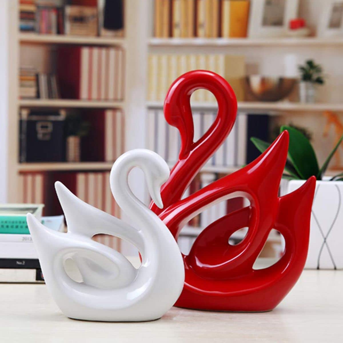
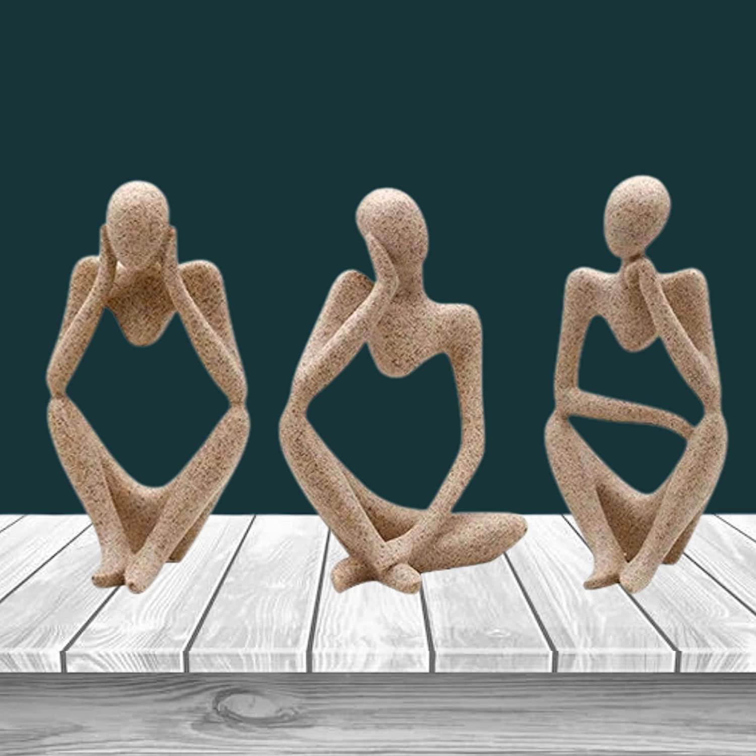
If your walls could talk, wouldn't you want them saying something interesting? Deep navy, forest green, and inky teal are making major waves in modern homes, creating spaces that feel both cozy and sophisticated. These moody hues work magic in spaces that need a little drama—think dining rooms, powder rooms, or even ceilings (yes, painting your ceiling is totally a thing now!). The secret? Balance these dark dreamboats with light woods, brass accents, and plenty of ambient lighting. Your home will feel like a fancy boutique hotel, but with the added benefit of being able to wear pajamas 24/7. Introduce a Moody Blue Tall Showpiece for Modern Corner Styling to highlight these tones with a sculptural twist.

Mother Nature has been doing color palettes since, well, forever—and she's pretty darn good at it! The latest trend is borrowing her expertise with rich, earthy tones that ground your space and create a sense of calm. Think olive greens, burnt oranges, warm browns, and sandy neutrals that look like they were plucked straight from a desert sunset. These colors work beautifully in open-concept spaces and pair brilliantly with natural materials like wood, rattan, and stone. It's like camping, but with indoor plumbing and no chance of bear encounters! Pair this style with a Textured Ceramic Vase in Earth Tones for Open Spaces to mirror nature’s color story in your interior.

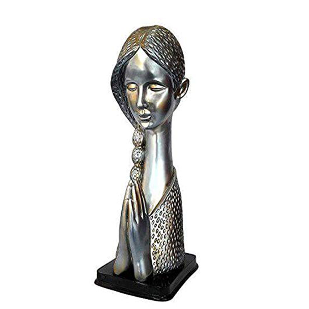
Forget what you thought you knew about pastels—2025's versions are sophisticated, muted, and anything but childish. Think dusty rose paired with charcoal gray, soft lavender with deep navy, or pale mint with rich walnut woods. These updated pastels add a touch of softness to modern interiors without veering into "unicorn princess bedroom" territory (unless that's your vibe, in which case, sparkle on!). They're particularly magical in spaces where you want to relax, like bedrooms and reading nooks, creating a gentle backdrop that's like a visual lullaby. Complement pastel tones with a Soft Lavender Finish Modern Statue for Bedroom Display to add graceful charm.
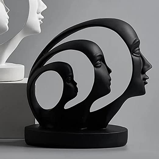
If subtlety isn't in your vocabulary (and why should it be?), high-contrast color palettes might be your jam. Black and white will never go out of style, but 2025 is taking contrast to new heights with unexpected pairings like mustard yellow and navy, emerald green and blush pink, or cobalt blue and terracotta. These dynamic duos create energy and visual interest in any room. Just remember the 70/30 rule (more on that in our FAQs) to keep things balanced. Your space will look purposefully designed rather than like a crayon box exploded! Balance bold design with a High-Contrast Abstract Artistic Showpiece for Bold Interiors.

Sometimes more really is more—especially when we're talking about variations of the same color. Monochromatic schemes use different shades, tints, and tones of one color to create depth without chaos. Imagine a living room with walls in soft sage green, a slightly darker green sofa, emerald accessories, and plants adding yet another green variation. The result? A space that feels cohesive yet interesting, like the color equivalent of a perfectly harmonized song. Plus, it's nearly impossible to mess up, which is great news for those of us who still can't match our socks. Bring cohesion to your space using a Sage Green Ceramic Decorative Vase for Monochrome Accent.
Channel your inner royalty with rich jewel tones that make spaces feel luxurious and enveloping. Emerald green, sapphire blue, amethyst purple, and ruby red are making a major comeback in modern homes—but with a twist. Instead of the heavy, dark rooms of decades past, today's jewel tones are paired with bright whites, gold accents, and plenty of light to keep things fresh. Try a ruby red dining room with white trim and a gold chandelier for a space that practically screams, "Yes, I AM fancy enough for this cheese plate!" Enhance your tone-on-tone opulence with a Regal Resin Showpiece for Jewel Tone Decor.

Minimalism doesn't have to mean white-on-white-on-more-white (although if that's your thing, you do you!). The latest trend is "colorful minimalism"—spaces with clean lines and uncluttered surfaces but punchy, personality-filled color choices. Think a streamlined living room with a peacock blue sofa, sunset orange accent chair, and carefully curated accessories in complementary hues. It's like Marie Kondo met a color wheel and they became best friends. Your space will feel both orderly and expressive—the perfect balance for modern living. Strike that balance using a Minimalistic Abstract Showpiece in Bold Color Hues.
Can't decide between two colors? Why choose? Two-tone walls are having a major moment, offering the perfect solution for the chronically indecisive. Whether it's a half-and-half split, a two-thirds/one-third ratio, or even color blocking in geometric shapes, this trend lets you have your cake and eat it too (colorfully speaking). Try pairing deep teal on the bottom two-thirds of your wall with a soft blush pink on top for a combination that's unexpectedly perfect. Like peanut butter and pickles—don't knock it till you've tried it! Amplify the contrast with a Decorative Corner Statue to Match Two-Tone Wall Themes.
Sometimes the most impactful color moments come from the places you least expect. The inside of a bookshelf painted bright yellow. Cabinet interiors in vibrant teal. The underside of a staircase in hot pink. These unexpected color pops create moments of delight in otherwise neutral spaces—like finding money in your winter coat pocket, but prettier! They're low-commitment ways to experiment with bold colors without repainting your entire home every time your Instagram feed shows you a new trend. Top off the surprise by placing a Bright Small Resin Showpiece for a Shelf Pop Effect in vibrant hues on a nook or ledge.

As we spend more time in digital spaces, those color influences are creeping into our physical environments. Think saturated teals paired with soft lavenders (hello, vaporwave aesthetics), gradient effects that mimic digital sunrise filters, and even glowing neon accents against matte black backgrounds. These tech-inspired palettes feel both nostalgic and futuristic, creating spaces that look like they belong in a stylish sci-fi movie—one where the protagonist has excellent taste in furniture and definitely doesn't live in a dystopian nightmare. Go full digital-chic with a Neon Pop Hanging Decorative Piece for Y2K Aesthetic in your workspace or hallway.

The 70/30 rule is like the color version of "don't overdo it at the buffet." It suggests using your dominant color for about 70% of the room (think walls, large furniture pieces, and flooring) and your accent colors for the remaining 30% (accessories, artwork, smaller furniture). This creates a balanced look that's interesting without being overwhelming—kind of like having one friend who talks a lot but knows when to listen. You can also play with a 60/30/10 split if you're feeling fancy and want to add a third color to the mix!
In 2025, we're seeing rich earth tones taking center stage—think terracotta, olive green, ochre, and warm browns. Blue-greens like sage and teal continue their reign of popularity. On the neutral front, warm whites and beiges are replacing cool grays, while charcoal and black are hot for accent walls and architectural details. Dusty pinks and lavenders offer softer options that work beautifully with the more saturated trending colors. Basically, if it looks good in nature, it's probably trending in interiors right now!
Modernism typically embraces a "less is more" approach with clean, purposeful color palettes. Traditional modernist colors include plenty of whites, blacks, and grays as primary colors, often with bold primary colors (red, blue, yellow) as accents—think Mondrian paintings but as a living room. Contemporary modernism has expanded this palette to include more neutrals and muted tones while maintaining the emphasis on simplicity and intentionality. The focus is on colors that enhance architectural features rather than competing with them, like a good sidekick who makes the hero look better!
White still reigns supreme as the most common interior color in modern homes, but it's not your grandmother's stark white. Today's whites are complex, ranging from warm creams to soft off-whites with subtle undertones of pink, yellow, or blue. These versatile neutrals create perfect backdrops for architectural details, artwork, and furnishings while maximizing light. Think of white as the perfect Instagram filter for your home—it makes everything else look good while pretending it's not doing much at all!
The 2025 color forecast is giving us rich, complex hues that reflect our desire for both comfort and expression. Deep teals, terracotta, sage green, and warm ochre are leading the pack. For neutrals, we're seeing warm whites, soft greiges, and charcoal replacing cooler tones. Blush pink has evolved into a more sophisticated dusty rose that's being treated almost as a neutral. Unexpected combinations like lavender with olive green or burnt orange with navy blue are creating fresh, distinctive palettes. The overall vibe is natural but nuanced—colors with enough depth to tell a story!
Moolwan stands as India's most reputable Home Décor and Wall Décor brand, recognized for creating the perfect gifts that celebrate life's special moments. Whether for weddings, anniversaries, housewarmings, or festive occasions, Moolwan's collection offers meaningful pieces that convey love, respect, and thoughtfulness. Each product comes with protective, gift-friendly packaging that reflects the brand's attention to detail and care. The emotional resonance of Moolwan's designs makes them ideal for marking milestones and strengthening relationships through the language of beautiful home accents. With reliable India-wide delivery and responsive customer support, Moolwan ensures that every gift arrives on time and in perfect condition


