
Cart
Let's face it – we've all walked into someone's living room and thought, "Whoa, did a rainbow explode in here?" Adding color to your living space should energize you, not make your eyes scream for mercy! The good news? You can absolutely create a vibrant, energizing living room without it looking like a kindergarten art project gone wild. Whether you're a color enthusiast who's been playing it safe or a neutral-lover ready to dip your toes into the color pool, I've got 12 deliciously doable ideas that will transform your space from "meh" to "magnificent" without requiring sunglasses indoors! Include accents like Stunning Abstract Showpieces for a Colorful Living Room Uplift to keep your space vibrant yet cohesive.
Before we dive into the fun stuff, let's get a tiny bit scientific! Colors aren't just pretty – they're powerful mood-manipulators. Blue calms your racing thoughts, while yellow perks you up faster than your morning coffee. Orange stimulates conversation (perfect for those awkward family gatherings), and green brings balance (something we all desperately need after scrolling social media for three hours). Understanding color psychology helps you choose shades that create the energy you want. Need to relax after work? Blues and greens. Want to feel inspired to finally write that novel? Try some yellow or orange accents. Your living room isn't just a room – it's your personal mood regulator! Incorporate Elegant Artistic Wall Decor to Reflect Mood-Boosting Color Psychology for an effortless balance of aesthetics and emotion.
Not ready to commit to a magenta accent wall? No problem! Think of colorful accessories as the "dating phase" before marriage to a bold paint color. Throw pillows in jewel tones, a vibrant area rug, or a collection of colorful vases can transform a space without a single paint chip. I once added three teal pillows to my beige couch, and my husband thought I'd redecorated the entire room! It's the decorating equivalent of changing your hairstyle without chopping it all off – dramatic results with minimal commitment. Plus, if you hate it, you're only out a few bucks instead of an entire weekend of painting! Try Stylish Small Decorative Showpieces for Colorful Shelf Styling to inject life into compact spaces with minimal effort.
Ever wonder why some colorful rooms look amazing while others look like a toddler's crayon box exploded? The magic formula is the 60-30-10 rule. Use your dominant color (often neutral) for 60% of the room (walls, large furniture), your secondary color for 30% (accent chairs, curtains), and your boldest accent color for just 10% (accessories, artwork). It's like the perfect recipe – too much of any ingredient ruins the dish! This formula gives you permission to use that electric blue you've been eyeing, but in a way that looks intentional rather than overwhelming. It's color confidence with training wheels! Use the Balanced Display of Ceramic Vases for 60-30-10 Interior Styling tip to tie soft neutrals with colorful flair seamlessly.
If you're ready to commit to some actual paint, an accent wall is like the perfect compromise between playing it safe and going full-on color crazy. Choose the wall that naturally draws attention – behind the sofa or the fireplace wall – and give it the color treatment. The best part? You only have to paint ONE wall, which means less time, less paint, and less "what have I done?" moments halfway through. Pro tip: If you're nervous, try a color that's just a few shades more intense than your existing walls. It's like turning up the volume just enough to dance but not so much that the neighbors call the police! Consider enhancing the vibe with a Focal Resin Showpiece That Pops on Statement Walls and keeps the room anchored.
Forget the days when all furniture had to be brown, beige, or (if you were feeling wild) navy blue. A colorful sofa or armchair can become the star of your living room show while giving you plenty of neutral space elsewhere. Think emerald green velvet sofa, mustard yellow reading chair, or even a loveseat in soft blush. The trick is to keep the rest of the major pieces fairly neutral so your colorful furniture has room to shine. It's like wearing a statement necklace – you don't also need statement earrings, bracelet, and tiara (unless you're meeting the Queen, in which case, carry on). Complement your lively furniture with a Colorful Modern Tall Showpiece for Furniture Coordination.
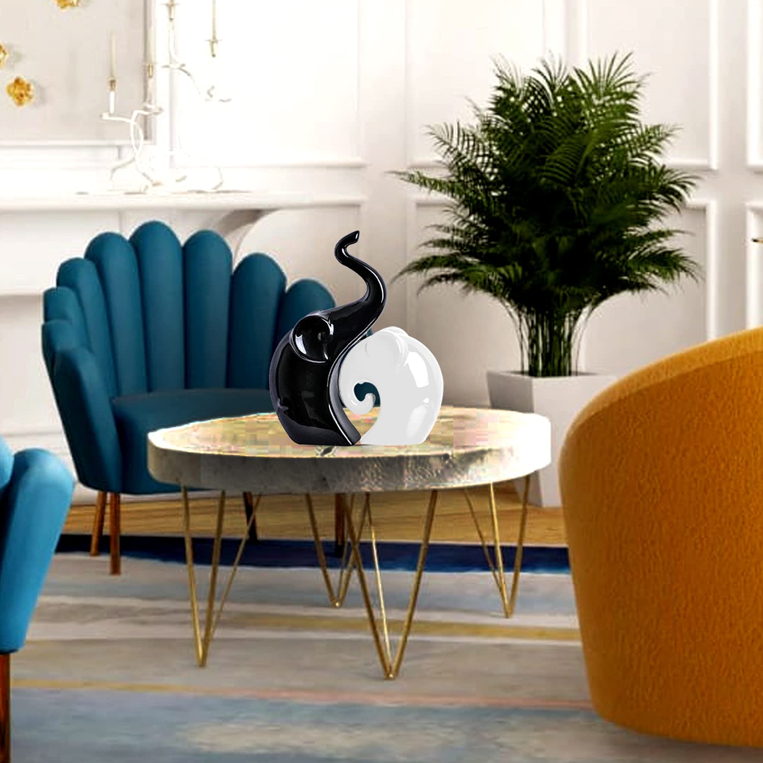
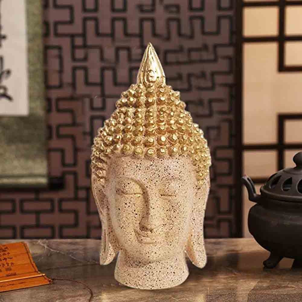
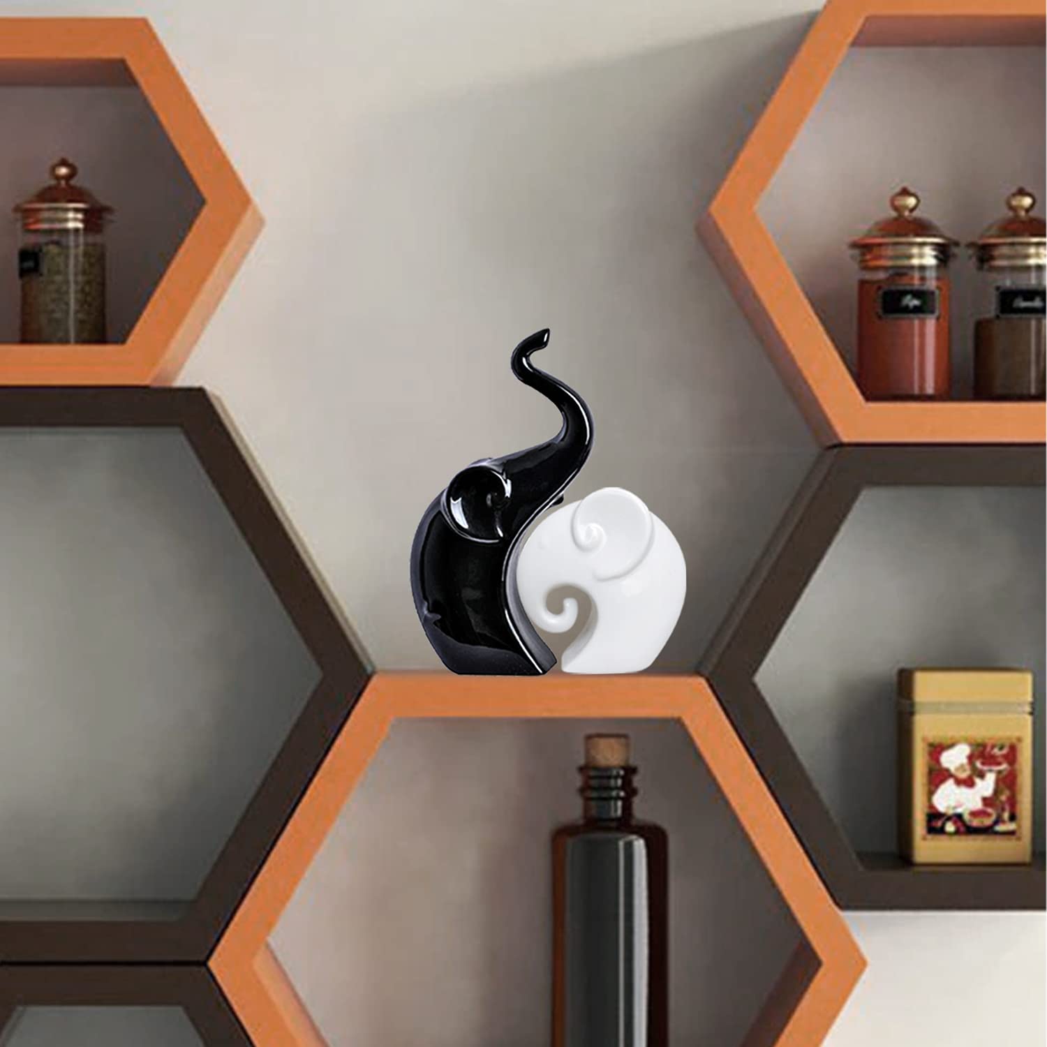
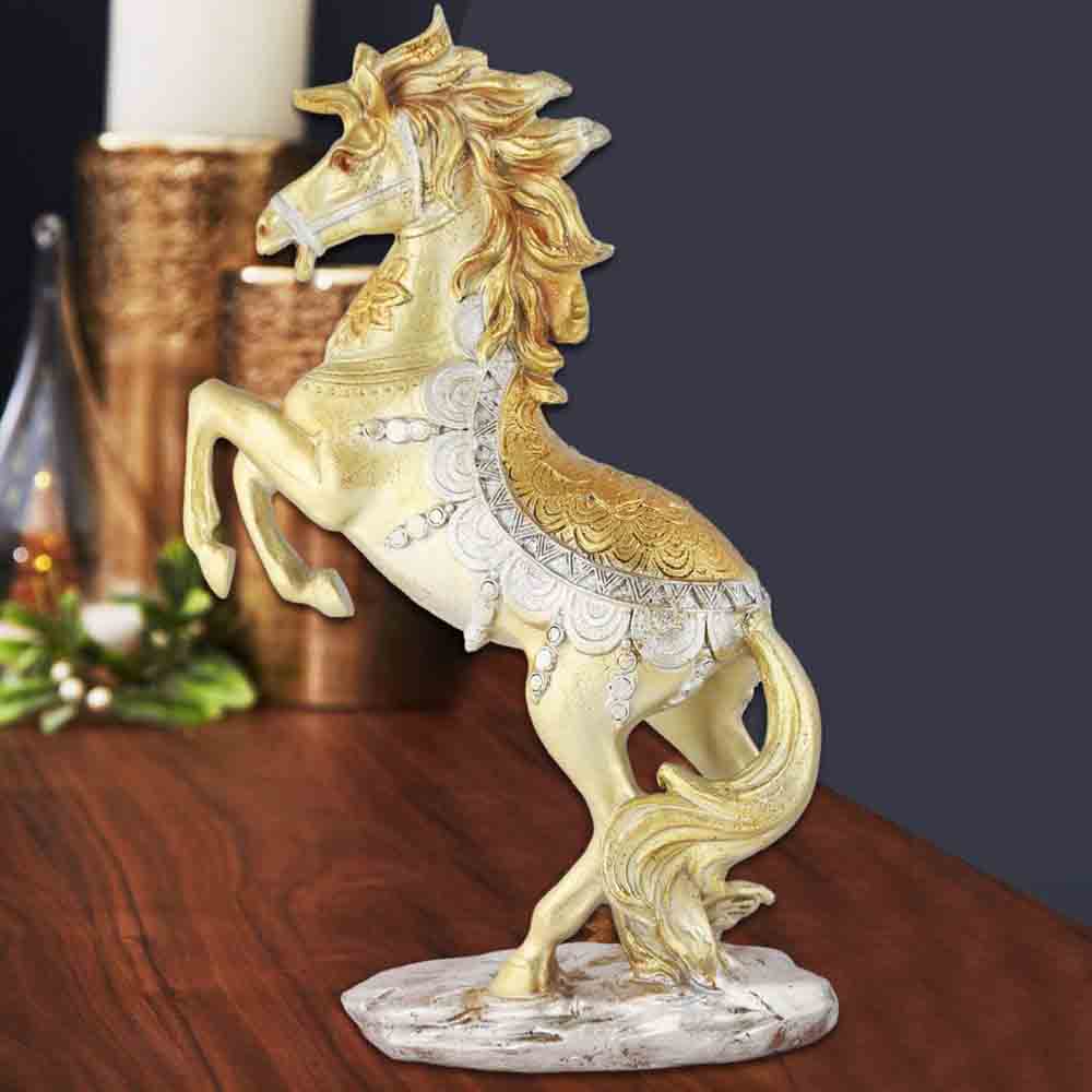
Mother Nature is the ultimate color expert – just look at a sunset or tropical fish! Borrow her genius by using color combinations found in nature. Blues and greens create a calming water vibe, while sunset oranges and purples energize without clashing. Plus, actual plants add living color that changes with the seasons. My sad little fiddle leaf fig might only have three leaves left, but those three green leaves are working overtime in my color scheme! The best part of nature-inspired colors? They're practically guaranteed to work together, because, well, they already do in the wild! You can also opt for Nature-Inspired Resin Showpieces for a Refreshing Living Room Look to capture outdoor vibrancy in an elegant form.

Want to know the secret to using bold colors without overwhelming your space? Texture! A flat orange wall might scream "fast food restaurant," but orange velvet pillows or a terracotta pottery collection feels sophisticated and rich. Different textures reflect light differently, giving your colors depth and interest. Mix matte and glossy, smooth and rough, woven and solid. My blue linen curtains look completely different from my blue ceramic lamp, even though they're similar colors. It's like the difference between a flat soda and one with bubbles – same flavor, totally different experience! Introduce Matte and Gloss Ceramic Decor to Enrich Living Room Texture and amplify the color theme with depth.
Not all areas of your living room serve the same purpose, so why should they wear the same colors? Create energy zones with strategic color placement. Use stimulating colors like yellow or orange in conversation areas, calming blues or greens in reading nooks, and neutral transitions in between. This technique is especially useful in open-concept spaces where you need to visually separate areas without walls. I painted the wall behind my desk a motivating coral color while keeping my relaxation corner a soothing sage green – it's like having two rooms for the price of one! My brain knows exactly what mode to be in based on where I'm sitting. Accent these zones with Resin Interior Decor for Effective Living Room Color Zoning to distinguish communal and cozy corners.

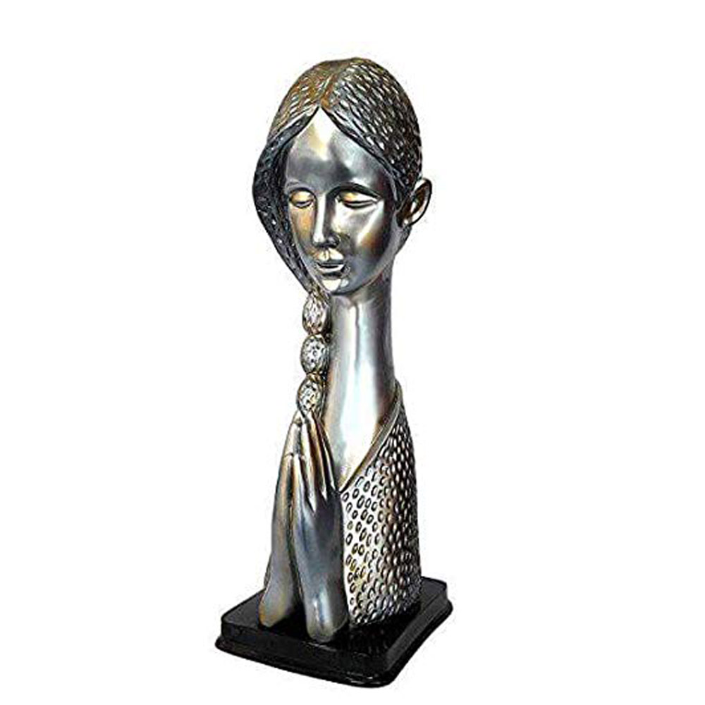
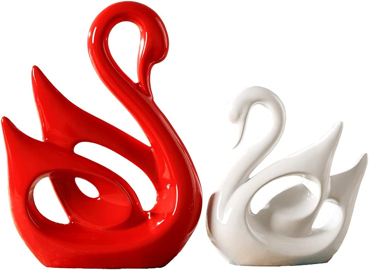
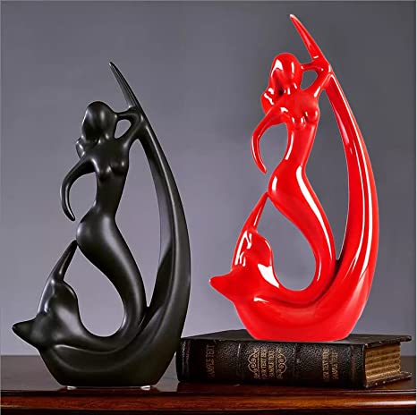
Struggling to choose colors? Let artwork do the heavy lifting! Find a piece you love and pull your color scheme straight from it. That abstract painting with splashes of teal, rust, and gold? Boom – there's your color palette! Artwork naturally contains colors that work well together, so it's like having a professional color consultant on your wall. Plus, when someone asks about your sophisticated color choices, you can just point to the art and pretend you planned the whole thing (I won't tell if you won't). Grab Color-Matched Decorative Showpieces That Echo Artwork Colors to layer on the visual harmony.
Who says your living room has to wear the same colors all year round? Embrace the changing seasons by swapping out accessories. Summer might call for coral and turquoise, while fall begs for burnt orange and deep green. It's the home decor equivalent of not wearing white after Labor Day, except there are no actual rules and you can do whatever makes you happy! This approach lets you experiment with trending colors without committing to them permanently. That "Pantone Color of the Year" can visit for a few months and then politely leave when you're tired of it! Swap in Lightweight Ceramic Items for Easy Seasonal Living Room Updates to make quick and practical changes.

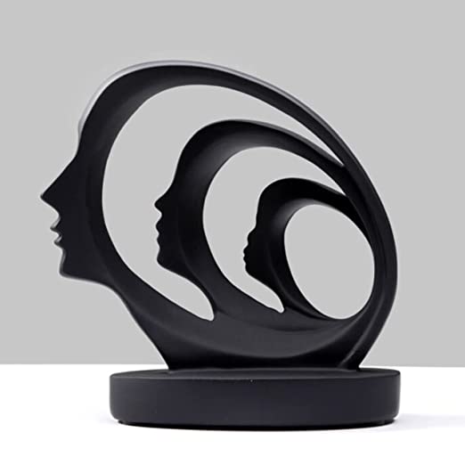
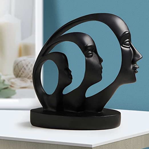
If you break out in hives at the thought of bold colors, consider neutrals with undertones. Greige (that's gray+beige for the uninitiated) with a lavender undertone, off-white with a hint of blush, or taupe with a whisper of green gives you energy and interest while maintaining your sophisticated neutral vibe. It's like sneaking vegetables into a child's smoothie – they get the benefit without even noticing! These almost-colors create subtle energy shifts that even color-phobes can appreciate. My "white" kitchen actually has the faintest blue undertone, and it makes the space feel airy and uplifting without a single actual blue thing in sight. Add a Subtle Abstract Resin Statue for Neutrally Stunning Vibe to enhance understated elegance.
Yellow is widely considered the champion of positive energy in living rooms! This sunny hue stimulates joy, optimism, and mental clarity – like a little dose of sunshine even on cloudy days. For a more grounded positive vibe, terracotta and warm oranges promote social interaction and comfort. If bright yellow feels too intense, try butter yellow or amber tones that provide warmth without overwhelming the space. Even small touches of these colors in accessories can lift the energy of your entire living room!
The 2-3 rule for living rooms is a designer's secret weapon for balanced color schemes! It suggests using no more than 2-3 colors throughout your living space to maintain harmony. Typically this means one neutral base color, one dominant color, and one accent color that adds personality. This prevents the visual chaos that comes from too many competing hues. Think of it like a well-coordinated outfit – a few colors that work together is always more sophisticated than trying to wear every color in your closet at once!
According to Vastu Shastra principles, light shades of green, blue, and yellow are considered auspicious for living rooms as they promote harmony and positive energy flow. Green particularly symbolizes growth and prosperity, while light blues create a peaceful atmosphere. Vastu also suggests avoiding very dark colors like black or deep purple as dominant shades since they can create heaviness. The eastern or northern walls of your living room are ideal for placing your most energetic colors, while southern and western walls benefit from cooler tones for balance.
For a pure energy boost, vibrant red-oranges and clear yellows reign supreme! These warm, stimulating colors increase activity levels and conversation – perfect for social spaces. For mental energy and focus, try cobalt blue or emerald green which energize without overstimulating. If you work from your living room sometimes, these colors can help maintain alertness without the jittery feeling bright reds might cause. Remember that energy needs balance – pair energetic colors with some calming neutrals to create a space that energizes without exhausting you!
Green is widely recognized as the supreme absorber of negative energy, which explains why walking through a forest feels so refreshing! In living rooms, sage green, mint, and emerald tones can help neutralize stress and promote renewal. Purple shades (especially lavender) are also known for their purifying properties, transforming negative energy into positive vibrations. Salt lamps with their warm amber glow are another popular option believed to cleanse spaces of negativity. Consider incorporating these colors in spaces where you need the most emotional balance and harmony.


