
Cart
Let's face it—your dining room walls have seen everything from Thanksgiving gravy spills to that time your uncle Bob got a little too excited about politics over dessert. They deserve a color that can handle the drama! The right wall color in your dining room doesn't just serve as a backdrop; it sets the entire mood for your culinary adventures. Whether you're hosting fancy dinner parties or just trying to convince your kids that vegetables aren't the enemy, your wall color is silently influencing everyone's experience. In this colorful journey, we'll explore combinations that'll make your dining space so inviting, guests might "accidentally" show up at dinnertime more often. From subtle elegance to bold statements that scream "yes, I do know what I'm doing with interior design," these color combos will transform your dining room from "meh" to "magnificent" faster than you can say "pass the potatoes!"
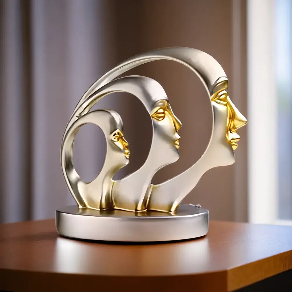
To complement these stylish settings, consider enhancing your theme with Artistic Resin Showpieces for perfect dining room color combinations that subtly elevate even the simplest interior styles.
Red dining rooms aren't just for fancy restaurants where the waiter judges your wine selection! A rich crimson or burgundy wall creates an atmosphere that literally stimulates appetite (science says so!). Pair it with cream or off-white trim for that chef's-kiss contrast that keeps the room from feeling like the inside of a tomato. The secret to pulling off red without overwhelming your space? Use it on just one accent wall behind your buffet or sideboard. Your guests will think you hired a designer, while your food will look more Instagram-worthy against that passionate backdrop. Just be warned: studies show people eat more in red rooms, so if you're on a diet... maybe go with blue? (Kidding! Or am I?)
Balance the fiery tones of red with Handmade abstract showpieces for red-themed dining elegance on your buffet table or wall shelves to maximize visual harmony.
Nothing says "morning person" quite like a dining room dressed in sunshine yellow! But before you panic about it being too bright (nobody needs that kind of energy before coffee), here's the trick: pair it with a sophisticated gray to keep things grounded. This combination is like that perfect couple—one's the life of the party, the other makes sure everyone gets home safely. A pale yellow on three walls with an accent wall in charcoal gray creates dynamic tension that interior designers drool over. Add white trim and suddenly your ordinary Tuesday night spaghetti dinner feels like a special occasion. Bonus: yellow is scientifically proven to boost mood and creativity—perfect for when you need to creatively explain why dinner is burnt again!
Match this cheerful palette with Modern vases and ceramic decor for yellow and gray dining walls that bring charm and function to your table centerpiece or shelf zones.
Sage green is the wall color equivalent of that friend who always brings homemade bread to dinner parties—effortlessly impressive but not showing off. This muted green creates a serene backdrop that makes both your grandmother's china and your IKEA plates look equally at home. Pair it with cream or ivory trim and you've got a combination that whispers "I have my life together" without shouting it. The natural, earthy tone promotes relaxation during meals (helpful for families with teenagers!), while also complementing most wood furniture tones. It's particularly magical in rooms with lots of plants—suddenly your sad little succulent looks like part of a carefully curated collection!
Take it one step further with Decorative vases for sage green dining rooms that bring a well-planted, serene charm to your walls and tabletops.
Channel your inner sailor (the sophisticated yacht-owning kind, not the "I've been at sea too long" kind) with navy blue walls paired with crisp white trim. This timeless combo works in traditional and modern spaces alike, creating a dramatic backdrop that somehow makes everything—from takeout containers to fine china—look more expensive. The deep blue grounds the space while white moldings and ceiling keep it from feeling like you're dining underwater. Add brass accents and suddenly you're hosting dinner in what feels like a fancy captain's quarters! This color combination is particularly forgiving of spills and splashes—which, let's be honest, is a practical consideration when your dining partners include small humans or clumsy adults.
Bring a bit of sophistication aboard with Blue-accented resin statues for navy-themed dining areas that subtly echo the nautical aesthetic and elevate visual rhythm.
Tired of dining at home feeling, well, too much like home? Transport yourself to a Mediterranean getaway with warm terracotta walls punctuated by turquoise accents. This unexpected pairing creates instant personality—like your dining room suddenly developed excellent taste in world music. The earthy orange-brown tones create warmth that makes everyone look like they have a perfect tan, while turquoise details (think artwork frames, vases, or chair cushions) add that splash of excitement. It's like your walls are saying, "Yes, we're just having leftovers, but let's pretend we're in Santorini!" This combination works particularly well in rooms with natural light, where the colors shift beautifully throughout the day—breakfast, lunch, and dinner, three slightly different rooms!
Let the Mediterranean mood shine through with Terracotta-toned antique decorative pieces for exotic dining vibes, placed in corners or buffet tops.
Lavender isn't just for grandma's guest bathroom anymore! This soft purple hue creates a surprisingly sophisticated dining space when paired with warm white trim and ceiling. The subtle purple undertones create a sense of relaxation (perfect for those long, lingering meals with friends) while giving your room a distinctive look that stands out from the sea of beige dining rooms everywhere. The key is choosing a lavender with gray undertones to keep it grown-up rather than princess-bedroom-esque. This combination is particularly flattering in evening light—whether that's candles or your fancy dimmer switch—making everyone look like they've just returned from a spa weekend. Who needs filters when you have properly colored walls?
Soften the aesthetic further with Lavender-themed showpieces for relaxing dining environments to beautify side tables or centerpoints.
Want a dining room that says "I read design magazines but make my own rules"? Enter the unexpectedly perfect marriage of deep charcoal walls with soft blush accents. This contemporary combo creates instant drama without feeling like a moody teenager's bedroom. The dark walls make artwork pop and create an intimate dining experience (perfect for those dates when you've actually cooked instead of ordering in). Meanwhile, blush-toned chairs, curtains, or table linens add just enough softness to keep things from feeling too serious. It's like wearing a black tuxedo with a quirky pink bowtie—sophisticated with personality! This combination works especially well in dining rooms that transition into evening entertaining spaces—the darker walls create the perfect backdrop for ambient lighting.
Tie it all together with Modern artistic decor in blush tones for charcoal dining walls that highlight contrasts and textures in a stylish way.
Channel your inner royalty with jewel-toned emerald green walls accented with gold fixtures and frames. This combination screams luxury faster than you can say "pass the fancy mustard." The rich green creates an intimate atmosphere that flatters everyone (yes, everyone) while gold accents catch the light and add that touch of glamour your Tuesday night deserves. The secret to making this combination work without feeling like a casino lobby? Keep the gold touches minimal and intentional—picture frames, light fixtures, and perhaps the edge of your dining plates. The beauty of this pairing is that it makes even ordinary meals feel like special occasions. Mac and cheese just hits different when you're dining like a sophisticated British aristocrat!
Accent with Emerald green tabletop decor items for luxurious dining room ideas placed precisely for visual balance and elegance.
Sometimes the best color inspiration comes from what's already in your dining room—like that essential morning cup of coffee! A rich mocha brown paired with creamy off-white creates a warm, inviting space that feels like a perpetual hug. This combination has serious staying power because it's both timeless and practical (shows less dirt from those inevitable dinner mishaps). The trick to keeping it from feeling too 1990s? Use the darker color sparingly—perhaps on just one accent wall or the lower half of a chair rail arrangement. Add some black wrought iron accessories or lighting fixtures and suddenly your space feels like that chic café where the baristas know your name. It's comfort food for your walls!
Add to the coziness with Coffee-toned Vastu decor items for harmony in dining spaces that promote wellness and welcome.
If your dining room needs to work harder at being interesting than your brother-in-law's golf stories, consider the bold-but-livable combination of teal walls with warm wood tones. This pairing feels both contemporary and timeless, creating an energetic backdrop for lively dinner conversations. The blue-green hue is sophisticated yet playful (much like you after one glass of wine), while natural wood elements—in your table, chairs, or sideboard—keep things grounded. This color is particularly magical in rooms with lots of houseplants, creating a lush, vibrant environment that makes take-out feel special. The best part? Teal is scientifically proven to reduce hunger, which means you might finally stop eating your kids' leftover chicken nuggets!
Infuse charm with Artistic antique-style decor items for teal and wood tone dining setup that balance brightness and tradition.
Not ready to commit to a bold color statement? Meet greige—that perfect neutral that's neither gray nor beige but somehow better than both. This chameleon color is the Switzerland of interior design: neutral, dependable, and plays well with literally everything. Pair it with literally any accent color (yes, ANY) through accessories, artwork, or table settings, and you've got a dining room that can transform with the seasons or your moods. Today you're feeling coral napkins; next month it might be emerald green placemats. The beauty of greige is its ability to make other colors shine while creating a sophisticated backdrop that says "I have excellent taste but don't need to show off about it." It's particularly perfect for open floor plans where your dining area needs to play nicely with adjacent spaces!
Try complementing this foundation with Neutral-toned wall hangings and small decor pieces for greige dining themes that adapt seamlessly to any seasonal makeover.
The best dining room wall color depends on the mood you want to create, but warm neutrals like greige, taupe, and soft cream are universally flattering and timeless. Rich, warm colors like terracotta, sage green, and burgundy stimulate conversation and appetite, making them excellent choices for dining spaces. If you entertain often in the evening, deeper tones like navy blue or emerald green create an intimate, sophisticated atmosphere. For smaller dining rooms, lighter colors like soft butter yellow or pale lavender make the space feel larger while adding personality.
Red is traditionally considered the luckiest color for dining rooms in many cultures, particularly in Chinese feng shui, where it symbolizes good fortune and abundance. Gold or yellow tones are also auspicious choices, representing prosperity and wealth—who doesn't want that energy around food? In Western traditions, green symbolizes growth and renewal, making it a subtly lucky choice. For a modern interpretation of lucky colors, consider combining elements—perhaps a neutral backdrop with red or gold accents through artwork, table linens, or a bold ceiling color for prosperity without overwhelming the space.
According to Vastu Shastra, the ancient Indian science of architecture and design, the ideal dining room colors are warm and appetizing tones like yellow, orange, and warm neutrals. These colors promote positive energy flow and stimulate healthy digestion. Light green is also Vastu-approved as it represents growth and harmony. Avoid using blue or purple as primary colors in the dining area, as Vastu principles suggest these cooler tones may suppress appetite and conversation. For best results, the eastern or southeastern part of your home is considered ideal for the dining area, with colors that complement these directions.
According to design experts, pure bright blue should generally be avoided in dining areas as it's been shown to act as an appetite suppressant (great for diet centers, not so much for enjoying meals!). Stark clinical whites can create an uninviting, cafeteria-like atmosphere that lacks warmth. Very dark colors like black or charcoal should be used sparingly in smaller dining rooms as they can make the space feel cramped and gloomy. Neon or extremely bright colors might be too stimulating and distracting for a peaceful dining experience—save those for accent pieces rather than entire walls.
Green is considered universally lucky for most rooms as it represents growth, renewal, and abundance. In bedrooms, soft blues and lavenders promote restful sleep and peaceful energy. For living spaces, earth tones like terracotta, amber, and brown create grounding, protective energy. Yellow brings joy and positive energy to any space, making it particularly lucky for kitchens and activity rooms. White symbolizes purity and new beginnings, making it an auspicious choice when starting fresh. For a modern approach to lucky colors, consider your personal associations with colors—the shade that makes you feel most comfortable and happy brings its own kind of luck to your space!


