
Cart
We've all been there – standing in the middle of a room with a questionable paint color on the walls and a rug that somehow looked WAY better in the store. Whether you're a decorating newbie or someone who regularly binges home makeover shows while eating ice cream straight from the container, we all make mistakes. But fear not! I'm here to guide you through the decorating danger zone with a smile on your face and your dignity intact. Think of this as your personal "what not to do" guide that'll save your home from looking like a garage sale gone wrong! And while we’re at it, let’s toss in some solutions like incorporating modern statues as home decor accents to fix common decorating mistakes and elevate your interiors effortlessly.
You know that friend who wears ALL their accessories at once? Your home might be doing the same thing. Cramming every surface with knick-knacks, filling walls with more art than the Louvre, and showcasing every souvenir from every trip ever taken is the interior design equivalent of wearing five perfumes at once. Nobody wins!
Give your space room to breathe, people! Try this wild concept: empty space is actually good! Start by removing half of your decorative items (yes, HALF), then wait a week. I promise your shelves won't feel naked – they'll feel sophisticated. Consider switching to minimalist corner showpieces for decluttered and stylish home decoration that suit both large and compact areas while still making a visual impact.
Ah, the dreaded postage stamp rug – sitting sadly in the middle of your room like a tiny deserted island in a sea of flooring. This little guy isn't just lonely; he's completely failing at his job of unifying your space!
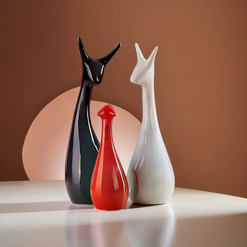
Size matters, friends! Your rug should be large enough for at least the front legs of all furniture to rest on it, or go big and get all legs on that textile magic. Think of your rug as the foundation of your conversation area – not a decorative bath mat that wandered too far from the bathroom. Pro tip: measure your space before shopping, then go about 2 feet larger than you think you need. Your room will thank you with fabulous, grounded vibes. Add cohesion with large ceramic decor items for cohesive rug and room balance standing gracefully near their rug-bound siblings.
Walking into a room where the sofa, loveseat, coffee table, end tables, and lamps are all from the same furniture store collection is like showing up to a party where everyone's wearing identical outfits. It's weird, it's awkward, and nobody's having fun.
Your home deserves personality! Mix it up with different textures, materials, and styles that complement each other without being twins. Try pairing that traditional sofa with a modern coffee table or industrial lighting with vintage chairs. The goal is "collected over time" not "bought everything during one lunch break." Your space will feel much more authentic – like you, but in room form! Try adding artistic mismatched showpieces to bring personality to identical furniture sets and create layers of design interest.
Picture this: a tiny, lonely frame floating in a vast sea of wall, hung at exactly eye level... for a basketball player. Or maybe you've gone the gallery wall route, but it looks more like a chaotic jigsaw puzzle than a curated collection. Either way, your walls are quietly weeping.
Art should be hung at eye level for the average person (that's about 57-60 inches from the floor to the center of the piece). For gallery walls, treat the entire arrangement as one unit and center that. And please, I beg you, size matters here too! That 8x10 frame on your massive living room wall looks like a postage stamp. Go bigger or create a thoughtful grouping. Or upgrade with artistic wall hangings for elevated statement wall pieces that anchor your room with elegance.
Living with just overhead lighting is like having only one pair of shoes for every occasion – technically functional but definitely not ideal. That harsh ceiling light makes everyone look like they're in a police interrogation room, and that's not the vibe for cozy movie nights!
Layer your lighting, decorating rockstar! Every room needs three types: ambient (general overhead), task (for specific activities), and accent (for drama and dimension). Floor lamps, table lamps, sconces, and even string lights can transform your space from "stark hospital waiting room" to "magazine-worthy living space." Plus, nothing hides dust bunnies better than strategic mood lighting! Amp up the vibes with resin decorative lamps and tall accent pieces for cozy light layering.
Short curtains are the decorating equivalent of wearing pants that are two inches too short – awkward and making everyone uncomfortable. Those tiny window treatments hovering above your baseboards aren't doing your space any favors.
Go long or go home! Curtains should either kiss the floor elegantly or puddle slightly for drama. Hang those rods high (like, almost at the ceiling) and wide (extending about 12 inches beyond the window frame on each side). This simple trick makes windows look larger, ceilings taller, and your decorating skills more impressive. Complete the frame with modern curtain decor accessories and statues to style extended windows for a polished finish.
Shoving all your furniture against the walls creates a weird "dance floor" in the middle of your living room – great if you're hosting a middle school dance, not so great for actual living. This arrangement screams "I don't know what I'm doing!" faster than painting your ceiling neon orange.
Pull those pieces away from the walls to create intimate conversation areas. Your sofa doesn't need to be best friends with your wall – it needs to facilitate actual human connection! Float furniture to define areas, create flow, and make your space feel thoughtfully planned rather than hastily arranged. Think of your furniture as party guests – they should be mingling, not awkwardly hugging the perimeter! Add warmth with corner statues for visual support in grouped furniture layouts.
Choosing colors without a plan is like grocery shopping when you're hungry – you end up with a bizarre combination that made sense in the moment but leaves you questioning your life choices later. That lime green accent wall might have seemed exciting in theory, but now it's giving everyone a headache.
Start with a cohesive color palette before buying a single pillow or paint can. Pull colors from a piece you already love – a rug, artwork, or even a favorite throw pillow – and build from there. Stick to 3-5 colors for your main palette, using the 60-30-10 rule (60% dominant color, 30% secondary color, 10% accent color). Your home will feel harmonious rather than like a crayon box exploded! Introduce harmony using color-balanced antique decor accessories for calm interior design.
That life-sized metal giraffe seemed like such a conversation starter in the store... but now it's just staring at you judgmentally while taking up half your living room. Impulse decor purchases are the equivalent of grocery shopping on an empty stomach – rarely a good idea.
Before buying larger pieces or statement items, try the "sleep on it" rule. Take measurements, photos of your space, and create a plan. Ask yourself: "Does this fit my overall vision? Do I have the perfect spot for it? Will I still love this when the novelty wears off?" If you're still dreaming about that piece after 48 hours, then maybe that metal giraffe is your decor soulmate after all! Better yet, stick with purposefully selected resin statues for thoughtful statement decor.
You know you've gone too far when sitting on your couch requires removing 37 decorative pillows first. At that point, your throw pillows have stopped being accents and started being roommates who take up too much space.
Edit your pillow collection like you're Marie Kondo on a mission. Keep the ones that actually add style, comfort, and color – ditch the rest. A good rule of thumb: 2-3 pillows for a chair, 3-5 for a sofa. And please, they don't all need to match! Mix patterns, textures, and sizes while keeping within your color palette. Your seating will look polished rather than like a pillow factory exploded. Try using small decorative items to replace excessive pillows stylishly and free up space with flair.
Tiny coffee table. Massive sectional. Giant lamp on a delicate side table. When your furniture pieces don't respect each other's personal space bubbles, the whole room feels awkward – like a basketball player slow-dancing with a gymnast.
Pay attention to scale! Your coffee table should be about 2/3 the length of your sofa. Your side tables should be within 3 inches of your sofa's arm height. That TV stand? It should be proportional to both your TV and the wall it sits against. Think of your furniture as a team – they need to work together, not compete for attention or awkwardly stand out. Harmony is the goal, people! Balance the room with proportional ceramic vases and tall showpieces for furniture harmony that align with spacing and function.
Avoid rushing the process without a plan! The biggest disasters happen when you buy pieces impulsively without considering how they'll work together. Also, steer clear of following trends that don't actually speak to you personally - that millennial pink wall might be Instagram-worthy, but if you secretly hate pink, you'll regret it daily. Finally, don't skimp on measuring before purchasing furniture or hanging art. Those "eyeballed" measurements are responsible for more decorating fails than anything else!
The rule of 3 is your secret weapon against boring decor! It's based on the principle that odd-numbered groupings (especially threes) create more visual interest and energy than even-numbered groupings. When styling shelves, coffee tables, or mantels, arrange items in groups of three, varying their heights, widths, and textures. For example, a tall candle, a medium-sized plant, and a short stack of books create a visually pleasing vignette that draws the eye without looking cluttered. Remember: things that come in threes are inherently more satisfying and effective than other numbers!
The biggest interior design problem is creating spaces that look "designed" but don't actually function for the people living in them. Beautiful rooms that don't support real life are like gorgeous shoes that give you blisters – impressive but ultimately painful! Many people sacrifice comfort and practicality for aesthetics, leading to homes that look like showrooms but feel uncomfortable. The solution? Start with your actual needs and lifestyle, then build beauty around those requirements. Your perfect home should be both functional AND fabulous!
The 3-5-7 rule provides guidance for adding accessories to your space. It suggests using 3 colors in a room (any more can feel chaotic), displaying accessories in groups of 3, 5, or 7 items (odd numbers create more visual interest), and incorporating different heights within these groupings. For example, when styling a bookshelf, use 5 decorative objects alongside your books, arranged at varying heights to create visual flow. This rule helps create balanced, intentional-looking vignettes rather than random clutter!
The 60-30-10 rule is the color-balancing superhero of interior design! It dictates how to distribute colors in a room: 60% should be your dominant color (usually walls, large furniture pieces, or flooring), 30% should be your secondary color (accent furniture, curtains, or bedding), and 10% should be your accent color (accessories, art, or small decor items). This distribution creates visual harmony while still allowing for personality. For example, in a living room, you might have 60% neutral beige (walls and sofa), 30% blue (curtains and accent chairs), and 10% coral (pillows, artwork, and a vase). Follow this rule and suddenly you're decorating like a pro!


