
Cart
Welcome to the wild world of home decorating, where the difference between "eclectic chic" and "garage sale nightmare" is sometimes just a properly placed throw pillow! If you've ever walked into someone's perfectly styled home and wondered if they secretly hired elves to arrange everything while they slept, I'm here to spill the beans. There ARE rules to this madness! But don't worry – understanding these decorating commandments doesn't mean you can't break them occasionally (with style, of course). Think of these rules as training wheels before you become the Picasso of pillow placement. Let's dive into the decorating guidelines that even interior designers pinky-swear by!
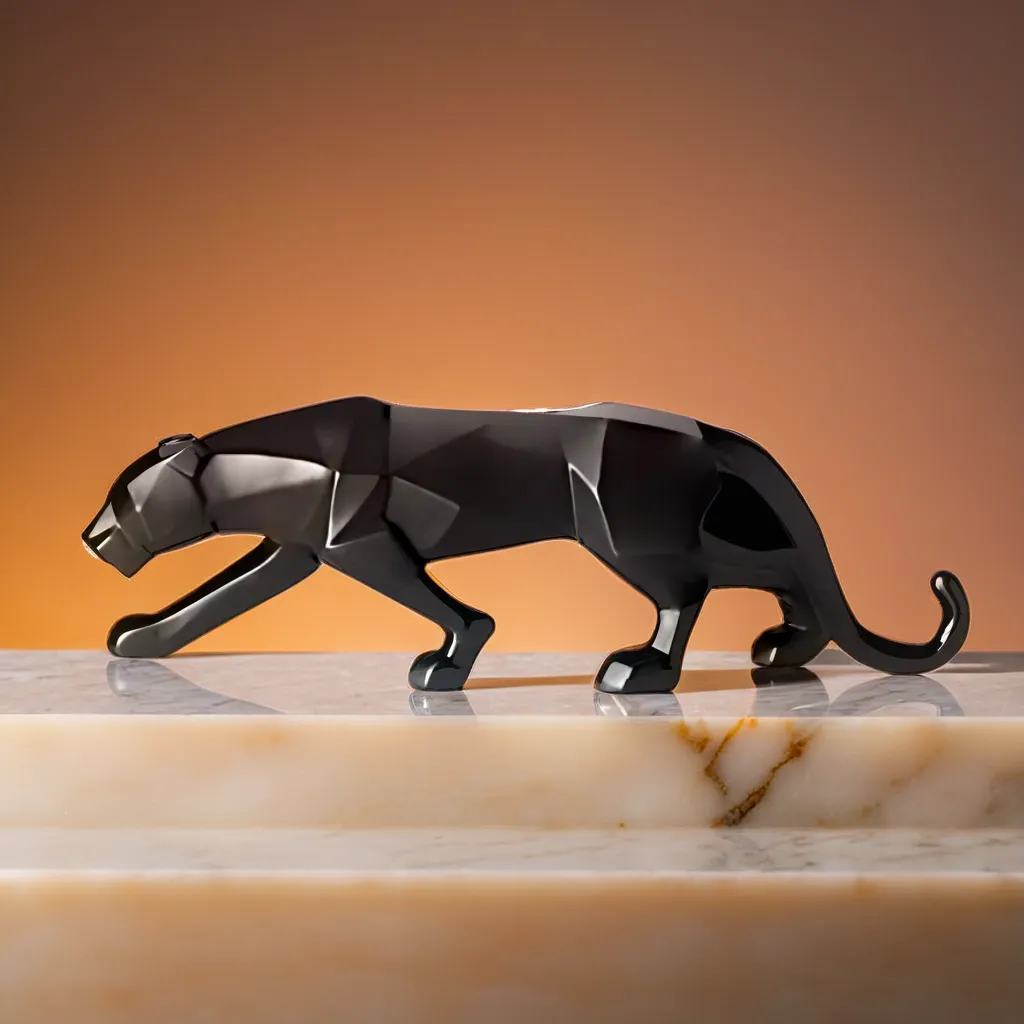
If you're looking to elevate your decorating game with just the right flair, consider discovering the must-have decorative items for home decor enthusiasts that blend artistry with function to keep your rooms looking anything but accidental.
Remember struggling with fractions in school? Well, here's some math you'll actually use! The 60-30-10 rule is basically the holy grail of color distribution. Use your dominant color for about 60% of the room (walls, large furniture), a secondary color for 30% (accent chairs, curtains), and that bold color you're secretly afraid of for 10% (accessories, artwork).
Think of it like making a sandwich – bread (60%) makes up most of it, filling (30%) adds substance, and that spicy mustard (10%) gives it the kick! Without this balance, your room might look like a rainbow had an identity crisis. And nobody wants that on their living room wall. That’s where pieces like ceramic vases as decor items to balance color distribution truly shine—elevating your space while subtly following the 60-30-10 rule.
Nothing screams "amateur decorator" louder than a tiny picture floating in a sea of wall or a coffee table that requires Olympic long-jumping skills to reach from your sofa. Scale and proportion are all about relationships – like dating, but for furniture!
Your coffee table should be about two-thirds the length of your sofa. Art should generally take up 2/3 to 3/4 of the wall space above furniture. And please, for the love of design, don't put a postage stamp-sized rug under your dining table unless you enjoy watching guests play "keep your chair on the rug" throughout dinner. Remember: sometimes bigger IS better (your tiny rug is not the exception). From modern design showpieces to elevate proportion decor, it's critical to match the right sizes for harmony.
Odd numbers in decorating create harmony and visual interest that even numbers just can't match. Groups of three, five, or seven items make dynamic, memorable arrangements while pairs can look static and boring. It's like the difference between a perfectly symmetrical haircut and one with a little edge – the asymmetry keeps things interesting!
Try clustering three different-height candles, displaying five frames on a gallery wall, or arranging seven small objects on a bookshelf. Your eye will thank you by doing a little happy dance every time it sees these groupings. And if anyone asks why you have three decorative pineapples, just say you're following the design rule of odds! Especially when using artistic wall hangings as per odd number grouping rule, this rule can make all the visual difference.
If your home is 100% antiques, you're living in a museum. If it's 100% new items, you're living in a furniture showroom. The 70/30 rule suggests that a mix of 70% traditional/contemporary and 30% antique/modern creates the perfect balance.
This mix gives your space personality and prevents it from being trapped in a single time period. Like wearing vintage jeans with a trendy top, your Victorian chair can absolutely hang out with your modern coffee table – they might become best friends if you introduce them properly! A clever combination like showcasing handmade decor pieces for a 70-30 traditional-modern home can help you strike that exciting visual equilibrium.
Ever heard of the 3-5-7 rule? It's like the secret code to a well-accessorized room! The idea is simple: limit your decorative objects to groups of 3, 5, or 7. Three books stacked with a small plant on top. Five picture frames arranged on a wall. Seven decorative items strategically placed on your bookshelf.
This rule prevents your room from looking like a tchotchke explosion while still giving you plenty of opportunity to display your treasures. Think of it as Marie Kondo meets design theory – keeping only the items that spark joy, but arranging them in odd-numbered groups that spark visual interest! Try using small decorative showpieces that follow the 3-5-7 decor rule for artfully curated shelf displays.
The 2/3 rule is like the peacekeeper in furniture relationships. It suggests that end tables should be approximately 2/3 the height of your sofa arms, and lamps should be about 2/3 the width of the table they sit on. This creates visual harmony without everything being exactly the same height (which would be incredibly boring).
It's like having friends of slightly different heights in a photo – it creates interest while still looking cohesive. If everything in your room is exactly the same height, your eye has nowhere interesting to travel, and your design falls flatter than a soufflé during an earthquake. Consider exploring decor accessories that complement the 2-3 furniture rule to balance function and aesthetics seamlessly.
The triangle rule is about creating visual triangles throughout your space – arranging items at different heights to draw the eye up and around the room. In your living room, this might mean your coffee table (low point), a table lamp (medium point), and artwork (high point) forming a triangle.
This technique adds dimension and prevents the "everything is at the same height" syndrome that can make a room feel static. Think of it like adding peaks and valleys to your design landscape – much more interesting than a flat prairie of same-height decor! Leverage stylish home decor items for triangle rule placement to layer your vertical interest.
Just like we all need personal space (especially after that family member stays too long during the holidays), your decor needs breathing room! This is why designers love "white space" – the empty areas that give your eyes a rest and allow your special pieces to shine.
Cramming every surface with knick-knacks is like talking without taking a breath – exhausting for everyone involved! Instead, practice some decorative restraint. Your grandmother's vintage clock will get much more appreciation when it's not competing with seventeen other items for attention. Remember: sometimes nothing is something in design! Incorporate minimalist decor showpieces for whitespace impact that allow your room to breathe stylishly.
Relying solely on that builder-grade overhead light is like wearing only underwear – it's the bare minimum and nobody's impressed. Professional designers know that rooms need at least three types of lighting: ambient (general), task (for activities), and accent (for drama).
Mix table lamps, floor lamps, wall sconces, and yes, even that overhead light to create a space that can transform from "bright enough for tax preparation" to "romantically dim for date night" with the flick of a few switches. Your room (and your selfie game) will thank you for the flattering layers of light! Accentuate lighting with complementary decor pieces designed for accent lighting themes in your layout.
The golden ratio (approximately 1:1.618) has been used since ancient times to create visually pleasing proportions in everything from the Parthenon to the Mona Lisa. In your home, this divine proportion can guide furniture arrangement, art placement, and even room dimensions.
Without getting too deep into math class, just know that rectangles with these proportions (like a 5×8 rug) are naturally pleasing to the human eye. It's why some rooms just "feel right" even if you can't explain why. So when in doubt about proportions, channel your inner Da Vinci and go for the gold(en ratio)! Incorporate resin decor items that naturally fit golden ratio design aesthetics and elevate the visual balance across rooms.
An area rug isn't just a place for your dog to nap – it's the foundation that visually anchors your furniture groupings. A properly sized rug should allow for at least the front legs of all furniture to rest on it, creating a defined conversation area.
A too-small rug floating in the middle of a room is like wearing shoes two sizes too small – uncomfortable and everyone can tell something's not right. Invest in the biggest rug your budget allows, and your furniture will finally feel like it belongs together instead of looking like awkward strangers at a party! Tie it all together with large size showpieces as anchor points in room layout for maximum grounding effect.
Here's the thing about decorating rules – once you understand them, you earn the right to break them! The most interesting spaces often bend conventional wisdom in unexpected ways. That all-white room with zero pops of color? That maximalist space with precisely zero white space? They work because their creators understood the rules before deciding which ones to magnificently ignore.
So consider this your design diploma – you now know enough to start breaking rules with intention rather than by accident. Whether you follow every guideline or throw the rulebook out your perfectly proportioned window, remember that the ultimate rule is creating a space that makes YOU happy when you walk through the door. After all, homes are for living, not just for Instagram!
The 3-5-7 rule is all about grouping decorative objects in odd numbers, specifically 3, 5, or 7 items together. These odd-numbered groupings create more visual interest and balance than even-numbered groups. For example, three candles of varying heights on a mantel, five coordinating frames on a wall, or seven small objects thoughtfully arranged on a bookshelf. This rule helps prevent your space from looking cluttered while still allowing you to display your favorite items with intention!
Oh, where to start! Avoid pushing all furniture against walls (the "wallflower syndrome"), using rugs that are too small (the "postage stamp" effect), hanging art too high (the "giraffe gallery"), and matching absolutely everything (the "furniture showroom" look). Also, steer clear of poor lighting (relying solely on overhead lights), overcrowding surfaces with too many small items, and ignoring scale and proportion. Finally, please avoid following trends you don't actually like just because they're popular – that geometric wallpaper won't make you happy if you secretly hate geometry!
The 70/30 rule is about creating balance between different design elements. Typically, it means using about 70% of one style, era, or finish and 30% of another contrasting element. For example, 70% traditional pieces with 30% modern accents, or 70% neutral colors with 30% bold colors. This creates spaces with personality and depth rather than rooms that feel one-dimensional. It's like the perfect recipe – the right proportion of ingredients makes all the difference!
The fundamental rules include: follow proper scale and proportion, create balance (symmetrical or asymmetrical), establish a focal point in each room, layer different lighting types, use color strategically (like the 60-30-10 rule), incorporate texture and pattern for depth, arrange items in odd-numbered groupings, maintain adequate white space, ensure proper furniture placement for flow, and select appropriately sized area rugs. These guidelines create harmonious spaces that feel intentional rather than accidental. Think of them as the grammar rules of design – once you know them, you can communicate your style effectively!
The 2/3 rule (sometimes called the rule of thirds in different contexts) suggests that furnishings should be about two-thirds the size of the larger piece they complement. For example, a coffee table should be approximately two-thirds the length of your sofa, end tables should be about two-thirds the height of your sofa arms, and lamps should be about two-thirds the width of the table they sit on. This creates visual harmony without everything being exactly the same size, which would look boring and unnatural.
The ultimate golden rule in interior design is to create a space that reflects your personality and meets your functional needs, regardless of trends. On a more technical level, the "golden ratio" (approximately 1:1.618) has been used since ancient times to create visually pleasing proportions. In practical terms, this might mean selecting rectangles with these proportions (like 5×8 rugs) or dividing wall space according to this ratio for art placement. But truly, the best design rule is to create spaces you love coming home to – because no amount of perfect proportions can replace the feeling of a home that genuinely makes you happy!


