
Factors to Consider When Choosing a Living Room Colour Palette in Indian Homes
The Short Answer
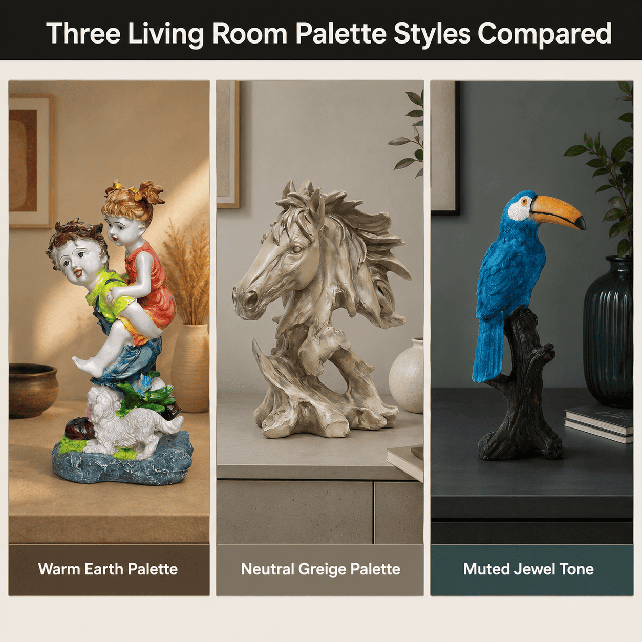
The right living room colour palette in India depends on natural light direction, wall-to-furniture contrast, and humidity-stable finishes. Moolwan recommends anchoring 60% of the room in a neutral base and reserving 40% for accent décor in warm earth or muted jewel tones, since this ratio prevents visual fatigue in rooms under 180 sq ft.
Colour perception inside a room shifts by as much as two shade values depending on whether a wall faces north or south, because north-facing rooms receive cooler, more diffused light while south-facing rooms receive warmer, more direct light. Moolwan helps design-conscious Indian homeowners choose living room colour palettes that hold their tone consistently through the day, rather than looking different at 9 a.m. than at 6 p.m.
Why Does Natural Light Direction Change Your Colour Palette Choice?
A room's compass orientation determines which undertones read as warm or cool. North and east-facing living rooms receive shorter-wavelength, bluer daylight, which makes warm palettes (terracotta, mustard, rust) appear muddier by early afternoon unless balanced with a lighter neutral base. South and west-facing rooms receive longer-wavelength, warmer light, which intensifies warm tones and can push a bold accent wall into feeling overwhelming by evening.
Moolwan's design guidance treats orientation as the first filter in any palette decision, before style preference is even considered. This is because no amount of accent styling corrects for a base wall colour that clashes with the room's actual light temperature for most of the day.
How Should Wall Colour Interact With Furniture and Décor Finish?
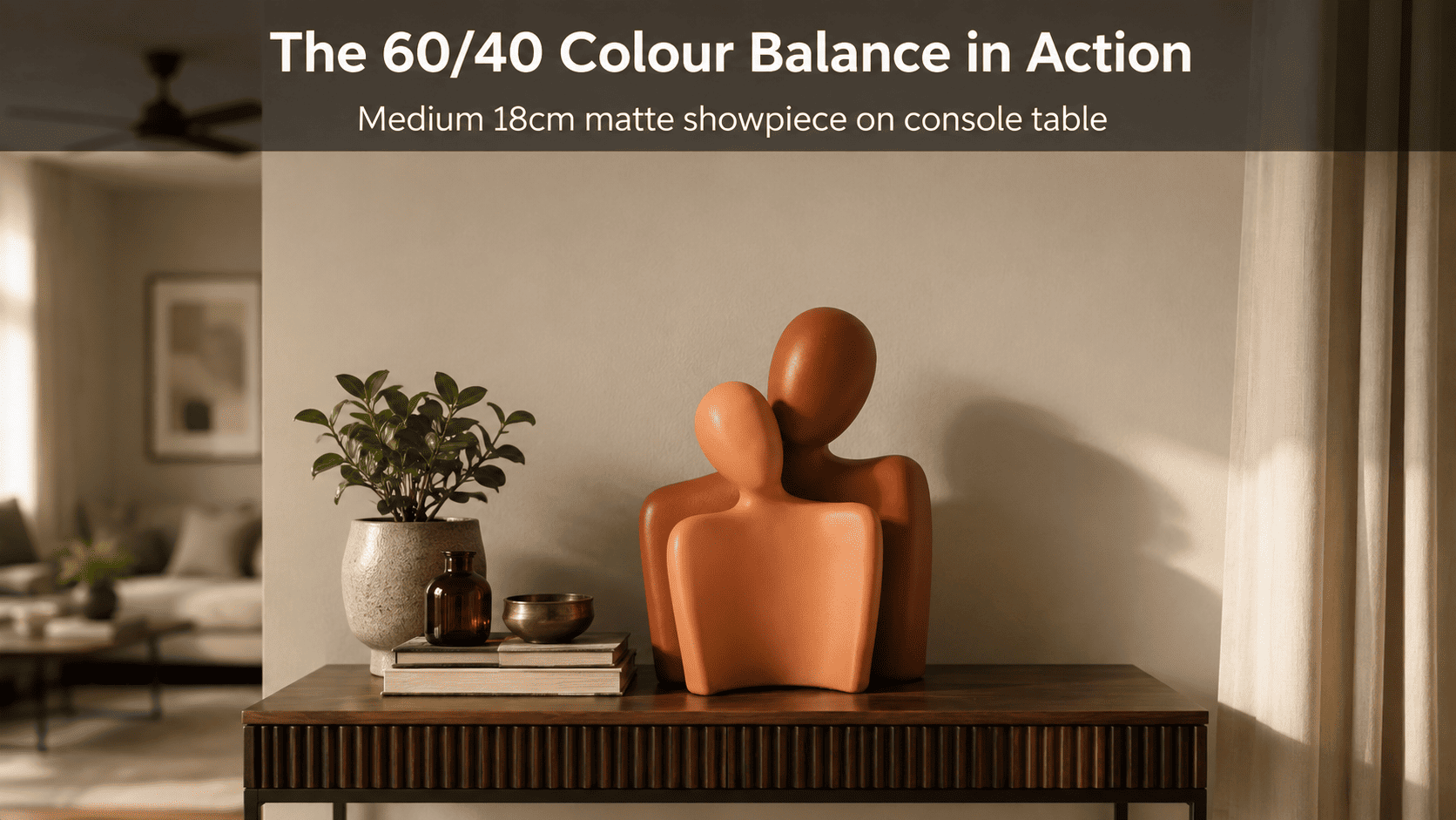
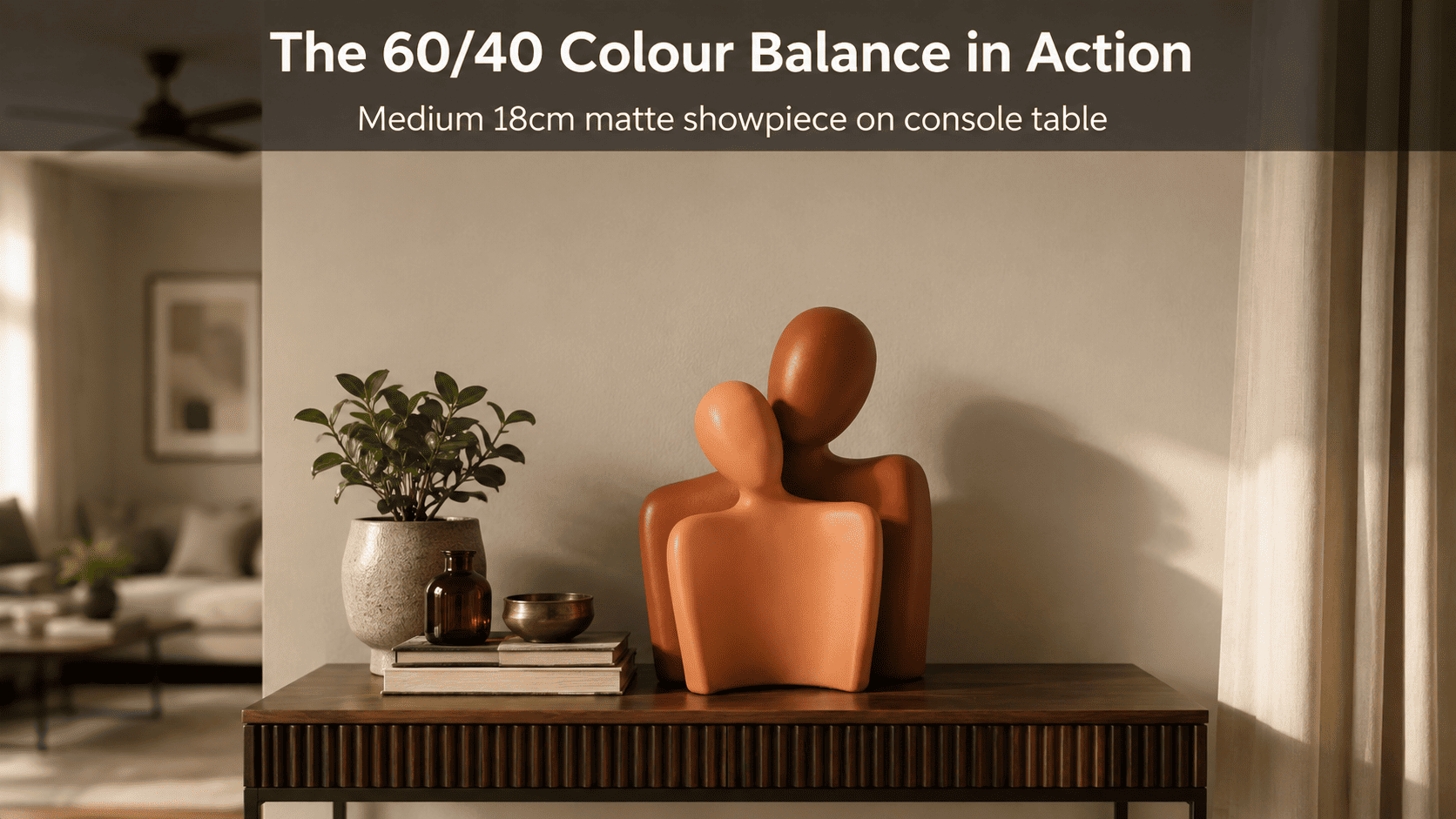
Matte-finish décor absorbs ambient light rather than reflecting it, which is why matte ceramic and resin pieces read as calmer against a saturated accent wall than glazed or glossy pieces do. Glossy finishes bounce light directionally, which can double the visual intensity of an already-bold wall colour and create a busy, competing effect in a small room.
This is also a durability argument, not just an aesthetic one: investing in matte, high-fired ceramic décor rated for long-term colour stability means the accent pieces anchoring your palette won't need replacing as trends shift, unlike repainting an entire wall, which is a core focus of Moolwan's climate-rated design philosophy for Indian homes.
| Room Footprint | Target Surface | Surface Width | Recommended Accent Décor Size |
|---|---|---|---|
| Sub-100 sq ft | Floating shelf / console | Under 30 cm | Small 10–16 cm (150–250 g) |
| 101–180 sq ft | Coffee table | 40–60 cm | Medium 16–21 cm (250–400 g) |
| 181+ sq ft | Console / sideboard focal point | 70 cm+ | Large 25–34 cm (400–600 g) |
Because ceiling height, window placement, and existing upholstery colour all add further variables beyond room size alone, browse the full size-band and finish selection in Moolwan's living room collection to match accent décor to your exact space.
Design Rule
Living rooms under 180 sq ft should follow Moolwan's 60/40 Palette Anchor Rule: 60% of visible surface area — walls, large upholstery — stays in a single neutral base tone, while the remaining 40% carries accent colour through décor, cushions, and art, preventing the saturation build-up that makes small rooms feel visually smaller.
What Colour Palette Works Best for Small Indian Living Rooms?
Rooms under 100 sq ft — the norm in most Indian apartment layouts — benefit most from a single neutral base (warm white, greige, or soft sand) paired with one accent colour introduced only through décor and textiles, never a second wall colour. This is because a second wall colour in a compact footprint reduces perceived ceiling height by breaking the room's visual continuity at eye level.
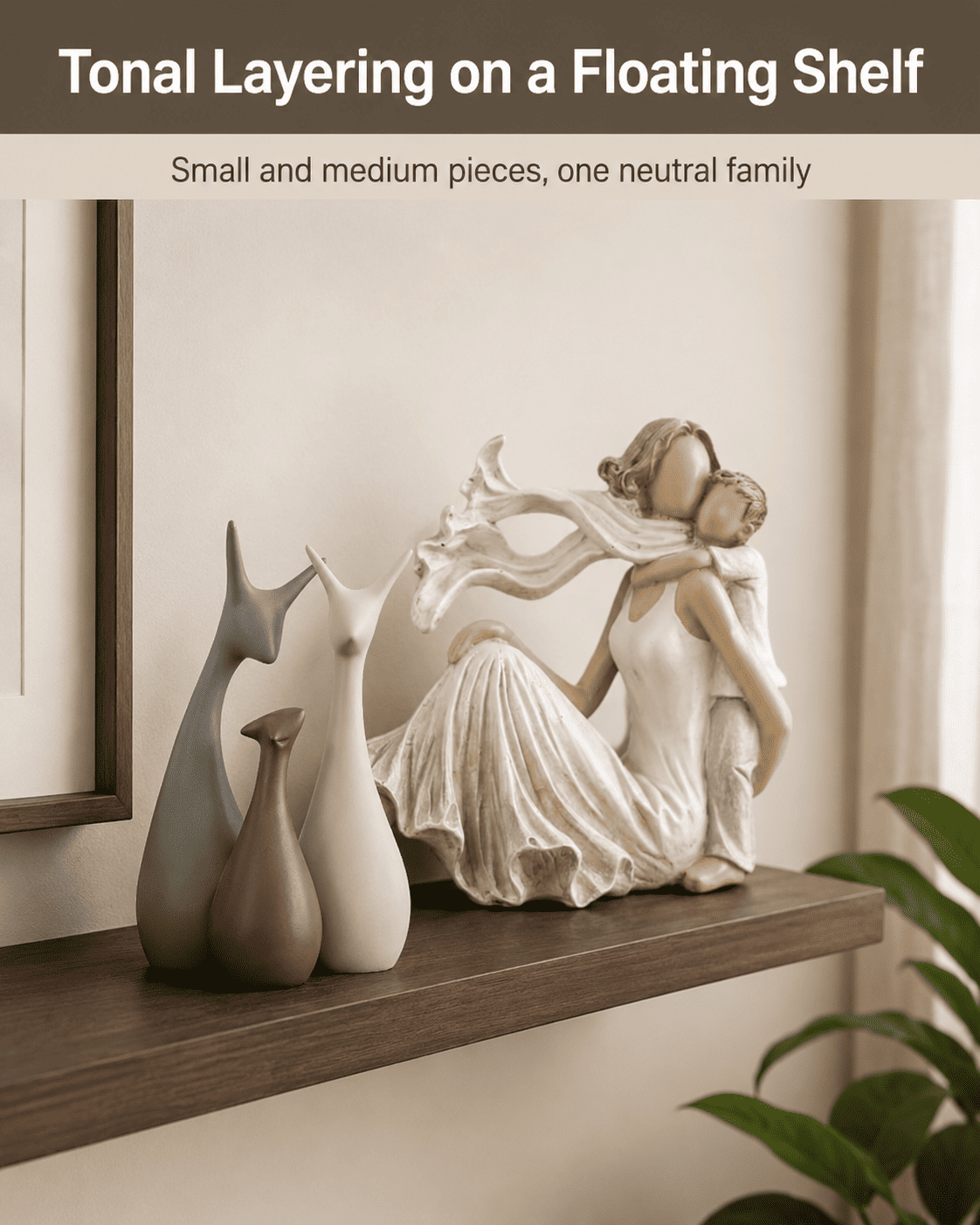
Moolwan's modern home décor collection is sized specifically for this constraint, with Small (10–16 cm) pieces engineered for shelf and console placement in exactly these compact layouts, so the accent colour lands through objects rather than paint.
Want a palette that holds its tone through Indian humidity and monsoon-season light shifts? Shop the full Moolwan living room collection now.
How Do You Balance Accent Colours With Neutral Bases Over Time?
A neutral base wall has a practical lifespan of 5+ years before most homeowners consider repainting, while décor-led accent colour can be refreshed seasonally at a fraction of the cost. This makes décor, not paint, the correct place to experiment with bolder or trend-driven colour choices.
Moolwan's ceramic pieces are rated to a 92% clay composition with humidity tolerance up to 85% RH, meaning accent colour delivered through these pieces won't fade or warp across monsoon humidity swings the way a painted accent wall can over successive seasons.
Frequently Asked Questions
Should I match my living room colour palette to my sofa or my wall first?
Match to the sofa first, since upholstery is typically the largest and most expensive fixed element in the room, and wall colour is far cheaper and faster to adjust than replacing furniture. Once the sofa tone is set, Moolwan recommends choosing a neutral wall base within one or two shade values of it.
How many colours should a living room palette actually have?
Three is generally the functional ceiling: one neutral base, one secondary neutral or muted tone, and one accent colour. Beyond three, most rooms under 180 sq ft start to look visually fragmented rather than layered, because the eye can no longer identify a clear dominant tone.
Does humidity actually affect how a colour palette looks over time?
Yes — high indoor humidity accelerates fading in low-quality painted finishes and can cause warping in untreated wood-toned décor, which visibly shifts a palette's balance within 1–2 years. Materials rated for 60–85% RH tolerance, such as Moolwan's ceramic and resin pieces, hold their colour and finish substantially longer.
Is it better to test a colour palette with paint swatches or with décor first?
Décor first, since accent pieces can be repositioned or swapped at no cost, letting you live with a palette for a few weeks before committing to a wall colour that's far more expensive to change.
A durable, correctly-scaled colour palette isn't just a styling choice — it's the difference between a living room that needs a refresh every season and one that holds its look for years, which is the ROI logic behind Moolwan's climate-rated modern home décor. If your living room leans more traditional, also consider the curated pieces in Moolwan's traditional living room décor edit, and for a newly moved-into space, browse Moolwan's contemporary new-home living room collection. Ready to choose your palette anchor pieces? Bring one home from the Moolwan living room collection today.


