
Cart
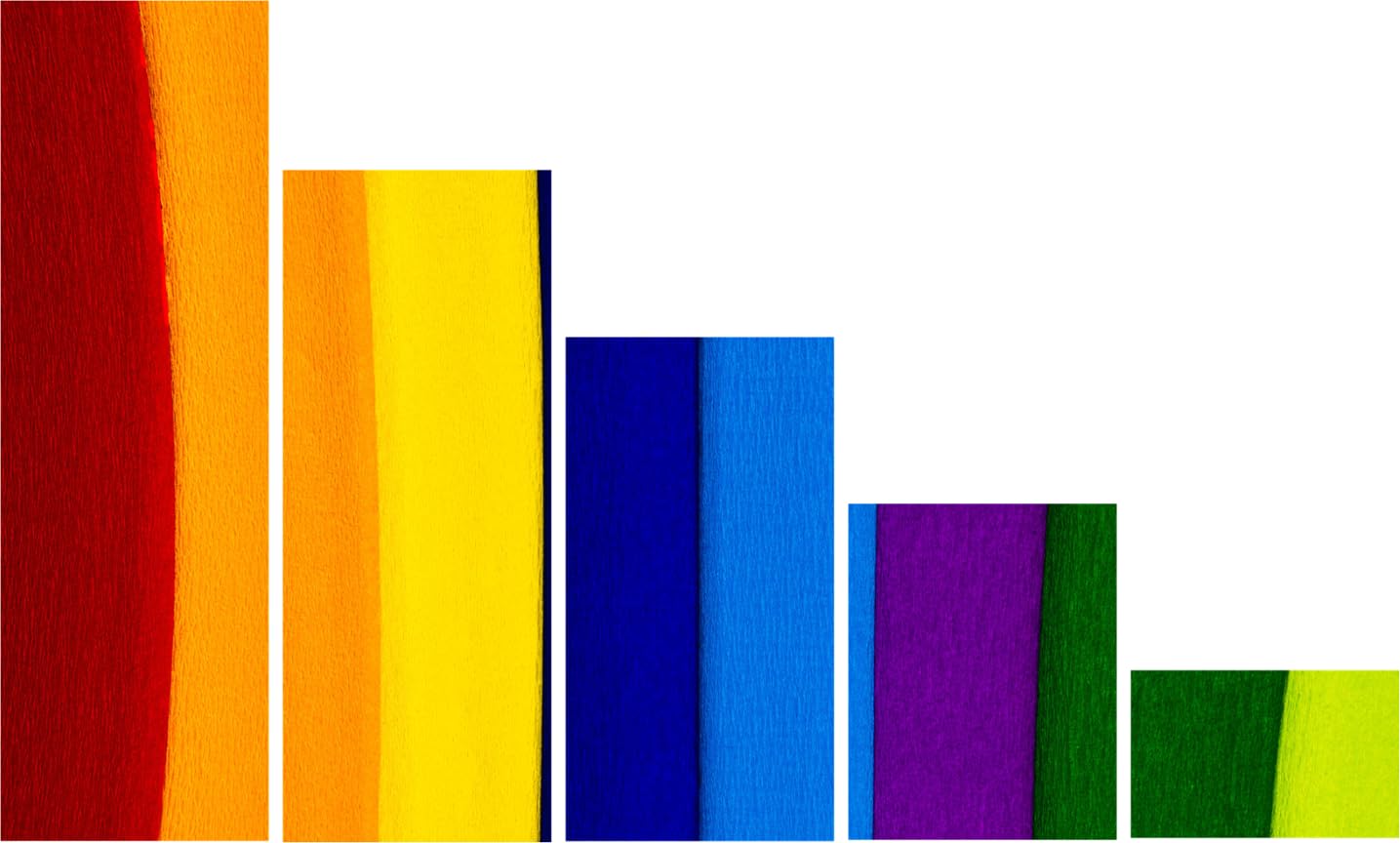
5-Panel Geometric Abstract Canvas Wall Art Painting (127x76cm) - Descending Bar Design in Bold Multicolor
Here's what's actually stopping you: "Will these bright colors clash with my brown sofa and cream walls? Will my mother-in-law think I've lost my mind? Will this look like I'm trying too hard to be modern?"
These aren't irrational fears. This is a bold piece. Deep reds blending into burnt orange. Bright yellows next to navy blues. Magenta purple sitting beside forest green. This isn't subtle nature art that disappears into your decor. This is a statement piece that announces itself the moment someone walks into your living room.
But here's why this particular bold choice works when others don't: the warm color dominance. About 60% of this canvas is warm tones—deep reds, burnt oranges, bright yellows. These aren't cool-toned primary colors that look jarring against cream walls. These are colors with enough warmth that they read as energizing, not clashing. Your living room walls are probably cream, off-white, or that light yellow shade many Indian apartments have. Your sofa is probably brown or beige fabric with wooden arms. Against that foundation, warm reds and oranges don't fight—they complement.
The cool tones—navy blue, sky blue, magenta, greens—make up the remaining 40%. They provide contrast and visual interest without dominating. And the geometric pattern, five descending bars creating a stepped silhouette from left to right, gives your eye a clear path to follow. This isn't random abstract chaos. This is structured energy.
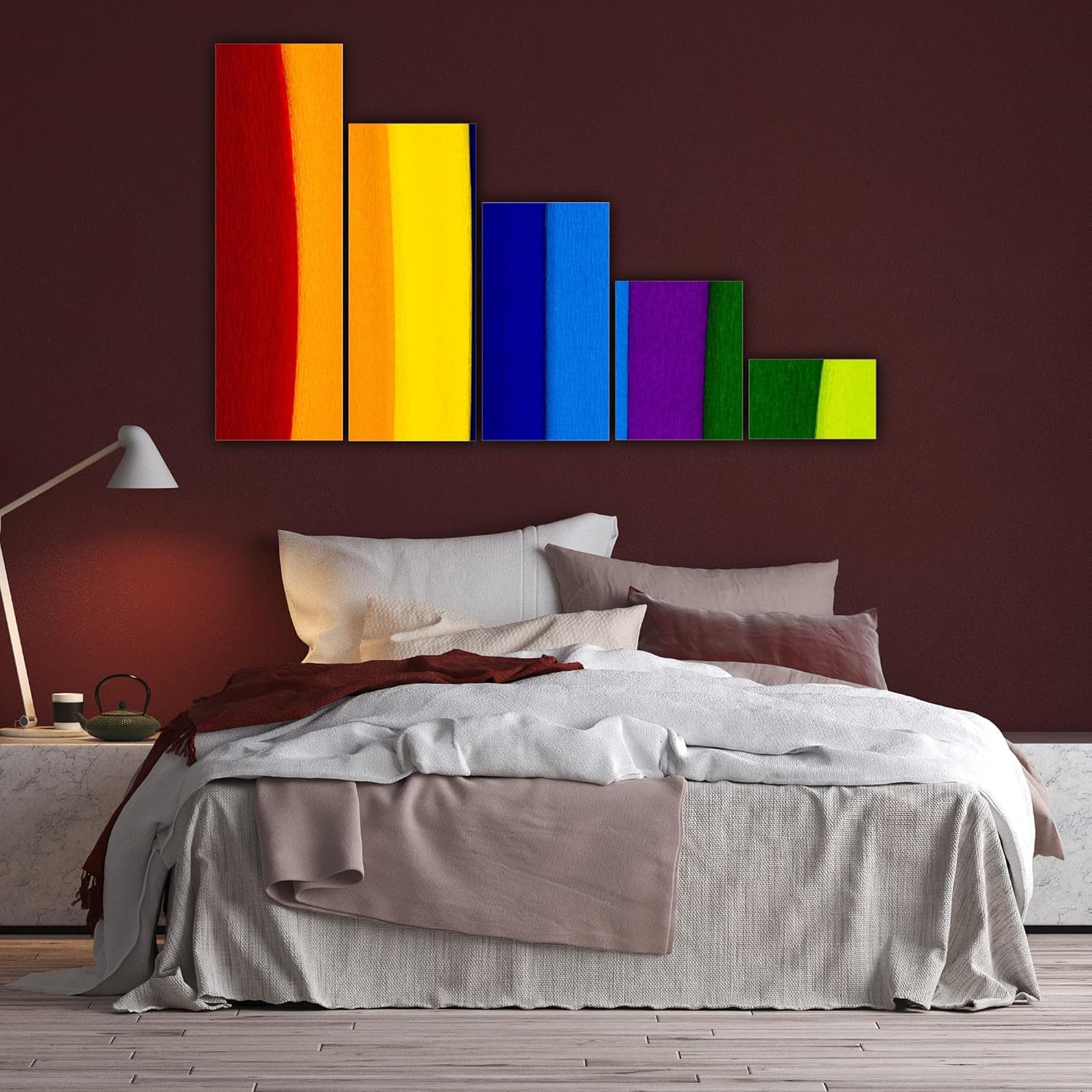
And the size—127cm wide—covers about one-third of a standard 12-foot (360cm) living room wall. It's large enough to be a focal point, small enough that the bold colors don't overwhelm the entire room. You'll have 116cm of neutral wall space on each side, giving the colors room to breathe instead of cramming brightness wall-to-wall.
Your living room wall is probably 10 to 12 feet wide (300-360cm in most Indian 2BHK and 3BHK apartments). The ceiling is probably 8 to 10 feet high. With a bold multicolor piece like this, the spatial math matters even more than with neutral art—because colors need breathing room.
127cm canvas on a 12-foot (360cm) wall:
116cm of cream/off-white wall space on the left side
116cm of cream/off-white wall space on the right side
Coverage ratio: Canvas covers 35% of wall width
Effect: The bold colors have a defined boundary. They don't spread across your entire field of vision.
This is critical with bright abstracts. If this were 150cm wide (42% wall coverage), the reds and yellows would dominate your peripheral vision every time you entered the room. You'd feel the color intensity constantly. At 127cm, the colors are contained within a focal zone. When you're sitting on your sofa looking straight ahead, you see the canvas as an intentional accent. When you're walking past or sitting at an angle, the neutral wall space on either side gives your eye visual rest.
Now consider your furniture arrangement:
Your sofa is probably 6-8 feet (180-240cm) wide, sitting 6-12 inches from the wall
Hanging height: 20-25cm above sofa top puts canvas center at 140-160cm from floor (perfect eye level from 8 feet away)
Side elements: You probably have a side table (18-24 inches wide), floor lamp, or window within 3-4 feet of sofa edge
The 127cm width spans the sofa zone without forcing you to rearrange your side furniture
If you went with 90cm instead:
25% wall coverage—the bold colors would look like an accent pillow, not a statement piece
The geometric pattern (five descending bars) would be compressed. Each panel would be only 17cm wide instead of 24cm. The visual rhythm would feel cramped.
Effect: You chose bold colors to make an impact. A 90cm size undermines that choice.
If you went with 150cm instead:
42% wall coverage—the colors would dominate the wall
If you have a window 4 feet from your sofa edge, or a side table and floor lamp, the 150cm width would crowd them
Effect: Bold colors in a large size can make a room feel energizing or overwhelming, depending on your other furniture. You'd need a completely blank wall to make 150cm work.
The 127cm is the balanced choice: large enough that the geometric pattern has visual impact, small enough that the bold colors don't visually exhaust you.
And at 76cm tall, this sits proportionally under 8-10 foot ceilings. The descending bar pattern (tallest panel on the left at approximately 76cm, shortest on the right at approximately 40cm) creates a diagonal flow that actually makes your ceiling feel higher, not lower.
The five-panel layout adds another benefit: Instead of one solid 127cm rectangle of color, you get five separate 24cm panels with 2-3cm gaps between them. This creates visual rhythm—your eye travels left to right across the descending bars, following the color progression from warm reds through yellows to cool blues and greens. The gaps prevent the colors from blurring together into a single overwhelming mass.
This is the real anxiety, isn't it? You've read that bold abstracts work in modern homes. You've seen photos of multicolor art in white-walled lofts with mid-century modern furniture. But your home doesn't look like that.
Your walls are cream. Your sofa is brown fabric, maybe with beige throw pillows. You have a wooden coffee table. Your flooring is vitrified tiles in beige or light gray. Your TV unit is dark wood. There's probably a pooja shelf in the corner with brass diyas. This is what actual Indian homes look like—and you're wondering if bright reds, yellows, and blues belong here.
Here's the honest answer: bold color abstracts work in traditional Indian homes when the warm tones dominate, and when you position them intentionally.
Why the warm color dominance matters: This canvas is approximately 60% warm tones (deep red, burnt orange, bright yellow) and 40% cool tones (navy blue, sky blue, magenta, forest green). The warm tones echo the natural warmth of your wooden furniture and cream walls. Browns and creams are earth tones—they already have red and yellow undertones. When you add a canvas with reds, oranges, and yellows, you're intensifying colors already present in your room, not introducing foreign elements.
The cool blues and greens provide contrast without clashing because they're grounded by the warm tones around them. Navy blue next to burnt orange reads as sophisticated, not jarring. Forest green next to bright yellow feels energizing, not chaotic.
Compare this to what doesn't work:
Cool-toned abstracts (grays, purples, icy blues): Look stark against cream walls, create visual tension with brown furniture
Neon brights (electric pink, lime green, cyan): Clash with the natural warmth of Indian home palettes
Black-and-white high-contrast: Too severe for spaces that already have warm, lived-in tones
How to position this intentionally: Your canvas will look best when it's the primary color accent in the room, not competing with other bold elements.
If your living room currently has:
Neutral sofa (brown, beige, gray): Perfect. The canvas becomes the color focal point.
Colorful throw pillows: Consider switching to neutral pillows so the canvas stands out.
Bright curtains: If your curtains are already bold, this canvas will compete. Better to have neutral curtains and let the wall art provide the color.
Neutral everything: This is ideal. The canvas will feel like an intentional design choice.
Lighting matters more with bold colors:
Morning light (east-facing wall): The warm tones (reds, oranges, yellows) will appear slightly muted in soft morning light. The cool tones (blues, greens) will look more vibrant. Overall effect: balanced.
Afternoon light (west-facing wall): The warm tones intensify in bright afternoon sun. Reds look deeper, yellows glow, oranges become richer. Cool tones recede slightly. Overall effect: warm and energizing.
Evening/artificial light (warm white LED, 3000K): All colors appear richer and more cohesive. This is when the canvas looks its best—the reds and oranges have depth, the blues and greens add contrast without harshness.
If your living room gets harsh afternoon sun and you're worried about color intensity, hang this on a perpendicular wall that doesn't get direct sunlight. The colors will stay vibrant without becoming overwhelming.
The family acceptance test: Will your mother-in-law approve? Probably not immediately. Bold modern abstracts aren't traditionally "safe" choices. But here's what changes minds: when the canvas has been on your wall for two weeks, and she walks in and says, "You know, I've gotten used to it. It makes the room feel lively."
Bold doesn't mean wrong. It means you're choosing energy over neutrality. If your home already feels complete and calm, this might not be the right piece. But if your living room feels bland—beige sofa, cream walls, brown coffee table, nothing that makes you smile when you walk in—this canvas is the intentional accent that changes that.
Let's acknowledge the secondary anxiety: you're in a rental. Your deposit is ₹50,000. And you're about to drill holes in the wall for a bold multicolor canvas you're only 85% confident about.
Here's what actually happens: you drill two small 6mm holes, 35mm deep. When you move out, you fill them with wall putty (₹50 from any hardware store), sand smooth, and touch up with a dab of paint. Your landlord will never notice. Total repair cost: ₹200 and 15 minutes.
The holes for canvas art are smaller than the holes left by picture frame nails. They're nowhere near the massive holes from mounted TV brackets (12mm diameter, 80mm deep) that actually cost you your deposit.
Here's exactly what you need:
For drywall (common in modern apartments):
Plastic wall anchors (included with your canvas)
6mm drill bit
Drill 30mm deep holes
Insert anchors, screw in hooks, hang canvas on D-rings
Installation time: 15 minutes
For concrete (common in older buildings):
Concrete anchors (included with your canvas)
6mm masonry bit
Drill 35mm deep holes
Tap in anchors, screw in hooks, hang canvas
Installation time: 20 minutes
The hanging template solves the "drilling in the wrong spot" anxiety. You tape the paper template to your wall at the exact height you want (20-25cm above your sofa top). The template shows you precisely where to drill—two marks, perfectly spaced for the D-ring hangers on the back of your canvas. You drill, remove the template, insert anchors, hang canvas. No measuring, no second-guessing, no clusters of failed holes.
And if you decide in three months that the colors are too bold for you? You remove the canvas, patch the two tiny holes, and try a different piece. The commitment isn't permanent. But most people who choose bold abstracts intentionally don't regret them—because they chose them knowing they wanted energy, not neutrality.
You've seen multicolor geometric abstracts on marketplace sites for ₹1,200. You've seen similar descending bar patterns for ₹900. So why spend ₹2,496 here?
Because you're not comparing the same product. You're comparing a photograph of canvas to canvas that will survive Mumbai monsoons, Bangalore temperature swings, and Delhi's relentless sun without fading, warping, or looking cheap in six months.
Here's what the price difference actually buys you:
Canvas weight: 340 GSM cotton vs. marketplace 180-220 GSM Cheap canvas looks thin. You can see the wooden frame showing through if there's any light behind it. With bold colors like reds and yellows, thin canvas makes the colors look washed out in bright light. The texture feels like poster paper stretched over wood.
340 GSM cotton has actual substance. The weave is dense. The bold colors—deep reds, bright yellows, navy blues—stay opaque even when afternoon sunlight hits the wall. When guests touch it (and they will, because bold geometric patterns invite touching), it feels like quality artist canvas, not a printed poster.
Eco-solvent UV-resistant inks vs. marketplace dye-based inks Dye-based inks fade. Not slowly over decades—visibly, within 6-12 months if your wall gets morning sun. The bright yellows turn pale cream. The deep reds shift to brownish-pink. The navy blues wash out to dusty gray.
With bold multicolor abstracts, fading is catastrophic. You chose this canvas specifically for the color intensity. If the colors fade, the entire point disappears.
Eco-solvent inks are chemically stable. They're designed for outdoor signage, tested to withstand UV exposure without color shift. Your bright yellows will still glow two years from now. Your deep reds will stay rich through multiple monsoon seasons.
1.5-inch kiln-dried pinewood frame vs. marketplace 0.75-inch raw wood Cheap frames warp. In 70-85% monsoon humidity, in temperature swings, in coastal salt air—raw wood bends. The canvas loosens. Within 3-6 months, you'll see ripples forming at the edges. The five-panel layout will start looking uneven—one panel sits slightly crooked, creating an asymmetric shadow that ruins the clean geometric pattern.
1.5-inch kiln-dried pinewood (12% moisture content) doesn't flex. The five panels stay aligned. The canvas stays drum-tight. Three years from now, your geometric bars will still create that crisp stepped silhouette.
Manufacturing consistency vs. marketplace randomness Marketplace sellers source from random suppliers. One batch might use decent canvas and inks. The next batch cuts costs. You have no idea what you're getting until it arrives.
Moolwan manufactures in-house. Every 5-panel geometric abstract uses the same 340 GSM canvas, the same eco-solvent inks, the same kiln-dried frames. You're not gambling on supplier quality.
The ₹1,296 difference (₹2,496 vs. ₹1,200) is the difference between canvas that still looks bold and intentional in three years and canvas you're replacing in eight months because the colors faded and the frame warped.
Product photos are styled. Perfect lighting. Blank white walls. Carefully coordinated neutral furniture. Your home isn't that.
Your wall probably has electrical switches, an AC vent, the warm LED lighting you installed, afternoon sun coming through east-facing windows. So here's what this bold geometric abstract will actually look like:
In morning light (7am-10am): Colors appear slightly cooler and softer. The reds look less intense, the yellows less bright, the blues more prominent. If you have morning sun hitting the wall, the canvas won't feel overwhelming—it'll feel balanced and energizing as you're having coffee.
In afternoon light (12pm-4pm): Colors warm up and intensify. The reds become deeper, the oranges glow, the yellows turn almost luminous. This is when the bold color choice is most apparent. If you have direct afternoon sun on this wall, the colors will be vibrant—possibly too vibrant if you're sensitive to visual intensity. Better to hang this on a perpendicular wall that doesn't get direct sun.
In evening/artificial light (6pm onwards, warm white LED 3000K): This is when the canvas looks its best. All colors appear richer and more sophisticated. The reds have depth, the yellows have warmth, the blues and greens add contrast without harshness. Evening is when guests visit, when you're relaxing after work, when you actually spend time in your living room—and this is when the canvas creates the "intentional, curated home" feeling you wanted.
Against cream/off-white walls (most common): The neutral wall provides contrast that makes the colors pop without clashing. The warm tones (reds, oranges, yellows) feel cohesive with cream. The cool tones (blues, greens) provide accent contrast.
Against light yellow walls: Works beautifully. The bright yellows in the canvas echo your wall color, creating continuity. The reds and oranges feel warm and complementary. The blues provide cooling contrast.
Against peach walls (common in older apartments): Still works. The reds and oranges in the canvas have enough intensity to stand out from peach without clashing. The blues and greens provide balance.
Above brown/beige sofas (most common Indian furniture): The warm color dominance (reds, oranges, yellows) complements brown tones naturally. The geometric pattern provides structure that balances the organic texture of fabric sofas. If you have beige throw pillows, the canvas provides the color accent your neutral furniture setup needs.
With wooden furniture (coffee tables, TV units, side tables): The canvas provides color that wooden furniture lacks. Wood is neutral—browns and tans. This geometric abstract gives your furniture arrangement a focal point that isn't another piece of wood.
The honest test: When you walk into your living room from the foyer, does your eye go to the canvas in a "that energizes the space" way or a "that's too much color" way? Bold abstracts aren't for everyone. If you prefer calm neutrality, this isn't your piece. But if you've been feeling like your living room is bland and uninspiring, this canvas is the intentional choice that fixes that.
"I was nervous about the bright colors—my whole apartment is cream and beige. But after two weeks, I can't imagine the wall without it. The reds and yellows make the room feel alive instead of boring." — Priya, Bangalore (purchased 127cm geometric abstract canvas)
"Installation took 18 minutes. The template made it foolproof. I hung it 22cm above my sofa, stepped back, and it looked exactly right." — Rahul, Mumbai (purchased 127cm abstract canvas)
"My mother-in-law said it was 'too modern' the first time she visited. Three months later, she asked where I bought it because she wants one for her guest bedroom. Bold art grows on people." — Anjali, Pune (purchased bold multicolor abstract canvas)
"Through two monsoon seasons in Chennai, no fading. The yellows are still bright, the reds are still deep. My previous marketplace canvas faded to pastels in six months." — Karthik, Chennai (purchased abstract canvas)
"The five-panel layout is what makes it work. If this were one solid rectangle, it would be overwhelming. The separated bars create rhythm instead of a color wall." — Deepa, Hyderabad (purchased 5-panel geometric canvas)
Product: 5-Panel Geometric Abstract Canvas Wall Art Painting Dimensions: 127cm W x 76cm H x 0.6cm D Weight: 3kg (lightweight, easy to mount) Panel Count: 5 panels in descending bar design Colors: Deep red, burnt orange, bright yellow, navy blue, sky blue, magenta purple, forest green, lime green Pattern: Geometric descending bars (stepped silhouette from left to right)
Materials:
Canvas: 340 GSM cotton with moisture-resistant coating
Frame: 1.5-inch kiln-dried pinewood (12% moisture content)
Inks: Eco-solvent UV-resistant (no fading in direct sunlight)
Backing: Dust-sealed for insect and moisture prevention
Wall Fit:
Ideal for: 12-foot (360cm) living room walls
Coverage: 35% of wall width (127cm canvas + 116cm breathing room on each side)
Hanging height: 20-25cm above sofa top
Works above: 6-8 foot sofas without crowding side furniture
Climate Tested:
Monsoon humidity: 70-85% (no warping, no canvas loosening)
Temperature range: 5°C-45°C (no frame expansion/contraction)
Coastal environments: Salt air resistant
Sun exposure: UV-resistant inks prevent fading
Installation Included:
Concrete wall anchors (for older buildings)
Drywall anchors (for modern apartments)
D-ring hangers pre-attached to frame
Paper hanging template (shows exact drill points)
Installation time: 15-20 minutes
Rental-friendly: 6mm holes easily patchable (₹200, 15 minutes to repair when moving out)
Shipping:
Delivery: 5-6 days to metro cities (Mumbai, Bangalore, Delhi, Chennai, Hyderabad, Pune)
Packaging: Triple-layer (bubble wrap + corner protectors + outer carton)
COD available: Yes, across all Indian cities
Tracking: Provided within 24 hours of order
Price: ₹2,496 Shipping: Free across India
Replacement Policy:
Full replacement for manufacturing defects (print errors, frame defects, loose canvas)
Full replacement for shipping damage (bent frames, torn canvas, broken corners)
Requires: Unboxing video showing damage
Replacement ships: 2-3 days after approved claim
Not covered: Buyer's remorse, subjective color complaints, post-installation damage
You've read 2,200 words about a bold geometric abstract canvas. You know the exact colors (deep red through bright yellow to navy blue and forest green). You know the size (127cm fits 12-foot walls without overwhelming them). You know the quality difference (340 GSM canvas vs. marketplace 180 GSM that warps in monsoons). You know installation is straightforward (15 minutes, two small holes, rental-friendly).
The decision isn't whether this canvas is good quality. It is—340 GSM cotton, eco-solvent UV-resistant inks, kiln-dried frames, climate-tested for Indian conditions.
The decision is: are you ready to choose bold over neutral?
If you want your living room to feel calm and understated, this isn't your piece. Choose nature landscapes in soft greens and browns. Choose abstract art in muted grays and beiges.
But if you're tired of walking into your living room and feeling nothing—if you want to walk in and feel energy, if you want guests to notice and react, if you want a space that feels intentional instead of accidentally bland—this geometric abstract is the piece that does that.
Your cream walls and brown sofa aren't going anywhere. They provide the neutral foundation. This canvas provides the personality.
The commitment isn't permanent. If you hang this and decide in two months that the colors are too intense, you remove it, patch two tiny holes, and try something else. But most people who choose bold abstracts intentionally don't regret them. Because they chose energy over neutrality. And that choice reflects who they actually are, not who they think they should be.
Your wall has been empty long enough. You know what you need.
Price: ₹2,496 | Free Shipping | 5-6 Days Delivery | COD Available
Moolwan: Canvas wall art manufactured in-house for Indian homes. 340 GSM cotton canvas, eco-solvent inks, kiln-dried frames. Tested for monsoon humidity, temperature extremes, and Indian living conditions. Not marketplace reseller stock.