
Cart

Three weekends of browsing. 47 saved items. 12 open tabs. And you're still here because every time you get close to buying, the same question stops you: will 127cm look proportional on a 12-foot wall, or will there be awkward empty space that makes guests pause? You're not indecisive—you're careful. Because once this is on your living room wall, you'll see it daily. It needs to be right.
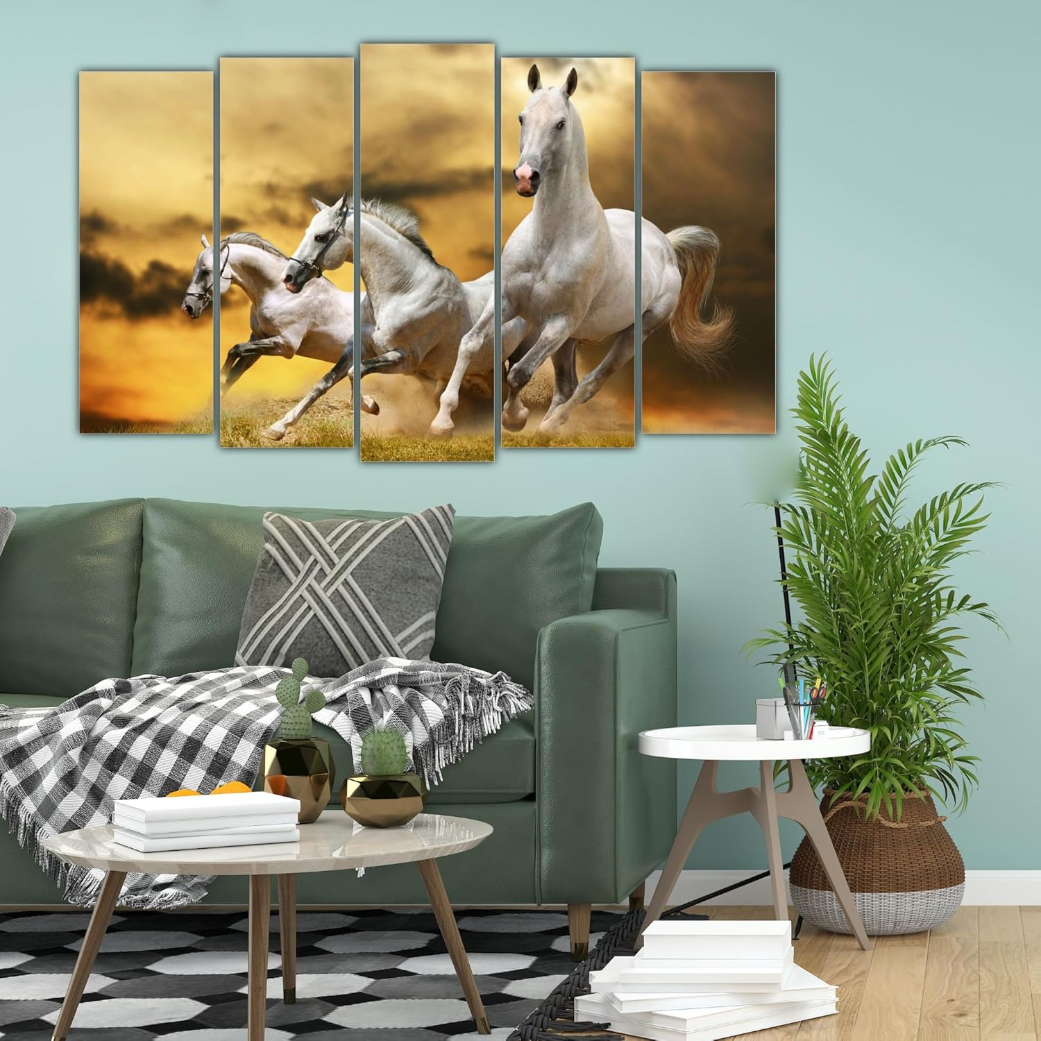
This is probably your longest-standing open tab. You keep coming back to these galloping horses—the white horses against golden amber, the five-panel layout that suggests movement without chaos. But the measurement uncertainty lingers. Your wall is probably 12 feet (360cm). This canvas is 127cm. That's 35% coverage, leaving 116cm on each side. Not sparse enough to look lost. Not crowded enough to feel overwhelming. The space works because Indian living rooms need breathing room—your sofa is probably 6-8 feet wide, your coffee table extends another 3 feet, and this canvas fits the visual rhythm without competing.
Your wall measures 360cm. This five-panel canvas spans 127cm—just over one-third of your wall width. That leaves 233cm of empty wall space, split roughly into 116cm margins on both sides. This isn't arbitrary. A 35% coverage ratio creates what interior designers call "intentional negative space"—the canvas becomes a focal point without dominating.
Compare this to a 152cm canvas (42% coverage): it might feel stretched, leaving only 104cm margins. Your 8-foot sofa would visually crowd it. Now consider a 102cm option (28% coverage): it leaves 129cm margins—so much space the canvas starts looking tentative, like it's apologizing for being there. The 127cm option balances these extremes.
Your ceiling height matters too. If you have standard 9-10 foot ceilings (270-300cm), this 76cm height positions comfortably in the middle third of your wall. Hung at typical eye level (150cm from floor to canvas center), it doesn't graze the ceiling or sink toward furniture. The five-panel horizontal layout emphasizes width over height, which visually expands narrow living rooms—a practical advantage in 12x14ft spaces where width often feels compressed.
You've seen this look beautiful in product photos. But your walls are probably cream, off-white, or that builder's beige-peach that came with the house. Your sofa is probably brown or beige fabric. Your coffee table is dark wood. Will these white horses on golden amber actually complement that, or will the colors clash?
Here's what happens in real-world conditions: The golden amber background isn't bright orange—it's a warm, muted tone closer to sunset glow or wheat fields. Against cream walls, it creates gentle contrast without shocking. The white horses add brightness without glare, functioning like lighter accents that prevent the overall composition from feeling too warm or monotone.
This matters in Indian lighting conditions. Morning sunlight through east-facing windows will make the golden tones richer, almost glowing. Evening LED bulbs (typically 3000K warm white) soften the contrast, making the entire canvas feel cohesive with wooden furniture. If you have tube lights (4000K cool white), the white horses pop more distinctly, but the amber grounds them so it doesn't look stark.
The five-panel format helps here too. Because the image is split across frames with narrow gaps (typically 2-3cm), your eye reads it as one cohesive scene with built-in dimensionality. The horses in motion create diagonal flow, so the golden background doesn't feel like a flat block of color—it has depth and narrative.
You might be hesitating because you're renting, and your deposit is ₹50,000. Or because you've never hung multi-panel art before and worry about alignment. This canvas makes both concerns manageable.
Each panel weighs approximately 600g (total 3kg for five panels). That's lighter than a single framed painting of equivalent size. You don't need special anchors or studs—basic picture hooks rated for 1-2kg each handle this easily. The 0.6cm depth means each panel sits nearly flush against the wall, so minor misalignment isn't visually obvious from normal viewing distance (8-10 feet).
For rental-safe installation: Use 3M Command Picture Hanging Strips (large size, 7kg capacity per pair). They hold the canvas securely but remove cleanly without damaging paint—critical for deposit protection. The kiln-dried pinewood frames (1.5" thickness) have pre-attached hanging hardware on back, so you're not drilling into the canvas itself.
Alignment strategy: Measure your wall's center point horizontally. Mark 63.5cm (half of 127cm) left and right from center. Hang the middle panel first at eye level (typically 150-160cm from floor to canvas center). Then position the two left panels and two right panels, maintaining 2-3cm gaps. Use a measuring tape and level app on your phone. Total time: 15-20 minutes for all five panels if you work methodically. Faster if someone holds panels while you hang.
You've probably looked at the 152cm version and the 102cm version. Maybe you've compared 3-panel vs 5-panel formats. Here's the honest difference.
The 152cm canvas (42% wall coverage) makes a bolder statement—it's immediately visible when guests enter. If your living room is 14x16ft with minimal furniture, that extra presence works. But in a 12x14ft space with a full sofa, coffee table, and side tables, 152cm can feel greedy. It demands attention in a way that competes with your furniture layout.
The 102cm version (28% coverage) is safer—it definitely won't overpower. But safety often translates to "easily ignored." Guests might not notice it unless they're specifically looking at your walls. In larger living rooms (14x16ft or bigger), it risks looking undersized, like you compromised on budget rather than made a design choice.
The 127cm option (35% coverage) sits in the intentional middle. It's noticeable without being loud. It suggests you made a deliberate choice about scale rather than defaulting to smallest-safest or biggest-boldest.
Panel count matters too. A 3-panel version at 127cm means each panel is about 42cm wide—wider individual frames. That can feel heavier, more formal. The 5-panel format breaks the image into narrower sections (roughly 25cm per panel), which feels lighter, more contemporary, and introduces subtle dimensionality through the gaps. It's the difference between "one large painting" and "a curated panel arrangement."
You've seen the product photo—perfectly lit, no furniture in frame, colors vivid. Your living room is different. Your walls have light switches. Your sofa has cushions. Your mother-in-law has opinions. Here's what to expect realistically.
The golden amber background will look warmer in natural morning light, slightly cooler under evening LEDs. If your walls are cream or off-white, the contrast will be noticeable but not dramatic—think "intentional accent" not "shocking pop." If your walls are that builder's peach-beige, the amber tones will harmonize more closely, making the white horses the primary visual draw.
From 8-10 feet away (typical viewing distance from a sofa), you'll see the galloping motion clearly—the horses' dynamic poses, the sense of movement from left to right. The five-panel splits won't be obvious; your brain stitches them into one continuous scene. Up close (2-3 feet), you'll notice the print texture on vinyl, the slight gaps between panels, and individual horse details. This is normal for canvas prints in this price range (₹3,796).
The 127cm width will center nicely above a 7-8 foot sofa without extending past the sofa arms—a visual guideline designers use to maintain proportion. If your sofa is smaller (6 feet), the canvas might extend slightly beyond the sofa width, but that's acceptable if you have side tables or lamps flanking it.
One common concern: "Will the Vastu element feel obvious?" The galloping horses symbolize progress and momentum in Vastu, typically recommended for south-facing walls. But the art doesn't announce this—guests won't immediately think "Vastu décor" unless they're specifically knowledgeable. It reads as dynamic, nature-inspired art that happens to align with traditional principles.