
Cart
So you've got the keys to your new place – congratulations! Now you're staring at those blank walls thinking, "What on earth do I do with all this...space?" Don't panic! I'm about to spill the beans on those insider design secrets that will transform your empty box into a magazine-worthy home. And no, you don't need to sell a kidney to afford a celebrity designer! These tricks of the trade will have your friends wondering if you've secretly been studying interior design all along. Grab a cup of coffee (or wine, I don't judge) and let's turn that new house into a home that makes you smile every time you walk through the door! To kick things off, consider setting the mood with the right Artistic Wall Hangings for Interior Design Enthusiasts Working on a New Home Makeover. These pieces can define your style and provide the starting palette for a cohesive look.
Ever walked into a perfectly designed room and thought, "How did they make those colors work so well together?" Let me let you in on a little secret: designers aren't color wizards—they just follow the 60-30-10 rule! Think of it like making the perfect sandwich: 60% is your bread (your dominant color for walls and large furniture), 30% is your filling (secondary color for curtains or accent furniture), and 10% is your special sauce (that pop of color in accessories that makes everything exciting).
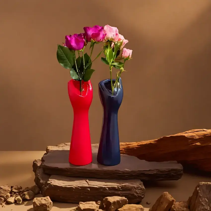
Try painting your living room a lovely sage green (60%), add some cream-colored curtains and a sofa (30%), then throw in mustard yellow pillows and a vase (10%). Voilà! You've got a room that looks professionally designed, and your friends will be too busy complimenting your "naturally good taste" to realize you just followed a recipe! Accent pieces like Ceramic and Resin Vases That Complement the 60-30-10 Rule of Interior Design seamlessly add that final 10% pop of style.
If your instinct is to vacuum-seal all your furniture against walls like you're prepping it for long-term storage, I'm going to need you to step away from the sofa! The biggest rookie mistake in decorating is the dreaded "furniture against the wall" syndrome. Instead, create conversation areas where people can actually, you know, converse without shouting across a football field-sized space.
Float your sofa away from the wall with a slim console table behind it. Angle those chairs. Create pathways that make sense (nobody wants to parkour over an ottoman to reach the kitchen). And for the love of design, please measure your space before buying furniture! Nothing says "I didn't think this through" quite like a sectional sofa that makes your living room look like a dollhouse. Your future guests (and their shins) will thank you! Finish the layout by adding Modern Design Statues That Highlight Furniture Placement Excellence in Interior Design to create focal interest.
If you're relying solely on that builder-grade ceiling fixture to light your entire room, we need to talk. That's like trying to look good in fitting room lighting—nobody wins! Professional designers know the secret to amazing rooms is lighting in three layers: ambient (overall light), task (for specific activities), and accent (the pretty decorative stuff).
Mix it up with floor lamps, table lamps, wall sconces, and maybe even some twinkly string lights tucked into a bookshelf. And please, for the sake of romance and good selfies everywhere, put everything on dimmers! Nothing kills the vibe faster than flipping on a light that has the intensity of an alien abduction. Your Instagram photos (and date nights) will improve dramatically! And don't forget to elevate corners with Tall Showpieces for Corners That Enhance Your Room's Lighting Ambience — because, yes, corners need love too.
Ever seen a tiny couch drowning in a massive room, looking like it got shrunk in the wash? Or a coffee table so huge you need a GPS to navigate around it? That, my friend, is the problem of scale and proportion—and it's a design crime we need to talk about!
Here's the secret: your coffee table should be about two-thirds the length of your sofa. Your art should cover about two-thirds of the wall space above furniture. And please, measure the height of your ceiling before buying that chandelier, unless you enjoy guests playing an involuntary game of "duck or get concussed." Remember, just because that massive sectional fit in the showroom doesn't mean it belongs in your apartment. Unless you're planning to remove doors and windows to get it in (spoiler alert: bad idea), always measure twice and order once! For striking balance, place a Large Decorative Showpiece as the Hero of Scale in Small Living Room Interiors that naturally fits the space.
Here's a weird but true design secret: things arranged in odd numbers look more appealing and natural than even-numbered groupings. It's called the Rule of Three (or five, or seven), and designers swear by it! Your brain gets bored with symmetry but finds odd groupings more interesting and dynamic.
So instead of two matching candlesticks on your mantel (boring!), try three candles of varying heights (exciting!). Group five frames instead of four. Stack three books instead of two. This little trick works everywhere—coffee tables, bookshelves, wall galleries. And when your friends ask how you made your shelves look so effortlessly stylish, just wink mysteriously. Your odd little secret is safe with me! Display Small Decorative Showpieces That Follow the Rule of Three for Traditional Vibes on shelves and watch visual harmony unfold.
If your room feels as flat as day-old soda, you're probably missing the secret ingredient that designers never skip: texture! A room without texture is like pasta without sauce—technically edible but why would you do that to yourself?
Layer up different textures like you're creating the world's coziest sandwich: smooth velvet pillows against a nubby linen sofa, a glossy ceramic lamp on a rough wooden table, a fluffy shag rug under sleek furniture. Mix metals, woods, fabrics, and finishes like you're the DJ of decorating, mixing tracks to create the perfect vibe. When people walk in and instantly feel comfortable without knowing why—that's texture working its magic! They might not notice it consciously, but they'll definitely feel the difference between "sterile showcase" and "I want to live here forever." Don’t forget the Resin Abstract Showpieces That Mix Textures for Elevated Living Room Interiors for visual and tactile play.
If I had a dollar for every home I've visited with art hung too high, I could afford to hire someone to rehang it all! Here's the insider secret: the center of your artwork should be at eye level, which is typically 57-60 inches from the floor. That's museum standard, folks!
When hanging art above furniture, it should be 4-8 inches above the piece, forming a visual connection rather than floating awkwardly in space like it's trying to escape. And please, don't be afraid to go big! A tiny picture on a massive wall looks like it got lost on the way to its actual home. If you can't afford large art, group smaller pieces into a gallery wall—it's like the design equivalent of "strength in numbers." Your walls (and neck, from not having to crane upward) will thank you! Make your statement pop with Wall Decor Pieces Best Suited to Perfectly Hung Living Room Spaces.
Did you know there's actually a mathematical formula behind beautiful design? It's the Golden Ratio (approximately 1:1.618), and it's the same proportion found in everything from seashells to the human face to the pyramids. Fancy, right?
In practical terms, this means that dividing a room into sections using this ratio creates spaces that feel naturally balanced. Try it when arranging furniture—if your room is 16 feet long, your furniture arrangement might work best at around 10 feet (16 ÷ 1.618), with the remaining 6 feet used differently. You can also apply it to shelving heights or the dimensions of a gallery wall. When something just "feels right" but you can't explain why, chances are you've accidentally stumbled upon the Golden Ratio. Congratulations, you're now as clever as Leonardo da Vinci, but with better indoor plumbing! Make proportions pleasing by using Ceramic Showpieces That Align with Golden Ratio Principles in Home Design.
Here's a counterintuitive design secret: sometimes the most important thing in your room is...nothing at all! Empty space (or "negative space" if you want to sound fancy at dinner parties) gives your eyes a place to rest and prevents your home from looking like a furniture store having an everything-must-go sale.
Resist the urge to fill every corner, shelf, and surface. That breathing room around your furniture and decor is like the pause between music notes—it's what makes the composition work! If your coffee table is covered with so many artfully arranged books that there's no place for an actual coffee cup, you might have gone too far. Remember, you're designing a home, not preparing for an appearance on "Hoarders: Buried Alive in Throw Pillows." Give your stuff—and yourself—some room to breathe! Inspire simplicity with Medium-Sized Abstract Showpieces Ideal for Balanced Empty Space Layouts.
Want to know how designers create rooms that don't look dated faster than last year's TikTok dance? They follow the 70/30 rule! This means keeping about 70% of your decor timeless and classic, while letting the other 30% be trendy, seasonal, or experimental.
Your big-ticket items like sofas, beds, and dining tables should fall into the 70% category—think neutral colors and classic shapes that won't make you cringe in five years. Then have fun with the 30%—those bold pillows, that funky lamp, or that wallpaper in the half bath that makes your traditional mother-in-law clutch her pearls. When the trend inevitably dies (pour one out for the chevron print era), you can update just the accessories without breaking the bank. It's like having a classic wardrobe but expressing yourself with wild shoes and jewelry—business in the basics, party in the accessories! For this strategy, introduce Trendy Resin Decor Accessories to Balance Classy Interiors in New Homes for that 30% twist.
Here's the biggest secret professional designers don't want you to know: the most interesting homes aren't perfect—they're personal! That weird souvenir you brought back from Thailand, your grandmother's slightly ugly but meaningful vase, that quirky flea market find that makes you smile—these are the things that turn a house from "nice showroom" into "YOUR home."
Display that collection of vintage cameras. Frame your child's adorable but objectively terrible artwork. Put out those travel mementos that spark joy and conversation. These items tell your story and create a home that couldn't possibly belong to anyone else. After all, if I wanted to live in a perfectly styled but soulless room, I'd just move into the nearest West Elm display window. The perfect home isn't the one with no mistakes—it's the one that feels undeniably, wonderfully you!
Let's end with the most liberating design secret of all: perfect is boring! The Japanese concept of wabi-sabi embraces imperfection, asymmetry, and the beauty of things that show their age and history. It's like the design equivalent of embracing your laugh lines instead of getting Botox.
Love that antique table with the water ring from that wild party in 2010. Appreciate how your leather sofa gets more character as it ages. Let your home evolve organically rather than trying to control every detail. Some of the most interesting and comfortable homes I've ever visited were nowhere near perfect—but they were full of life, stories, and personality. So take a deep breath and repeat after me: "My home doesn't need to be perfect to be beautiful." Feels good, doesn't it?
The 3-5-7 rule is a designer's trick for creating visually appealing groupings. It suggests decorating with objects in odd numbers (3, 5, or 7), as they create more visual interest and dynamic energy than even-numbered arrangements. For example, place three candlesticks of varying heights on your mantel instead of two, or arrange five frames in a gallery wall instead of four or six. This rule works because odd numbers create asymmetry, which forces your eye to move around the grouping and makes the arrangement more engaging and natural-looking. It's an easy way to make your decorative displays look professionally styled!
The 70/30 rule is all about balancing timeless design with trendy elements. Essentially, it suggests that 70% of your interior should be comprised of classic, timeless pieces and neutral colors that won't go out of style, while the remaining 30% can be trendy, seasonal, or experimental. This applies to everything from furniture and color schemes to patterns and accessories. The beauty of this rule is that when trends inevitably change, you only need to update 30% of your space to keep it looking fresh and current, rather than doing a complete overhaul. It's both budget-friendly and ensures your home never feels dated!
The 60/40 rule (sometimes expanded to 60/30/10) is a color proportion guideline that helps create balanced and harmonious spaces. In its simplest form, it suggests using your dominant color for 60% of the room (typically walls, large furniture pieces, and flooring), and your secondary color for the remaining 40% (accent furniture, curtains, etc.). The expanded 60/30/10 version adds a third accent color that makes up just 10% of the space through accessories like pillows, art, or small decor items. This formula creates visual balance while still allowing for creative color expressions, making it nearly foolproof for color-coordinating any room!
The 7 basics of interior design are the fundamental principles that guide all great spaces: 1) Space planning (how you arrange furniture and define areas), 2) Light (natural and artificial lighting layers), 3) Color (schemes and psychological effects), 4) Texture and pattern (creating visual and tactile interest), 5) Scale and proportion (ensuring pieces work together size-wise), 6) Balance (distributing visual weight evenly), and 7) Rhythm and harmony (creating flow and cohesion throughout your space). These principles work together like ingredients in a recipe—when properly balanced, they create rooms that not only look beautiful but function effectively for how you actually live. Master these basics, and you'll have the foundation for designing any space successfully!
The golden rule in interior design is simple but profound: form follows function. This means that while aesthetics are important, how a space functions for its intended purpose should always be the priority. Even the most beautiful room is a failure if it doesn't work for the people living in it! Before choosing that gorgeous but uncomfortable sofa or creating a picture-perfect dining area that's too cramped for actual dining, ask yourself: "Does this serve the way we really live?" Design choices should enhance your lifestyle, not complicate it. The most successful spaces seamlessly blend beauty with practicality, creating rooms that not only look amazing but also genuinely improve your daily experience in your home.


