At Moolwan, we help design-conscious Indian homeowners turn statement-colour rooms into spaces that feel intentional, not accidental. A pink room is one of the most rewarding challenges in home décor — it has inherent warmth and femininity, but without the right décor balance, it can feel overwhelming or flat. This guide tells you exactly what to place, where, and why.
---
Not all pink rooms are the same, and the décor strategy changes completely depending on which pink you are working with. Dusty rose and blush are cool-leaning and pair beautifully with sage, ivory, and brushed gold. Hot pink and magenta are warm and bold — they need grounding in charcoal, deep wood, and matte black. Pale pastel pink, common in Indian children's rooms and small bedrooms, works best with white and soft terracotta accents.
Before buying a single décor piece, identify your pink. Hold a white sheet of paper against your wall in natural daylight. If the pink looks warm, pair warm-toned décor. If it reads cool or grey-tinted, go cooler with sage, slate, or pewter accents. Getting this wrong is the most common reason a pink room feels "off" despite good pieces.
| Pink Type | Best Accent Colours | Avoid | Ideal Décor Finish |
|---|---|---|---|
| Blush / Dusty Rose | Cream, sage, ivory, brushed gold | Bright white, neon accents | Matte ceramic, soft resin |
| Hot Pink / Magenta | Charcoal, deep walnut, matte black | More brights, pastels | Glossy ceramic, dark wood |
| Pastel / Baby Pink | White, terracotta, soft mint | Heavy dark tones | Light resin, pale canvas |
| Millennial Pink / Nude | Warm grey, copper, natural rattan | Cool blues, pure white | Glazed ceramic, warm canvas |
Wall art is where most pink rooms either succeed or collapse. The instinct is to go soft and feminine — watercolour florals, pastel abstract prints. But that approach creates a one-note room. What works far better is contrast: bold, structured art against a soft pink wall, or warm botanical prints against a cooler blush.
For Indian living rooms and bedrooms with pink walls, canvas wall art in warm neutrals — cream, taupe, burnt sienna, or deep forest green — creates a grounding focal point without fighting the pink. Avoid art with strong blues or purples, which pull colour in conflicting directions. Geometric black-and-white art works beautifully against dusty rose. Abstract gold-accented prints elevate millennial pink to something refined.
Moolwan's canvas wall art is printed on 340 GSM cotton canvas with eco-solvent UV-resistant inks — meaning the colours you see in the product photograph are the colours that stay on your wall for years, even in humid Indian rooms. The 1.5-inch kiln-dried pine frames are moisture-resistant coated, so they do not warp or yellow behind your pink wall. You can browse Moolwan's full home décor range to find art pieces specifically suited to warm and neutral palettes that complement pink.
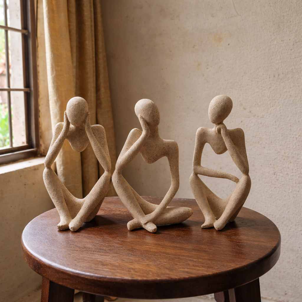
A pink room needs grounding, and the fastest way to achieve it is through physical texture and material contrast at the shelf, dresser, and coffee table level. Smooth pink walls call for rough, organic, or tactile décor surfaces — matte ceramic, natural stone, raw wood, woven accents. Avoid shiny chrome or silver in pink rooms — it amplifies the "sweetness" in a way that rarely reads sophisticated.
Moolwan's modern home décor showpieces are manufactured in ceramic with a 92% clay composition, rated heat-resistant to 60°C, humidity-tolerant to 85% RH, and drop-resistant from 15 cm. These are not decorative afterthoughts — they are engineered for Indian homes where dust, humidity, and seasonal temperature swings are real. For a pink room specifically, look for pieces in matte terracotta, warm white, and charcoal glazed finishes. These create visual rest points in a colour-saturated space.
Size matters in a pink room. Placing too many small pieces creates visual clutter that competes with the wall colour. Moolwan's size guidance for showpieces: Small (10–16 cm) for bathroom shelves and desk corners; Medium (16–21 cm) for bedroom side tables and showcases; Large (25–34 cm) for living room focal points. In a pink room, we recommend anchoring with one Large piece and no more than two Mediums — keep the shelf breathable.
You can shop Moolwan's modern home décor collection for showpieces sized and finished for Indian living rooms and apartments — perfect pairings for both bold and soft pink rooms.
---A pink bedroom is a different challenge from a pink living room. The bedroom needs to feel restful, not stimulating — and pink, unless handled carefully, activates rather than calms. The key is saturation control: if your pink wall is saturated, keep every other surface in the room neutral. If your pink is soft (blush, nude, pastel), you have room to layer in one more warm colour — terracotta, gold, warm wood.
For the bedroom, the highest-impact décor moves are:
Moolwan's resin décor pieces (epoxy resin, 94% purity, rated for 3+ year indoor lifespan, scratch-resistant at 3H pencil hardness) are lightweight — most weigh between 150 g and 600 g — making them ideal for the bedroom where the priority is ease and harmony over drama. Browse Moolwan's decorative items for bedroom to find pieces curated specifically for restful, design-forward sleeping spaces.
---Most pink rooms go wrong in one of four ways. Identifying which mistake applies to your space saves you money and effort before you buy anything.
| Mistake | Why It Happens | The Fix |
|---|---|---|
| Too many pink accessories | Instinct to "match" the wall | Contrast, not match. Neutral and earth-toned décor only. |
| Art that competes in colour | Buying art you love independently of the wall | Pick art with one dominant neutral or warm tone from the table above. |
| Wrong metal tone | Defaulting to silver or chrome | Gold or copper for warm pinks. Pewter or gun-metal for cool pinks. |
| Cluttered shelves | Trying to fill every surface | Edit down to one Large + two Medium pieces. Negative space is décor. |
| Ignoring light direction | Pink reads differently in morning vs evening light | Observe your wall at 7 AM, 2 PM, and 7 PM before selecting décor colour palette. |
Warm neutrals work best — cream, beige, terracotta, warm white, and charcoal. Metallic accents in brushed gold or raw copper add richness without competing with the pink. Avoid matching pink décor to a pink wall; contrast always reads more designed.
Canvas art in warm neutral tones — botanical prints, abstract warm-toned pieces, or geometric black-and-white work exceptionally well against pink. For blush walls, gold-accented abstract canvases feel elevated. Avoid art with strong blue or purple tones, which pull the colour balance off-axis.
Yes — dark accents are often the best choice. Charcoal, deep walnut, matte black, and dark terracotta all ground a pink room effectively. This is especially true for bold pinks like magenta or hot pink, where dark tones prevent the room from feeling saccharine. One or two dark anchor pieces are enough.
Less than you think. Because the wall colour is already working hard, the décor needs to breathe. A well-decorated pink room typically has one large focal showpiece (25–34 cm), two medium accent pieces (16–21 cm), and one piece of wall art. Beyond that, each additional piece competes rather than contributes.
Moolwan accepts returns within 24 hours of delivery, provided the item is unused and in its original packaging. A 10% restocking fee applies. Refunds are processed within 15 working days. This policy applies to all canvas wall art, ceramic showpieces, and resin decorative items.
Moolwan designs every piece for Indian homes — the right scale, the right finish, the right durability for Indian climate and everyday use. No middlemen. No guesswork.
Quick View


