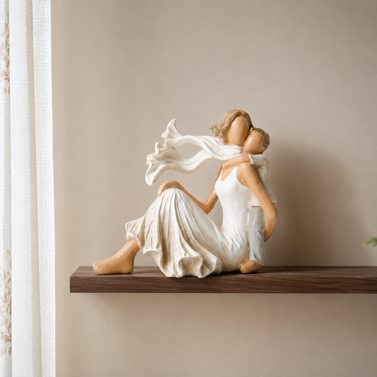
Pick one 60% neutral base, one 30% supporting color, and one 10% accent — then repeat that same ratio in every room, adjusting only the accent. This "60-30-10" rule keeps an entire Indian home visually connected while still letting each room, and each piece of art or decor in it, feel distinct.
Most Indian homes end up with a different color mood in every room because each room was decorated on its own, months apart, with no shared rule. The fix isn't picking one color for the whole house — it's picking one ratio and reusing it everywhere. At Moolwan, we help design-conscious Indian homeowners turn scattered rooms into one coherent home, without hiring a designer or repainting everything at once.
The 60-30-10 split, by wall area, furniture, and decor — the ratio does not change from room to room, only the colors inside it do.
The 60% base is your walls and largest surfaces — think warm white, soft greige, or a muted sand tone that reflects light well in rooms with limited windows, which is common in Indian apartments. The 30% support is your furniture and larger soft furnishings: a sofa, curtains, a dining table runner, or a large piece of wall art from Moolwan's modern home decor collection that anchors the room. The 10% accent is everything small and swappable — cushions, a showpiece, a vase, a photo frame — and it's the layer you're allowed to change with the seasons or festivals without touching the rest of the room.
This structure matters more in Indian homes than in most Western design content you'll find online, because Indian interiors already carry color through textiles, brassware, and religious or festive objects. If your base and support layers are too busy, there's no room left for that cultural texture to show. Keep the 60% and 30% quiet, and let the 10% carry the personality — that's where a hand-finished ceramic or resin showpiece earns its place on a shelf.
Building your 30% layer first? A single large canvas piece does more color work than five small accents combined.
Browse Modern Home Decor Items →Homeowners usually start palette planning with the color they're most excited about — a jewel-tone accent wall, a bold showpiece, a printed cushion set — and then try to build the rest of the room around it. This is backwards, and it's the single biggest reason whole-home palettes fall apart room to room. Start instead with the 60% neutral, choose it once for the whole home, and only vary the 30% and 10% layers by room.
Pick a single 30% color family — a deep teal, a warm rust, a muted olive — and use a version of it in every major room. It doesn't need to be the exact same shade; a teal sofa in the living room and teal-toned cushion covers in the bedroom both count. What matters is that your eye recognizes the same color language moving through the house, which is what makes a home feel designed rather than assembled.
The table below shows how one consistent ratio produces a different mood in each room, using the same base and support colors throughout and changing only the 10% accent layer — which is exactly where a curated showpiece or gift-worthy decor piece belongs.
| Room | 60% Base | 30% Support | 10% Accent | Where decor fits |
|---|---|---|---|---|
| Living Room | Warm greige walls | Deep teal sofa / curtains | Marigold cushions, brass | Large canvas wall art as focal point |
| Dining Area | Warm greige walls | Teal-toned runner | Ceramic centerpiece | Medium showpiece for coffee table height |
| Bedroom | Soft sand walls | Teal bedding accent | Terracotta throw | Framed art above headboard |
| Entryway / Shelf | Sand or white walls | Wood-tone console | Resin or ceramic piece | Small showpiece, 10–16cm shelf scale |
| Study / Home Office | Warm white walls | Olive or rust chair | Desk showpiece | Small resin piece, desk-scale |
Color alone doesn't finish a room — material finish changes how a color reads under Indian humidity and heat, and a palette that photographs well but degrades in six months isn't a palette worth building around. This is the detail most home décor guides skip, and it's where a manufacturer-direct brand like Moolwan can be specific instead of generic.
Moolwan's home decor items collection is engineered around exactly this problem. Canvas wall art is printed on 340 GSM cotton canvas with eco-solvent, UV-resistant inks and set in 1.5-inch kiln-dried pine frames with a moisture-resistant coating, so a deep teal or rust accent color doesn't fade or warp against a sunlit wall. Ceramic showpieces are 92% clay composition, heat-resistant to 60°C, humidity-tolerant up to 85% RH, and rated for a 15cm drop and a 5+ year lifespan — which matters on an open shelf in a monsoon-humid city. Resin pieces use 94%-purity epoxy resin, are scratch-resistant to 3H pencil hardness, and are built for indoor humidity up to 60% RH and temperatures between 15–35°C, with a 3+ year indoor lifespan.
If you're building the accent layer for a coffee table or entry console, explore Moolwan's table-top decorative items — vases, statues, and photo frames sized specifically for that 10% role, in matte or glazed finishes that are both easy to maintain in Indian household conditions.
Three mistakes account for most palette failures we see across Indian homes, and all three are fixable without repainting anything.
Moolwan is a manufacturer-direct home décor brand for Indian homes — we design, produce, and ship canvas wall art, ceramic and resin showpieces, and curated gifts without a middleman markup, and we engineer every piece for Indian climate, space, and light rather than importing a generic catalogue. What Moolwan stands for is simple: décor that respects your budget, your climate, and the balance between modern design and Indian tradition that most homeowners are already trying to strike on their own. What Moolwan sells is the 30% and 10% layer of your palette — the wall art, showpieces, and gifts that carry the color and material decisions covered in this guide, without the guesswork of sourcing them separately from five different sellers.
Returns are straightforward if a piece doesn't sit right in your palette once it's on the shelf: send it back within 24 hours of delivery, unused and in original packaging, for a refund within 15 working days (a 10% restocking fee applies).
Three color roles — one 60% base, one 30% support, one 10% accent — repeated across every room. More than three color families is what usually makes a home feel disconnected room to room, even if each individual room looks fine on its own.
No. The base neutral can stay identical, but the 30% and 10% layers should shift in shade or intensity by room — a bedroom can use a softer, muted version of the same color family a living room uses more boldly.
Art with a dominant neutral or earth-tone background and one saturated accent color tends to work across the widest range of home palettes, since it can serve as either the 30% or 10% layer depending on scale.
Choose one neutral-to-warm accent color — brass, terracotta, or deep teal are safe starting points — and buy every new decor piece in that single family going forward. New purchases will start unifying the home even before older rooms are repainted.
Yes. Materials without humidity resistance can dull, warp, or discolor in India's monsoon humidity. Moolwan's ceramic pieces are rated humidity-tolerant up to 85% RH and resin pieces up to 60% RH, specifically to keep accent colors true for years, not months.
Start with the 30% and 10% layers — the pieces that carry your color story into every room, engineered for Indian homes from the first coat to the last shelf.
Quick View