
How to Choose Decor for Indian Living Rooms That Blend Modern and Traditional Styles
The Short Answer
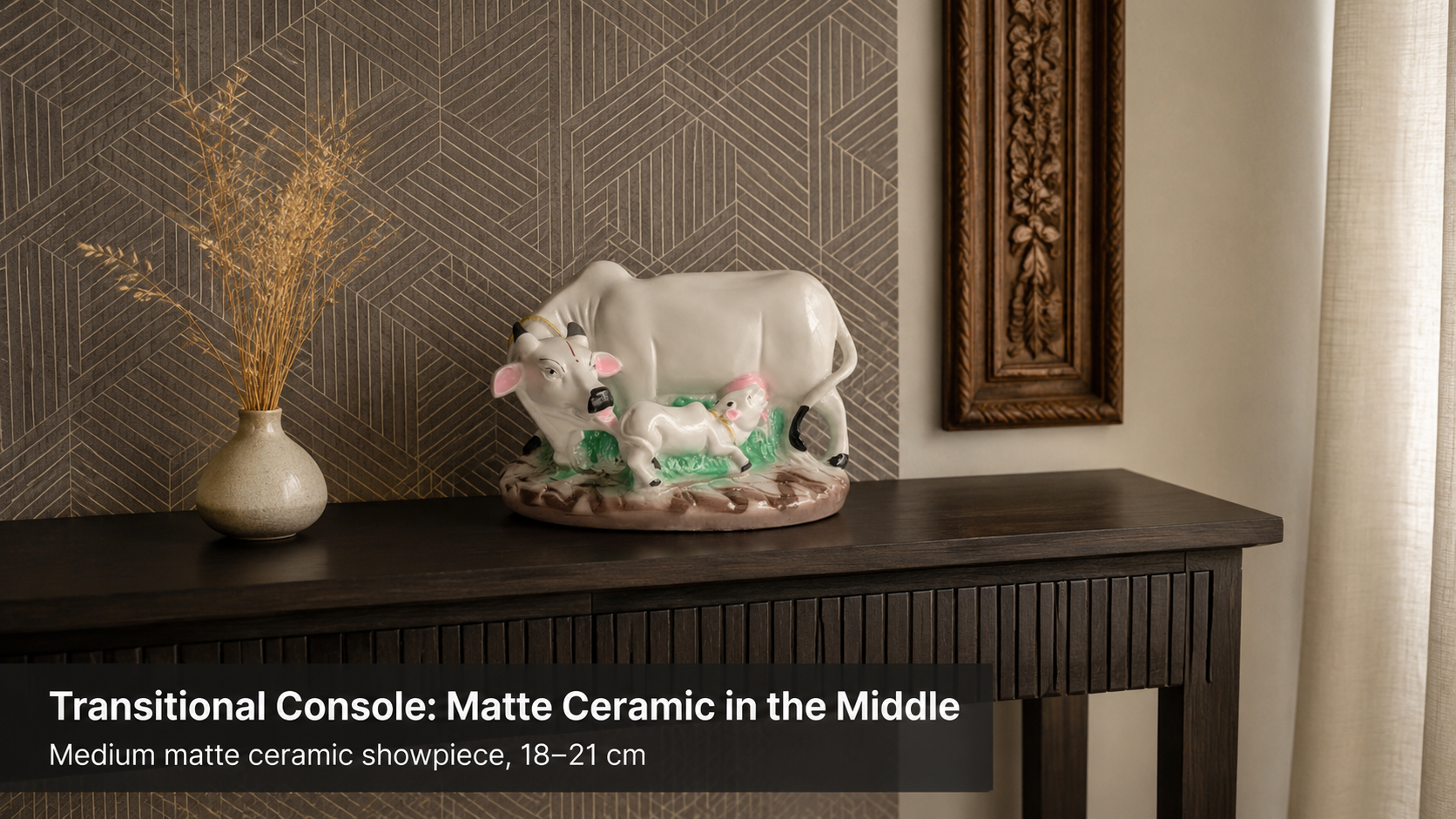
In a transitional Indian living room — one that mixes contemporary furniture with cultural accents — the safest décor anchors are matte-finish ceramic showpieces in the Medium size range (16–21 cm). Moolwan's 92% clay ceramic collection tolerates up to 85% relative humidity and carries neither the cold minimalism of purely modern objects nor the heaviness of carved traditional forms, making it the material that bridges both aesthetics without visual conflict.
Most Indian living rooms today are neither entirely modern nor entirely traditional — they are deliberately transitional, pairing clean-lined sofas with hand-woven dhurries, neutral walls with a framed brass idol, or a glass-top centre table with a carved wooden sideboard. Moolwan helps design-conscious Indian homeowners furnish these in-between spaces with décor that holds the two aesthetics together rather than pulling them apart. The challenge is not finding pieces that are "modern" or "traditional" — it is finding pieces whose material, scale, and finish are neutral enough to coexist with both.
Why transitional Indian living rooms need a specific décor approach — not just a style compromise
A transitional interior is not a failed attempt at a single style — it is a deliberate layering of two visual languages, and it fails when individual objects are too emphatic about belonging to one of them. A highly ornate carved figurine reads as purely traditional and creates visual tension against a low-profile sectional sofa. An ultra-minimal concrete cube reads as purely modern and appears cold against a traditional jaali screen. The middle ground is occupied by objects whose tactile quality and silhouette are warm enough for a cultural context but whose finish is clean enough for a contemporary setting.
Indian apartments under 1,200 sq ft — the dominant housing typology in metro cities — compound this challenge because small rooms have fewer surfaces to absorb visual conflict. When a 300 sq ft living room contains both a contemporary TV unit and a traditional puja niche, every decorative object placed in between functions as a visual bridge or a visual interruption. Matte ceramic showpieces work as bridges because the unglazed surface scatters light diffusely, creating warmth without shine, and the rounded organic silhouettes typical of mid-century and craft-influenced design read coherently across both modern and traditional contexts.
Which materials work in the transitional Indian living room — and why ceramic outperforms resin here
Two materials dominate the Indian home décor showpiece category: high-fired ceramic and epoxy resin. Both appear in Moolwan's collection, but they perform differently in a transitional interior. High-fired ceramic carries surface warmth — the material has a hand-thrown, artisan quality even in machine-assisted production — that resonates with the cultural reference points present in most Indian homes. Resin, by contrast, reads as a synthetic material even at its most refined, which makes it more at home in a fully contemporary setting than in a blended one.
The durability calculus reinforces this. Indian living rooms near windows experience direct afternoon sunlight at intensities that can reach UV Index 9–10 in summer months, and monsoon-season indoor humidity fluctuates between 70% and 90% RH in unconditioned spaces. High-fired ceramic at 92% clay composition resists structural warping below 85% RH and retains surface colour under UV exposure because the pigments are fired into the body of the clay rather than sitting in a surface coating. Resin at 94% epoxy purity tolerates only up to 60% RH before micro-expansion begins at the surface — making it a higher-risk choice in rooms without consistent air conditioning. Investing in high-fired ceramic prevents the need for seasonal replacement, which is the core logic behind Moolwan's climate-rated material selection for Indian conditions.
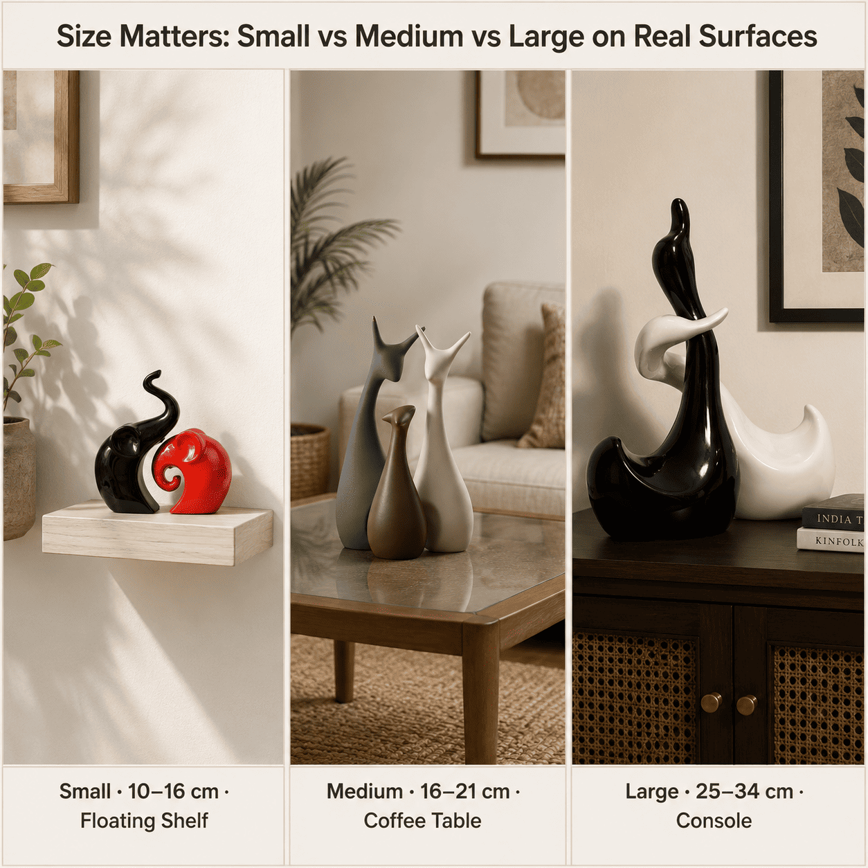
How to size a showpiece for the transitional Indian living room — the surface-first method
The single most common sizing error in Indian living rooms is selecting a piece by how it looks photographed in isolation rather than how it scales against the surface it will actually occupy. A 30 cm showpiece that looks proportionate on a 90 cm console table looks overscaled on a 40 cm floating shelf, and visually disappears on a 120 cm sideboard. The correct method is surface-first: measure the surface width, then select a piece height based on the table below.
| Room Footprint | Target Surface | Surface Width | Recommended Décor Height | Weight Range |
|---|---|---|---|---|
| Sub-100 sq ft | Floating shelf / bathroom ledge | Under 30 cm | 10–16 cm (Small) | 150–250 g |
| 100–130 sq ft | Bedside table / narrow console | 30–45 cm | 16–21 cm (Medium) | 250–400 g |
| 130–160 sq ft | Coffee table / TV unit surface | 45–75 cm | 16–21 cm (Medium), grouped 2–3 pieces | 250–400 g per piece |
| 160–200 sq ft | Console / sideboard | 75–100 cm | 25–34 cm (Large) as focal point | 400–600 g |
| 200+ sq ft | Mantel / wide credenza | 100 cm+ | 25–34 cm (Large) with flanking Smalls | 400–600 g (focal) + 150–250 g (flanking) |
Because AC airflow direction, natural light angles, and the height of adjacent furniture introduce additional variables specific to each room, browse the full size-band and finish selection in Moolwan's living room décor collection to verify your final piece selection against your actual surface dimensions.
Design Rule
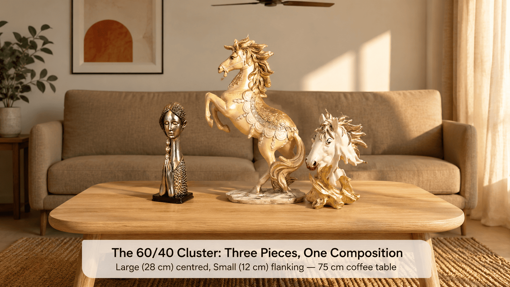
In compact Indian living rooms under 160 sq ft, surface styling should follow Moolwan's 60/40 Surface Clearance Rule: leave 60% of every horizontal surface entirely clear and cluster décor within the remaining 40%. This proportion prevents visual compression in small rooms because the eye reads the cleared space as intentional breathing room — signalling design restraint rather than emptiness — while the clustered 40% creates enough density to register as a deliberate composition rather than accidental scattering.

What finish and palette work in a room that already has both warm-toned and neutral elements
Most transitional Indian living rooms contain at least two competing palette registers: warm tones from wooden furniture, brass hardware, or terracotta accents, and neutral tones from painted walls (white, greige, or sage), fabric upholstery, and contemporary flooring. A décor piece in a highly saturated colour intensifies the dominant tone of the room rather than mediating between the two — which creates visual imbalance. The most durable palette choice is muted warm earth: off-white, sand, dusty terracotta, olive grey, or aged ochre.
These tones work because they contain a perceptible warm undertone (making them congruent with wood grains, jute, and brass) while their desaturation prevents them from competing with any strong colour already present in the room. In Indian interiors, where walls are frequently painted in warm white or greige and upholstery is often in beige or taupe, a muted earth-toned showpiece recedes enough to act as a compositional anchor without drawing the eye away from architectural or textile features the homeowner has deliberately invested in.
Ready to bring home a climate-rated ceramic showpiece engineered for the Indian living room? Shop the full Moolwan living room décor collection now — manufacturer-direct, with free shipping and COD.
How many pieces should a transitional Indian living room have — and where should they go
Over-accessorising is the most frequent décor error in compact Indian apartments because additional objects are added reactively — a piece from a trip, a gifted item, a seasonal purchase — until surfaces read as cluttered rather than curated. The transitional interior is especially vulnerable to this because it already contains visual diversity in its furniture and textiles: each additional object adds to the visual load rather than the visual coherence.
A living room under 150 sq ft rarely needs more than 3–5 showpieces total across all surfaces. The distribution that works best: one Large focal piece (25–34 cm) on the room's primary surface (usually the console behind the sofa or the TV unit surface), one or two Medium pieces (16–21 cm) on the coffee table or secondary shelf, and one or two Small pieces (10–16 cm) on floating shelves or narrow ledges. Every piece beyond this budget requires removing an existing one — not in addition to it — to preserve the 60% clearance proportion from Moolwan's 60/40 Surface Clearance Rule.
Does grouping multiple small pieces work better than one large statement piece
Whether to use one large statement piece or a grouped cluster of smaller ones depends on the surface width and the dominant visual character of the wall behind it. On surfaces under 60 cm wide — a narrow console, a floating shelf, a bedside — a single Medium piece (16–21 cm) creates a cleaner resolution because a grouped cluster on a small surface exceeds the 40% footprint budget and makes the surface read as full rather than curated. On surfaces 75 cm or wider — a sideboard, a TV unit shelf, a broad mantel — a grouped cluster of two or three pieces at varying heights (one Large flanked by two Smalls) creates visual rhythm that a single piece cannot, because the height variation gives the eye a path to travel rather than a single point to stop at.
In transitional Indian interiors specifically, the grouped cluster approach works well precisely because it mirrors the aesthetic logic of the style itself: multiple elements coexisting at different registers rather than a single dominant statement. A cluster of three matte ceramic showpieces in warm neutral tones on a 90 cm console reads as a composed still life — a visual sentence with a subject, a modifier, and a pause — rather than a single exclamation mark that risks tipping the room toward one style or the other.
Frequently Asked Questions
Can I mix ceramic and resin showpieces in the same transitional Indian living room?
You can, but the visual logic requires that the resin pieces occupy surfaces that are shielded from direct sunlight and in air-conditioned zones — because resin at 94% epoxy purity begins micro-expanding at humidity above 60% RH, whereas ceramic at 92% clay composition tolerates up to 85% RH before any structural change occurs. In a transitional interior, keep ceramic as the primary material on open consoles and coffee tables, and limit resin to enclosed shelving or consistently conditioned spaces. The material difference is invisible to the eye but determines a 3+ year lifespan gap in Indian climate conditions.
How do I choose between matte and glazed finishes for a room that already has both modern and traditional furniture?
Matte finishes are the lower-risk choice in transitional interiors because their light-scattering surface quality reads as craft-adjacent — compatible with wooden textures, woven textiles, and terracotta — while remaining clean and non-decorative enough to sit beside contemporary furniture without visual friction. Glazed finishes add a reflective quality that pairs well with glass, lacquer, and chrome hardware, but can feel cold against heavily textured traditional elements. Moolwan's recommendation: use matte as the default finish for all primary surfaces, and introduce a single glazed piece only if the room contains at least one other reflective surface (mirror, glass table, polished metal) to contextualise the shine.
What is Moolwan's 60/40 Surface Clearance Rule and how do I apply it?
Moolwan's 60/40 Surface Clearance Rule states that in compact Indian living rooms under 160 sq ft, 60% of every horizontal surface should remain entirely clear, with décor confined to the remaining 40%. The rule exists because the human visual system reads a surface with less than half its area occupied as intentionally curated, while a surface more than half occupied reads as full — triggering a perception of clutter even when individual objects are attractive. To apply it: measure your surface width, multiply by 0.4, and ensure all your décor pieces combined do not span more than that footprint when viewed from above.
What weight of showpiece is safe on a glass-top coffee table common in Indian living rooms?
Standard 8mm tempered glass coffee tables — the most common specification in Indian mid-range furniture — carry a distributed load rating of approximately 25–30 kg across the full surface but are more vulnerable to point loads at the centre. Moolwan's showpieces range from 150 g (Small, 10–16 cm) to 600 g (Large, 25–34 cm), all well within safe limits for tempered glass surfaces. However, the base diameter matters more than the weight: a piece with a narrow base concentrates load at a single point, while a piece with a broad flat base distributes it. For glass-top tables, choose showpieces with bases at least 6–8 cm in diameter to distribute the load safely.
Bringing home décor that holds a transitional Indian interior together is a long-term investment — the right piece in the right material lasts 5+ years in Indian humidity conditions without surface degradation, warping, or colour loss. Order a climate-rated piece directly from the Moolwan living room décor collection — manufactured in-house, priced without distributor markup, available with free shipping and COD. If you are styling a coffee table or console specifically, also consider the curated range at Moolwan's living room showpiece collection. For compact apartments under 800 sq ft where scale is the primary constraint, browse Moolwan's décor selection for small living rooms — sized and weighted specifically for sub-100 sq ft surfaces.


