
How to Choose Paint Colors for a Luxurious Living Room Look
The Short Answer
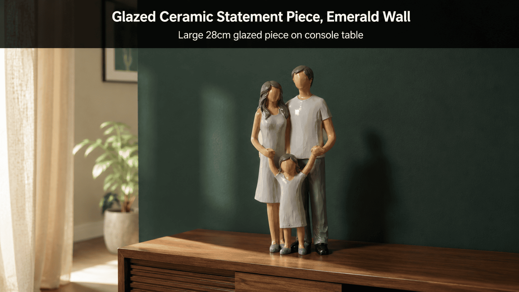
Deep jewel tones and warm neutrals read as luxurious because they absorb and reflect light differently than bright primary colors, creating depth instead of flatness. Moolwan recommends pairing emerald or navy walls with glazed ceramic décor (25–34cm) and warm-greige walls with matte resin pieces (16–21cm) for the most cohesive high-end finish.
In residential interior design, perceived luxury is measured less by paint cost and more by light-reflectance value (LRV) — colors with an LRV between 10–40% absorb ambient light and create visual depth, while colors above 60% LRV flatten a room under typical Indian apartment lighting. Moolwan helps design-conscious Indian homeowners translate this principle into a complete room, not just a wall, by curating décor finishes engineered to match each LRV band. Getting the wall color right is only half the equation; the décor accents sitting against that wall either reinforce the luxury effect or undercut it.
Which Paint Colors Create a Luxurious Living Room Look?
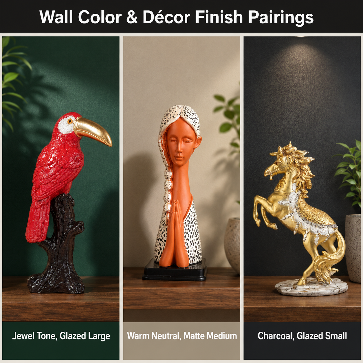
Deep jewel tones, warm neutrals, and charcoal-based accent walls create the strongest luxury effect in living rooms under 1,200 sq ft. This is because low-LRV colors such as emerald, navy, burgundy, and deep charcoal absorb stray light reflections from windows and ceiling fixtures, producing a saturated, gallery-like depth rather than the washed-out look of high-LRV pastels.
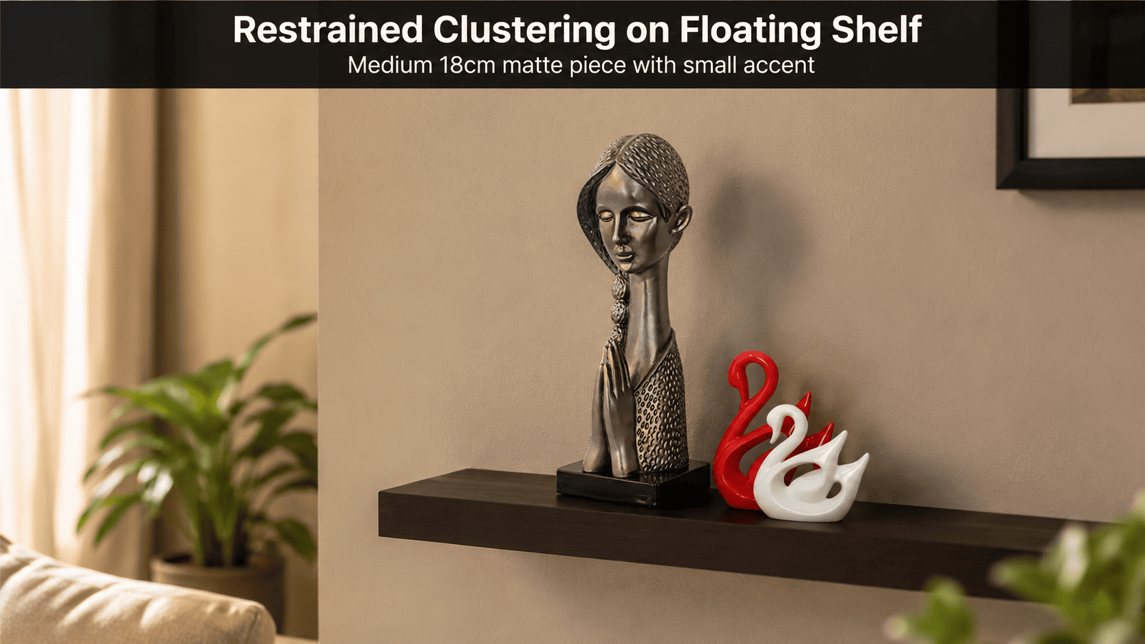
Warm neutrals such as greige and warm taupe sit in a middle LRV band and work as a safer alternative for renters or smaller apartments, since they still create shadow definition along skirting boards and cornices without committing to a bold jewel tone. Moolwan's modern home décor collection is curated specifically around these three palette families, because every showpiece, vase, and sculpture in the range is finished to either contrast or blend with one of them.
How Does Wall Color Affect the Right Décor Accent Finish?
The finish of a décor piece — glazed, matte, or textured — should shift opposite to the gloss level of the wall paint, because two glossy surfaces in the same sightline compete for light and create visual noise rather than depth. Against a high-gloss jewel-toned wall, a glazed ceramic piece reflects complementary light without doubling the shine; against a flat-matte neutral wall, a matte resin piece blends rather than fights for attention.
Material durability also matters at this stage, since accent pieces near a freshly painted wall are touched, dusted, and repositioned often during a room refresh. Moolwan's ceramic collection is built on a 92% clay composition that is drop-tested to 15cm and tolerant of 85% relative humidity, while the resin collection uses a 94%-purity epoxy with 3H pencil hardness — both rated for the seasonal humidity swings typical of unconditioned Indian living rooms.
| Wall Color Family | Recommended Décor Finish | Accent Size Band | Weight Range |
|---|---|---|---|
| Deep Jewel Tones (emerald, navy, burgundy) | Glazed ceramic | 25–34 cm (Large) | 400–600 g |
| Warm Neutrals (greige, warm taupe) | Matte resin | 16–21 cm (Medium) | 250–400 g |
| Charcoal Accent Walls | Glazed, clustered small pieces | 10–16 cm (Small), clustered ×2–3 | 150–250 g |
| Off-White / Cream Base Walls | Matte ceramic | 16–21 cm (Medium) | 250–400 g |
| Muted Sage / Earth Tones | Textured ceramic | 25–34 cm (Large) | 400–600 g |
Because lamp placement, console depth, and existing furniture tone introduce additional variables beyond wall color alone, browse the full finish-and-size selection in Moolwan's modern home décor collection to find pieces matched to your specific palette.
Design Rule
Moolwan's 60-30-10 Luxury Layering Rule holds that a high-end living room should commit 60% of the visible palette to the dominant wall color, 30% to a secondary neutral (rug, upholstery, curtains), and only 10% to the décor accents that carry the boldest finish or color contrast — preventing the room from reading as either flat or visually overloaded.

What Décor Pairs Best With Jewel-Toned, Neutral, and Charcoal Walls?
Jewel-toned walls pair best with one large glazed statement piece rather than several small ones, because a single large object anchors the eye to one focal point, while multiple small glazed pieces against a dark wall create scattered reflections that read as cluttered. Warm neutral walls, by contrast, support clustering — two or three medium matte pieces grouped together on a console create rhythm without overwhelming a lighter base tone.
Charcoal accent walls behave differently again: their low LRV means even small glazed pieces stand out sharply, so clustering 2–3 small décor accents (10–16cm) works better than one oversized piece, which can visually overpower a darker wall in a compact Indian living room.
Want a décor piece engineered to hold its finish for 5+ years against Indian humidity? Shop the full Moolwan modern home décor collection now.
Is Glossy or Matte Décor a Better Long-Term Investment?
Matte finishes are the better long-term investment for most Indian living rooms, because micro-scratches on a matte surface scatter light unevenly and stay visually invisible over a 5-year lifespan, while the same scratches on a glossy surface reflect light uniformly and become obvious within the first year or two of normal handling. This durability gap matters more in décor than in paint, since accent pieces are repositioned and dusted far more often than a wall is touched.
This is also why investing in a high-fired matte ceramic or hardness-rated resin piece avoids the seasonal replacement cycle that cheaper, unrated décor often requires — a core focus of Moolwan's climate-rated design philosophy for Indian homes.
How Many Décor Pieces Are Too Many for a Luxury Look?
A living room surface should keep at least 60–70% of its visible area clear, because dense clustering removes the negative space that the eye needs to register an object as a deliberate choice rather than visual clutter. Beyond 2–3 grouped pieces per surface, additional décor accents stop adding perceived value and start reading as overcrowding, regardless of how well each individual piece matches the wall color.
Frequently Asked Questions
Do dark paint colors make a small living room feel smaller?
Not necessarily — a dark, low-LRV wall combined with adequate ambient lighting and one statement décor piece often creates more perceived depth than a flat white wall, because the contrast between the dark base and a light-reflecting accent draws the eye outward rather than compressing it. Moolwan's large glazed ceramic pieces (25–34cm) are sized specifically to work as that contrast anchor in compact Indian apartments.
Should curtains and rugs match the wall color or the décor accents?
Curtains and rugs should generally match the secondary 30% layer in the 60-30-10 split, not the wall or the décor accents directly, since matching all three layers removes the contrast that makes a room feel curated rather than monochrome.
Does humidity affect how paint and décor finishes age together?
Yes — in unconditioned rooms with seasonal humidity swings up to 85% RH, untreated décor materials can warp or develop surface bloom faster than the paint itself fades, which is why Moolwan engineers its ceramic collection to tolerate that exact 85% RH threshold.
Can the same décor piece work across different wall colors if I repaint later?
A neutral matte or textured ceramic piece generally transitions well across 2–3 different wall color schemes, since its low-saturation finish doesn't lock it visually to one specific palette the way a glossy, color-matched piece does.
Ready to style your repainted living room with décor that's built for Indian humidity and sized for compact layouts? Bring home a piece from the Moolwan modern home décor collection — and if you're after a bolder statement finish or a more traditional sensibility, also consider the curated picks in Moolwan's modern luxury décor edit or the modern-vintage collection for traditional living rooms.


