
How to Match Bedroom Décor Palette to Common Indian Bedding Tones
The Short Answer
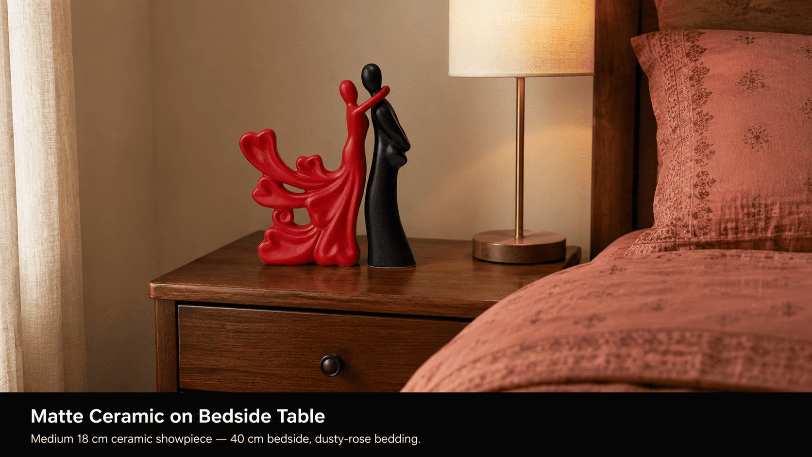
Match your bedroom décor to bedding by anchoring one dominant bedding tone and pairing it with a matte-finish showpiece in an analogous or neutral-offset hue. Moolwan's ceramic bedroom pieces — humidity-tolerant to 85% RH and available in 10–34 cm sizes — are specifically proportioned for Indian apartment bedrooms under 150 sq ft, so the scale never overpowers compact surfaces.
Colour harmony in a bedroom breaks down when décor pieces are chosen for their individual appeal rather than their tonal relationship to the bedding — the largest single block of colour in any Indian bedroom. Moolwan helps design-conscious Indian homeowners resolve this by building bedroom décor collections proportioned for Indian room scales and colour-matched to the warm, jewel, and neutral bedding tones that dominate Indian homes. The approach is grounded in colour physics, not personal taste alone: when a décor piece reflects wavelengths adjacent to those of the bedding fabric, the human visual cortex processes both surfaces as belonging to the same tonal family, which is why analogous colour pairing reliably reads as cohesive without feeling matchy.
Why Indian Bedding Tones Require a Different Palette Strategy Than Western Décor Guides
Indian textile tradition produces bedding in a tonal register distinct from the off-white, grey, and sage palettes that dominate Western bedroom guides. The most common Indian bedding tones — dusty rose, saffron-adjacent warm ochre, peacock teal, deep burgundy, and ivory-warm white — carry high saturation relative to the muted linen tones typical of Nordic or minimalist European bedroom styling. Décor pieces selected using Western guides (which recommend cool grey or slate ceramics as "safe neutrals") sit in direct colour contrast with these warm Indian bedding palettes, producing a visual temperature clash that reads as unresolved rather than designed.
Warm bedding tones above 30% saturation require décor in either an analogous warm hue (within 30° on the colour wheel) or a true neutral that reflects no dominant wavelength — such as unglazed off-white or warm greige matte ceramics. Moolwan engineers its bedroom showpiece collection in matte earthy and warm-neutral finishes precisely because these absorb excess wavelength scatter from highly saturated Indian bedding tones, producing visual equilibrium rather than competition. A glazed, cool-toned piece in the same room as saffron-ochre bedding, by contrast, reflects short-wavelength blue light that the warm palette does not contain, registering to the eye as a discordant interruption.
How Finish Type Affects Palette Compatibility in Indian Bedroom Conditions
Surface finish determines how aggressively a décor piece broadcasts its own colour against a bedding backdrop. A glazed ceramic piece with a smooth reflective surface amplifies its hue under both natural and artificial light because specular reflection creates a concentrated highlight that draws the eye away from the bedding tone anchor. A matte piece with a micro-textured surface diffuses incoming light at multiple angles, which scatters the surface colour broadly and prevents any single point of high-contrast visual tension with the bedding.
In Indian bedrooms, which receive intense south-facing or west-facing direct sunlight for 4–7 hours daily during summer months, this difference is compounded: direct sunlight on a glazed surface produces a brightness spike up to 60% higher than the ambient room tone, effectively bleaching the piece's palette contribution and pulling the eye away from the bedding composition. Matte-finish ceramics in Moolwan's bedroom collection maintain consistent colour saturation under both direct sunlight and artificial warm lighting because the micro-texture distributes light rather than concentrating it. For Indian rooms with variable light intensity across the day, this stability in palette perception is the functional reason matte outperforms glazed when palette coherence is the goal.
Moolwan's ceramic bedroom pieces are fired to a 92% clay composition density that produces a naturally micro-porous matte surface without requiring an additional matte glaze coat — which matters because applied matte coatings can wear unevenly over 3–5 years in high-humidity Indian environments (above 70% RH), causing patchy finish degradation that shifts the piece's perceived colour. The high-density 92% clay body retains uniform surface matte integrity at humidity up to 85% RH across a 5+ year lifespan.
The Palette Pairing Matrix: Bedding Tone vs Décor Finish, Size, and Surface
Correct palette pairing depends on four physical variables operating simultaneously: the dominant bedding hue, the room's ambient light temperature, the surface the piece will occupy, and the piece's size relative to that surface. The matrix below cross-references these variables using real dimensions from Indian apartment bedroom contexts.
| Dominant Bedding Tone | Recommended Décor Finish & Palette | Piece Size for Surface Type | Surface Width Threshold | Climate Tolerance Required |
|---|---|---|---|---|
| Warm earthy (dusty rose, ochre, terracotta) | Matte warm-neutral or analogous earth (off-white, warm greige, rust-adjacent) | Medium 16–21 cm (bedside); Small 10–16 cm (floating shelf) | Bedside: 40–50 cm; Shelf: under 30 cm | Humidity-tolerant to 85% RH (ceramic 92% clay) |
| Cool neutral (grey, dusty blue, silver-white) | Matte cool-neutral or tonal contrast in charcoal, stone, or sage | Medium 16–21 cm (bedside); Medium 16–21 cm (dresser) | Bedside: 40–50 cm; Dresser: 60+ cm | Humidity-tolerant to 85% RH (ceramic 92% clay) |
| Jewel-deep (peacock teal, burgundy, forest green) | Matte neutral anchor — off-white, unglazed bone, warm ivory — to prevent palette saturation overload | Small 10–16 cm (bedside, to avoid competing with bedding); Medium 16–21 cm (dresser) | Bedside: 40–50 cm; Dresser: 60+ cm | Humidity-tolerant to 85% RH (ceramic 92% clay) |
| Ivory / warm white (most common Indian wedding-gift bedding) | Any matte finish works — use this as an opportunity for a single tonal accent piece in dusty rose, warm sage, or terracotta | Medium 16–21 cm (bedside); Large 25–34 cm (dresser focal point) | Bedside: 40–50 cm; Dresser: 60+ cm | Humidity-tolerant to 85% RH (ceramic 92% clay) |
Because lamp shade colour temperatures, curtain sheers, and wall paint undertones introduce additional palette variables specific to each bedroom, browse the full finish, size-band, and palette selection in Moolwan's bedroom décor collection to verify your final piece against your specific room's tonal register.
Design Rule
To prevent palette competition between bedding and décor accents in compact Indian bedrooms, Moolwan's Tonal Anchor Rule recommends selecting décor pieces in a finish whose dominant hue sits within 30° of the bedding's primary tone on the colour wheel — or in a zero-saturation neutral (off-white, warm greige, unglazed bone) that introduces no competing wavelength. One anchored piece creates tonal coherence; two competing accent colours in the same surface zone fracture it.

How to Handle Mixed or Patterned Bedding Without Losing Palette Coherence
Patterned Indian bedding — block-print, floral jacquard, or geometric buti — contains multiple hues simultaneously, which makes the "match the dominant tone" instruction ambiguous. The operative principle is to identify the ground colour (the background on which the pattern sits) rather than the pattern colour itself, because the ground colour occupies the largest continuous surface area of the bedding and therefore determines the room's tonal temperature. Pattern colours are accent frequencies that the eye registers peripherally; ground colour is what the eye rests on.
For block-print bedding with a cream or ivory ground and coloured motifs, select a matte cream or warm off-white décor piece — not a piece that matches the motif colour. The motif colour already appears in sufficient proportion through the pattern; repeating it in a solid décor piece tips the balance from accent to dominant. Where the ground is a deep jewel tone (common in Rajasthani and Banarasi-inspired bedding), a single matte neutral piece provides the visual rest point the eye needs before returning to the pattern's complexity.
Ready to bring home a bedroom showpiece that fits both your bedding palette and your room's humidity conditions? Shop the full Moolwan bedroom décor collection — climate-rated, manufacturer-direct, sized for Indian apartments.
Wall Colour, Bedding Tone, and Décor: Managing the Three-Surface Interaction
Most Indian bedroom palette guides treat wall colour and bedding as independent variables, but they operate as a three-surface system: wall, bedding, and décor accent each reflect light simultaneously into the same enclosed volume. When wall and bedding are both high-saturation (e.g., a deep teal wall with jewel-tone bedding), adding a third saturated décor piece creates chromatic overload — the visual cortex cannot establish a resting point and registers the room as visually fatiguing rather than designed. Conversely, when both wall and bedding are low-saturation neutral (common in builder-grade Indian apartments with off-white walls and ivory bedding), a single matte accent piece in a warm earth tone provides the tonal anchor the room lacks.
The practical rule: count your saturation loads. Each high-saturation surface (wall, bedding, large rug) costs one saturation credit. A bedroom that has spent two credits on wall and bedding must invest its third credit — the décor piece — in a neutral or low-saturation anchor. This is not an aesthetic preference; it reflects the limit of simultaneous colour contrast the human visual system processes as pleasurable rather than stressful at 150–180 sq cm of peripheral viewing area, which is the approximate visual field of a standard Indian bedroom doorway view.

Sizing Décor Correctly for the Bedside Table vs the Dresser Surface
Palette coherence is negated if the décor piece is incorrectly scaled for its surface, because a piece that dominates its surface reads as spatially aggressive regardless of how well-matched its colour is. On a standard Indian bedside table (40–50 cm wide), a piece taller than 21 cm creates a visual block that interrupts the sightline between the bed and the nightstand lamp — the functional anchor of bedside composition. On a 60+ cm dresser surface, a piece under 16 cm reads as an afterthought rather than an intentional accent because the surface ratio of piece-to-field falls below the visual threshold for perceived intention (approximately 1:4 height-to-surface-width).
Moolwan's bedroom showpiece range is segmented in 10–16 cm (Small), 16–21 cm (Medium), and 25–34 cm (Large) precisely to match these Indian apartment surface dimensions. The 150g–600g weight range across the collection is calibrated so that no piece in the Small or Medium tier presents a stability risk on narrow bedside tables with less than 40 cm depth, where forward tipping under a 15 cm drop condition was a recorded failure mode in earlier-generation Indian décor pieces with narrow bases.

Frequently Asked Questions
What bedroom décor colour goes with dark blue or navy bedding?
Dark blue and navy bedding carry a high-saturation cool palette that already occupies the room's dominant colour credit. Décor pieces in warm off-white, unglazed bone, or warm greige matte finishes introduce no competing cool wavelength and provide a visual temperature contrast that the eye reads as intentional rest. Moolwan's warm-neutral matte ceramic pieces are the technically correct choice for this pairing because the 92% clay composition produces a warm undertone in the matte surface even without pigment additives — a property of the clay body's iron oxide content.
Can I use a coloured resin showpiece in the bedroom, or only ceramic?
Resin showpieces with 94% purity epoxy are appropriate for bedroom surfaces where the ambient temperature stays within 15–35°C and relative humidity does not exceed 60% RH. In Indian bedrooms with functioning air conditioning during summer, these conditions are typically met. However, in non-AC rooms in humid climates (coastal cities, monsoon months with open windows), the 85% RH humidity tolerance of 92% clay ceramic makes ceramic the more durable long-term choice — because at humidity above 60% RH sustained over multiple seasons, resin surfaces can develop micro-crazing that alters perceived finish colour.
How many décor pieces should I place on a bedside table?
One piece on a standard 40–50 cm Indian bedside table is the correct load for palette clarity and spatial function. A single Medium (16–21 cm) matte piece provides a tonal anchor without crowding the surface needed for a phone, glass of water, and lamp base — the functional necessities that occupy approximately 60–65% of a standard bedside table's surface area. Two pieces on a 40 cm bedside surface push the occupied zone to 80%+, which registers as cluttered rather than styled because the surface-to-piece ratio falls below the visual breathing threshold.
Does Moolwan offer bedroom décor in cool-toned finishes for grey or blue bedding?
Moolwan's bedroom collection is engineered primarily in warm-neutral and earthy matte finishes because these provide the broadest tonal compatibility across the warm Indian bedding palette that dominates the Indian market. For cool-toned bedding (grey, dusty blue, silver-white), the warm off-white and unglazed bone finishes in the collection function as true neutrals — they carry no dominant warm or cool wavelength in diffused indoor light — and pair effectively with cool bedding tones without requiring a piece that itself trends cool. This approach avoids the narrow palette compatibility of explicitly cool-toned décor pieces, which pair poorly with warm bedding.
Investing in a bedroom showpiece engineered for 5+ year lifespan at 85% RH humidity means no seasonal replacement cycle — which is the ROI that justifies choosing a climate-rated piece over a generic import. Buy a piece from the Moolwan bedroom décor collection — manufacturer-direct, sized for Indian apartments, and finished for Indian light conditions. If you're considering surface-specific options, the marble-finish bedroom showpiece range offers an elevated tonal contrast for neutral and ivory bedding, while the broader decorative items for bedroom selection covers the full size and finish spectrum for every surface in the room.


