

How to Style a Bookshelf with Decorative Objects Without It Looking Cluttered
The Short Answer
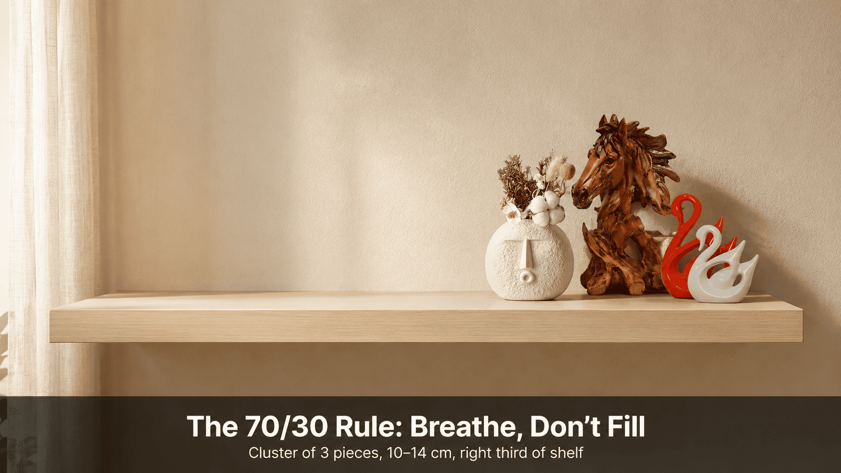
Leave 70% of each shelf clear and cluster small decorative pieces — 10–16 cm height, 150–250 g — in odd-number groups of three within the remaining 30%. Moolwan's small decorative accents in matte ceramic (92% clay, humidity-tolerant to 85% RH) hold this composition year-round without warping or discolouring, because high-fired matte surfaces resist both humidity-driven swelling and direct sunlight bleaching.
Visual clutter on a bookshelf is not a styling failure — it is a physics problem. When objects of uniform height, finish, and spacing are placed side by side, the human eye reads them as a single undifferentiated mass rather than as individual focal points, creating the sensation of crowding even when the shelf is only half full. Moolwan helps design-conscious Indian homeowners resolve this by engineering small decorative accents precisely sized for Indian shelf depths (typically 25–35 cm) and weighted to stay stable on floating shelves without wall anchors. The principles below apply whether you are styling a floor-to-ceiling unit in a 1,200 sq ft Bangalore apartment or a single floating shelf in a 600 sq ft Mumbai studio.
Why Does a Bookshelf Look Cluttered Even When It Isn't Overfull?
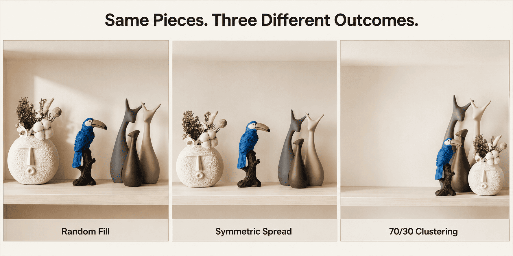
Perceived clutter is almost always caused by three spatial errors: uniform height across objects, symmetric spacing between them, and a fragmented colour field with no dominant palette. When every decorative piece on a shelf sits at approximately the same height, the eye moves horizontally across the shelf without a single resting point — a phenomenon described in spatial design as a "flat horizon effect," which the brain interprets as noise rather than composition. The fix is height contrast: at least one tall piece (14–16 cm), one medium piece (11–13 cm), and one short accent (10 cm or below) within each group.
Symmetric spacing compounds the problem. Two identical objects placed equidistant from the shelf centre create a mirror pattern that feels mechanical and institutional — the visual language of a display case, not a curated home. Asymmetric grouping — clustering three objects close together and leaving significant negative space to their left or right — signals intentionality to the eye and reads as styled rather than stored.
Fragmented colour is the third driver of perceived clutter: when six objects each carry a different hue, the shelf reads as a collection of unrelated items. Restricting each shelf zone to a two-tone palette (for example, warm terracotta with off-white, or muted sage with natural wood) visually binds the group and allows the eye to settle.
What Size Decorative Pieces Work Best on a Bookshelf?
Decorative accents sized between 10 and 16 cm in height are the correct range for most bookshelf surfaces because they remain visible above the spine height of standard trade paperbacks (typically 18–20 cm) without blocking neighbouring items, and their footprint (typically 8–12 cm depth) fits within a standard 25–35 cm shelf without overhanging the edge. Objects exceeding 21 cm on a bookshelf shift the visual grammar from accent to statement piece, pulling the eye away from the shelf composition as a whole.
Weight matters as much as height — particularly on floating shelves, which are standard in Indian apartments and are typically load-rated at 5–8 kg per bracket pair. Individual decorative objects in the 150–250 g range allow safe grouping of three to five pieces on one shelf zone without approaching load limits. Ceramic pieces in this range retain their weight advantage because the 92% clay composition used in high-fired ceramic achieves the material's density ceiling without the additional mass of lower-grade fillers — meaning more volume per gram relative to lower-fired ceramics.
Resin accents offer a lighter alternative — typically 150–200 g in the same size band — with a 94% purity epoxy composition that gives surface hardness equivalent to a 3H pencil, resisting shelf-induced micro-scratches from repositioning. The trade-off is a slightly lower humidity ceiling (60% RH versus 85% RH for ceramic), which makes resin a better fit for air-conditioned rooms where humidity stays controlled, and ceramic the default choice for rooms exposed to seasonal monsoon humidity.
| Shelf Type | Usable Depth | Recommended Piece Height | Recommended Weight Range | Best Material |
|---|---|---|---|---|
| Floating shelf (single bracket) | 20–25 cm | 10–14 cm (Small) | 150–250 g | Ceramic (85% RH tolerance) |
| Floating shelf (double bracket) | 25–30 cm | 10–16 cm (Small) | 150–300 g | Ceramic or Resin |
| Bookshelf — fixed unit, upper shelf | 28–35 cm | 12–16 cm (Small–Med) | 200–350 g | Ceramic (monsoon-exposed rooms) |
| Bookshelf — fixed unit, lower shelf | 28–35 cm | 14–21 cm (Small–Med) | 250–400 g | Resin (AC rooms) / Ceramic (open rooms) |
| Open corner unit / cube shelf | 30–40 cm | 16–21 cm (Medium) | 300–500 g | Ceramic (focal-point placement) |
Because shelf depth, bracket load rating, and room humidity introduce additional variables specific to each home layout, browse the full size-band and material selection in Moolwan's small decorative items collection to verify your final piece selection against your shelf type.
Design Rule
To prevent visual compression on any bookshelf surface — regardless of shelf width — apply Moolwan's 70/30 Spatial Breathing Rule: leave 70% of each shelf's horizontal surface entirely clear and restrict all decorative grouping to the remaining 30%, clustering odd numbers of pieces (three or five) within that zone. The rule works because the human visual system resolves a single dense cluster as one intentional focal point, whereas objects distributed across the full shelf width are processed as individual competing stimuli — a cognitive load the brain registers as clutter even when the objects themselves are beautiful.
How Do You Use Odd-Number Grouping and Height Contrast Together?
Odd-number grouping (three or five objects per cluster) works because it prevents the eye from splitting the group into symmetrical halves — a two-object or four-object arrangement always resolves into a pair or two pairs, restoring the symmetry the eye reads as mechanical. Three objects force an asymmetric reading: the eye moves from the tallest to the shortest, establishing a diagonal hierarchy within the group that reads as a composed scene rather than a row of items.
The height sequence within the trio follows a specific logic: place the tallest piece (14–16 cm) at the back left or back right of the cluster, the medium piece (11–13 cm) in front of it at a slight diagonal offset, and the smallest accent (10 cm or below) at the front of the cluster closest to the shelf edge. This triangular front-to-back arrangement creates depth on a surface that is physically only 20–35 cm deep — depth the camera and the eye both read as considered composition.
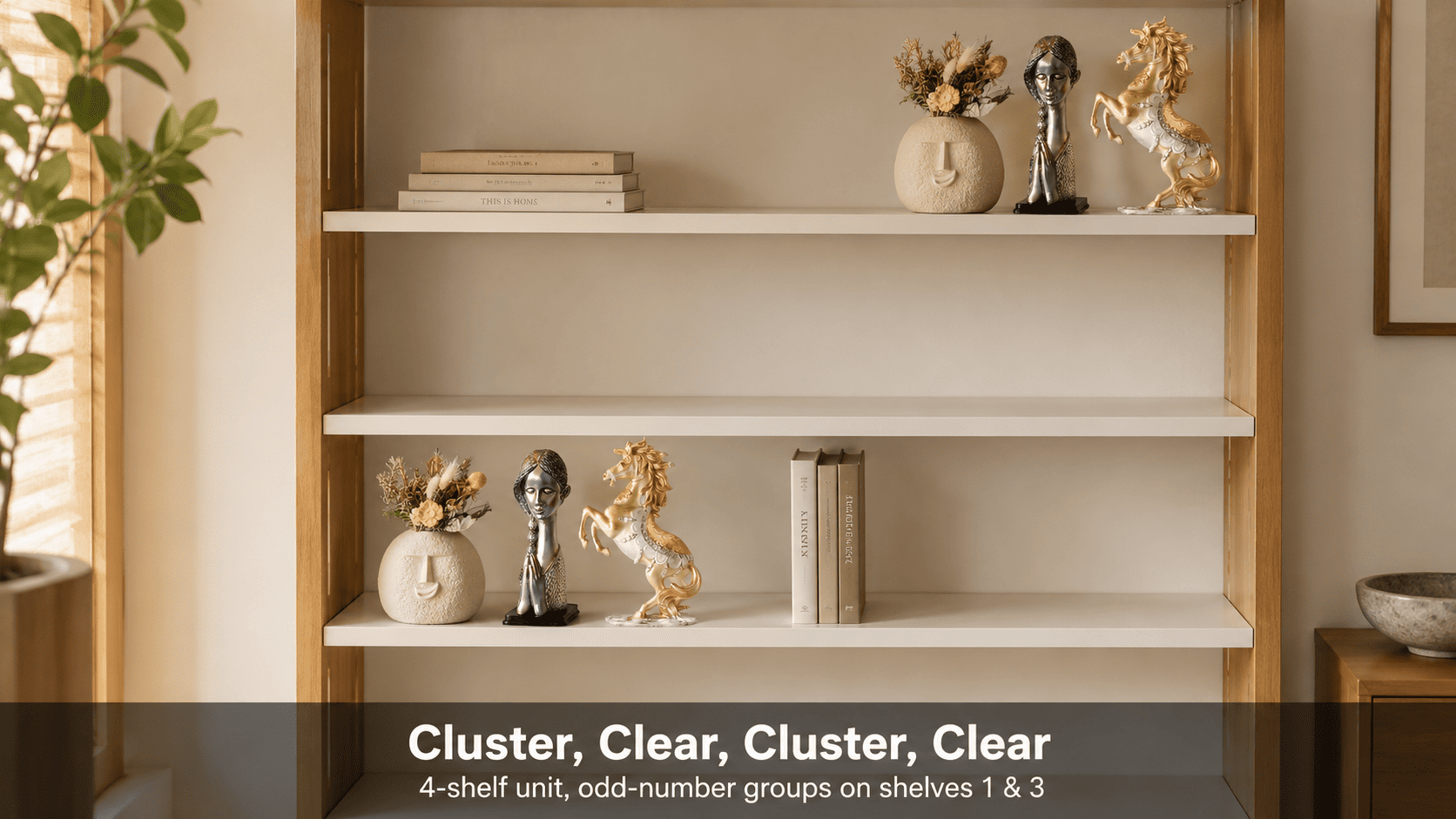
Vary this arrangement across shelves rather than repeating the identical configuration on every level. On the shelf directly above or below an active cluster, either leave the surface entirely clear or place only a horizontal stack of two to three books with no decorative objects. This alternating rhythm — cluster, clear, cluster, clear — gives the full bookshelf a vertical pacing that prevents the top-to-bottom uniformity that reads as storage rather than display.
Ready to build a bookshelf composition that holds its structure through every season? Shop the full Moolwan small decorative items collection — climate-rated, shelf-weighted, and sized for Indian homes.
How Do You Keep Colour Consistent Across a Styled Bookshelf?
Colour consistency on a bookshelf is achieved through palette banding rather than colour matching. Matching requires every object to share exactly the same hue — an outcome that reads as forced and eliminates the tonal variation that makes a composition feel curated rather than coordinated. Palette banding requires only that every object on a given shelf zone belong to the same temperature family: warm earth tones (terracotta, ochre, off-white, natural wood), cool neutrals (sage, slate, warm grey, linen), or monochromatic (varying lightness values within one hue).
The practical rule: no more than two hue families per shelf zone, and one must carry significantly more visual weight than the other. A shelf with three terracotta ceramic pieces and one off-white accent reads as a coherent warm-earth zone. The same shelf with two terracotta, one sage, and one cobalt blue reads as four separate colour decisions — a fragmented field that the eye resolves as clutter regardless of how well each individual piece is styled.
Finish consistency amplifies palette banding: mixing matte and high-gloss within the same shelf cluster creates a secondary visual contrast that competes with the colour relationship between objects. Matte finishes are the lower-risk default because the micro-textured surface absorbs ambient light rather than reflecting it, which means two matte pieces in adjacent tones read as harmonious even when they are not strictly the same hue. Moolwan's matte ceramic small decorative accents are formulated at a 92% clay composition specifically because high clay density produces a consistent matte surface without the surface variation (pinholing, sheen inconsistency) that lower-grade ceramics exhibit after two to three monsoon cycles.
How Many Decorative Objects Is Too Many for One Bookshelf?
The upper density limit for a standard four-shelf bookcase (approx. 80 cm wide × 180 cm tall) is nine to twelve small decorative pieces distributed across no more than three of the four shelves, with one shelf left entirely free of objects. This is not an aesthetic preference — it is a perceptual threshold. Research in environmental psychology consistently identifies the human eye's limit for processing a cluttered foreground field at approximately seven to nine distinct objects before the brain switches from individual-object recognition to gestalt pattern detection, at which point the surface reads as full regardless of its actual fill percentage.
Frequently Asked Questions
Can I mix ceramic and resin decorative pieces on the same shelf?
Yes, but match them by finish rather than material. Moolwan's matte ceramic (92% clay composition, 85% RH tolerance) and matte resin (94% purity epoxy, 60% RH tolerance) pieces read as visually consistent when both carry an unglazed surface because micro-texture absorbs light uniformly across both materials. The functional consideration is humidity: in rooms without AC or with seasonal monsoon exposure exceeding 60% RH, ceramic is the climate-safe default because resin at sustained humidity above 60% RH can develop micro-surface clouding over a 12–18 month period.
How far apart should I space groups of decorative items on a bookshelf?
Within a cluster (three pieces), objects should be spaced 3–5 cm apart — close enough that the eye reads them as a single group, but with enough clearance that each piece's silhouette remains distinct. Between clusters on the same shelf, the gap should be a minimum of 40% of the shelf's total width — this is the negative space threshold below which two clusters begin to merge visually into one dense zone, eliminating the focal-point contrast that makes each cluster legible as an intentional composition.
Do small decorative pieces fall off floating shelves during minor vibrations?
Pieces in the 150–250 g range with a flat base diameter of 8 cm or more are stable on floating shelves at standard vibration frequencies (ceiling fan, foot traffic, minor seismic tremors) because their centre of mass sits low relative to their height. Moolwan's small decorative accents are drop-tested to 15 cm to verify base-to-height stability ratios before production sign-off, which means the piece's contact footprint is calibrated to resist tip-over at the forces a shelf encounters in a standard Indian apartment context.
How do I prevent dust buildup on bookshelf decorative accents without damaging them?
Matte ceramic surfaces in the 92% clay composition can be wiped clean with a lightly damp microfibre cloth — the micro-porous surface releases dust without requiring cleaning agents that degrade surface finish. Resin accents (94% purity epoxy, 3H pencil hardness) should be dry-dusted only; water exposure on the base seam can slowly soften the seal between piece and base over 24–36 months in a high-touch surface environment. Both materials are unsuitable for ultrasonic cleaners — vibration at ultrasonic frequencies can fracture internal stress points in both ceramic and resin, reducing structural lifespan from 5+ years to under two.
A bookshelf styled with the right small decorative pieces — correctly sized at 10–16 cm, grouped in odd numbers, and composed with matte finishes that age without visible surface wear — does not need seasonal refreshing. Moolwan's ceramic accents are high-fired to a 5+ year lifespan at up to 85% RH, which means the investment in a correctly chosen cluster outlasts three to four rounds of lower-grade replacement pieces at the same cumulative cost. Bring home a curated cluster from the Moolwan small decorative items collection — manufacturer-direct, climate-rated, and sized for Indian shelf depths. If you are also styling open wall shelves, the Moolwan decorative items for wall shelves collection offers pieces scaled for the shallower depths and lighter load ratings typical of wall-mounted units. For bookshelf units positioned in a living room where the shelf is visible from a seating area, consider pairing with pieces from the Moolwan living room shelf décor collection, which is curated for pieces that read well from a 2–3 metre viewing distance.


