
Cart
You keep opening the product page, trying to mentally place this on your living room wall. But it's impossible to know for sure, isn't it? 127cm looks perfect in mockups, but your wall has windows, maybe a console table below, probably that cream-colored paint most Indian homes have. You need to know this works in your specific space, not just styled photos.
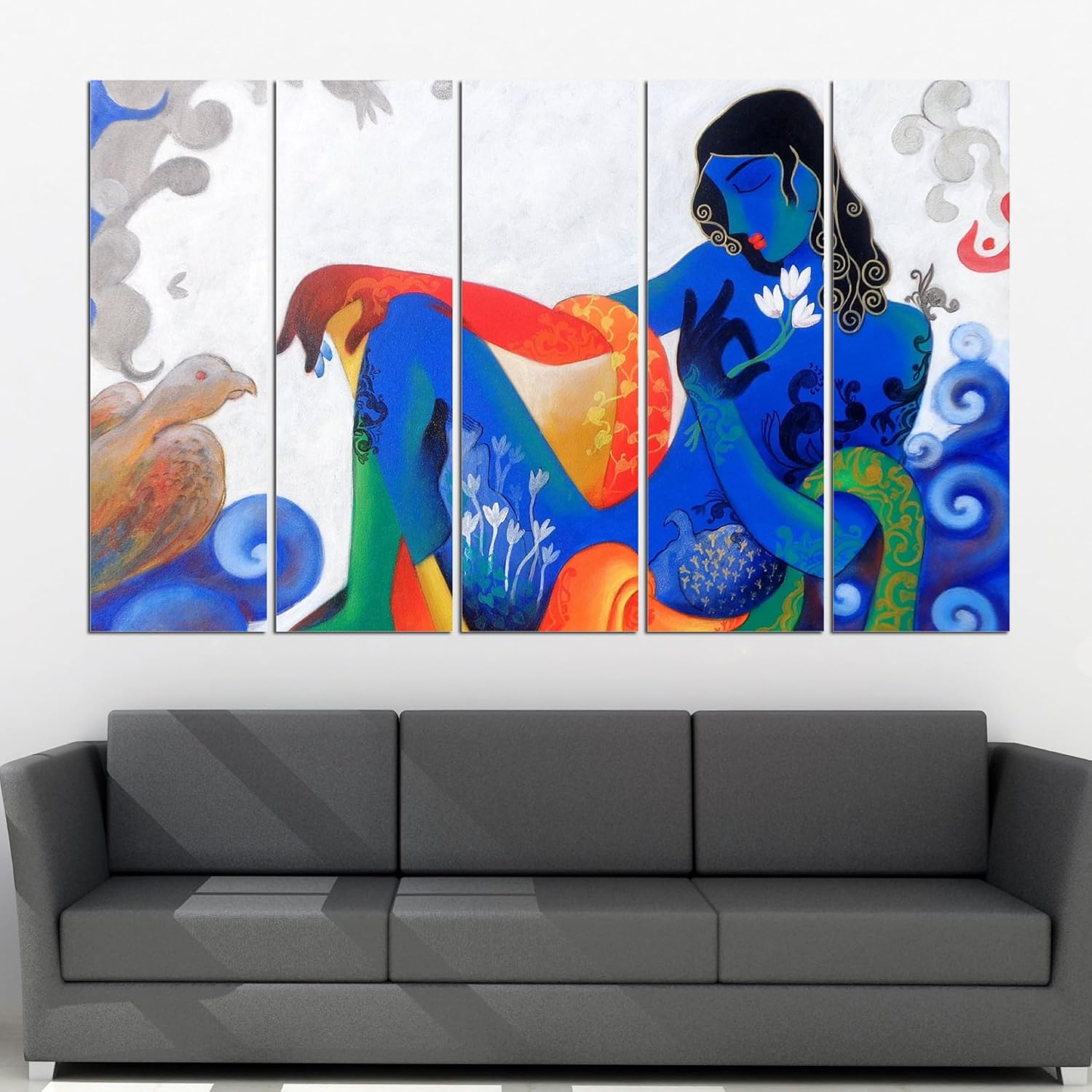
Here's what 127cm actually means in context: if your wall is the standard 12 feet (360cm) that most Indian living rooms have, this covers about 35% of it. That leaves 116cm of empty space on each side—enough breathing room so the piece doesn't feel cramped, but not so much that it looks like a postage stamp. The 76cm height sits naturally above most 6-8 foot sofas, creating that visual separation designers talk about (roughly 15-20cm gap from sofa back to bottom edge).
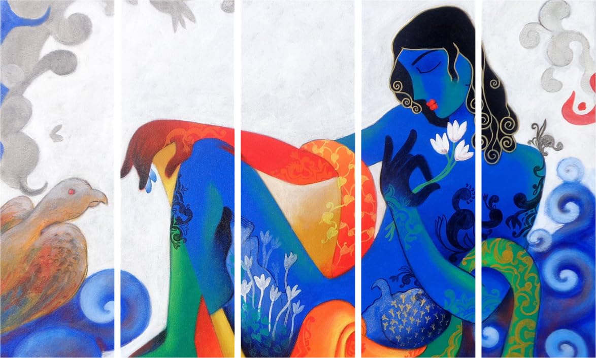
The five-panel split is what keeps this from feeling like a giant poster. Each panel has its own story—Krishna with the flute, peacock motifs, lotus flowers, spiritual symbols—so your eye moves across the composition naturally. In person, those panel gaps (probably 2-3cm) create depth. It reads as intentional art arrangement, not just a big picture.
You've probably measured your wall three times. The math says 12 feet, but you're still not confident because every online guide shows different-sized rooms.
Your wall is probably 360cm wide. Here's the coverage breakdown:
127cm canvas = 35% coverage
If you were considering 100cm instead:
If you were tempted by 150cm:
The 127cm size is what interior designers call the "Goldilocks zone" for 12-foot walls in Indian homes. It's substantial enough to be your room's focal point, but not so large that it fights with your existing furniture layout or makes the room feel unbalanced.
The 76cm height matters too. Standard Indian ceilings are 8-10 feet. If you hang this with the bottom edge 15cm above your sofa back (which is probably around 90cm high), the top of the canvas sits at roughly 181cm from the floor—well below the ceiling line. That vertical breathing room prevents the "crowded" feeling that happens when art goes too close to the ceiling.
Your walls are probably cream, off-white, or that builder's beige that comes with most flats. You might have brown fabric sofas, wooden furniture, maybe brass accents in your pooja area.
The color palette here is designed for those exact conditions:
Deep blues (Krishna's skin tone, decorative swirls): Create calm, spiritual depth. Against cream walls, blue reads as rich and anchoring—not harsh. In morning natural light, these blues look serene. Under warm LED evening lighting (which most Indian homes use), they deepen slightly but don't go muddy.
Bright oranges and reds (clothing, accents): These warm tones connect with your existing wooden furniture browns and any traditional textiles you have. Orange specifically bridges between the cool blues and your warm wall colors, so nothing feels disconnected.
Greens (peacock feathers, nature elements): Bring in freshness without clashing. Green works as a neutral bridge color here—it doesn't compete with your existing decor but adds visual interest.
Peacock and lotus motifs: These traditional symbols tie the piece to Indian aesthetic sensibilities. If you have other traditional elements (brass diyas, carved wood, ethnic textiles), this doesn't look out of place. But the modern 5-panel split and contemporary composition mean it also works in minimalist or modern interiors.
The multi-color approach is intentional: it gives you flexibility. If your curtains are beige, your cushions are rust, and your rug has teal—this canvas has enough color range to tie those elements together rather than fighting them.
Total weight is 3kg spread across 5 panels. That's roughly 600 grams per panel—lighter than most framed photos.
What's in the package:
Installation process:
You don't need to drill multiple holes for each panel. Most hardware systems use single-point hangers. The frames are lightweight pine, so even standard wall anchors (the ones that come with most hanging kits) work fine. If you're in a rental and worried about your ₹50,000 deposit, consider removable adhesive hooks rated for 1kg each—these panels are light enough.
Spacing between panels: aim for 2-3cm gaps. Eyeball it—perfect precision isn't critical because the design is forgiving.
The canvas arrives ready to hang. No assembly, no stretching, no frame-building. Unpack, hang, done.
You've probably looked at single-panel 120cm canvases too. Here's the honest difference:
Visual interest: Five panels create movement. Your eye travels across the composition—flute, peacock, Krishna's face, lotus, swirls. A single 120cm panel shows one scene. Both work, but multi-panel adds dynamism.
Installation flexibility: With 5 separate pieces, you can adjust spacing slightly to account for wall irregularities, switch outlets, or small obstacles. Single panel is all-or-nothing placement.
Perceived value: Multi-panel reads as more complex, more "designed." Single panels can look simpler (not worse, just different).
Weight distribution: 3kg across 5 points vs. 3kg on 2 hanging points (typical single-panel setup). Multi-panel is actually easier on your wall.
Price: At ₹3,296, you're paying roughly ₹659 per framed panel. Single-panel 120cm canvases in this quality tier run ₹2,500-3,500, so you're getting more visual coverage for similar or better value.
The trade-off: installation takes 15 minutes instead of 5. And if you move houses, you're packing 5 pieces instead of 1. But for most people, the visual payoff justifies the minimal extra effort.
Morning light (9-11 AM): Natural light from windows will make the blues look brighter, almost electric. The oranges and greens pop. If you have sunlight hitting the canvas directly, expect slight glare on the canvas surface (normal for all canvas art). Position away from direct harsh sunlight if possible.
Afternoon (12-4 PM): Softer light. Colors look most true-to-photo during this window. Blues are rich but not overwhelming, oranges are warm but not aggressive.
Evening LED light (6-10 PM): Warm LED bulbs (which most Indian homes use) make the oranges and reds glow slightly more. Blues deepen but stay vibrant. If you have cool white LEDs, colors stay closer to afternoon appearance. The canvas won't look dull or flat—the color range is saturated enough to hold up under artificial light.
Monsoon days: Overcast natural light mutes all wall art slightly. The blues might look deeper, the oranges less punchy. This is normal. Your canvas won't look drastically different, just softer.
Viewing distance: From your sofa (probably 8-10 feet away), you see the full composition—Krishna's face, the peacock, the decorative elements. Move closer (3-4 feet), you see brushstroke-style texture details and the canvas weave texture. Both views work.
Dust and maintenance: Canvas collects less dust than glass-framed art, but not zero dust. A soft cloth wipe every few months keeps it fresh. Avoid water or cleaning chemicals—dry dusting only.