
Cart
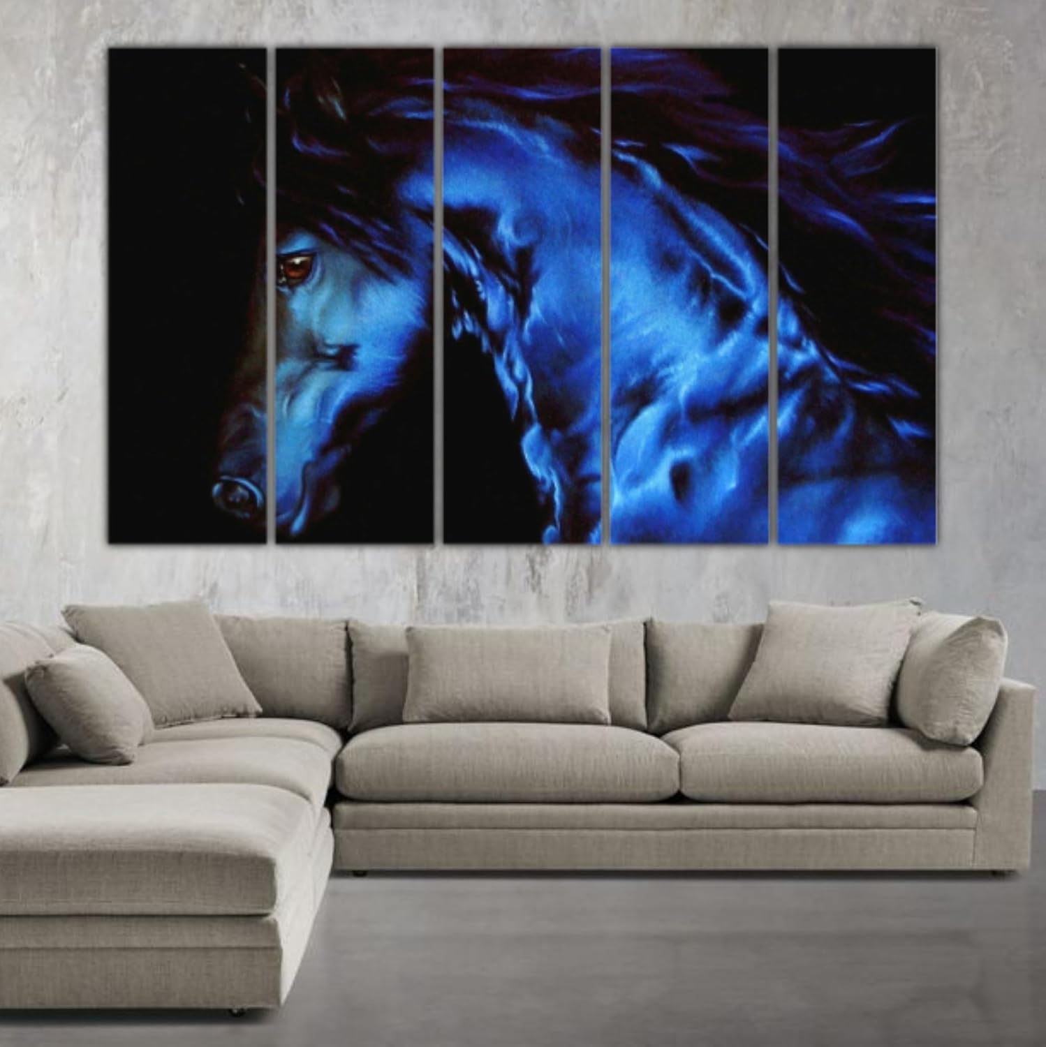
You've measured your wall three times. You know it's roughly 12 feet wide. But when you're deciding whether 127cm of electric blue horse art—cobalt on black, five panels wide—will actually feel right in your room, measurements answer only half the question. The other half is about visual intensity. Can your living room carry this, or will it feel like it's trying too hard?
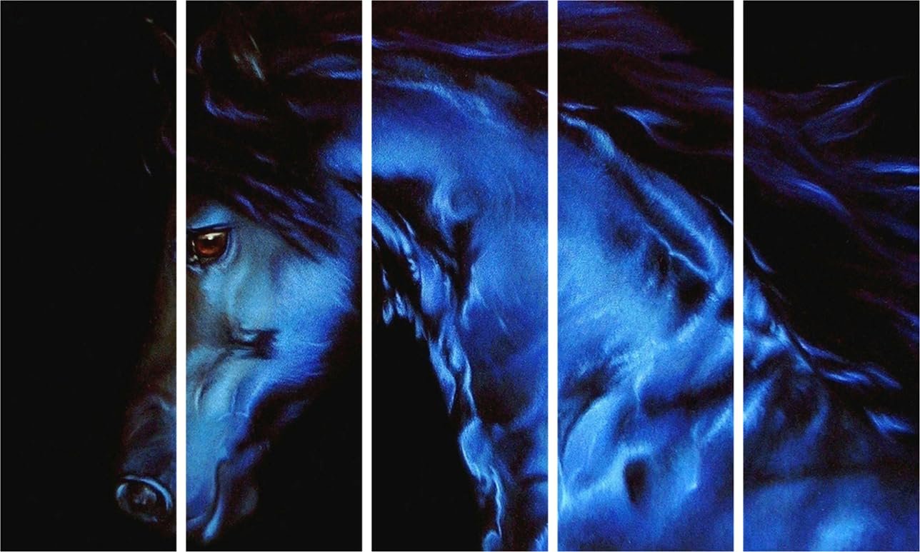
Here's what the image tells you that the tape measure doesn't: the composition begins in darkness. The leftmost panel is almost entirely black—the horse's face barely visible, just a nostril and jaw emerging from shadow. The second panel is where the single amber-brown eye appears: warm, precise, still. Then the neck and mane sweep rightward through panels three, four, and five in cobalt-blue muscle and motion. That one amber eye is the only warm point in the entire piece. Everything else is cool, electric, and dark. The painting reads as a dramatic illustration, not a decorative print—and it reads differently from across the room than it does up close. Both readings are intentional, and both work.
Your wall is probably 10 to 12 feet wide (300–360cm in most Indian 2BHK and 3BHK apartments). Here's how 127cm sits within that:
On a 12-foot (360cm) wall: roughly 116cm of open space on each side. Coverage ratio: 35%. Effect—anchored and deliberate, without overwhelming the room.
On a 10-foot (300cm) wall: roughly 86cm of open space on each side. Coverage ratio: 42%. Effect—stronger presence, slightly more dominant, still balanced if the wall is otherwise clear.
Hanging height follows the same logic as any piece above a sofa arrangement: 20–25cm above the top of your cushions. This places the visual centre of the painting at approximately 140–155cm from the floor—the natural sightline when someone walks into the room from the doorway.
The five-panel format creates horizontal momentum. Your eye enters from the shadowed left panel, finds the amber eye in panel two, then travels with the flowing mane all the way to panel five. This left-to-right pull makes the wall feel wider rather than just filled. On a 10-foot wall, that horizontal sweep is particularly effective.
If you considered 90cm instead: 25% coverage on a 12-foot wall. The composition compresses. The amber eye—the single detail that anchors the entire painting—becomes too small to register from the doorway. Statement art that no longer makes a statement.
If you considered 150cm instead: 42% coverage on a 12-foot wall. Works only if the wall is completely unobstructed. A side table, floor lamp, or window within three feet of where the panels would end will make the larger size feel crowded rather than commanding.
One practical note: five panels with thin visible gaps between them means your actual hanging span is slightly wider than 127cm. Factor approximately 2–3cm per gap—roughly 8–12cm across the full set—when mapping the piece against furniture and wall elements.
This is a cool-toned, high-contrast painting. The horse is rendered in cobalt-to-navy blue gradients with light-catching highlights across the neck and mane. The background is deep black throughout all five panels. The single warm element is the amber-brown eye in the second panel.
In morning light, the cobalt reads closer to navy—deep, restrained, almost moody. The amber eye appears warm against it. In afternoon light, if your wall receives direct sun, the cobalt brightens noticeably toward electric blue and the contrast between the lit surface and the black background sharpens. In the evening with warm white LED (3000K—standard in most Indian apartments), the blue settles into a rich mid-cobalt. The black background absorbs ambient light, which makes the blue horse appear slightly luminous. This is when the painting looks its best.
Wall compatibility: this works on dark walls—charcoal, deep navy, forest green—where the cobalt creates layered depth rather than visual fight. It also works on plain white or mid-grey walls, where the black background handles the visual separation by itself.
Where this is harder to place: cream or off-white walls with warm wooden furniture. The cool-blue-on-black composition sits in direct tension with the warm-toned interiors of most Indian apartments. Not impossible—but it requires the rest of the room to be leaning contemporary (grey upholstery, metal accents, minimal objects) rather than the standard warm 2BHK layout.
The amber eye has one useful quality in warmer rooms: it picks up adjacent warm tones—a rust cushion, a wooden side table, a terracotta vase within view. That single warm accent acts as a quiet bridge between the cool painting and a room that hasn't fully committed to a contemporary palette.
Five panels need more wall preparation than a single piece. Each panel has its own fixing points, and the panels need to hang level with each other at consistent spacing.
The included hardware covers concrete anchors, drywall anchors, and D-ring hangers. The hanging template is what makes five-panel alignment manageable without professional help—it maps the exact spacing between panels before you drill anything. Tape the template to your wall at the desired height, mark the anchor points, remove the template, drill. The gaps between panels come out consistent without you having to measure between each one manually.
For concrete walls (common in older Indian buildings): 6mm masonry bit, 35mm deep holes, concrete anchors. For drywall (newer construction): 6mm drill bit, 30mm deep, plastic anchors. Each hole is smaller than a standard picture-frame nail.
When moving out: fill with wall putty (₹50 at any hardware store), sand smooth, touch up with paint. All five panels require 10–15 small holes total. No landlord will flag them. Installation time including standing back to check alignment: 25–35 minutes.
Macrame wall hangings are what many buyers consider when they want something that covers 100cm or more of wall with visual weight. The appeal is three-dimensional texture—the woven depth that flat prints can't match. The trade-off is worth understanding.
Macrame sags. Natural fibers absorb moisture. In Indian humidity—particularly through monsoon months—the bottom of a large macrame piece sits visibly lower than when you first hung it. Re-leveling requires taking it down entirely.
Macrame gathers dust into the weave, and the weave doesn't clean easily. A dry cloth doesn't reach inside the fibers. Over time, especially in dustier cities or near kitchen walls, the texture that initially read as artisanal starts to look grimy.
And macrame has no colour range in the dramatic sense. Natural fiber tones are passive—beige, off-white, natural brown. If you want a wall that creates genuine visual presence through colour, fiber hangings rely on scale alone.
This five-panel vinyl print on MDF doesn't sag, doesn't absorb humidity, and holds its cobalt blue through monsoon seasons because the vinyl surface is sealed—moisture doesn't interact with it the way it does with woven fibers. The MDF backing keeps each panel dimensionally stable year-round. You trade tactile fiber texture for colour depth, visual precision, and long-term consistency.
From the doorway, 127cm of electric blue horse on black reads as a single complete statement. Your eye goes there before it goes to the sofa, the TV unit, or anything else on the wall. This painting does not play a supporting role.
Up close—within three feet—the individual painterly details become visible: the blue gradient shifting from deep navy in the shadowed areas to lighter cobalt where the neck catches the light, the flowing mane rendered in motion, the amber eye precise and still against all that movement. The composition holds at both viewing distances, which is what separates a painted illustration from a decorative print.
This works best as a standalone piece. Adjacent wall art on the same wall would compete rather than complement. If you have framed photos or smaller pieces near the proposed hanging spot, move them first. The painting needs clear wall on both sides to read as intended.
If your room is already balanced—furniture arranged, lighting warm, textiles in place—this painting will feel like the final element that makes everything intentional. If the room is still a work in progress, it will feel like a bold statement without context to support it. The sequence matters.
Moolwan Design Note
The amber eye in the second panel is the compositional anchor—the single warm point in an otherwise cool, dark palette. The cobalt-to-navy gradient across the horse's body was painted to change with viewing distance: darker and more restrained from far, luminous and detailed when you're close.
Moolwan Quality Standard
Designed for Indian apartments and lighting conditions. Printed to resist humidity-related colour fading. Packed for long-distance Indian transit. Quality checked before dispatch. Ships from West Bengal.
Moolwan Fit Guidance for Indian Homes
At 127cm wide, this five-panel set anchors most 10–12ft living room walls at 35–42% coverage depending on your wall width. Place it above a sofa or as a standalone feature on a hallway or dining wall where it can be viewed straight-on from 8–10 feet away—the distance at which both the amber eye and the full panel sweep register together.
Will 127cm look proportional on a 12-foot wall? On a 12-foot (360cm) wall, the five panels span 35% of the width—about 116cm of open wall on each side. This is anchored and intentional without consuming the space. On a 10-foot wall, coverage increases to 42%, which is strong but still balanced if the wall is otherwise uncluttered. The horizontal panel sweep also makes the wall feel wider rather than just filled.
How will electric blue look against cream walls and brown wooden furniture? It will stand out sharply—this is a high-contrast, cool-toned piece. Against cream walls and warm-toned furniture, the cobalt-on-black creates an immediate visual break from the room's warm palette. This works if you're deliberately introducing a contemporary element, but it needs support from other cool accents in the room (grey upholstery, metal fixtures, neutral rugs) to feel deliberate rather than disconnected.
How do I align five panels evenly? Will I need a professional? The hanging template shows the exact spacing between panels and the position of each fixing point before you drill anything. Tape it to the wall, mark the anchor points, remove it, then drill and hang. The gaps between panels are consistent because the template handles the spacing—you don't need to measure between panels manually. Total installation time: 25–35 minutes.
Will the cobalt blue fade if the wall gets afternoon sun? The vinyl surface is printed with UV-resistant inks. Direct afternoon sunlight won't shift the cobalt toward grey or wash out the black background. The MDF backing doesn't respond to humidity cycles the way stretched canvas can, so the panels stay dimensionally stable through monsoon seasons. The colour you see when you unbox it is the colour it holds.
Is this rental-safe? Will the five panels leave too many holes? Five panels require approximately 10–15 small anchor holes (6mm diameter, 30–40mm deep)—smaller than standard picture-frame nail holes. When moving out, fill with wall putty (₹50 from any hardware store), sand smooth, touch up with paint. Total repair time under 30 minutes. Standard landlord inspections won't flag holes this size.