
Cart
Let's be honest – we've all had that moment when we step back, look at our living room, and think, "Did a home decor tornado just blow through here?" Whether it's that impulse-buy rug that looked SO different in the store lighting or that gallery wall that somehow resembles a kindergarten art explosion, we've all committed decorating sins that would make HGTV hosts clutch their pearls. But fear not, fellow decor disaster survivors! Today we're diving into the most common home decorating blunders and how to fix them with simple tweaks that won't require a second mortgage or an interior design degree.
Ah, the classic "let's push everything against the walls and create a dance floor nobody asked for" approach. We've all been there! This layout makes your room feel like an awkward middle school dance – everybody hugging the walls with a vast empty space in the middle.
The fix? Float that furniture, friend! Pull your couch a few inches away from the wall, create conversation areas, and use area rugs to define spaces. Your living room should feel like a warm hug, not an empty airport terminal. Try arranging furniture in a way that encourages people to look at each other instead of just the TV (revolutionary concept, I know!). Add a Tall Showpiece for corners in modern styling to balance your layout and fill that awkward space elegantly.
If your home looks like you bought an entire showroom display in one swoop (including those weird ceramic fruits nobody actually wants), you might be suffering from matching-itis. When everything matches perfectly, your space looks about as interesting as unseasoned chicken.
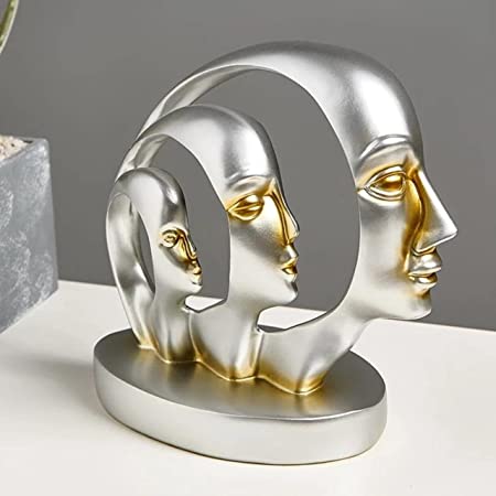
Instead, embrace the art of coordination without matching. Mix patterns and textures that complement each other. That navy blue sofa? It's begging for mustard yellow pillows, not more navy blue accessories! Think of your room like a good playlist – variety keeps things interesting, but there's still a harmony that ties it all together. Break the monotony with an Artistic abstract showpiece as a pop accent fixer that adds flavor and character.
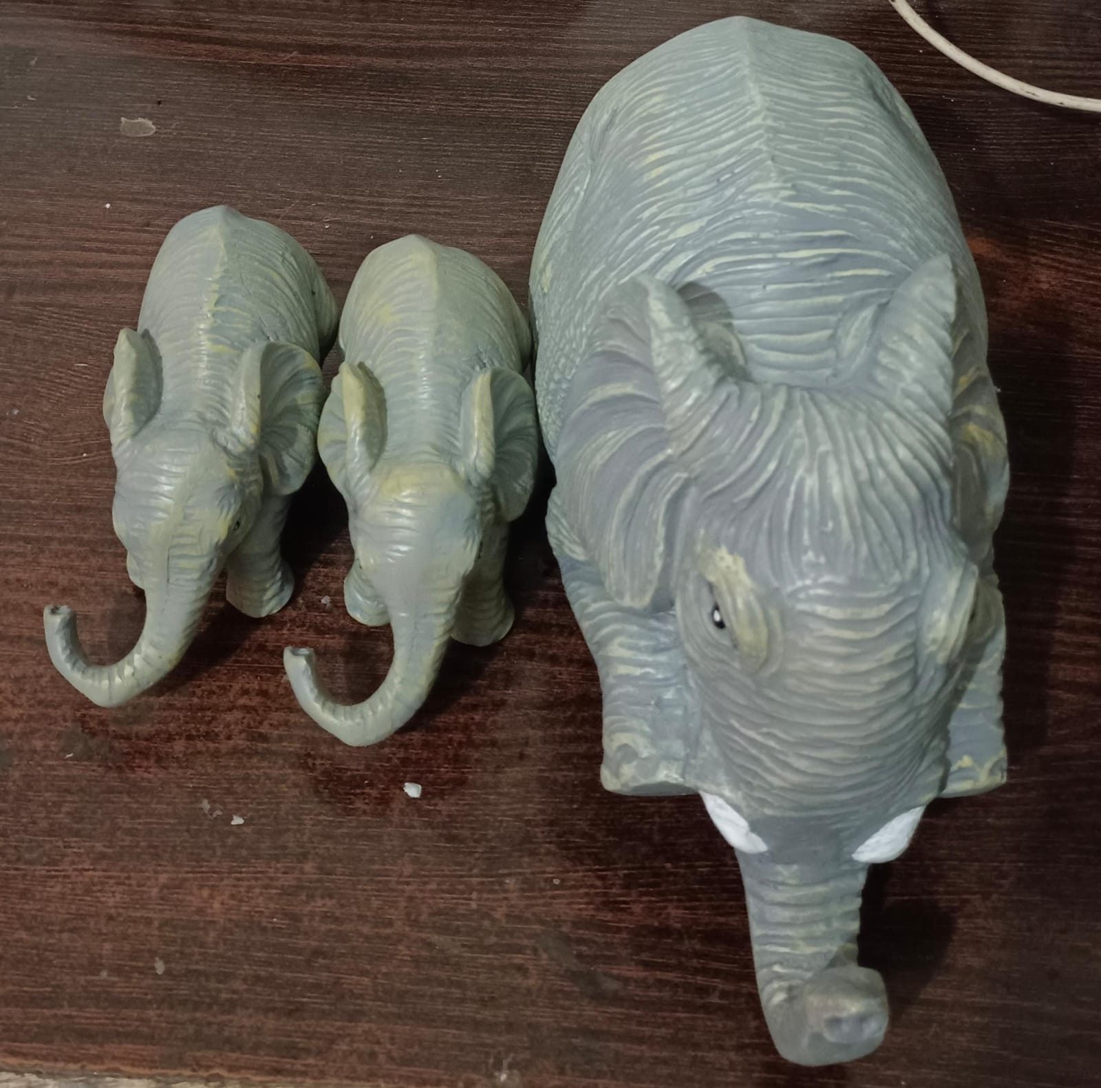
Collecting small decorative items is like eating potato chips – it's hard to stop at just one. Before you know it, every surface in your home becomes a landing strip for tiny ceramic animals, inspirational word signs, and those random knickknacks your aunt keeps giving you for Christmas.
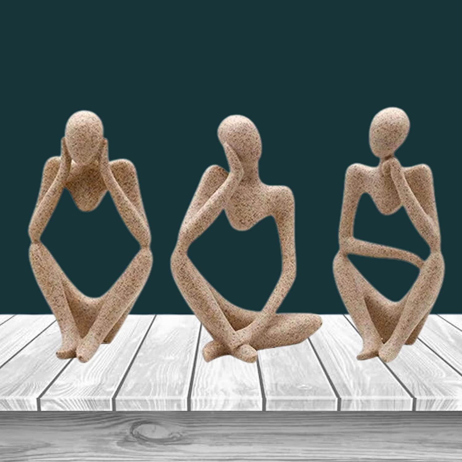
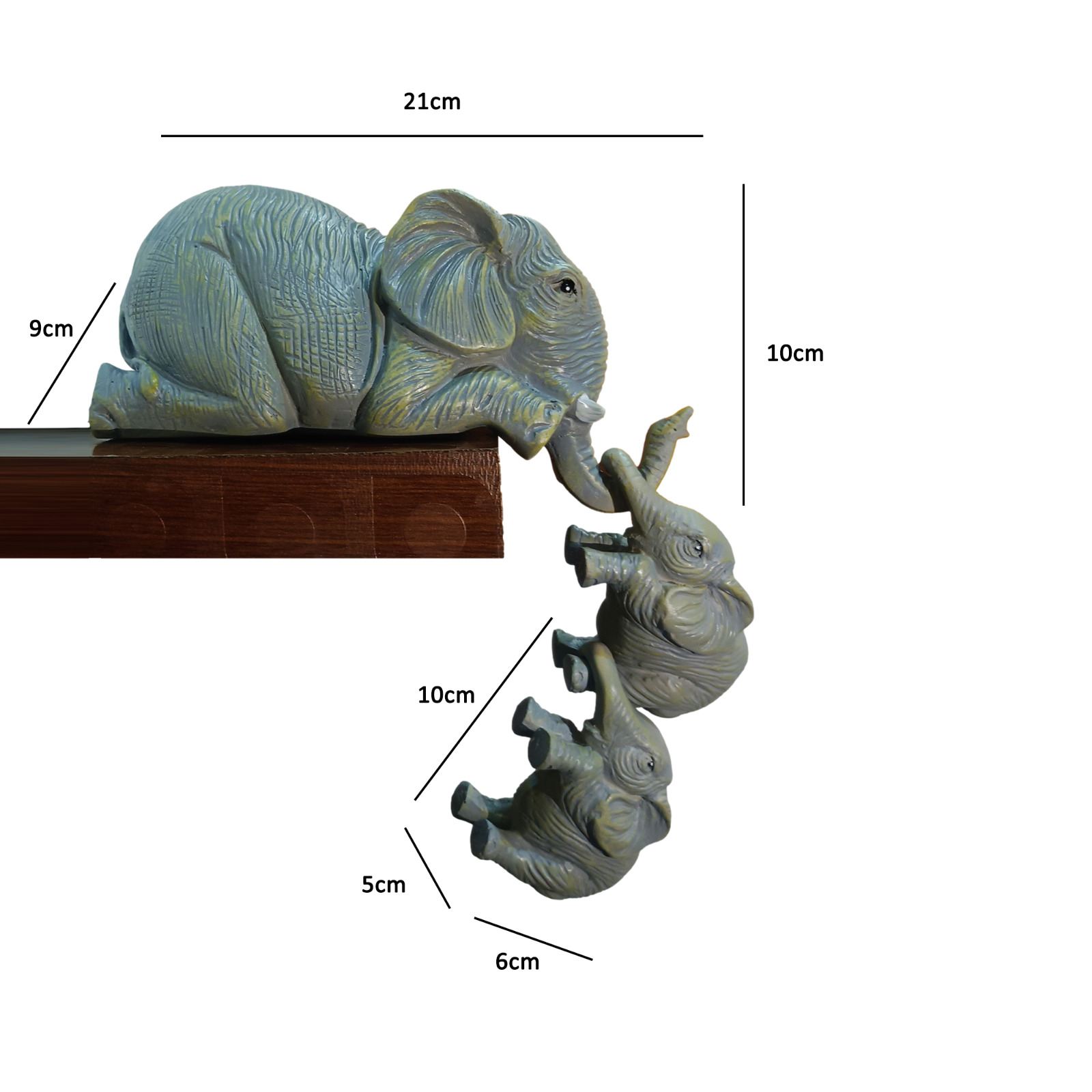
Time to Marie Kondo that situation! Group smaller items in odd-numbered clusters (threes work wonderfully), vary their heights, and please – leave some breathing room on those surfaces! Remember: if dusting your home requires tweezers and the patience of a saint, you've gone too far. Curate clusters of Small showpieces for showcase or desk styling to bring intentional design into compact areas.
Is your home lit with all the ambiance of a hospital waiting room? Or perhaps you're relying solely on that overhead light that makes everyone look like they're about to share ghost stories? Bad lighting can make even the most beautifully decorated room feel off.
Layer your lighting like you layer your winter clothes! Aim for at least three light sources in each room: ambient (overall lighting), task (for specific activities), and accent (to highlight cool stuff). And for the love of cozy evenings, put everything on dimmers – your guests will thank you when they don't need sunglasses indoors. Complement these layers with Decorative ceramic vases as highlight lighting accessories to double up as design elements.
Nothing screams "I have no idea what I'm doing" louder than artwork hung so high it's practically touching the ceiling. Unless you're decorating for a family of giraffes, that painting doesn't belong up there.
The general rule: hang art at eye level, with the center about 57-60 inches from the floor. And please, size matters! That tiny 4x6 photo looks lost and confused on your massive living room wall. Either go bigger or create a gallery arrangement that fills the space appropriately. Your neck will thank you for not having to crane upward just to see what that picture actually is. Try integrating Large artistic wall hangings to balance blank walls and bring identity to your space.
A postage stamp-sized rug under your coffee table that touches absolutely nothing else in the room is the equivalent of wearing shoes three sizes too small – uncomfortable and everybody notices.
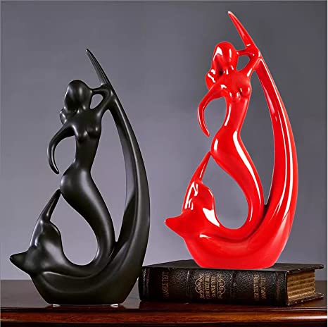
Size up, buttercup! Your rug should be large enough that at least the front legs of all furniture in a grouping can rest on it. In dining rooms, make sure there's enough rug to pull chairs out without falling off the edge (unless you enjoy watching your dinner guests teeter). When in doubt, go bigger – nobody ever complained about a rug being too generous. Also, anchor the room further with a Large floor showpiece as decor accent for corners, maintaining scale and proportion.
Is your bed/couch drowning in a sea of throw pillows? Do guests need to excavate a spot to sit down? Have you ever lost the TV remote in the great pillow jungle? You might be suffering from pillow overload.
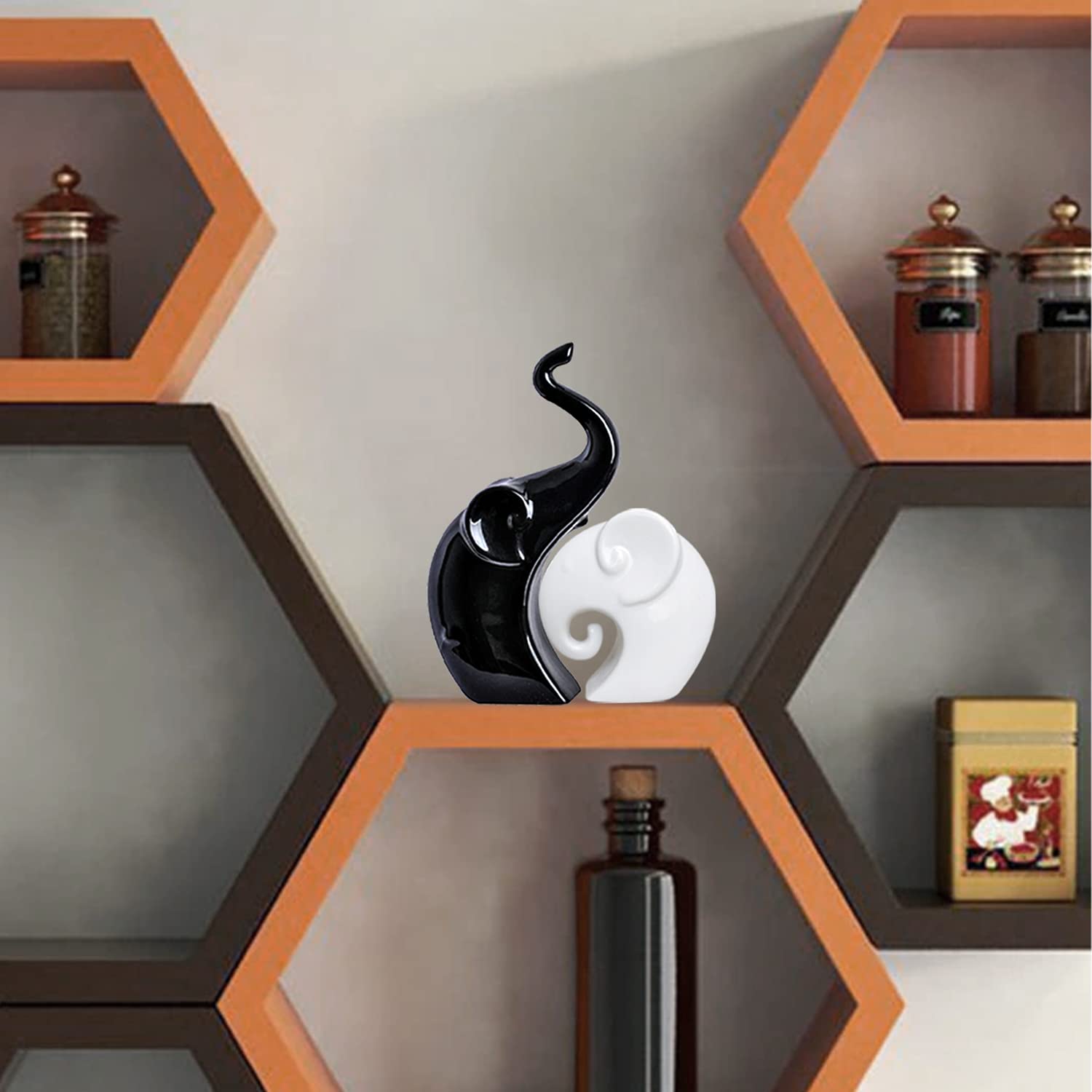
Quality over quantity, my friend! Choose a few statement pillows rather than seventeen matching ones. And here's a radical thought: people should be able to sit on your couch without conducting a pillow removal ceremony first. Keep it to 2-5 pillows depending on the size of your furniture, varying the textures and patterns for interest. Add one or two Medium-sized decorative showpieces for coffee tables to maintain elegant balance on seating areas as you declutter pillows.
When your entire living room is arranged like a movie theater facing the TV, you've fallen into the black screen trap. Yes, we all binge Netflix, but designing your entire space around the television is like making the microwave the centerpiece of your kitchen.
Create a more balanced focal point with a beautiful fireplace, striking artwork, or an interesting architectural feature. Position your furniture to encourage conversation while still allowing TV viewing. And if possible, consider mounting your TV on the wall or tucking it into a cabinet to minimize its presence when not in use. Your room will instantly feel more sophisticated and less like a sports bar. Use a Statement corner showpiece beside the media unit to shift the visual narrative from just the screen.
If all your furniture, art, and accessories are at exactly the same height, your room's visual interest flatlines faster than a bad TV show. This creates a monotonous horizontal line that makes your space feel static and boring.
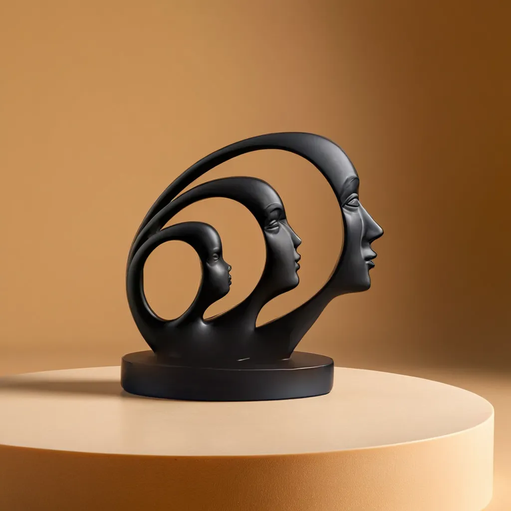
Vary those heights like a city skyline! Mix tall lamps with shorter side tables, hang art at different levels in a deliberate arrangement, add plants of varying heights. Your eye should dance around the room, not march in a straight line. Think rollercoaster, not treadmill. Incorporate Multi-height decorative statues for elevation contrast to keep flow alive.
Naked windows or, worse, those flimsy mini blinds that came with your rental are the home decor equivalent of showing up to a wedding in pajamas – technically covered, but missing the point entirely.
Window treatments frame your views and can make ceilings appear higher. Go for curtains that extend from near the ceiling to just touching the floor (or even with a slight "puddle" for drama). Too-short curtains are the high-water pants of home decor – nobody's fooled and everybody notices. And please hang those rods high and wide to make windows appear larger! Pair with Window-adjacent décor like ceramic vases to accent drapes and complete the look.
Beige on beige on greige with a side of more beige. If your home has all the personality of a bowl of oatmeal, you might be suffering from color-phobia.
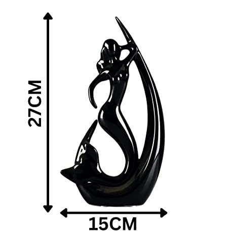
You don't need to paint your walls electric blue (unless you want to!), but every room needs some color to feel alive. Start small with colorful pillows, art, or a statement piece of furniture. Remember the 60-30-10 rule: 60% dominant color (often your neutrals), 30% secondary color, and 10% accent color. That little bit of mustard yellow or emerald green might just be the life of your room's party! Add freshness with a Bright modern resin showpiece with glaze finish that pops.

Creating a home that looks like an uninhabited showroom might earn you Instagram likes, but it's about as functional as high heels on a hiking trail. If your space is so "perfect" that you're afraid to actually live in it, something's gone terribly wrong.
Your home should reflect YOU – your travels, your interests, the books you actually read (not just color-coordinated spines). Include personal photos, that weird souvenir you love from your vacation, comfortable places to put your feet up. The most beautiful rooms tell your story, not a generic one from a catalog. Try displaying Personal favorite keepsakes with mini resin home decor for stories that spark joy daily.

Start with the basics: a cohesive color scheme (pick three colors you love and stick with them), properly sized rugs, and curtains that actually fit your windows. Focus on one room at a time to avoid feeling overwhelmed. Shop your own home first—that vase gathering dust in your bedroom might be perfect for your living room! Plants add life to any space, and thoughtfully arranged bookshelves create instant character. Remember, less is often more for beginners—it's easier to add than subtract. Finally, lighting makes or breaks a space, so invest in table lamps and floor lamps with warm-colored bulbs for that instant cozy factor.
The 3-4-5 rule is actually a carpenter's trick for ensuring perfect right angles (hello, Pythagorean theorem!), but in decorating, it refers to visual triangles. Place objects in groups of three, vary their heights, and position them in a triangular arrangement. This creates visual interest and balance. For example, on your mantel, place a tall object on one side, a medium-height item in the middle, and a shorter piece on the other side. Your eye naturally follows this triangular path, creating flow and harmony. It's like magic—except it's just good design!
This rule helps with grouping accessories. Odd numbers create more visual interest than even numbers, with 3, 5, and 7 being the design world's magic numbers. When styling a coffee table, bookshelf, or mantel, group items in collections of 3, 5, or 7 rather than 2, 4, or 6. For example, a stack of three books topped with a small plant and a decorative object makes a perfect vignette. These odd-numbered groupings look more natural and less staged than symmetrical arrangements. Your brain actually has to work a tiny bit harder to process odd-numbered groupings, which makes the arrangement more interesting!
The seven golden rules are: 1) Balance (visual weight should be distributed evenly), 2) Rhythm (patterns that lead the eye through a space), 3) Harmony (elements that complement each other), 4) Emphasis (a clear focal point in each room), 5) Proportion (the size relationship between objects), 6) Contrast (differences that create visual interest), and 7) Scale (objects properly sized for the space). Think of these as your design safety net—when something feels "off" in a room, one of these principles probably needs attention. They're like the grammar rules of design—once you know them, you can break them creatively!
The 70/30 rule suggests that 70% of your room should be one style, color, or theme, while 30% can be something contrasting or different. For example, 70% neutral colors with 30% bold accent colors, or 70% modern furniture with 30% vintage pieces. This creates just enough contrast to make things interesting without looking chaotic. It's like wearing a classic outfit with one statement accessory—that 30% is where you can have fun and express personality while the 70% keeps everything grounded. Perfect for those who want a cohesive look but are afraid of being boring!


