
Cart
Welcome to the wild world of home decorating, where one minute you're confidently picking paint colors and the next you're wondering why your living room looks like a teenager's Pinterest board gone rogue! We've all been there – standing in the middle of a room wondering how that gorgeous sofa from the showroom somehow looks like it belongs to a completely different house in your actual home. Fear not, my décor-challenged friend! This guide will walk you through the most common decorating faux pas that have even interior designers waking up in cold sweats. Let's turn those "what was I thinking?" moments into "look at me now!" successes! Spice things up by using Stunning Ceramic and Resin Vases for Home Decor Mistakes to Avoid Common Errors that blend elegance with function to reflect your personal taste.
Picture this: a beautiful rug floating in the middle of your room like a magical carpet that might take off any minute. That's what we call the dreaded "postage stamp rug" mistake! Your area rug should be large enough for at least the front legs of your furniture to rest on it, creating a cohesive seating area rather than an island of fabric in a sea of flooring. Remember: a too-small rug is like wearing shoes two sizes too small – technically it works, but everyone's uncomfortable and nobody's having a good time! Anchor the space with furniture and throw in Medium Size Abstract Showpieces for Home Decorating Mistakes Prevention to balance the visual weight of the room.
I've walked into homes where the artwork is hung so high it seems like it's trying to escape the room! Unless your goal is to give everyone neck strain, aim to hang your art at eye level – generally about 57-60 inches from the floor to the center of the piece. This isn't the Sistine Chapel, and you're not Michelangelo expecting people to lie on their backs to admire your ceiling. Bring that artwork down where mere mortals can actually see it without binoculars! Complement your balanced wall height with Artistic Wall Hangings to Avoid Home Decorating Blunders for a pleasing composition.
If navigating your living room feels like competing in American Ninja Warrior, you might have a furniture traffic flow problem. Leave at least 30-36 inches of walking space between pieces, and for goodness' sake, don't make people climb over the coffee table to reach the couch! Your home should feel like a welcoming sanctuary, not a military training facility designed to test one's agility and spatial awareness. Incorporate Tall Decorative Showpieces for Corners to Fix Traffic Flow Mistakes to make use of tight spaces without obstructing movement.

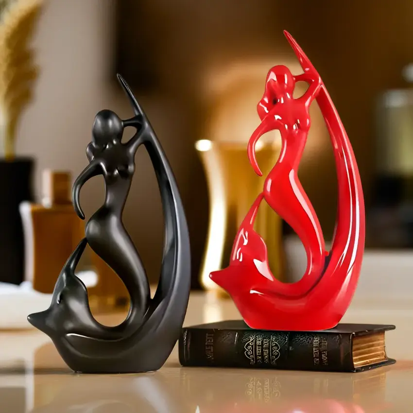
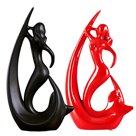
There was a time when buying the entire furniture set from the showroom – you know, the matching sofa, loveseat, coffee table, end tables, AND lamps – was the height of sophistication. That time was 1987, and we've moved on! Your home should look collected, not like you swallowed a furniture store catalog whole. Mix textures, styles, and periods for a space that feels authentic rather than like a furniture showroom where real people don't actually live. Try introducing Unique Artistic Wall Decor to Prevent Matchy-Matchy Decorating Disasters for a curated feel.

Relying solely on that sad overhead light that came with your home is like trying to set a romantic mood with fluorescent office lighting. Spoiler alert: it doesn't work! Layer your lighting with a mix of ambient, task, and accent lights at different heights. A floor lamp here, a table lamp there, maybe some wall sconces – suddenly your room has dimension, warmth, and you no longer look like you're being interrogated every time you sit on your couch! Complement it with Home Decor Pieces like Glazed Ceramic Showpieces for Stylish Lighting Balancing to bring mood-enhancing accents.
Pillows are like potato chips – it's hard to stop at just one. But when your guests need to excavate your couch like archaeologists just to find a place to sit, you might have crossed into pillow hoarding territory. The sweet spot? Two to five pillows per sofa, depending on its size. Remember: pillows should be guests on your furniture, not the primary residents staging a hostile takeover. Offset your cushion count with Small Resin Showpieces for Coffee Tables to Balance Pillow Use and incorporate visual relief.
Short curtains are like high-water pants – technically they work, but they're making everyone uncomfortable. Your curtains should either kiss the floor gently or puddle slightly, not hover anxiously above it like they're afraid of getting their feet wet. And please, hang those rods high and wide to make your windows look larger and let in maximum light. Your windows deserve better than those skimpy, too-short panels that scream "I gave up halfway through this project!" Accentuate your window styling with Vertical Column Decor Showpieces to Match Floor-Length Curtains and enhance vertical balance.

Gallery walls can be stunning when done right, or look like your photos are trying to escape in different directions when done wrong. Before hammering a single nail, arrange your frames on the floor first and take a picture to see how it looks. Consider spacing, balance, and for the love of level surfaces, use a measuring tape! Your future self (and wall) will thank you for not turning it into Swiss cheese with random nail holes. Pair your frames with Small Decorative Wall Items for Gallery Wall Precision to anchor and complete the arrangement.
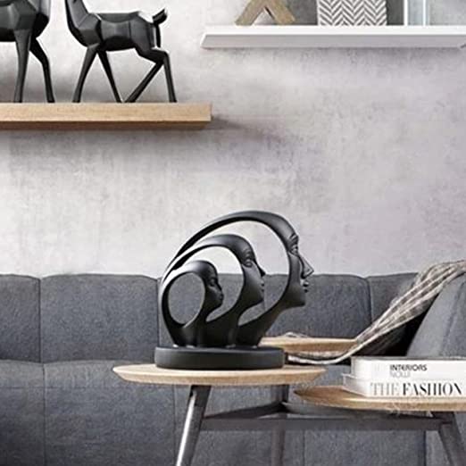
Those awkward empty corners in your home shouldn't be treated like the last kid picked for dodgeball. A stylish floor lamp, a small accent table with a plant, or a cozy reading nook can transform that sad, empty corner into a purposeful space. Every square foot of your home should earn its keep – no corner left behind! Introduce Large Decorative Showpieces as Corner Fillers to Avoid Decor Mistakes to make corners come alive.

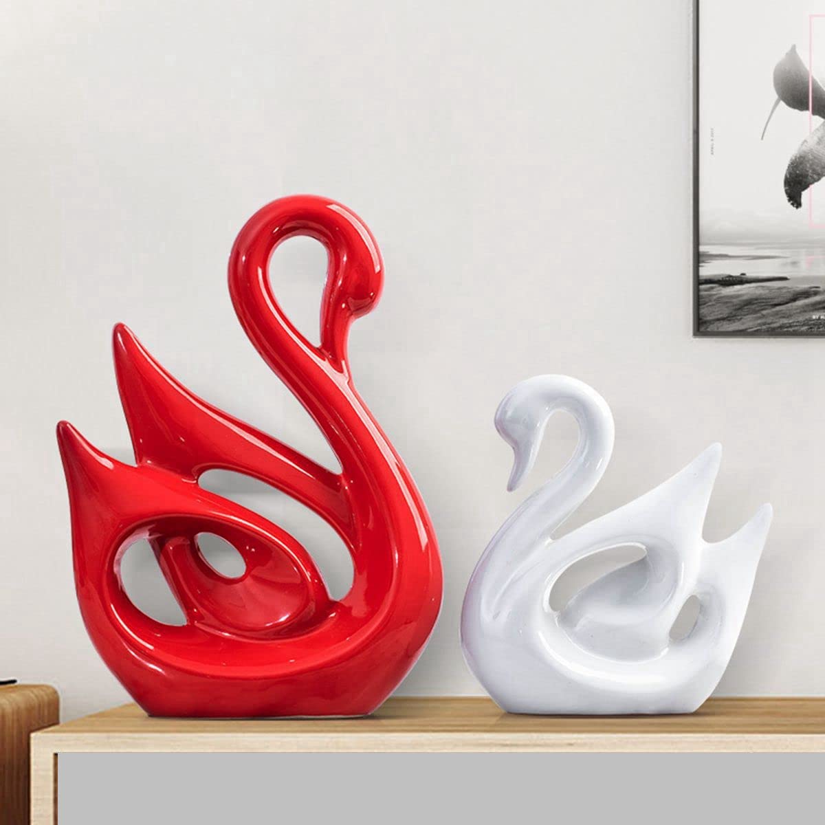
Playing it safe with all-white or all-beige everything might feel like a safe bet, but it can leave your space feeling flatter than week-old soda. Don't be afraid to introduce color through accessories, artwork, or even an accent wall if you're feeling particularly brave. Your home should reflect your personality, not look like it's preparing for a minimalist monastery photo shoot. Try embracing Bright Color Abstract Showpieces to Fix Home Color Mistakes and let your décor breathe life into the room.

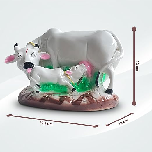
That adorable side table might look perfect next to your oversized sectional in your imagination, but in reality, it's like pairing a Great Dane with a teacup chihuahua – awkwardly mismatched. Pay attention to scale and proportion when selecting furniture and accessories. Your coffee table should be about two-thirds the length of your sofa, your rug should extend beyond your furniture arrangement, and your TV shouldn't require binoculars or cause neck strain. Use Proportion-Friendly Resin Showpieces for Home Decorating Mistakes to Avoid that suit the layout of small and large spaces alike.

Nothing ruins the vibe of a beautifully designed space faster than a tangled nest of cables or a television that dominates the room like it's the altar of a modern religion. Consider cord management solutions, furniture with built-in cable organization, or even those clever cord covers that can be painted to match your wall. Your technology should enhance your life without becoming the visual centerpiece of your carefully curated space.
Avoiding these common decorating mistakes doesn't require an interior design degree or an unlimited budget – just a bit of planning, proportion awareness, and the courage to occasionally step outside your comfort zone. Remember that creating a home you love is a marathon, not a sprint (unless you're on one of those 48-hour makeover shows, in which case, godspeed!). Take your time, trust your instincts, and when in doubt, just ask yourself: "Would my judgmental cat approve of this decision?" Works every time!
The 3-5-7 rule is a color strategy that helps create balanced spaces. Use 3 colors for small rooms (one dominant, one secondary, one accent), 5 colors for medium-sized spaces, and 7 colors for larger areas. This prevents your room from looking like a rainbow exploded in it while still giving you enough variety to create interest. Think of it as color math for people who slept through actual math!
The 3-4-5 rule is actually a designer's secret weapon for perfect right angles (hello, Pythagorean theorem from high school!). When laying out rooms or positioning furniture, measure 3 feet along one wall, 4 feet along the perpendicular wall, and the diagonal between those points should measure exactly 5 feet if your corner is square. It's like geometry class finally becoming useful in real life!
The 70/30 rule suggests that 70% of your room should be in your primary color or neutral base, while 30% should be in accent colors. Think of it like your wardrobe - you probably have lots of basics (the 70%) and then those statement pieces that make things interesting (the 30%). This prevents your room from looking like it can't make up its mind about which color personality it wants to have.
The 7 basics that designers obsess over are: Space (how you use it), Line (horizontal, vertical, dynamic), Form (shapes), Light (natural and artificial), Color (your palette), Texture (how things feel), and Pattern (visual interest). Think of them as the Avengers of interior design – individually powerful, but unstoppable when they work together. Missing even one can throw your whole design universe out of balance!
The golden rule of interior design is simple: function first, then form. No matter how Instagram-worthy your space looks, if it doesn't work for how you actually live, it's a design fail. That all-white sofa might look divine in photos, but if you have three kids and a chocolate Labrador, you're setting yourself up for a lifetime of anxiety. Design for your real life, not your Pinterest fantasy life. Your stress levels will thank you!


