
Cart
Let's face it – staring at boring beige walls is about as exciting as watching paint dry (pun absolutely intended). Your living room deserves better! It's the place where you Netflix-binge, entertain friends, and occasionally find that missing pizza slice from last week. So why not give those walls the glow-up they deserve with some DIY color magic? Grab your paintbrushes, put on your "I'm totally an artist" beret, and let's transform your living room from "meh" to "WOW" faster than you can say "paint splatters on my good jeans!"
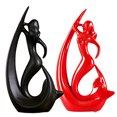
Ever notice how you feel instantly calmer in a blue room but weirdly energized in a red one? That's not just you being quirky – colors actually mess with our brains! Blues and greens are like nature's chill pill, perfect for creating that "ahhhh, I'm home" feeling. Meanwhile, vibrant yellows and oranges are basically coffee for your eyeballs, bringing energy and warmth. Before you slap that hot pink on every surface (tempting, I know), think about the vibe you're going for. Want a zen den for relaxation? Cool blues might be your jam. Need a space that says "let's party"? Warmer tones might be calling your name. Your walls are basically mood rings – choose wisely! Just like your choice in painting vibes, curating decor enhances it further — think of a buddha-themed artistic wall hanging that blends with calming color themes of your DIY living room to channel serenity into the space.
Not ready to commit to painting your entire living room that delicious shade of emerald green? I feel you – commitment issues extend to paint colors too! Enter: the accent wall, AKA the "I'm adventurous but not crazy" option. Pick one wall (usually the one your sofa faces) and make it the star of the show with a bold color or pattern. Think of it as the fashionable statement piece in your room's outfit. The best part? If you hate it, you've only ruined one wall instead of four! That's what I call a risk management strategy for the design-impaired. Amp it up by flaunting something bold, like a vibrant abstract showpiece for your accent wall makeover project, which adds dimension and color synergy.
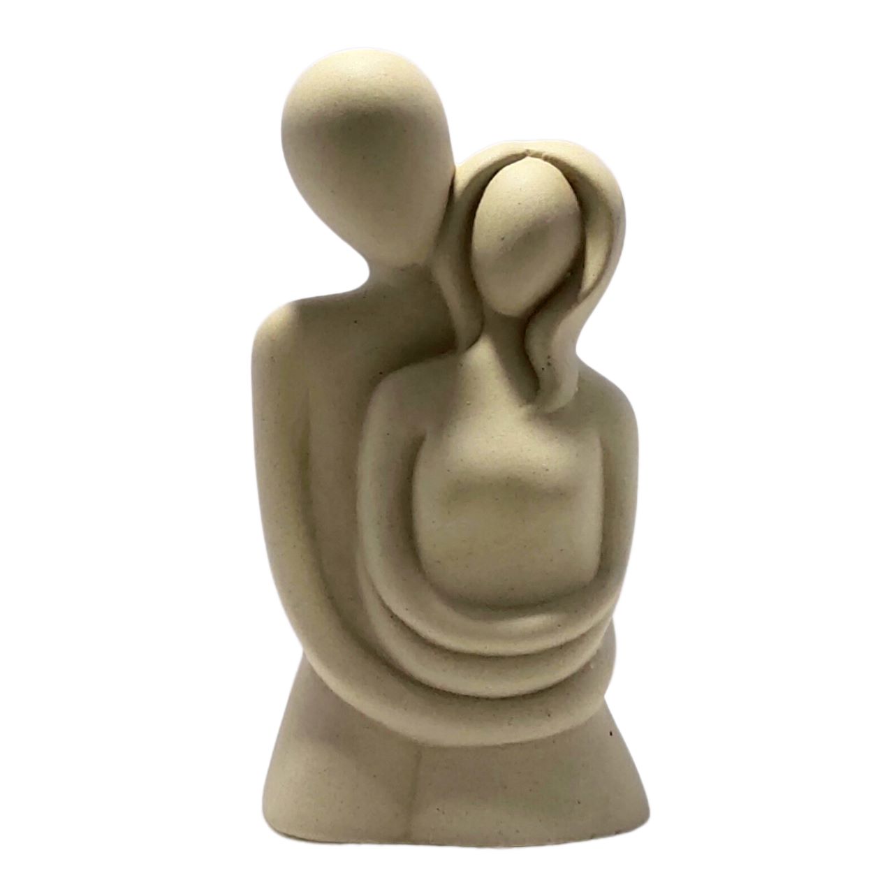
Why settle for one color when you can have two? (This is also my ice cream ordering philosophy). Two-tone walls are like the cool kids of interior design – effortlessly stylish without trying too hard. Try painting the bottom third of your wall in a deeper shade and keep the top light and airy. Or go horizontal with a bold stripe right through the middle! Navy and cream? Classic. Charcoal and blush? Chef's kiss. Forest green and soft gray? Italian chef finger kiss The combinations are endless, and the compliments from visitors? Guaranteed. Complete the look with something classic — a modern ceramic vase to stylishly complement your two-tone DIY design, perfect for coffee tables or a small shelf.
Remember playing with shapes in kindergarten? Time to channel that energy onto your walls! Geometric patterns are basically math you can stare at while sipping wine. Try painting a series of triangles climbing up your wall, or hexagons that look like the fanciest beehive ever. All you need is some painter's tape, a ruler, and the patience of a saint. Pro tip: measure twice, tape once, and maybe don't attempt this after that third glass of Pinot. Your future self will thank you when the lines are actually straight. Add dimension by pairing it with a geometric-themed resin corner showpiece for standout symmetry in your wall design.
Remember tie-dye shirts from summer camp? Ombre walls are like that, but make it fashion. This gradual color fade effect looks like you hired a professional, but it's actually just you blending colors like you're on some HGTV show. Start with your darker shade at the bottom, working up to the lighter tone, and blend in the middle with a dry brush or sponge. The result? A wall that looks like the most beautiful sunset ever. Warning: may cause unexpected napping as you gaze dreamily at your masterpiece. Add the final touch with a sunset-inspired ceramic showpiece perfect for your ombre wall vibe, adding more warmth and coherence.

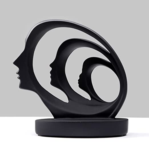
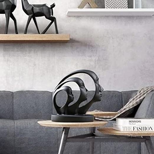
Let's be honest – most of us couldn't draw a straight line if our Netflix subscription depended on it. Enter stencils: the training wheels of wall design! From Moroccan patterns to botanical beauties, stencils let you fake artistic talent with minimal effort. Simply secure your stencil to the wall, dab paint through the cutouts, and voilà – suddenly you're Michelangelo with a spray bottle! The best part? When friends ask if you did it yourself, you can say yes while conveniently forgetting to mention the pre-cut plastic sheet that did all the hard work. To up the wow factor, consider a decorative small artifact that echoes the stencil theme in size and vibe, blending the design with a functional decor piece.
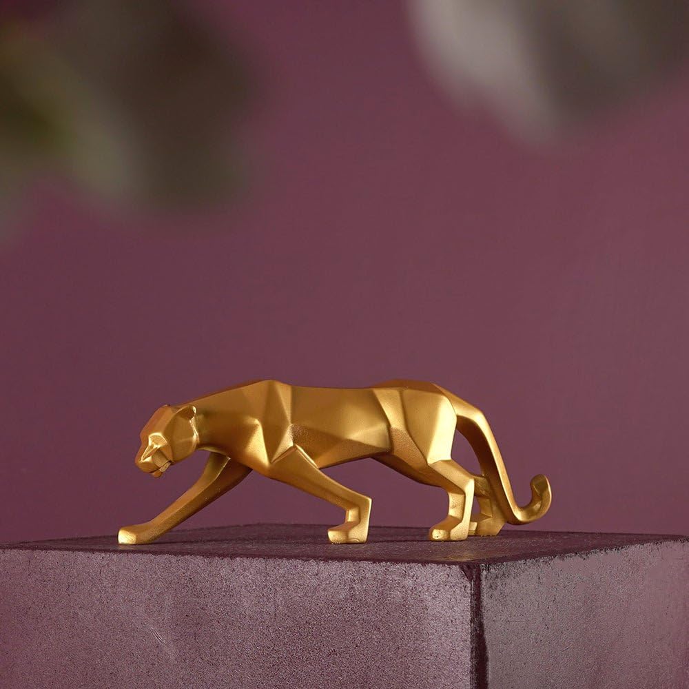
Remember that sponge gathering dust under your sink? Time to promote it to art tool! Sponge painting creates a textured, dimensional look that adds serious sophistication to any space. Simply dip your sponge in paint, blot off excess, then dab it against the wall in random patterns. The result is a textured finish that looks like expensive wallpaper but costs about as much as last night's takeout. Just maybe don't use the same sponge for dishes afterward – blue curry isn't the culinary innovation you think it is. Style it out with a sponge-accentuated Buddha-inspired statue for meditative design harmony, ideal for corner displays.
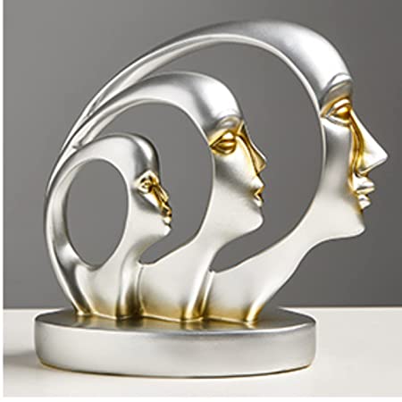
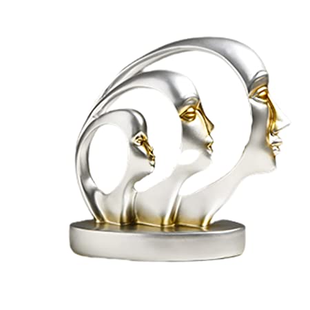
Color blocking is like Tetris for your walls – fitting different colored sections together to create a masterpiece. Choose 3-4 complementary colors and divide your wall into asymmetrical sections using painter's tape. The result? A wall that screams "I have an art degree" (even if your only artistic achievement was winning the third-grade coloring contest). This technique works particularly well in modern spaces or when you want to make a small room feel larger. Plus, it's perfect for indecisive people who can't commit to just one color – now you can have ALL the colors! Match your blocky design with a bold corner statue that perfectly complements graphic DIY wall colors.
Vertical stripes make your ceiling look higher. Horizontal stripes make your room look wider. Diagonal stripes make your guests dizzy (use with caution). Stripes are basically optical illusions you can live in! All you need is some painter's tape, a level, and the patience of a parent trying to assemble a bicycle on Christmas Eve. For extra credit, try varying the width of your stripes or using alternating glossy and matte finishes of the same color for a subtle but sophisticated look. Your walls will look so good, even zebras will be jealous. Don’t forget a sleek tall showpiece to synchronize with the stripe pattern and add vertical flair.
Why settle for flat walls when you can have walls with personality? Create your own textured paint by mixing sand, coffee grounds, or even salt into your paint for a custom finish that adds dimension and drama. Try a subtle sand finish for a beachy vibe, or go bold with a dramatic combed texture that makes your walls look like they're wearing corduroy. Just be prepared for guests who can't stop touching your walls – maybe keep hand sanitizer nearby. Elevate the sensory experience with a resin statue perfect for textured wall settings in living room corners.
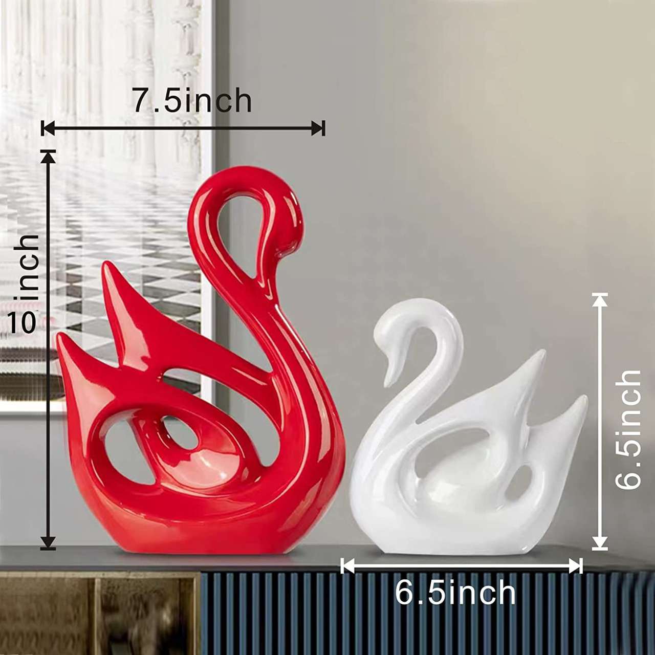
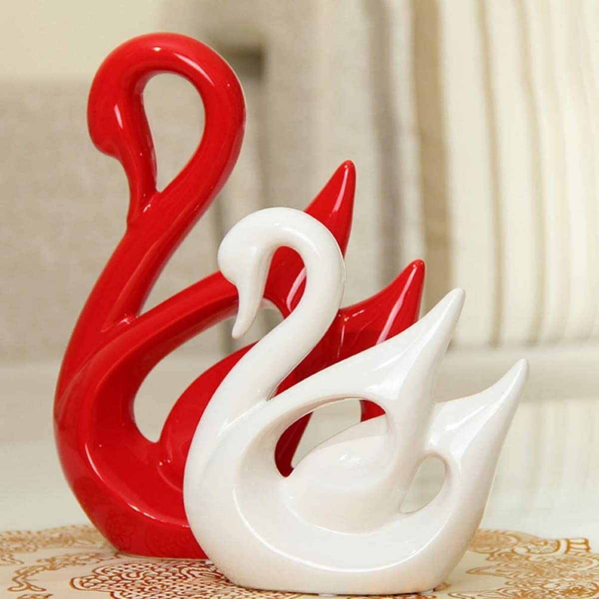
Nature knows what's up when it comes to color combos. Take a cue from Mother Earth and choose palettes inspired by your favorite outdoor scenes. Love the beach? Try sandy beiges with oceanic blues. Mountain person? Rich forest greens with granite grays might be your jam. Even that stunning sunset you photographed on vacation can translate into a gorgeous living room color scheme. The best part about nature-inspired colors? They never go out of style. Trees haven't changed their leafy green look for millions of years, and they're still killing it. Consider enhancing this nature-infused look with a beach-themed ceramic decor piece to echo natural DIY colors.
You've painted, you've patterned, you've possibly had several minor breakdowns along the way – but now it's time for the finishing touch! Consider adding a clear coat with different finishes to really make your design pop. A high-gloss finish on certain sections can create contrast against matte areas, or try a pearlescent topcoat that catches the light just right. It's like adding jewelry to your outfit – that little extra something that takes it from "nice" to "DAAAAMN!" Just remember to take plenty of "before and after" photos for your social media humble-bragging. You've earned it! Polish it more with a glazed resin showpiece to complete your final DIY living room transformation.
The "best" color depends on your personal taste and the mood you want to create, but neutrals like greige (that's gray-beige for the uninitiated), soft sage green, and warm taupe are universally flattering options. These shades play well with most furniture and create a versatile backdrop. For smaller living rooms, lighter colors like pale blue or soft cream make spaces feel larger, while larger rooms can handle deeper hues like navy or terracotta. Pro tip: "best" usually means "whatever color doesn't make you want to move out after staring at it for three days straight."
The most fool-proof living room color schemes follow the 60-30-10 rule: 60% dominant color (walls), 30% secondary color (furniture), and 10% accent color (accessories). For a calm, sophisticated vibe, try monochromatic schemes using different shades of the same color. For something more energetic, complementary colors (opposite on the color wheel) like blue and orange or purple and yellow create dynamic spaces. Earthy schemes with greens, browns, and creams bring nature's harmony indoors. Remember: the best scheme is one where you don't wake up six months later thinking, "What color crime did I commit here?"
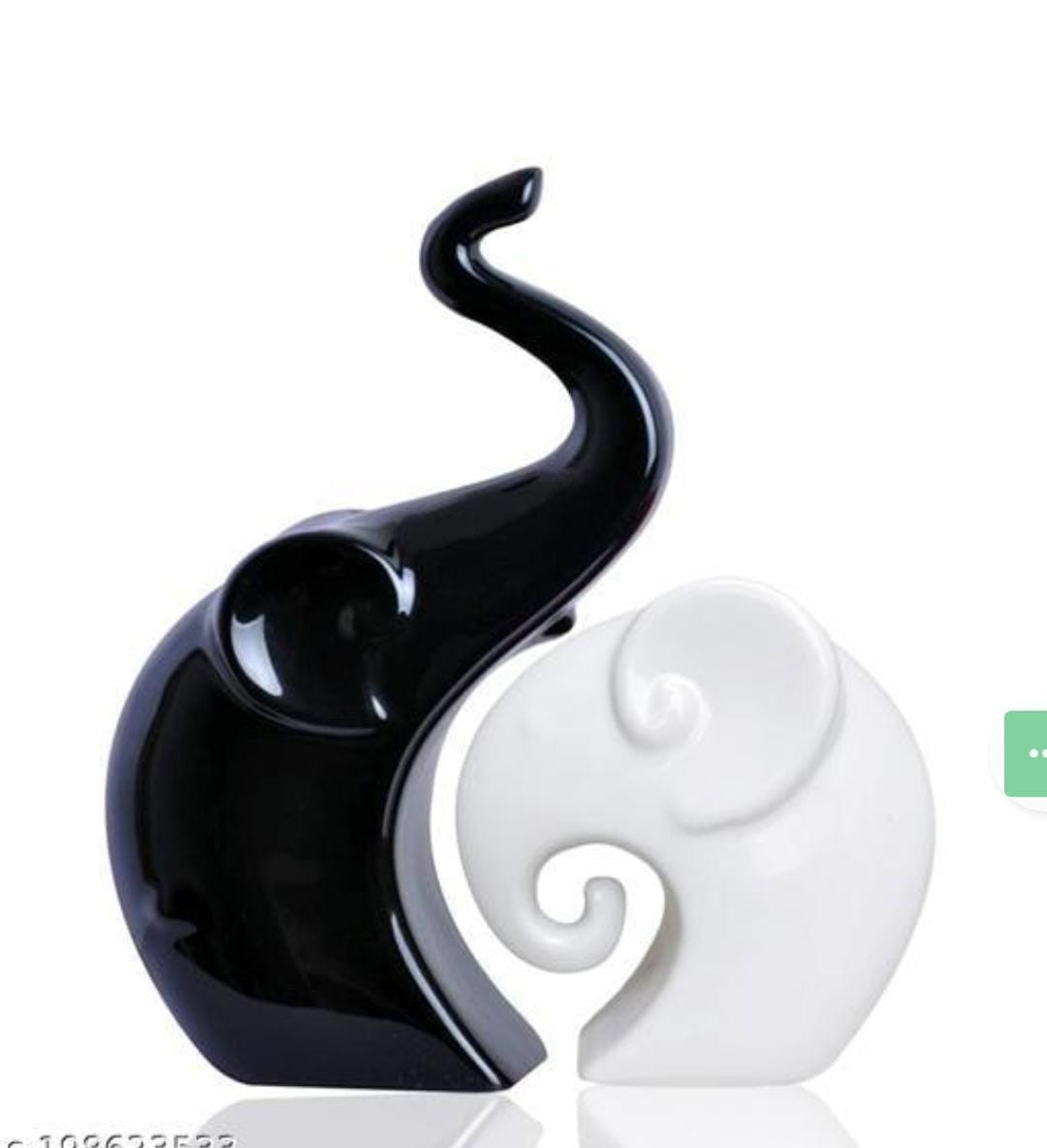
Some two-color combinations are like peanut butter and jelly – they just work! Navy and white create a classic, crisp look that never goes out of style. Sage green and warm beige bring natural harmony. Charcoal gray and blush pink offer sophisticated contrast. For dramatic effect, black and white is the power couple of color duos. If you want something unexpected but harmonious, try terracotta and teal – they're complementary without shouting for attention. The key is balancing warm and cool tones to create tension without visual chaos – kind of like maintaining a healthy relationship, but with fewer arguments about who forgot to take out the trash.
Start with inspiration – nature, favorite artwork, or that amazing vacation photo where everyone actually looked good. Create a mood board (fancy designer talk for "pin stuff to Pinterest") to see if your colors play nicely together. Test paint samples on your wall – and not those tiny squares, but big 2-foot sections you can see from across the room in different lighting. Remember that colors look different depending on natural light, artificial light, and what color your neighbor's cat is (okay, maybe not the last one). Plan your design with painter's tape before committing, and always work from top to bottom to avoid drips ruining your masterpiece. Most importantly, remember that paint is relatively cheap – if you hate it, you can always try again!
Creating custom DIY paint is easier than convincing yourself to fold laundry right after drying! Start with a base of white latex paint, then add small amounts of artist's acrylic paints or universal tinting colors until you achieve your perfect shade. For texture, you can add fine sand for a subtle gritty feel, or mix in some glitter for walls that party harder than you do. For a more eco-friendly option, try milk paint (mixing milk protein, lime, and natural pigments) or chalk paint (which you can DIY by adding baking soda to latex paint). Always mix thoroughly and test on a small area first – unless you're going for that "I closed my eyes and hoped for the best" aesthetic, which is also valid.


