
Cart
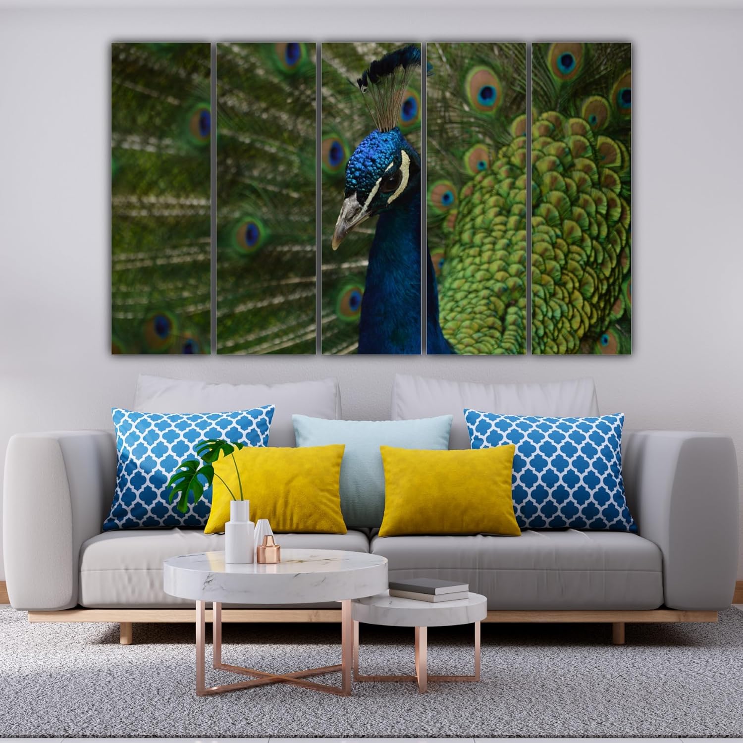
Moolwan 5-Panel Peacock Canvas Wall Art Painting (127x76cm) - Royal Bird Photography with Gold-Green Plumage
You've measured your living room wall three times. Maybe four. The tape measure says 360cm, but you're still not confident because those online guides show walls without windows, without your TV unit, without that corner where your mother's pooja shelf sits. Every guide says something different, and none account for the fact that your sofa already takes visual weight, or that your ceiling is 9 feet, not the 12-foot gallery ceilings in those staged photos. You keep second-guessing: is 127cm actually right, or will it look lost on that big wall?
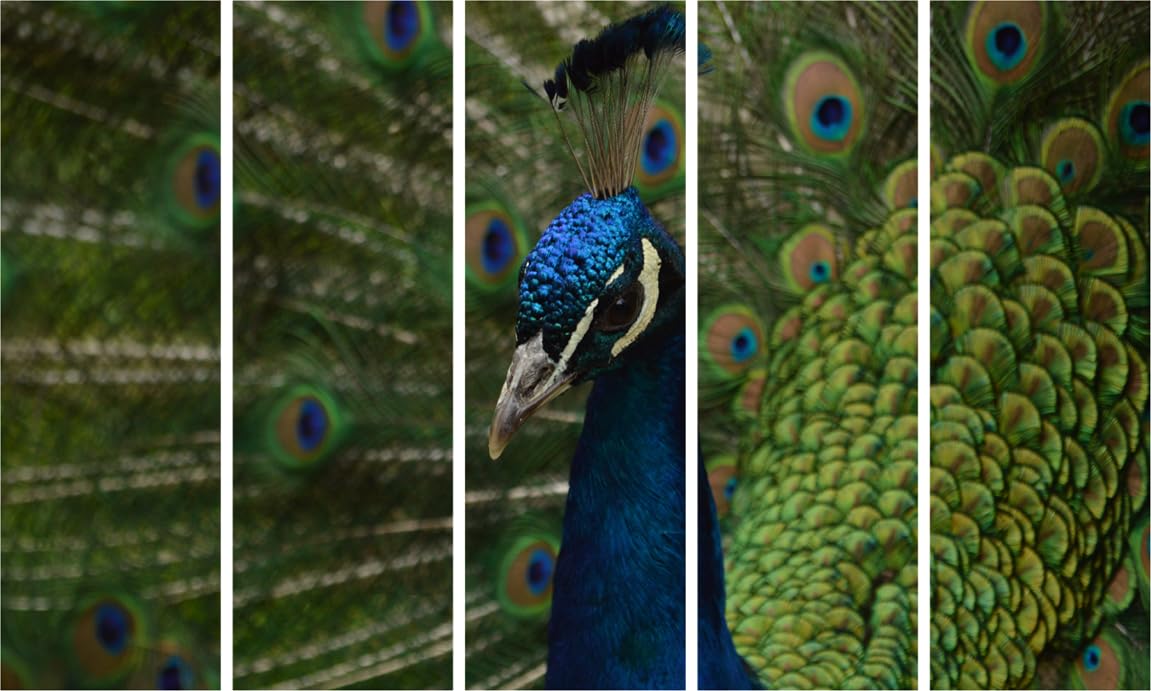
Here's what 127cm means on a standard 12-foot (360cm) wall: this peacock spans 35% of your wall width. That leaves 116cm of breathing space on the left, 116cm on the right. The peacock doesn't dominate—it anchors. The 76cm height works with 9-10 foot ceilings because it sits at natural eye level when you're standing (roughly 150-165cm from floor to center). If your sofa is probably 6-8 feet wide and sits below this, the proportions create balance, not competition.
The royal blue body, turquoise head crest, and gold-green feather eyes pull from a palette that already exists in Indian homes. Your walls are probably cream or off-white. Your furniture might be dark wood or brown fabric. The deep blue reads as intentional and grounded—not the baby blue that feels decorative, but the saturated blue that feels considered. The gold-green feather pattern catches light from windows during the day and from tube lights at night, which means it doesn't go flat in evening hours when most guests visit.
Let's break down the coverage math because this is where most people hesitate. A 12-foot wall is 360cm. This canvas is 127cm wide. That's 35% coverage. The remaining 233cm is split: 116cm left, 116cm right (assuming center placement).
Why does 35% work? Because visual balance in residential spaces—not galleries—happens around 30-40% coverage. Go smaller (say, 100cm) and you're at 28% coverage. The wall starts to feel underdressed, like you picked decor that's timid. Go larger (say, 150cm) and you're at 42% coverage. The wall feels busy, especially if you have windows, door frames, or adjacent furniture.
Now add the vertical: 76cm height on a 9-foot ceiling (274cm) is 28% vertical coverage. This sits comfortably between the sofa backrest (probably 75-85cm high) and where you'd naturally hang wall art (140-160cm from floor to center). The peacock's head aligns with where guests' eyes naturally land when they walk into the room—you're not craning up or glancing down.
If you're considering the 150cm version: that's 42% wall width. Your wall can handle it structurally, but visually, it compresses the breathing space to 105cm per side. If your TV unit or side table already takes corner space, 150cm starts to feel like you're filling wall, not designing it. If you're considering the 100cm version: that's 28% coverage, which works in 10-foot walls but feels undersized on 12-foot walls. The peacock loses its presence.
The peacock's color palette isn't accidental. The deep royal blue body reads as navy in natural morning light, saturated blue under afternoon sun through windows, and rich indigo under evening LED tube lights. This consistency matters because your living room lighting changes throughout the day, and you don't want art that looks stunning at noon but dull by 7 PM when guests arrive.
The gold-green feather eyes—those concentric circles that peacock plumage is known for—have yellow, lime green, and bronze tones. These aren't competing colors; they're accent notes. If your walls are cream (most builder flats) or light yellow (popular in North India), the gold-green harmonizes. If you have dark wood furniture (common in South India), the bronze tones echo that warmth. If your sofa is brown or beige fabric, the green doesn't clash—it complements.
Here's what this looks like in real lighting: morning sun from east-facing windows will highlight the turquoise head crest and make the gold-green shimmer. Afternoon light flattens everything slightly, which is when the deep blue body holds the composition together. Evening tube lights (usually cool white LEDs) bring out the blue intensity. If you have warm yellow bulbs, the gold-green gets richer. The canvas doesn't rely on one lighting condition to work—it adapts.
One caution: if your walls are already bold (deep maroon, dark green, burnt orange), the peacock's blue will compete. This works best on neutral walls where the art provides the color, not the architecture.
Each of the 5 panels weighs about 600 grams, so total weight is 3kg. That's lighter than a wall clock or a framed family photo collage, which means you're not drilling heavy-duty anchors or risking plaster damage.
Standard approach: use provided hooks and 2-inch nails. On brick-and-plaster walls (most Indian construction), 2-inch nails hold 3kg comfortably. The 5 panels are pre-spaced, so you're not measuring gaps or leveling each frame individually—the manufacturer has already set the visual rhythm. Hang the center panel first (the peacock's head), then attach the two left panels, then the two right panels. Total time: 15-20 minutes if you're doing it alone, 10 minutes with a second person holding panels.
For rental properties: if your landlord is strict about nail holes, use adhesive hooks rated for 1kg per hook (you'll need 5). Brands like 3M Command or Fevicol's adhesive strips work on painted walls. The downside: adhesive hooks don't adjust once placed, so you need to measure carefully. Nails are more forgiving—if you miss by 1cm, you can pull and re-nail. Adhesive mistakes mean re-buying strips.
The 0.6cm depth means these panels sit close to the wall—they don't jut out like thick wooden frames. This matters if you have narrow corridors or furniture placed near walls. A 2-3cm frame would cast shadows and feel obtrusive; 0.6cm reads as integrated, not added.
You've probably seen single-panel peacock canvases (usually 100cm x 60cm). Those work for bedrooms or smaller walls, but on a 12-foot living room wall, a single panel looks like placeholder art. The visual weight is concentrated in one rectangle, which creates a "hole" effect on either side.
The 5-panel design distributes the peacock across 127cm of horizontal space. The head is centered, the body tapers left, the feather fan spreads right. Your eye travels across the panels, which creates movement—the peacock feels alive, not static. This is why multi-panel photography works for living rooms: it mimics how we actually scan a room, not how we stare at a single point.
If you're considering 3-panel versions (usually 90-100cm total width): those compress the peacock into a tighter composition. The feather detail—the gold-green eyes, the layered plumage—gets cropped or simplified. The 5-panel version gives each element space: the head crest gets its own panel, the body gets definition, the feathers get their full spread. You're not choosing between 3 or 5 panels based on preference; you're choosing based on whether you want the full peacock or an abbreviated version.
Price comparison: single-panel peacock art at ₹1,200-1,500 uses thinner canvas (usually 200-250 GSM). This is 340 GSM cotton canvas with moisture-resistant coating, which matters in Indian humidity (70-85% during monsoons). Cheaper canvas warps or sags within a year. This holds taut. The ₹2,796 price reflects that durability, plus the 5-panel manufacturing complexity.
The product photo shows the peacock under professional studio lighting—bright, even, color-accurate. Your living room won't replicate that, and that's fine. Here's what changes:
Morning light (8-11 AM): if your windows face east or north, natural light will make the turquoise head crest pop. The gold-green feathers will look lime-ish. The blue body will read as navy. This is the "freshest" the canvas looks daily.
Afternoon light (12-4 PM): harsh sunlight through windows can wash out colors slightly. The blue stays strong, but the gold-green softens to beige-green. If you have sheer curtains, this diffuses light and balances the effect.
Evening tube lights (6-10 PM): cool white LEDs (most common) bring out the blue saturation. The gold-green reads as olive. If you have warm yellow bulbs (less common now), the entire palette shifts warmer—the blue looks teal, the gold-green looks bronze.
Distance matters: from 8-10 feet away (typical sofa-to-wall distance in 12x14 ft rooms), the peacock reads as a cohesive image. The 5 panels blend visually—you see the bird, not the frames. From 3-4 feet away (if someone walks up close), you'll see the individual feather details and the panel seams. This isn't a flaw; it's how multi-panel art works. The seams are part of the design language.
Color accuracy: the royal blue will be slightly darker in person than on your phone screen (screens boost brightness). The gold-green might be less neon, more muted-metallic. If you're expecting exact screen-to-wall color match, calibrate down by 10-15%. If that concerns you, most canvas art ships with a 7-day return window—you can evaluate in your actual space.
One realistic caution: if your living room has very low natural light (basement flat, north-facing with trees blocking windows), the peacock will read darker overall. The blue might look near-black in dim conditions. This isn't a canvas flaw; it's physics. If that's your situation, consider adding a picture light or ensuring your tube lights are bright (15-20 watts LED minimum).