
Cart
Moolwan 5-Panel Peacock Feather Canvas Wall Art Painting (127x76cm) - Multi-Frame Nature Photography
You might have browsed dozens of peacock wall art pieces by now. Some were too small—looking lost on a 12-foot wall like a postage stamp. Some were too large—overwhelming the space and leaving no breathing room around your furniture. You probably kept coming back to 127cm—because intuitively, it feels right. But you want to be sure.
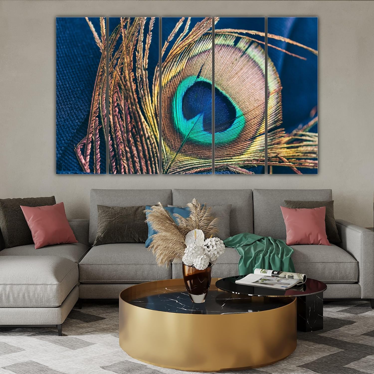
Here's the spatial logic: a 127cm canvas on a standard 12-foot (360cm) wall gives you 35% coverage. That leaves 116cm of wall space on the left and 116cm on the right. This matters because your sofa is probably 6-8 feet wide (180-240cm), positioned below. The canvas sits comfortably above it without extending beyond the sofa's edges—creating that "intentional gallery" look, not the "accidentally mismatched" look.
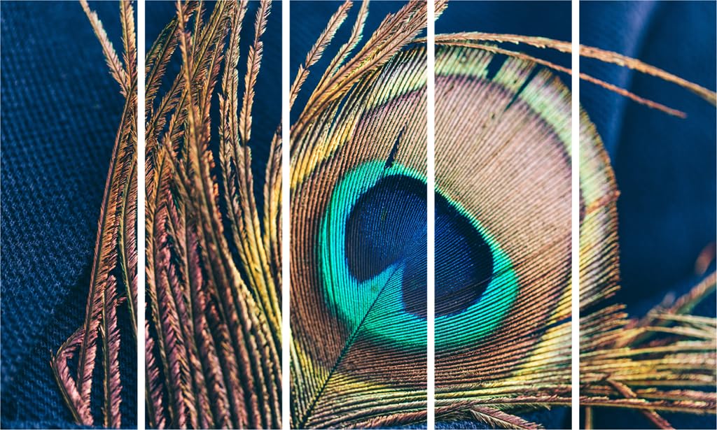
Your walls are probably cream, off-white, or that builder's light yellow. The turquoise eye of the peacock feather will pop against these neutral backgrounds. The golden-bronze tones and navy blues create depth without clashing. The 5-panel split adds visual texture—your eye moves across the composition rather than hitting a flat rectangle.
The math is straightforward: 127cm ÷ 360cm wall = 35% coverage.
Compare this to 100cm (28% coverage): It would look undersized, floating awkwardly above an 8-foot sofa. You'd constantly feel like something's missing, like the wall is hungry for more.
Compare this to 150cm (42% coverage): It works if your wall is clear, but if you have windows, a door frame, or a pooja shelf nearby, 150cm starts crowding. The 5-panel design needs breathing room—the outer panels feel cramped if there's not enough buffer space.
127cm is the sweet spot for most Indian living rooms. It's substantial without being dominating. Your ceiling is probably 8-10 feet—this 76cm height maintains good proportions. The canvas doesn't stretch too close to the ceiling (amateur mistake) or sit too low (another amateur mistake). When hung with the center at 57-60 inches from the floor, the composition aligns naturally with seated eye level.
If your room is 12x14 feet—common for Indian apartments—this size creates balance. It becomes the focal point without competing with your TV unit, coffee table, or other furniture. The peacock feather motif is detailed enough to appreciate from your sofa (8-10 feet away) but doesn't get busy or overwhelming.
You've seen the product photo—crisp, clean, studio-lit. But how will these colors look against your cream walls under your tube light or LED bulbs?
Turquoise (the peacock eye): This color has high contrast against cream or off-white walls. It reads as "rich" rather than "bright"—important because bright colors can look cheap in Indian homes where natural light is often filtered through curtains. Morning sunlight will make the turquoise glow softly. Evening LED light (if you use warm white, 3000K) will deepen it slightly, giving it an elegant teal appearance.
Gold and bronze tones: These metallics catch light at different angles throughout the day. If you have a window on the left, the left panels will shimmer subtly when afternoon light hits them. This isn't glitter or bling—it's understated luxury. The gold tones also complement wooden furniture beautifully. If you have a brown or beige sofa, a sheesham coffee table, or wooden pooja shelves, the warm tones create visual harmony.
Navy and deep blue sections: These provide grounding. Without them, the bright turquoise and gold might feel too energetic. The navy blues anchor the composition, making it feel sophisticated rather than loud. Against cream walls, navy adds depth without making the space feel dark.
The 5-panel split means colors transition across panels—your eye follows the gradient from golden feather strands on the left to the vibrant eye in the center to softer blues on the right. This keeps it visually interesting without being chaotic.
This weighs 3kg total—light enough for standard picture hooks or adhesive strips rated for 5kg.
If you're renting and worried about that ₹50,000 deposit: use 3M Command Picture Hanging Strips (the large size, rated for 7.2kg). They hold securely on painted walls and remove cleanly without damaging paint. Apply one strip set to each panel's back frame. Installation takes 15 minutes.
If you can use nails: standard 2-inch picture hooks work perfectly. The frame is 1.5-inch kiln-dried pinewood (category standard from Moolwan), so it's sturdy. The depth is only 0.6cm—this sits almost flush against the wall, not jutting out awkwardly.
Hanging tip: Mark your center point first (60 inches from floor to the middle of the canvas). Then hang the center panel. Use a level app on your phone to align the remaining panels. The 5-panel design means each panel should have consistent spacing—usually 1-2 inches between panels.
The splash-resistant coating means you don't need to panic if you're hanging this near a kitchen passthrough or in a dining area where moisture happens. The canvas won't warp or develop mildew in 70-85% monsoon humidity like uncoated canvas might.
If you've saved the 100cm version: It costs less (probably ₹500-700 cheaper), but you'll regret the size. A 100cm canvas on a 12-foot wall looks tentative. When guests sit on your sofa and glance up, they'll unconsciously feel like something's missing. You might end up buying matching side pieces or decorative elements to fill the gap—spending more in the end.
If you've saved the 150cm version: It's more dramatic, but it demands a clear wall. If you have a window, door, or adjacent wall feature within 50cm of where the canvas will hang, the 150cm feels cramped. The 127cm gives you flexibility—it works even if your wall has architectural quirks.
The honest difference: 100cm looks appropriate for bedrooms or study rooms (smaller walls). 150cm is for statement walls in larger living rooms (14-16 feet wide). 127cm is the versatile middle—it works in most standard Indian living rooms without requiring you to rearrange furniture or remove other décor.
Color-wise, all three sizes use the same peacock feather photography, so there's no quality difference. You're choosing based on spatial fit, not visual appeal.
Morning light (natural): The turquoise will be most vibrant. Gold tones will shimmer softly. Navy blues will look rich but not dark. This is when the canvas looks closest to the product photo.
Afternoon light (if your window faces west): The right side of the canvas will catch direct light, making colors slightly washed out. The left panels will have deeper, more saturated colors. This contrast is normal—it adds dimension.
Evening LED light (warm white, 3000K): Colors will be slightly warmer overall. Turquoise shifts toward teal. Gold looks deeper. Navy blues remain grounded. If you use cool white LEDs (6000K), colors stay truer to the product photo but may feel slightly clinical.
Tube light (old-style fluorescent): Colors will look flatter—this is the least flattering lighting for any art. If you can, add a picture light or wall sconce above the canvas. Even a simple 5W LED strip makes a dramatic difference.
Viewing distance matters: From your sofa (8-10 feet away), you'll see the overall composition—the eye, the feather structure, the color flow. From 3-4 feet (when you walk past), you'll notice the texture details, the individual barbs in the feather, the fine gradations.
The 340 GSM cotton canvas with eco-solvent UV-resistant inks (Moolwan category standard) means colors won't fade noticeably for 5-7 years even if you have indirect sunlight exposure. The splash-resistant coating adds durability—fingerprints wipe off, dust doesn't embed in the texture.