
Cart
Feel like your room is closing in on you faster than your deadline at work? You're not alone! We've all stood in the middle of our "cozy" (read: tiny) spaces, wondering if we could somehow stretch the walls without calling a contractor. Good news! Your paintbrush might be the magic wand you've been looking for. The right colors can visually expand your space faster than you can say "is this apartment actually a converted closet?" Let's dive into some color wizardry that'll have your rooms feeling airier than your favorite soufflé! And don’t forget to style your corners using the Tall Showpieces for Corner to Amplify Room Brightness Using Color Combinations to enhance openness visually.
Remember how Darth Vader's dark outfit made him look intimidating and bulky? Well, the same principle applies to your walls (minus the heavy breathing). Light colors like soft whites, gentle creams, and barely-there pastels reflect light rather than absorb it, making your walls appear to recede rather than advance. It's like your walls are politely stepping back to give you more space – how considerate of them! Try Benjamin Moore's "Cloud White" or Sherwin-Williams' "Alabaster" and watch your room take a deep breath and expand. Pair these hues with Small decorative showpieces for subtle room brightening with pastel shade contrasts to enhance this lightweight and airy ambiance.
Cool colors are like the responsible friend who actually plans ahead – they know how to make space! Soft blues, gentle greens, and lavenders create the illusion of distance (unlike that friend who's always "five minutes away" for an hour). Paint your walls a light blue like Behr's "Watery" or a soft sage green, and suddenly your room is doing social distancing without being told. These hues remind us of open skies and distant horizons, tricking our brains into seeing more space than there actually is. Sneaky, but in a good way! Include Modern decorative vases in subtle cool hues ideal for space-enhancing themes for corners and window sills to echo those spacious vibes.
Want to know a designer secret? Using varying shades of the same color creates a seamless look that prevents your eye from stopping at corners – kind of like how a good conversation flows without awkward pauses. Paint your walls, trim, and ceiling in the same color family (just vary the shades slightly), and suddenly your room boundaries become as blurry as your vision after binge-watching Netflix all night. This technique removes visual interruptions and creates the illusion of one continuous, larger space. It's like Photoshopping your room, but in real life! Tie it together effortlessly using Abstract modern art showpieces using monochrome tones for visual expansion.
Is your ceiling playing limbo with your head? Time to give it a lift! Paint your ceiling a shade lighter than your walls to create the illusion of height – it's like your ceiling is wearing platform shoes. For bonus points, extend your wall color about 12 inches onto the ceiling around the perimeter. This blurs where walls end and ceiling begins, making your ceiling appear to float higher. It's the same principle as wearing vertical stripes, except your ceiling won't look like a referee at a sports game. Delicately frame these illusions with Vertical artistic wall statues to visually lift wall height in color-coordinated settings.
Speaking of stripes – they're not just for making people look taller at parties! A subtle vertical stripe or pattern on one wall can draw the eye upward faster than a squirrel climbing a tree. Whether it's delicate wallpaper, painted stripes, or even strategically placed artwork, vertical elements create a visual pathway that makes your ceiling seem higher. Just keep the pattern subtle – you want "sophisticated height illusion," not "circus tent." You can also integrate Vertical ceramic decor showpieces in light hues to complement striped walls for maximum height-enhancing effect.
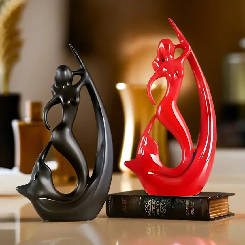
Mirrors aren't just for checking if you have spinach in your teeth – they're space-doubling wizards! Place a large mirror opposite a window or light source and watch as your room appears to double in size, like magic but without the annoying rabbit to feed. Mirrored furniture or glossy surfaces can also help bounce light around, making your space feel airier than your favorite souffle. Just don't go full-on hall of mirrors unless you want guests getting confused about which way is the bathroom. Use Resin showpieces with glossy finishes to aid light reflection in small spaces and boost brightness intelligently.
While light colors are generally your space-expanding friends, a strategic dark accent wall can actually create depth. It's like the optical illusion where pushing something very far back makes everything else seem closer – except in reverse! Paint your shortest wall in a deeper hue, and it creates the illusion that it's receding into the distance. Just remember: this is one area where "go big or go home" doesn't apply – limit dark colors to one wall, or you'll end up making your room look like it's wearing a shrink ray. Make your accent pop with Dark-toned decorative statues for enhancing dramatic focal walls that don't overpower but elevate the depth illusion.
All-white rooms aren't just for people who are afraid of stains – they're actually space-expanding powerhouses! White walls, white furniture, white everything creates a seamless expanse where your eye doesn't stop at boundaries. It's like your room is wearing the spatial equivalent of Spanx – everything just looks smoother and more expansive. Add different textures to keep things interesting (fuzzy pillows, smooth ceramics, woven baskets) so your space feels serene rather than sterile. After all, you want "airy modern loft," not "clinical waiting room." Incorporate Matte white decorative items for minimalist themes in small modern interiors to maintain elegance without visual clutter.
Who needs actual walls when you have color? Use different colors to create "zones" in your space without physically dividing it. Maybe a soft blue for your home office corner and a gentle green for your reading nook. It's like having roommates who respect each other's space – each area has its own personality, but they all get along in the same room. This technique gives the illusion of having multiple rooms without actually chopping up your precious square footage. Coordinate each zone smartly with Color contrasted tabletop showpieces for functional decorative zoning that visually distinguish spaces.
Here's a designer secret: painting your trim and moldings a lighter color than your walls makes the walls appear to be further back. It's like putting your walls on a diet – they instantly look slimmer! This works especially well in rooms with beautiful architectural details. Your crown molding and baseboards become like the fancy frame around a painting, drawing attention outward rather than to the limited space. It's the room equivalent of a really good contour makeup job – defining the best features while creating the illusion of more space. Complement this effect using Artistic border decor pieces to accentuate wall and trim light effects.
Did you know your brain literally perceives lighter spaces as bigger? It's not just design folklore – it's science! Our brains associate darkness with closeness and light with openness (probably from our cave-dwelling days when dark meant "small scary cave" and light meant "big open savanna where lions might eat us"). Take advantage of this prehistoric wiring by maximizing natural light alongside your color choices. Remove heavy drapes, use semi-sheer window treatments, and position mirrors to bounce that precious sunlight around. Your brain will thank you by perceiving your room as spacious enough for a prehistoric dance party. You can reinforce this effect with Light-reflective glazed ceramic pieces for enhancing natural room brightness.
Now that you've got all these color tricks up your sleeve, it's time for the grand finale: coordination! The most successful space-expanding color schemes work with your existing elements, not against them. Consider your flooring, large furniture pieces, and even the view from your windows when choosing your palette. The most convincing spatial illusions happen when colors flow naturally from one element to the next, creating a harmonious whole rather than a collection of competing parts. It's like orchestrating a symphony where every instrument plays its part perfectly – except instead of music, you get the sweet sound of friends saying "Did this room get bigger since I was last here?"
Light colors like soft whites, pale blues, light grays, and gentle beiges make rooms look bigger by reflecting more light and making walls appear to recede. Think of colors like Benjamin Moore's "Simply White" or Sherwin-Williams' "Sea Salt" – they're like spatial expanders in a can! These colors create fewer visual boundaries and allow the eye to move continuously through the space, giving the illusion of more square footage than your landlord is actually charging you for.
Pure whites, soft yellows, and pale peaches are brightness champions! White reflects nearly 100% of light, making it the ultimate brightness booster. Soft yellow adds warmth while still reflecting plenty of light – it's like sunshine in a paint can. Pale peach tones bring a subtle glow that's especially flattering in spaces with limited natural light. These colors essentially act as natural amplifiers for whatever light you already have, making even the gloomiest room feel like it's got its own personal sunshine subscription.
For bedrooms, soft blues, lavenders, and pale greens not only make the space look bigger but also promote relaxation. Light blue-grays like Behr's "Light French Gray" or gentle lavenders like Benjamin Moore's "Organdy" create a sense of expansiveness while maintaining that cozy bedroom feel. If you want to get fancy, paint your ceiling the same color as your walls but 50% lighter – this blurs the boundary between wall and ceiling, making your bedroom feel taller than your morning bed-head.
Soft blues, gentle greens, and lavenders are the zen masters of color psychology. Blue lowers blood pressure and heart rate (it's science!), while green connects us to nature and promotes calmness. Lavender combines the serenity of blue with a touch of warmth. For maximum relaxation, choose muted versions of these colors rather than their vibrant cousins – think "weekend meditation retreat" rather than "toddler's birthday party." These colors are particularly effective in bedrooms and bathrooms where relaxation is the name of the game.
Light, cool-toned colors universally make spaces look bigger, with pale blue-grays and soft greens leading the pack. These colors visually recede, creating the perception of more space. The lighter and cooler the tone, the more expansive the feeling. For a foolproof bigger-room formula, try colors like Sherwin-Williams' "Rainwashed" or Benjamin Moore's "Breath of Fresh Air" – they're like spatial smoke and mirrors, creating the illusion of endless space even in your cozy (tiny) apartment. Remember, when it comes to making rooms look bigger, going lighter and cooler is almost always the right move!


