
Cart
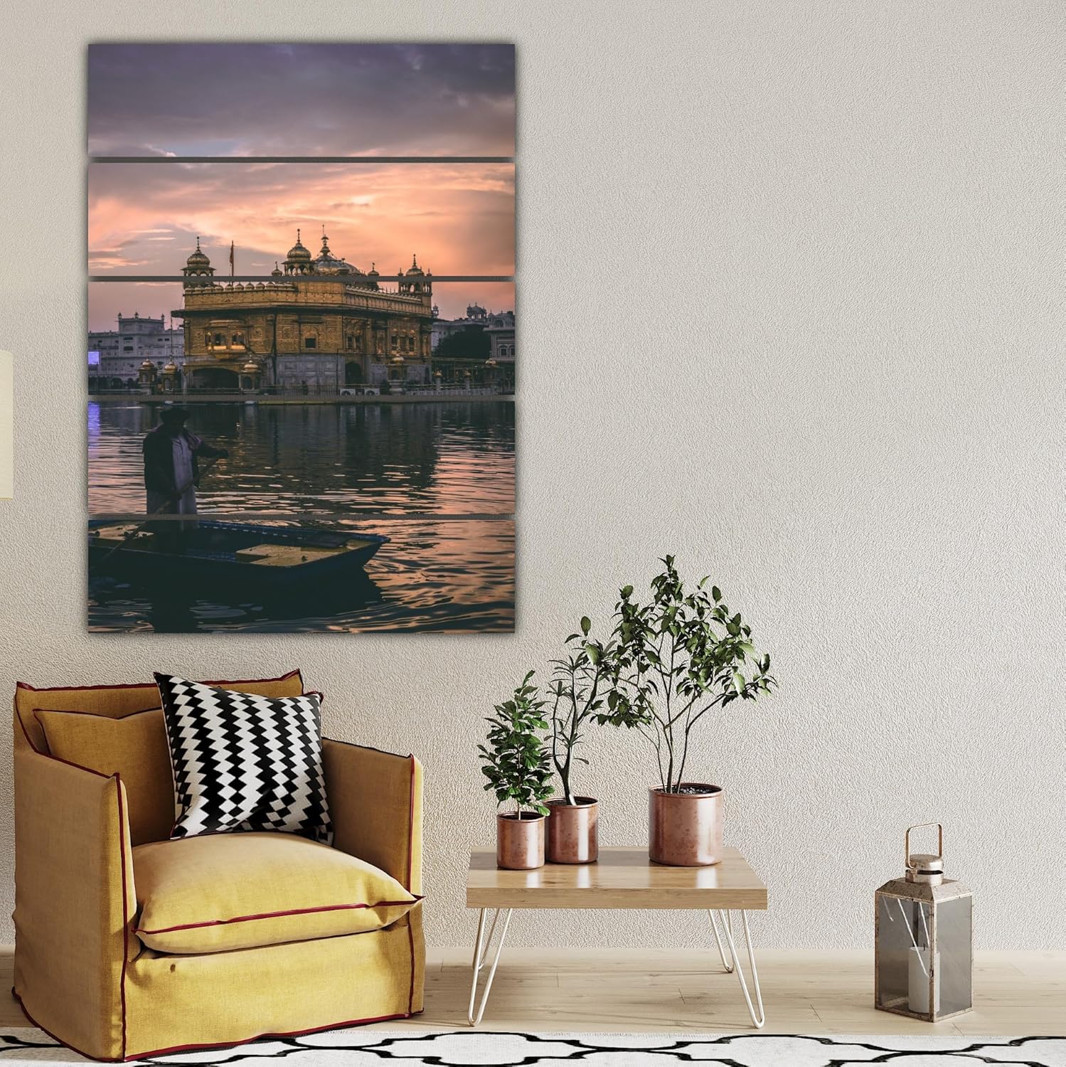
You keep opening the product page, trying to mentally place this on your living room wall. But it's impossible to know for sure, isn't it? 127cm looks perfect in mockups, but your wall has windows on one side and maybe a doorway on the other. You need to know this works in your specific space, not just styled photos.
Here's the spatial reality: on a standard 12-foot (360cm) wall—the kind you'll find in most 12x14 ft living rooms—this 127cm canvas covers approximately 35% of the wall width. That leaves 116cm on the left side and 116cm on the right side. It's the proportional sweet spot where the art commands attention without overwhelming the architecture around it.
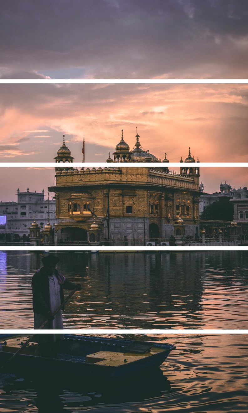
The 5-panel format matters more than you might think. Those horizontal divisions create visual rhythm that guides your eye across the golden temple, the sunset sky, the sacred pool, and the silhouette in prayer. Each panel is approximately 25cm wide, creating natural breaks that prevent the composition from feeling like one heavy block. When you're sitting on your sofa 8-10 feet away, your eye moves across the panels naturally—the way it would if you were actually standing at the temple's edge.
Your wall is probably 12 feet wide. Your sofa is probably 6-8 feet. And you've probably measured the space above it three times, wondering if 127cm is right.
Here's the visual math: 127cm is 35% coverage. Smaller options—like 90cm pieces—cover only 25% of the wall. They look proportional above a console table, but above a full-size sofa, there's too much negative space. The art feels like an afterthought rather than a focal point. Your mother-in-law will say "It's nice," but you'll know she means "It's small."
Larger options—152cm or 180cm—cover 42-50% of the wall. They work if you have a truly empty wall with no side furniture, no doorways, no architectural interruptions. But in most Indian homes, walls have pooja shelves, AC units, light switches, or windows. A 180cm piece leaves only 90cm on each side—not enough breathing room if there's a door frame 60cm from the corner.
127cm leaves 116cm on each side. That's enough space for:
This isn't arbitrary. It's the proportional balance where the art feels intentional—large enough to anchor the room, small enough to respect the architecture.
You've seen the product photos. Golden temple, peach sunset, teal water. It looks beautiful online. But you're wondering: what will these colors actually look like against your cream walls under your tube lights?
The golden temple structure reflects warm light. In morning sunlight streaming through your east-facing window, the gold catches natural light and appears brighter—almost luminous. The peachy sunset sky adds warmth without turning orange. The teal water at the bottom provides cool contrast, preventing the entire piece from feeling too warm or too yellow.
In evening LED light—the kind most Indian homes have—the colors soften. The gold becomes more muted, less reflective. The sunset transitions from peach to a dusty rose. The teal water appears deeper, more contemplative. This isn't a bad thing. It means the art shifts with your day, looking fresh in the morning and calming in the evening.
Against cream or off-white walls (the standard in most apartments), the golden tones create contrast without clash. The colors are warm enough to complement wooden furniture—your coffee table, your TV unit, your dining chairs—but not so warm that they compete. The teal water acts as a visual anchor, tying in any blue or grey accents you might have in cushions or curtains.
Against builder's peach or light yellow walls (common in slightly older apartments), the golden temple blends harmoniously. The peachy sunset sky transitions naturally into peachy walls, while the teal water provides necessary contrast to prevent the entire room from feeling monochromatic.
The 5-panel format matters here, too. Because the image is divided, the colors don't hit you all at once. The top panels show more sky. The middle panels focus on the architectural gold. The bottom panels emphasize the water and silhouette. This vertical color distribution prevents the art from feeling too heavy in any single tone.
You're probably wondering about wall damage. You have a ₹50,000 deposit on the line, and your landlord has opinions about nail holes.
This arrives ready to hang. Each of the 5 panels has a hook on the back. You need:
The process:
Total time: 15 minutes if you're careful, 10 minutes if you've done this before.
The nail holes are small—smaller than the holes left by calendar hooks. When you move out, a dab of toothpaste (white, not gel) fills them invisibly. Your deposit is safe.
Weight distribution matters: each panel weighs approximately 600 grams (total weight 3kg divided by 5). That's light enough that a single nail holds securely in standard Indian apartment walls—whether painted cement, plaster, or drywall. You're not mounting a TV. You're hanging five lightweight panels.
You've probably looked at 90cm options (smaller) and 152cm options (larger). Here's the honest difference:
90cm canvas:
127cm canvas (this one):
152cm canvas:
The ₹500 difference between sizes isn't just about canvas material. It's about proportional fit. A ₹2,296 piece that looks small is more expensive than a ₹2,796 piece that looks right. You'll see this daily. The cost-per-day over five years is negligible. The visual satisfaction—or regret—compounds.
For most 12x14 ft living rooms with standard 8ft sofas and architectural realities (door frames, windows, switches), 127cm is the size that works. Not because it's middle-ground compromise, but because it's proportional to how Indian homes are built.
This is not hand-painted. It's digitally printed on 340 GSM cotton canvas using eco-solvent UV-resistant inks. The colors won't fade in direct sunlight, but they won't have the brushstroke texture of original oil paintings either.
The frame is 1.5-inch kiln-dried pinewood—sturdy enough to keep the canvas taut, light enough to hang without heavy-duty mounting. The depth is 0.6cm, so the panels don't protrude far from the wall. This creates a sleek look, not a chunky shadow-box effect.
The temple image is a photograph, not an illustration. You'll see subtle details: the architectural carvings on the temple, the ripples in the water, the gradient in the sunset sky. But from 8-10 feet away (your viewing distance when seated), you'll perceive the overall composition more than minute details.
The 5-panel division means you'll notice the panel gaps—thin lines where the frames separate. This is intentional design, not a flaw. The gaps create rhythm and prevent the image from feeling like one continuous photograph. If you prefer seamless imagery, a single-panel canvas is different (though typically less visually dynamic).
This ships rolled in a tube if panels are detached, or in a flat box if pre-assembled. Assembly instructions are included. Delivery takes 5-6 days in metro cities (Delhi, Mumbai, Bangalore), 6-8 days in tier-2 and tier-3 cities. The packaging is solid—foam corners, plastic wrap—but inspect immediately upon delivery. Manufacturing defects are rare but possible.
The golden temple with sunset imagery has cultural and spiritual significance. If you're purchasing this for a prayer area or meditation corner, it creates a contemplative atmosphere. If you're purchasing for a living room, it adds elegance with spiritual undertones. Either way, it's a conversation piece. Guests will notice. They'll ask about the Golden Temple. They'll comment on the sunset. It's distinctive in a market flooded with generic abstract art and floral prints.