
Cart
Let's face it – staring at a blank wall is about as exciting as watching paint dry (pun absolutely intended!). But your living room walls are basically giant canvases just begging for some color love! Whether you're a bold color enthusiast or a "please don't make me choose between eggshell and off-white" kind of person, I'm here to help you turn those boring walls into conversation starters. Grab your paint chips and let's dive into some color combinations that'll make your guests say, "Did you hire a designer, or are you just naturally this fabulous?" You can complement these vibrant walls with modern abstract showpieces for stunning living room transformations that turn every blank space into a style statement.
Neutrals get a bad rap for being boring, but they're like that reliable friend who never lets you down. Think warm greige (that's gray+beige for the uninitiated) paired with crisp white trim. It's like the little black dress of wall colors – it goes with everything! Add a navy blue accent wall behind your TV, and suddenly you're not just watching Netflix – you're having an experience. To enhance the subtle elegance of this palette, try incorporating handcrafted ceramic vases for classic neutral living rooms that blend beautifully with clean and modern interiors.
Want to feel like royalty without the drama of maintaining a castle? Try pairing deep navy blues with gold accents. This combo is practically wearing a crown! A rich blue on your main walls with gold-framed artwork or mirror will make you feel like you should be sipping tea with your pinky up. Warning: may cause random urges to host fancy dinner parties where everyone mysteriously speaks with a slight British accent. Amplify the aesthetic by placing deep blue art sculptures for royal-themed living rooms that shimmer under the golden light, giving your space opulent charm.
If your idea of a perfect day involves hiking boots and zero cell service, bring that nature vibe home with sage green walls and terracotta accents. This combination is like having a houseplant that you can't kill! The earthy tones create a serene backdrop that'll make your living room feel like a spa retreat. Bonus: when you haven't vacuumed in a week, these colors are remarkably forgiving. Pair them seamlessly with ceramic corner showpieces with earthy color tones to highlight the raw, grounded elements of outdoor life inside your home.
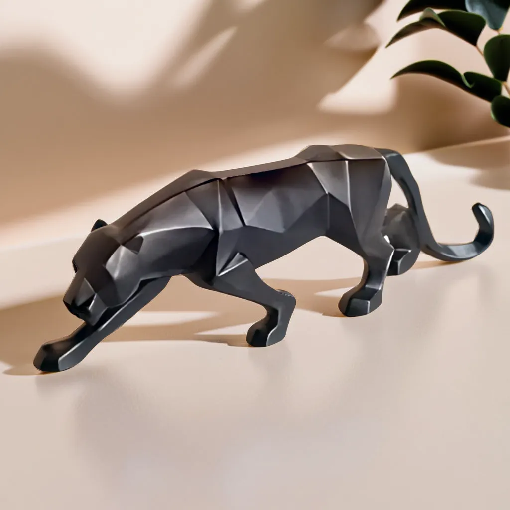
Channel your inner IKEA catalog with crisp white walls and natural wood accents. This pairing is cleaner than your kitchen will ever be and creates that effortless, "Oh this? I just threw it together" vibe that we all secretly aspire to. Add black metal accents for contrast, and you've got yourself a living room that looks like it belongs on a Pinterest board titled "Goals." Complement with resin statues in subtle hues for Scandinavian décor elegance to give your space the airy, artistic charm of Nordic simplicity.
For the color confident (or those looking to become color confident), teal and coral are the dynamic duo your walls have been waiting for. A teal feature wall paired with coral accessories is like a tropical vacation that doesn't require TSA pat-downs. This combo says, "Yes, I have a personality, and yes, it's delightful!" Just make sure to balance these bold hues with some neutral furniture unless you're aiming for the "exploding crayon box" aesthetic. Elevate the drama with large ceramic decorative pieces for accentuating coral and teal walls positioned as statement focal points.
Think of charcoal and blush as the modern power couple of interior design. Deep, moody charcoal walls create drama without going full goth, while blush accents add just enough softness to keep things friendly. This combination works in both modern and traditional spaces and has the magical ability to make your living room look expensive even if your furniture came from the "extreme discount" section. Infuse the drama with contemporary blush-toned décor showpieces for charcoal walls to add gentle warmth and balance to the bold color narrative.
Need a little sunshine but can't control the weather? Bring it inside with soft yellow walls and gray furniture. This combination is practically wearing a smile! Yellow brings the happy vibes while gray keeps things grounded – kind of like having both a spontaneous friend and a responsible one in the same room. This pairing works especially well in rooms that don't get much natural light. Illuminate shelves and side tables with small decorative pieces for sunny gray-yellow combos to tie together this cheery palette with minimal effort.
For those who aren't afraid of the dark (colors, that is), try deep teal or navy paired with emerald green accents. This rich, jewel-toned approach creates a sophisticated space that says, "Yes, I have opinions about wine." These deeper hues make your living room feel like a cozy embrace at the end of a long day. Just be warned – once you go dark, it's hard to go back to beige. Accentuate these jewel tones with luxury resin showpieces for moody green and blue living spaces that bring texture and elegance.
Channel those Joshua Tree vibes without the sunburn by pairing warm sand-colored walls with rust and terracotta accents. This combination feels both timeless and trendy, like your favorite vintage t-shirt that somehow never goes out of style. Add some cacti (real or fake, no judgment here) and textured pillows, and you've created a desert oasis that doesn't require you to check for scorpions before putting on your slippers. Complete the look using colorful resin art pieces for warm and rustic desert wall themes that mirror the hues of sun-kissed landscapes.
If you're into keeping your living room energetically balanced (and who isn't?), Vastu suggests light colors like pale blue, green, or cream for your living room walls. These hues supposedly invite prosperity and positive energy – and even if you're skeptical, wouldn't you rather have walls that potentially attract good fortune than ones that don't? Pair these light bases with gold or yellow accents, which are considered particularly lucky. Mix in large vastu-friendly decor items for spacious and calm living rooms to ensure energetic flow aligns with style.
Want a living room that helps you finish that novel/painting/interpretive dance routine you've been working on? Colors like soft lavender, aqua blue, or sage green are thought to boost creativity. These gentle hues provide enough interest to stimulate your brain without overwhelming it – think of them as coffee for your eyes, but without the jitters. Pair them with white trim for a clean look that lets your ideas (and your art) take center stage. Add flair with sage green abstract decor items for creativity-inspiring walls that feed the senses just right.
If your living room doubles as your personal art gallery, choose wall colors that make your art pop without competing for attention. Soft grays with a hint of warmth create a museum-like backdrop that lets your collection shine. For contemporary art, cool whites with blue undertones create that gallery-fresh look. Just remember – unlike actual museums, you can touch everything and there's no admission fee (unless you start charging your houseguests, which, honestly, isn't the worst idea).
Remember, at the end of the day, your living room should make YOU happy. Whether that means embracing the calming vibes of Scandinavian white or going full-on peacock with jewel tones everywhere, the best color combination is the one that makes you smile when you walk through the door. Paint samples are cheap, but joy is priceless! And if all else fails, just tell visitors your questionable color choices are "an artistic statement" – works every time!
The most versatile color combinations for living rooms include greige with white trim and navy accents, soft blues with gold accents, and warm neutrals with green elements. These pairings work across multiple design styles and create balance between interest and calm. For smaller spaces, lighter combinations like soft gray and white help rooms feel larger, while larger rooms can handle deeper color pairings like charcoal and blush.
According to Feng Shui and Vastu principles, yellow and gold tones are considered particularly lucky for living spaces as they represent prosperity and positive energy. Light greens symbolize growth and harmony, while light blues promote tranquility and communication. Earthy tones like terracotta can also invite grounding energy. For maximum "luck," avoid extremely dark colors that absorb light and potentially create heavy energy.
Vastu recommends light and soothing colors for living rooms, with green, blue, and cream being top choices. Yellow and gold accents are considered auspicious for prosperity. According to vastu principles, the living room typically sits in the northeast or northwest section of the home, where lighter colors are preferred. Avoid excessively dark colors like black or deep purple on the main walls, as these are believed to absorb positive energy.
For wall art backgrounds, neutral colors like soft white, light gray, and greige create a gallery-like setting that lets the artwork be the star. For more dramatic presentations, deep navy, hunter green, or charcoal can make colorful art pop dramatically. The best choice depends on your art collection – vibrant, colorful pieces often shine against neutral backdrops, while more subtle artwork may benefit from a bolder wall color that adds contrast.
The most universally appealing wall colors for drawing rooms include warm neutrals (greige, taupe, soft beige), gentle blues (sky blue, powder blue), and soft greens (sage, mint). These colors create welcoming environments while providing versatile backgrounds for furniture and decor. Regional preferences vary – coastal areas often favor blues, while urban settings may lean toward sophisticated grays and traditional homes often embrace warmer neutrals.
Colors that stimulate creativity without overwhelming the senses include soft purples (lavender, lilac), blues with green undertones (aqua, teal), and gentle greens (sage, mint). These colors are shown in color psychology studies to promote creative thinking without causing distraction. Yellow can stimulate mental activity, though softer versions are less likely to create visual fatigue. For a creative space that remains relaxing, consider these colors on one feature wall rather than the entire room.


