
Cart
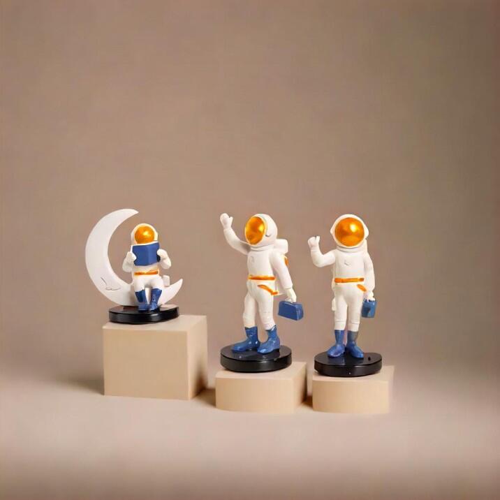
Ever walked into a living room and thought, "Wow, who let a rainbow explode in here?" Or worse, entered a space so beige you weren't sure if you were in a living room or an oatmeal factory? Finding that perfect color combo for your living space is like matchmaking your furniture with your walls – get it right, and they'll live happily ever after. Get it wrong, and well... let's just say your sofa might file for divorce. Let's dive into some fabulous furniture and wall color combinations that'll make your living room the coolest hangout spot since Central Perk! Add visual charm to this fun setup with the Stunning Small decorative showpieces as color contrast highlights in your living room, bringing out the best in your shelf or desk decor.
White walls with wooden furniture is like peanut butter and jelly – a timeless combo that never disappoints. This pairing gives you that farmhouse vibe without requiring you to actually wake up at 5 AM to milk cows. The crisp white walls make your space feel bigger than your last apartment (which isn't saying much, but still), while wood tones add warmth faster than that space heater you bought on Black Friday. Throw in some green plants and suddenly you're an influencer-level decorator without breaking a sweat! Complement this look with the Elegant Ceramic and Resin Vases that blend impeccably with Classic White and Wood combinations, ideal for shelves and small corners.
Navy blue walls paired with gold or brass accents and light-colored furniture is the adult version of wearing a tiara to the grocery store – sophisticated but still fun. This combination screams "I have my life together" even if your cabinet is full of mismatched mugs and takeout containers. The deep blue creates drama without the therapy bills, while the metallic touches catch light like you planned it (even if it was a happy accident). Warning: friends may suddenly want to host book club at your place. Capture this mood with Modern design statues in navy and gold tones for expressive living room drama, perfect for creating a focal point that reflects elegance.
Sage green walls with cream-colored furniture is like bringing the outdoors in, minus the pollen and surprise spiders. This earthy combo creates a sense of calm that even your mother-in-law can't disturb. The subtle green hue is like a spa day for your eyes, while cream furniture softens the space faster than that meditation app you downloaded but never use. Add some woven textures, and boom – you're practically living in a nature documentary (the peaceful kind, not the one where lions chase antelopes). Strengthen this tranquil setting with Artistic Wall Hangings and Decor to pair with Sage Green and Cream ambiance, designed to enhance organic vibes.
Dark charcoal walls paired with blush pink furniture pieces is for the brave souls who aren't afraid to make a statement bigger than your last Amazon delivery. This high-contrast duo creates a space that's both moody and playful – kind of like you after two glasses of wine. The dark walls create a cozy cocoon effect perfect for Netflix marathons, while the blush accents add just enough sweetness to prevent your room from looking like a villain's lair. Complete the narrative with Tall Showpieces for Corners that complement Charcoal and Blush sophistication, a daring but balanced design accent.
Not ready to commit to a bold color story? Greige (that magical hybrid of gray and beige) is the color equivalent of a Swiss Army knife – it goes with everything. Pair it with literally any furniture color, and somehow it works. It's like that friend who gets along with everyone at the party. Whether you go with navy sofas, emerald accent chairs, or mustard yellow ottomans, greige walls will be there nodding approvingly, never judging your choices. Accentuate this chameleon color with Versatile Abstract Showpieces fitting Greige and bold contrasts alike, bringing artful unity to the room.
Terracotta walls with teal furniture create a Southwest-meets-ocean vibe that'll make visitors ask, "Did you hire a designer or are you just naturally this cool?" This warm-meets-cool combination is unexpected but works like that weird food pairing you were skeptical about but now can't stop eating. The earthy orange tones create a sunset glow that makes everyone look better in selfies, while the teal adds just enough pop to keep things interesting. Reinforce the uniqueness using Antique finish Resin items that pop against Terracotta and Teal walls, perfect conversation starters.
Picking different shades of the same color family for both your walls and furniture is like wearing a matching sweatsuit – oddly satisfying and surprisingly chic. Whether you choose blue, green, or even (gasp) purple, playing with different intensities creates depth without requiring an art degree. Just remember the rule: vary the textures unless you want your sofa to disappear into your walls like a furniture-based magic trick. Bring this gradient illusion alive with Modern-style small resin pieces to match monochrome schemes effortlessly, enhancing textures without clutter.
Black walls with white furniture (or vice versa) is the color equivalent of wearing black tie to a wedding – always appropriate, never trying too hard. This high-contrast duo creates instant drama without the reality TV vibes. The best part? You can swap in literally ANY accent color when you get bored. Yellow pillows today, emerald vase tomorrow, hot pink throw next week – it's like having a new living room every season without the moving trucks. Add spice with Small decorative accents for TV units that lift Black and White elegance, dynamic yet minimal in appearance.
Deep emerald walls with sapphire blue and ruby red furniture pieces may sound like crown jewel theft, but it's actually a sophisticated way to embrace color without looking like a preschool classroom. These rich, saturated hues create a luxurious vibe that whispers "I might be nobility" even if your crown jewels are actually from the clearance section. Just keep some neutral elements to give the eye a place to rest – even royalty needs a nap sometimes. Enhance this luxury with Large Size Artistic Decor Items for Focal Impact with Jewel Tone schemes, making your living room feel majestic.
Pale yellow walls with gray furniture is like having sunshine on demand, no weather app required. This cheery yet sophisticated palette injects instant happiness faster than cat videos, while the gray keeps things grounded so your space doesn't look like a cartoon sun. It's the color equivalent of wearing a power suit with fun socks – professional enough for Zoom calls but with a secret personality. Add playful cheer through Resin decor pieces in Yellow Grayscale perfect for uplifting wall and couch palettes, elevating ordinary surfaces.
Various shades of blue with crisp white furniture creates that beachy vibe without requiring sand in unspeakable places. This combo makes your living room feel like a permanent vacation, even when you're just folding laundry in your pajamas. Layer different blue tones from navy to sky for depth that rivals the ocean itself. Just resist the urge to add too many literal beach items unless you want visitors asking where to check in for their room key. Tie it together with Ceramic Vases and Wall Decor to emphasize the Coastal Cool aesthetic, bringing breezy sophistication inside.
At the end of the day, your living room should reflect you – whether you're a bold color enthusiast or someone who thinks beige is actually exciting (no judgment... well, maybe a little). The perfect color combination makes you happy every time you walk through the door, even when that door leads to a pile of bills and yesterday's coffee mug. Remember: paint is relatively cheap, and furniture slipcovers exist for a reason. So go ahead, be brave with that color wheel – the worst that can happen is a fun story for your next dinner party!
The universally flattering combination is a neutral wall (white, greige, or light gray) paired with furniture in blues or greens. It's like the "little black dress" of interior design – it works for everyone! But the truly best combination is one that makes YOU happy every time you see it. If lime green walls and purple furniture bring you joy, who am I to stand in the way of your color happiness? Just maybe warn visitors before they enter.
According to vastu principles, light shades of green, blue, and yellow are considered auspicious for living rooms, particularly in the north or east areas of your home. Green represents growth and harmony (and not just for your houseplants), while yellow attracts positive energy faster than your dog runs to the sound of a treat bag opening. Avoid too much red or black in the living room unless you're going for the "dramatic vampire lair" aesthetic, which, to be fair, is making a comeback.
If I had to choose just three power couples (or rather, triplets) of the color world:
Navy blue, white, and gold – elegant without trying too hard, like wearing sunglasses indoors
Sage green, cream, and terracotta – earth mama vibes without requiring you to make your own granola
Gray, yellow, and teal – modern, cheerful, and versatile, like that friend who's somehow good at everything
Just remember to follow the 60-30-10 rule: 60% dominant color, 30% secondary color, and 10% accent color. It's like making a cocktail – proportions matter unless you want a decorating hangover!
Green (surprise, surprise) and purple are traditionally associated with wealth and abundance. It's why money is green and royalty wore purple when blue dye was on backorder. Gold and yellow are also considered prosperity colors across many cultures. Will painting your living room emerald green actually fatten your bank account? Probably not directly, but it might inspire confidence that leads to that promotion... or at least make you feel wealthy while eating ramen on the couch!
Yellow is the undisputed champion of positive vibes – it's basically sunshine in color form. Blues promote calm and tranquility (perfect for when the kids/pets/partners are doing the opposite), while green connects us to nature and renewal. For maximum positive energy, combine these colors in a way that makes YOU feel good. After all, the most positive energy comes from walking into a room that feels like it was designed specifically for your happiness – even if your design inspiration came from a potato chip bag (hey, those colors didn't pick themselves!).


